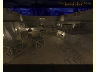
aim_dust_night
 CS
CS
aim_dust_night
by
=[Symmetry]=
Posted 19 years ago2005-12-01 18:12:51 UTC •
Completed •
Counter-Strike
- Name
- aim_dust_night
- By
-
![=[Symmetry]=](https://twhl.info/uploads/avatars/inline/718.jpg) =[Symmetry]=
=[Symmetry]= - Type
- Map
- Engine
- Goldsource
- Game
- Counter-Strike
- Category
- Completed
- Created
- 19 years ago2005-12-01 18:12:51 UTC
- Updated
- 19 years ago2005-12-01 18:12:51 UTC
- Views
- 3027
- Downloads
- 642
- Comments
- 5
- Rating
- 3.00 (4)
- Reviews
- 0
Enjoy! 

5 Comments
You must log in to post a comment. You can login or register a new account.


However, avoiding friendly fire could be difficult when it's dark.
+Lighting
+Ambience
+Idea
=Dust
-Remake
***************
+ Texturing. was ok, you used the trim, so the map really looked like dust.
+ Layout. It was good, lots of different paths, etc. The weapon placement was good too.
+ Gameplay. It would play nicely, i think.. Perhaps some AWPs at the top catwalks?
*****************
- Architecture. Too much crates, you didn't add any dust arches, which are the main resemblence to dust.
- Ambience. There could be some, although there wasn't any in dust, so that's not a big problem.
- Lighting. It's very boring, same lights everywhere.. :
********************
Nothing more to add, I guess.. Personally, I'm not fond of map remakes, so I'll give ya 3* for the effort
Texturing (+) Very dust-like. The trim on the walls and the cobble-stone road are all good. Nicely done there.
Architecture (+/-) The architecture was generally good around the walls and with the lights but as Daubster said.. crates.. too many of them... Crates are the lazy-mapper's signature. Think if something else to hide behind.
Layout (+/-) Meh. It's classic aim map.. almost a bit too classic.. like.. its perhaps decompiled? i dont know.. Anyways, weapon placement was pretty good... The layout helps gameplay.
Ambience (-) none. Wind or something would be good.
Lighting (+/-) i think the night time theme suits the dust map but it was rather dull... It needs something but i cant think what.
Obviously, effort was put into making this but honestly, itsbetter to get your own idea. Not bad. Not great.
+ Lightning, I think the lightning looks very sexy, it really adds that 'feeling'.
+ Layout, like hunter said, very classic, but it does the job.
+/- Architecture, it was alright.
Like the others said, crates, argh, althought it's typical for a aim map, they are a sign of lazyness and noobyness.
- Ambience, it really should have some!
- Another dust map!!
3 stars.