op_airfeild
 CS
CS

Loading...


This is the first map i have ever made
objective: ct kill t, t kill ct
http://www.devilsdominion.co.nr
This map has been edited slightly since the last release and i promis you that it is now defanatly the final version.
I found that they were still quite a few majour bugs in the map that needed to be resolved.
I have also made the glass translucent as it confused many people.
This map will now stay as it is
enjoy
11 Comments
You must log in to post a comment. You can login or register a new account.
1st When i fist made this map i relized the scale was of but then i liked it so i didnt change it
2nd I went over my patch limit resulting in lowering the texture on the walls
sorted... If anyone else says this i am going tio kill them
Yer i know but i promissed i wouldnt chnage it so i stick to that.
Also i will be working on op_airfeild2 which will be basicly and updated all buged fixed map with extras on whichi know will be pushing the compile limit but, bleh. It will be done!
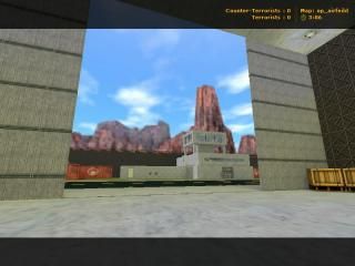
Start with the easy I guess. Re-texturing isn't hard and this map could definitely use some of that. Don't get me wrong though, because In general I like you basic colors--I like the dark runway, and the bright grass for instance, but they could definitely be don better.
I would scale the runway textures huge to make for better r_speeds, and perhaps replace it with a slightly lighter "black". Same with the hangar becuase it's so big, scale up those textures and watch your r_speeds go down. I won't look as good, but with a big open map like this, your choices are limited.
Your other choice of course would be to change the layout. So the engine isn't rendering so much of this map at once. You can do this by how much a player can see at any one time, and as it is now, the player can see way too much
No lights? Bad. I know it takes longer to run vis and rad, but it makes your map look so much better.
I could go on and on, but in the interest of my time, I'll throw out some more random suggestions. If you release a new version of this, I'll be happy to review it again.
-Scale is way to big for most things --fence, doors, helipad, all way to big.
-Make the hangar smaller, put a simply designed airplane in it, and close the hangar doors almost all the way, to increase your performance.
-Reference Pics: it's obvious to me you know what an airport looks like from the nice details, but it's also obvious you didn't use reference pics too much because of some of things that looked a little off. If I'm wrong on this, I would still recommend checking out some more ref pics.
-add a lip value to your doors so you don't see the ugly brush intersection when they are open
-add some ambient sounds! Airplanes wooshing by, tower chatter, supprort trucks!
-ladders look pants
-try to transition going from the end of the map to the sky textures. It looks weird, and i'll admit, it's a difficult problem to fix.
Excellent First map and also very clean in that there was no major brushing errors I could see. Looking forward to seeing a new version of this!
Nice job!
3 Stars
Don't worry as i said up there i was going to change it and add extras in. No wait, that must of been my other post,lol. Well anyway i will be making it look a lot cooler once i have my surf map done and dusted.
I opened the walls and just thought, hey, this could look cool as a hanger on a air feild. So i made the runway and what not.
So as it came to real layout planning i had non.ha ha
But i didnt care, i just wanted to make my first ever map.
p.s has anyone found how to get to the secret bit yet
Change Skybox
Scale (I know, you like it that way)
Just a question... How the hell did you get max patches with this map? Anyways, you didnt have to lower the scale on the textures to fix it. If you use Batch Compiler you can change the chop value, default is 64 so if you increase the limit to say.. 84, it most likely would work. I had to do this with cargohold and it worked. Hardly any difference with the way the lighting is patched.
Nice work...
3 Stars
I would like to see some improvement though.
Make the scale Bigger on the textures, not smaller... Sorry.