de_splinter2
 CSS
CSS

de_splinter2
by
Archie
Posted 16 years ago2008-10-11 15:54:38 UTC •
Completed •
Counter-Strike: Source
Loading...

- Name
- de_splinter2
- By
-
 Archie
 - Type
- Map
- Engine
- Source
- Game
- Counter-Strike: Source
- Category
- Completed
- Included
- BSP
- Created
- 16 years ago2008-10-11 15:54:38 UTC
- Updated
- 5 years ago2019-06-23 13:08:26 UTC
- Views
- 5051
- Downloads
- 1062
- Comments
- 12
- Rating
- 3.80 (5)
- Reviews
- 0


June 2019 Update:
A Steam update broke this map years ago. Don't know why, But I've recompiled it and it works again.
De_splinter2
The original de_splinter_clan, made for counter-strike 1.6 was my favourite of my own maps for a long time. I was really pleased with how the layout turned out especially. It was however, blocky and ugly as hell.
de_splinter came around for Counter-Strike: Source, but I was lazy and merely used the .rmf from the original map and coverted it to source resulting in that version being hideously ugly as well.
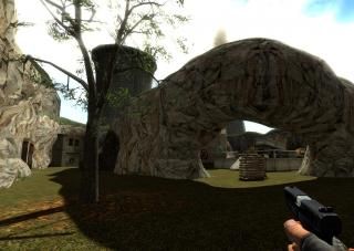
Finally, a complete remake from the ground up, de_splinter2 uses nothing from the original maps. The layout is different and better balanced, the visuals are a lot better and it incorporates several important things rarely seen in custom maps including a proper radar image.
Graffiti art by Daubster is much appreciated, and I hope you enjoy the result of a great deal of effort from both of us.
A Steam update broke this map years ago. Don't know why, But I've recompiled it and it works again.
De_splinter2
The original de_splinter_clan, made for counter-strike 1.6 was my favourite of my own maps for a long time. I was really pleased with how the layout turned out especially. It was however, blocky and ugly as hell.
de_splinter came around for Counter-Strike: Source, but I was lazy and merely used the .rmf from the original map and coverted it to source resulting in that version being hideously ugly as well.
Finally, a complete remake from the ground up, de_splinter2 uses nothing from the original maps. The layout is different and better balanced, the visuals are a lot better and it incorporates several important things rarely seen in custom maps including a proper radar image.
Graffiti art by Daubster is much appreciated, and I hope you enjoy the result of a great deal of effort from both of us.
12 Comments
You must log in to post a comment. You can login or register a new account.
I'm not one to write reviews, but I sure do like numbers.
3/5 D:
i did find it very strange too tho, its more like a sp map
but yeah its cool. 5/5
Visuals were alright and even if the outside could've used some improvements - I liked them overall.
A strong 4*. :>
What you mean to say is the lighting makes it weird. Hunter's weakness is lighting. I've seen that in all his maps.
It needs more colours. May I suggest spending some time lighting different versions of a room from Splinter, copy and paste a room and mess with the light settings and you'll see!
very different maps.