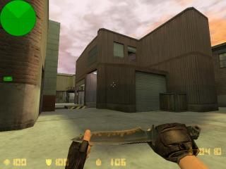
de_snare2
- Name
- de_snare2
- By
-
 NeCtRiCkS
 - Type
- Map
- Engine
- Goldsource
- Game
- Counter-Strike
- Category
- Completed
- Included
- BSP
- Created
- 15 years ago2009-05-17 22:53:22 UTC
- Updated
- 15 years ago2009-05-18 11:35:07 UTC
- Views
- 2314
- Downloads
- 955
- Comments
- 8
- Rating
- 4.67 (3)
- Reviews
- 0
De_snare2 - Bomb/Defuse (de_inferno's remake). Map by Lucas "NeCtRiCkS" Miranda
This is the final version. I will NOT change anything in the map anymore.
Thanks to:
This is the 3rd time I upload this map, due to bug problems.
2nd upload:
This is the final version. I will NOT change anything in the map anymore.
Thanks to:
- My friends, who motivated me to keep my map production
- CEVO and Frag Dominant
- Kevin "Philtk" Fields (publisher)
- Moises "SCoNtRe" Italo (texturing help)
- Victor "Ag3nt-X" Paiva (helped me by giving tips for my map)
- Leonardo "Kilate" Cordeiro (helped me by giving tips for my map)
- Jonathan "FODDER" Reynolds (Beta-Tester)
This is the 3rd time I upload this map, due to bug problems.
2nd upload:
- fixed a A Bombsite crate that was without light
- fixed a NULL texture on B Bombsite
- fixed problematic spawns (thanks to dacoorslightguy, who reported the problem)
8 Comments
You must log in to post a comment. You can login or register a new account.

 CS
CS


thanksss <3
Now I'm not sure how the changes in layout affect gameplay, however they all seem fairly well planned out. The additional flanking routes to A might make it a tad more CT-friendly, which is good.
Visually, I like the grunge-industrial style you went for, as well as lighting. There's some nice contrast between indoor/outdoor areas. Architecture is functional, though some things like the oversized staircases throughout the map or lack of detail in some areas really deteriorate it. Zero height variation in the buildings is also a bit of an eyesore.
One thing done near-perfectly, however, was ambience. A good background track combined with random smaller ones really makes the environment more believable. My only criticism would be the cricket sound in the ditch near bombsite B. Way too loud for crickets and it will get annoying for anyone camping in the area.
Overall - nice job. 4* 'cause I'm a sucker for ambience.
Your tips/criticisms are excellent for me
I'm really glad for it, because with good/constructive criticism (as the one you proved to me) I will only improve my mapping skills
= )
My only suggestions would are superficial ones:
-the smokestacks look sillily unrealistic compared to the rest of the map... you could easily make them better, as well add some other urban/industrial buidings in the background maybe... you definitely have spare wpolys to work with.
-the entire map is devoid of small detail, props, or anything to actually make it look "lived in". again, you definitely have some resources to spare, and while these things don't affect the gameplay, adding little props here and there definitley adds to the immersion when you're just walking around.
Great map!
Thanks for your feedback.
Well, I was adding some props and stuff like that, but I was having problem about a limit whose "name" I don't remember now. But thanks, again
I will try to make better smokestacks
Peace ;D