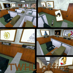
TWHL Cubicles: TWHL Office
 HL
HL
TWHL Cubicles: TWHL Office
by
Suparsonik
Posted 14 years ago2010-02-25 18:15:58 UTC •
Completed •
Half-Life
- Name
- TWHL Cubicles: TWHL Office
- By
-
 Suparsonik
 - Type
- Map
- Engine
- Goldsource
- Game
- Half-Life
- Category
- Completed
- Included
- BSP, RMF/VMF
- Created
- 14 years ago2010-02-25 18:15:58 UTC
- Updated
- 2 years ago2022-03-11 07:17:06 UTC
- Views
- 5261
- Downloads
- 919
- Comments
- 19
- Rating
- 3.67 (3)
- Reviews
- 0
YAY! My first completed map!
It's for the cubicle project though. -wadincluded. Also added the wad itself if anyone else wants to use it.
In order to make things a whole helluva lot easier, i suggest you make a "music" folder in your half-life sound folder and put green_onions in there.
People that I forgotten to put in there: DiscoStu, zeebaG, SpaG, Tetsu0, and more that I can't think of.

19 Comments
You must log in to post a comment. You can login or register a new account.


Cubicles looks fairly thick- make the walls maybe half that size.
Also, lighting is dull and architecture is a bit blocky.
I'll play it and report back; It does look nice.
EDIT: Eh, host is kinda bad. Perhaps you could use Filefront or something else for later maps?
EDIT2: You forgot to wadinclude.
You'll also need to set up the download file like this:
maps/[.map, .rmf, .bsp here]
sound/music/green_onions.wav (make sure to rename it with an underscore and update the map to suit, the game is looking for a file named "Green"
Make sure to run Extra RAD and wadinclude with BSP. I want to play this.
OMG GREEN ONIONS
oops, i'll wadinclude this time
DLing.
I would recommend making all the nameplates func_illusionary - so you don't get caught up on them, and also make the lights func_walls. They'll still emit light, but they wont carve up the ceiling. Also, you only have 10 months for EOTM.
Not bad for your first completed map.....
I can't stress enough to use a nodraw or null texture when you start a map and create your brushwork. I know this is a small map but your render speeds and overall performance will be greatly enhanced if you weren't rending all those unneeded textures. You could simply nodraw or null texture EVERYTHING and then re-texture the inside of your office. Shouldn't really take more than 20 minutes. It really bugged me to see textures on the outside of your office space. If you had a larger map this would greatly slow everything down and make your render speeds horrible.
I didn't see a big problem with the "thickness" of your walls. Alot of HL1 maps are like this--blocky and dull. This is why I don't map for HL1 anymore. You could add a little "round" to your map. Maybe some models that are roundish? I don't mind that the map is blocky though--it's an office!
The door textures are really whack. I know there are original and I know they are set right--texture wise, but it just looks weird--like the doorknob is way too low.
And I know I am not a real fixture around here but you could have added my avatar. lol.
good job dude!
does little dance
I would give a review, but pretty much everyone above is correct. So I won't bother.
Well... it's a bunch of cubicles. How appropriate
Not much to say, honestly. A decent shot at your first map. You've managed to use custom textures, texlights, and sounds. The brushwork on my avatar shows that you are capable of doing some vertex manipulation. Now use more of it
= )
Seems Rimrook is very popular employee of the month, and Soup Miner is not very popular with somebody!
Not bad for your first map. here are a couple nitpicks for my part:
-map is just about fullbright. tone down the lights a little so you can notice the contrast on the textures.
-provide the proper directory structure if u have custom content:
valve/wad.wad (or just wadinclude your textures)
valve/sound/sound.wav
valve/maps/yourmap.bsp
-scale is a bit off, but not horribly
-i like it when the "locked sound" is used for doors that don't open, so there is no question whether the door is accessible or not.