Post your screenshots! WIP thread
Created 17 years ago2007-12-16 00:58:58 UTC by
 doodle
Created 17 years ago2007-12-16 00:58:58 UTC by
![]() doodle
doodle
Posted 11 years ago2013-06-07 14:16:31 UTC
Post #313857
My presents to you are great ideas. But you seem to be wasting them.
Posted 11 years ago2013-06-07 15:01:55 UTC
Post #313860
My medication is making me too angry to fuck around with this. That's enough TWHL for today.
Posted 11 years ago2013-06-08 01:26:45 UTC
Post #313870
I looove mapping! I'm finally good at it! GOOD AT IT!Four years of practice finally paying off! I don't know why, but just taking this screeny has made me incredibly happy. I'm proud of it. The first map I'm going to put in my portfolio for the one day in the future that I will apply at Valve.
Posted 11 years ago2013-06-08 01:33:39 UTC
Post #313871
needs moar grunge 
lookin sharp though

lookin sharp though
Posted 11 years ago2013-06-08 01:35:33 UTC
Post #313872
In six months you will look at that screenshot and hate it 
That's just the way it works - you keep improving and your older work doesn't, so when you look back, everything you do looks bad! Happens with the code I write all the time.
Not bad though! I would definitely recommend some trims between texture transitions - the floor change is sudden and unnatural, the corners where the walls meet the floor look very plain, the top of the entryway as well.
Posted 11 years ago2013-06-08 03:49:35 UTC
Post #313876
Ninja: The model/brushwork/whatever that is is pretty nice, but the lighting is pretty bland and contrast-less. And lifeless. You keep posting those and I keep forgetting to say it. Nice work except on lighting.
Posted 11 years ago2013-06-08 10:18:59 UTC
Post #313887
I'm making Kino der toten for Hl2. Screenies soon, I need help anyways.
Posted 11 years ago2013-06-16 14:22:48 UTC
Post #313992
Posted 11 years ago2013-06-17 08:59:33 UTC
Post #313993
They sort of look like made out of jelly. Interesting stuff ninja.
Posted 11 years ago2013-06-17 18:37:55 UTC
Post #313994
thanks  the chairs need rework
 the chairs need rework
Posted 11 years ago2013-07-04 21:59:22 UTC
Post #314122
Hey again.
Posted 11 years ago2013-07-05 11:31:53 UTC
Post #314127
There's just something so nostalgic about goldsource that you can see in every picture that I'll never unfeel
Posted 11 years ago2013-07-05 16:54:18 UTC
Post #314128
I don't know... For me Half-Life 1 is wearing out even its nostalgic value. Perhaps because I discovered it much later. I know I saw it first sometime between 2000-2004, and then I played it for the first time on my computer in 2007. It's just that... FPS games like Half-Life(which are mostly an engine showoff, but Half-Life was quite good) are extremely exploited.
Plus, we can't even be talking about nostalgia when we interact with HL content everyday- be it media, playing or mapping.
I hope the trend of creating better versions of the GoldSRC engine is just because some people can and will invest time in creating something. If this actually has the purpose of making a better GoldSRC that blends better with current technology, then that's plain stupid and I hope it stops.
Posted 11 years ago2013-07-05 17:33:15 UTC
Post #314129
I don't agree with you. If something is good there is no reason for it to stop being used.
Posted 11 years ago2013-07-06 10:42:48 UTC
Post #314135
shut up motherfucker
Posted 11 years ago2013-07-06 13:50:43 UTC
Post #314136
I don't agree either, but at least I don't feel the need to call you names because there's no reason to.
Opinions, man.
Opinions, man.
Posted 11 years ago2013-07-06 14:21:33 UTC
Post #314138
sorry...
Posted 11 years ago2013-07-06 15:09:49 UTC
Post #314139
If something is good, but old, there's no reason not to be inspired from it. But it's not the same thing with using it.
Some things were good in their era. Nobody uses Windows 98 anymore .
.
Some things were good in their era. Nobody uses Windows 98 anymore
 .
.
Posted 11 years ago2013-07-06 17:16:46 UTC
Post #314141
maybe some guys were good too before writing stuff....
Posted 11 years ago2013-07-08 14:34:57 UTC
Post #314152
It's official guys, old games now are not fun! They must only be looked at and never touched. [/sarcasm]
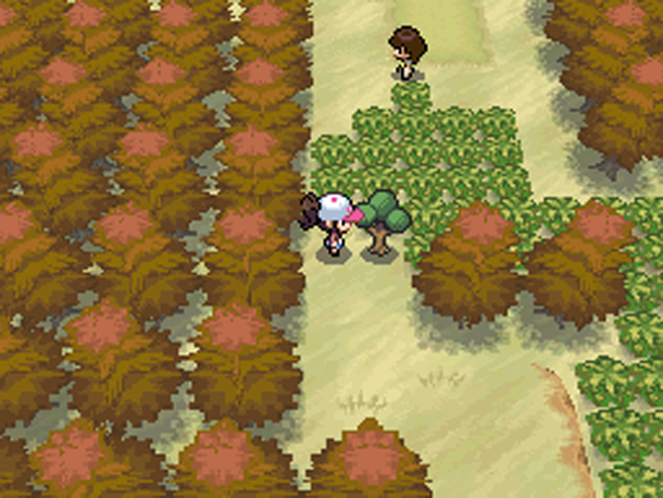
I only use Source these days but IMO, Goldsource is still a valid engine when treated correctly. There are better engines in terms of graphics and functionality then Source - Why does anyone bother with Source? People still create games using RPGMaker and its variants, how dated are games like this:Pokemon Black+White 2 came out in early 2012 which is 1 year after Crysis 2. Pokemon scored on average 9/10 by most of its reviewers and Crysis got of average 85/100.
I only use Source these days but IMO, Goldsource is still a valid engine when treated correctly. There are better engines in terms of graphics and functionality then Source - Why does anyone bother with Source? People still create games using RPGMaker and its variants, how dated are games like this:Pokemon Black+White 2 came out in early 2012 which is 1 year after Crysis 2. Pokemon scored on average 9/10 by most of its reviewers and Crysis got of average 85/100.
Posted 11 years ago2013-07-08 18:16:29 UTC
Post #314154
Graphics and engine types aren't as important as how you use them.
Pokemon Black and White got good reviews because of its depth and size. For it to look like Crysis 2, they'd have to sink in millions of dollars that they don't have.
It doesn't matter what you can do, it matters what you actually do.
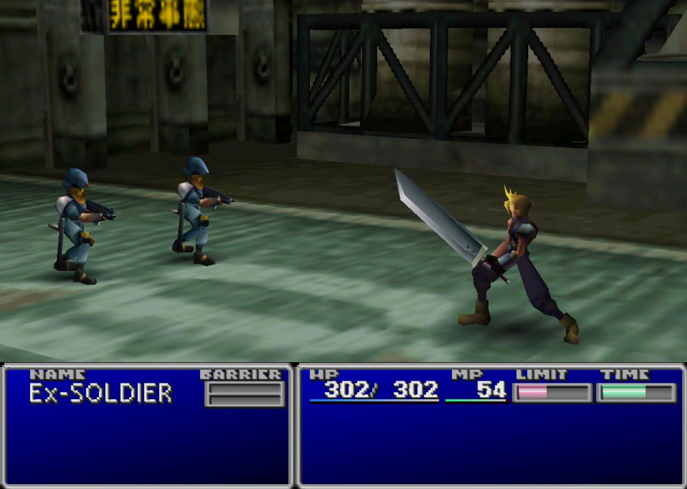
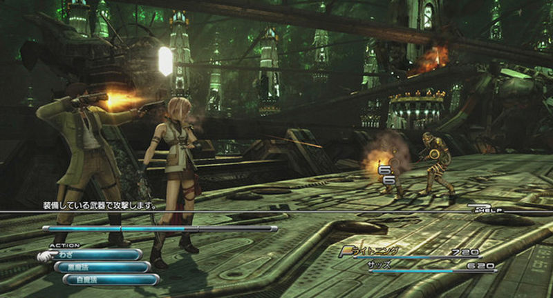
For instance, this is Final Fantasy 7.And this is Final Fantasy 13.Final Fantasy 13 can do so much more than Final Fantasy 7 in terms of story, looks, and gameplay. It just doesn't.
Final Fantasy 7 is a brilliant masterpiece of design, because it worked with what it had. Final fantasy 13 is a horrible, linear, straight line with one of the most awful video game stories ever, which constantly riddles its narrative with plot-holes and fills itself with pointless wandering... in a straight line. For hours.
Posted 11 years ago2013-07-08 18:31:53 UTC
Post #314155
That's what I said, Dimbark. For explaining what I said in 1 more image and more text, just so you could express your love for a recently brought game on Steam is a bit overboard, pal.
I would say we're all derailing but this site lacks enough recently released (or not released) content as it is.
I would say we're all derailing but this site lacks enough recently released (or not released) content as it is.
Posted 11 years ago2013-07-08 18:44:00 UTC
Post #314157
Some things were good in their era. Nobody uses Windows 98 anymore : .I still use it every day, as well as countless retro activists.
Old =/= bad.
Half life engine is an amazing retro engine that really shows the light and might of pre 2000 era.
Not as sophisticated as UT engine, but still having better handling and physics, Half life engine will always be remembered as one of the turning stones in gaming history.
Posted 11 years ago2013-07-10 14:51:38 UTC
Post #314165
Fuzzicks? What fuzzicks does Half-Life feature? Falling to the ground is not very good fuzzicks.
Posted 11 years ago2013-07-11 04:34:32 UTC
Post #314166
Half life engine will always be remembered as one of the turning stones in gaming history.It really won't. Half-life is notable for the game, not the engine. The Quake engine, on the other hand...
Posted 11 years ago2013-07-11 10:16:30 UTC
Post #314167
While HL is notable primarily for the game, I'd have to disagree slightly as well on that point. GoldSource implemented a lot of new features, such as skeletal animation, animated and dynamic mouth movement, and 32-bit lighting, that weren't present in the build of Quake it was based off of, and most of those features had never really been seen before in a game, period.
It'll be forgotten, but it really did add a lot back in the day.
It'll be forgotten, but it really did add a lot back in the day.
Posted 11 years ago2013-07-11 10:54:40 UTC
Post #314168
Perhaps, but those are relatively small steps in technology improvement and aren't really worth remembering. They're incremental additions to the engine that is actually worth noting: Quake. Outside of niche communities like TWHL, Goldsource is already forgotten, and many gamers these days wouldn't even be aware of its existence.
Quake and Unreal are probably the only 3D engines worth mentioning on the subject.
Quake and Unreal are probably the only 3D engines worth mentioning on the subject.
Posted 11 years ago2013-07-11 13:12:36 UTC
Post #314169
The new Pseudo 8/16-bit era with the indie game boom in the last few years seem to have drove home new philosophies in game development, especially with Minecraft.
Less is more.
A good developer does let the tech limit them, or even feel limited by the tech in the first place. There will always be leaps and bounds in gaming graphics and tech, but a good game will happen first on paper.EDIT: actually has anyone else played Game Dev Tycoon? Its a little relevant to this as you need to balance your company and team very carefully with the game you create. I think in some way, the game shows us a truth in the abstract.
Posted 11 years ago2013-07-11 13:33:22 UTC
Post #314171
@ Pengy
The way Half life handles movement and aiming, and shooting too, is far better than UT99 will ever have.
UT 99 has a lot of great features, but compare the two original versions. I certainly did.
And soon i will compare them with GLide.
The way Half life handles movement and aiming, and shooting too, is far better than UT99 will ever have.
UT 99 has a lot of great features, but compare the two original versions. I certainly did.
And soon i will compare them with GLide.
Posted 11 years ago2013-07-21 13:32:08 UTC
Post #314336
Hey, guys, I'm back. You probably don't know this, but I've moved to source. I haven't had much time to work on my mod, though. I still need to rework the materials, and the models.I'd love some criticism, other than, obviously, lack of props. Maybe a suggestion for some.
Posted 11 years ago2013-07-24 22:07:56 UTC
Post #314430
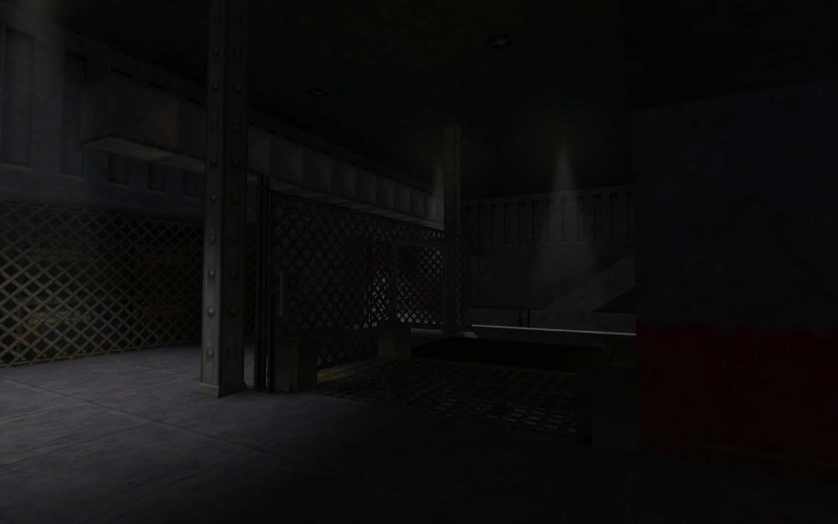
Updated it a lot with my own textures, and HL2 placeholder props. All I have to do in terms of textures are the trims, lights, and ceilings. Then there's just the props (and NPCs. I'm gonna make the HECU, Agrunt, Eli's hands (as it's a first person cinematic for the intro of the mod), and possibly higher definition versions of the G-Man and a skin of the Vort with its collar). By the way, has everyone stopped mapping or what? It'd be a shame, I love seeing your WIPs (and Habboi's Cistern all that time ago was awesome!) Anyways, without further ado, I give you:I'd really love some criticism from you guys, so go ahead and point out anything you don't like.
Posted 11 years ago2013-07-25 15:06:55 UTC
Post #314437
I've started mapping for TF2.
Posted 11 years ago2013-07-25 22:26:50 UTC
Post #314456
Looks pretty cool start, Dimbark, but I SERIOUSLY Can't stand the displacement to brush transitions. Why doesn't anyone use decals or have part of the brush as a displacement, and fade it in? It would look so much better.
Anyways, how come in the first shot it looks almost unlit or has a leak. Also, in the third shot, I'd suggest removing some of the consoles or spacing them out. Having them all tucked into a corner looks strange and neven. I'd also put a couple of trims, and decorate the ceilings a bit more. Some of the buildings in the distance in the first shot look pretty bare. TF2 has a lot of good models to break it up a lot. Lastly, some custom content goes a long way into making a map look like its own. If you'd like, I could go ahead and make a couple materials or some basic props for you.
Anyways, how come in the first shot it looks almost unlit or has a leak. Also, in the third shot, I'd suggest removing some of the consoles or spacing them out. Having them all tucked into a corner looks strange and neven. I'd also put a couple of trims, and decorate the ceilings a bit more. Some of the buildings in the distance in the first shot look pretty bare. TF2 has a lot of good models to break it up a lot. Lastly, some custom content goes a long way into making a map look like its own. If you'd like, I could go ahead and make a couple materials or some basic props for you.
Posted 11 years ago2013-07-25 23:06:53 UTC
Post #314458
Please turn on anti-aliasing, Dimbark.
Posted 11 years ago2013-07-29 11:51:57 UTC
Post #314557
Been a while since I put anything in here. 
This is the "briefing" room seen at the start of The Core. This picture just shows the various changes it's been through. There was a stage prior to 2008 which isn't really worth seeing. 2008 - Not nearly "Black Mesa" enough
2012 - Puke
2013 - The current and final version.

This is the "briefing" room seen at the start of The Core. This picture just shows the various changes it's been through. There was a stage prior to 2008 which isn't really worth seeing.
 2008 - Not nearly "Black Mesa" enough
2012 - Puke
2013 - The current and final version.
Posted 11 years ago2013-07-29 14:46:12 UTC
Post #314561
I hear you guys hired Ross Scott. Hope you didn't waste the talent. 

Posted 11 years ago2013-07-30 02:35:52 UTC
Post #314573
Curious as to why it was changed from 2008's to 2012's one =P
Posted 11 years ago2013-07-30 10:42:57 UTC
Post #314589
The 2008 version relied heavily on submerged.wad which we eventually phased out. The room was gradually gutted over the course of a year to what became the 2012 version shown here, but I never really did anything more with it.
Posted 11 years ago2013-08-14 04:16:57 UTC
Post #314887
Hello everyone! Here are some of my works I've recently mentioned in THIS thread.
I'm not using "simg" BBCode otherwise the post would be too long.
All the works you see here are "Works in Progress", and some are "Prefabs" from Half-Life (no MODs, I'll add them in the next post).
No antialias because my pc really, really sucks...
Constructive criticism is well accepted.
A mix of Mayan and Egyptian style with custom sprites and textures ( I'll also add some custom texlights in the near future):
http://imageshack.us/photo/my-images/853/mk82.jpg/
http://imageshack.us/photo/my-images/12/nn3g.jpg/
http://imageshack.us/photo/my-images/560/ural.jpg/
And its momentary overview:
http://imageshack.us/photo/my-images/822/76a8.jpg/
A detailed tiled floor prefab with HL textures (test):
http://imageshack.us/photo/my-images/199/3hnf.jpg/
http://imageshack.us/photo/my-images/546/2l56.jpg/
A pool table prefab with some custom textures:
http://imageshack.us/photo/my-images/197/c4wc.jpg/
http://imageshack.us/photo/my-images/51/uzhu.jpg/
A foundry-like map:
http://imageshack.us/photo/my-images/189/rk2j.jpg/
And its momentary overview:
http://imageshack.us/photo/my-images/716/4dcw.jpg/
A not finished ventilation system (test):
http://imageshack.us/photo/my-images/547/9asa.jpg/
A cornfield map, for a potential next near Halloween map release:
http://imageshack.us/photo/my-images/69/5rg1.jpg/
A broken brick wall (prefab):
http://imageshack.us/photo/my-images/713/jz91.jpg/
dm_death_rice_hl - A friend's map remake, firstly created for CS:S GG mode (unfinished):
http://imageshack.us/photo/my-images/577/0mjs.jpg/
http://imageshack.us/photo/my-images/197/5c2k.jpg/
And last but not least, a map created today to test my first time using the lastest version of VHLT's shadows. With TWHL as a protagonist! (2nd image is edited/polished in Gimp for a better look :3):
http://imageshack.us/photo/my-images/211/7h.png/
http://imageshack.us/photo/my-images/835/y5e3.png/
That's all for now!
Other screenies will come, I just don't want to make a very long post. :3
Thank you in advance!
I'm not using "simg" BBCode otherwise the post would be too long.
All the works you see here are "Works in Progress", and some are "Prefabs" from Half-Life (no MODs, I'll add them in the next post).
No antialias because my pc really, really sucks...
Constructive criticism is well accepted.

A mix of Mayan and Egyptian style with custom sprites and textures ( I'll also add some custom texlights in the near future):
http://imageshack.us/photo/my-images/853/mk82.jpg/
http://imageshack.us/photo/my-images/12/nn3g.jpg/
http://imageshack.us/photo/my-images/560/ural.jpg/
And its momentary overview:
http://imageshack.us/photo/my-images/822/76a8.jpg/
A detailed tiled floor prefab with HL textures (test):
http://imageshack.us/photo/my-images/199/3hnf.jpg/
http://imageshack.us/photo/my-images/546/2l56.jpg/
A pool table prefab with some custom textures:
http://imageshack.us/photo/my-images/197/c4wc.jpg/
http://imageshack.us/photo/my-images/51/uzhu.jpg/
A foundry-like map:
http://imageshack.us/photo/my-images/189/rk2j.jpg/
And its momentary overview:
http://imageshack.us/photo/my-images/716/4dcw.jpg/
A not finished ventilation system (test):
http://imageshack.us/photo/my-images/547/9asa.jpg/
A cornfield map, for a potential next near Halloween map release:
http://imageshack.us/photo/my-images/69/5rg1.jpg/
A broken brick wall (prefab):
http://imageshack.us/photo/my-images/713/jz91.jpg/
dm_death_rice_hl - A friend's map remake, firstly created for CS:S GG mode (unfinished):
http://imageshack.us/photo/my-images/577/0mjs.jpg/
http://imageshack.us/photo/my-images/197/5c2k.jpg/
And last but not least, a map created today to test my first time using the lastest version of VHLT's shadows. With TWHL as a protagonist!
 (2nd image is edited/polished in Gimp for a better look :3):
http://imageshack.us/photo/my-images/211/7h.png/
http://imageshack.us/photo/my-images/835/y5e3.png/
That's all for now!

Other screenies will come, I just don't want to make a very long post. :3
Thank you in advance!

Posted 11 years ago2013-08-14 09:56:29 UTC
Post #314891
Your stuff looks good!
Posted 11 years ago2013-08-14 11:10:02 UTC
Post #314893
Looks like you have some experience and talent!
I love the pool table.
I love the pool table.
Posted 11 years ago2013-08-14 14:52:55 UTC
Post #314901
Look I'm mapping. XD
Anyway second map ever, I still have so much left. That's only one third of the actual brush stuff, I still have to texture (as you can see) and add entities ;-;
Also hills are tedious.
Edit: Oh and add model, thingies.
Anyway second map ever, I still have so much left. That's only one third of the actual brush stuff, I still have to texture (as you can see) and add entities ;-;
Also hills are tedious.

Edit: Oh and add model, thingies.
Posted 11 years ago2013-08-14 15:45:39 UTC
Post #314905
Volpe, don't use Terrain maker, your map will blow up 
@ Alberto: Some of those are quite nice
Would like to see some finished maps.

@ Alberto: Some of those are quite nice

Would like to see some finished maps.
Posted 11 years ago2013-08-14 16:22:52 UTC
Post #314906
I would... If I knew what Terrain Markers were... XD
....From what Scott just explained to me, its some sort of program that does stuff automatically... Sounds like cheating to me. Good thing I don't cheat XD
....From what Scott just explained to me, its some sort of program that does stuff automatically... Sounds like cheating to me. Good thing I don't cheat XD
Posted 11 years ago2013-08-14 16:28:05 UTC
Post #314907
DiscoStuThank you, Disco!

Tetsu0Thanks a lot, Tetsu0! I'm gonna use that pool table for THIS GameBanana contest, I've got 8 days to finish all of my prefabs. Btw, I need to polish the pool table a bit, some things in different perspectives are bad. D:
Thank you again, by the way.

LaVolpeTerrain generator?? Nooo! xD Don't use it, or at least use it as a guide to make the displacements by yourself directly in hammer. Terrain generator cut the terrain in equal pieces instead of making one single brush for it (like in Source Engine), and it always create perfomance issues (a huge FPS drop). I know it's a bit annoying to make displacements in VHE 3.X, but this is the only way unfortunately.

By the way, The structure looks good! I suggest you to add some textures at least on the ground and on the perimeter walls, so you feel more comfortable and you'll better recognize what you're trying to design.

StojkeThank you, Stojke!
Well... I don't have finished GoldSRC works, because I'm still learning, I want to know everything on the VHE mapping tecniques before releasing something, I'm already studying everything I need to here on TWHL's tutorials. I need to learn how to use properly these entities for now: multi_manager, multisource, trigger_relay, game_counter, game_counter_set, path_corner, path_track, scripted_sentence, scripted_sequence, aiscripted_sequence, env_blood, env_global, env_render, and how to properly place info_node/info_node_air. I know what they do, but I need to know how I can use them in one of my maps.
 Is better to release something that people want to remember, instead of releasing something that have nothing that deserves a remembrance, am I right?
  But the screenies aren't finished! I've plenty to show, so these are not the only works you see, my friend.
Thank you, by the way!

Posted 11 years ago2013-08-14 16:35:41 UTC
Post #314908
By I would I meant, I wouldn't use it. Because Stojke said not too. XD
Also textures come later ;P Wanna get all the Brushes finished first. I can tell where everything is (I kinda have the whole thing planned so its easy to tell where I am and where everything should go). And design-wise, I'm not finished with the house, so textures can definitely wait XD
Thanks, by the way. =)
Posted 11 years ago2013-08-14 17:02:24 UTC
Post #314909
I map in the same way, LaVolpe. Block it out with nodraw then just spend a couple hours 'painting'. I find it a very efficient way to design things, particularly since I tend to build textures for specific brushwork.
Alberto309, your stuff is really solid looking. Very well-built.
Alberto309, your stuff is really solid looking. Very well-built.
Posted 11 years ago2013-08-14 17:08:56 UTC
Post #314910
@LaVolpe:People work in the manner they prefer, mine was only a suggestion. I make null brushes before adding textures too, I only texture the perimeter of the map (ground, perimeter walls and sky/roof if I already know the map height).

@Archie:Thanks a lot, Archie! Much appreciated!

Posted 11 years ago2013-08-14 17:09:42 UTC
Post #314911
Good to know I'm not the only one that does it that way.
-> I thought it was going to be another one of those "La, you're doing it the unconventional way again". XD
Posted 11 years ago2013-08-14 23:24:01 UTC
Post #314925
Hm, I've always textured the basics null/bevel first then do the detailing with actual textures.
You must be logged in to post a response.


