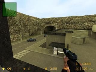
cs_prison
 CSS
CSS
cs_prison
by
Pain[ITA]
Posted 15 years ago2009-06-10 14:30:29 UTC •
Completed •
Counter-Strike: Source
- Name
- cs_prison
- By
-
![Pain[ITA]](https://twhl.info/images/avatars/inline/user_noavatar1.png) Pain[ITA]
Pain[ITA] - Type
- Map
- Engine
- Source
- Game
- Counter-Strike: Source
- Category
- Completed
- Included
- BSP
- Created
- 15 years ago2009-06-10 14:30:29 UTC
- Updated
- 15 years ago2009-06-10 14:30:29 UTC
- Views
- 1706
- Downloads
- 478
- Comments
- 4
- Rating
- 2.00 (1)
- Reviews
- 0
My first CS:S map after 8 years. My ultimate maps was for CS/HL1. NAV file generated.
4 Comments
You must log in to post a comment. You can login or register a new account.


Similar description, same creator, similar name, one day later? (hey, that rhymes)
*downloading
edit:
Ok, i'm sorry to say this was a lot worse than I was expecting, and if it's not a cheaply ported CS 1.6 map, I will eat my hat.
Architecturally, everything is extremely blocky with no details really anywhere. There is just no design flare at all and to compare it to a real place would be like comparing a bouncy castle to a real house.
Surely you can't look at these stairs and tell me you've seen a set just like them in reality. Note the complete lack of basic detail on the walls, too. Not even some easily placed decals to vary the drab look of the place.
Texturing is as poor as the architecture. Some texture choices don't even make sense, and many are poorly aligned.
Lighting is acceptable, but overall very dull. You also don't seem to have used lamp/bulb/light models anywhere.
Instead choosing to use these, and other noticably blocky brush-made light sources. Which brings me neatly on to my next point. In the entire map I saw a total of 2 prop models. Two.
The average Source map has hundreds. I only saw a car which had been duplicated around itself about 4 times and a couple of filing cabinets in one hallway. Models make up a good 60% of detailing in Source maps, and to play one practically devoid of any is a very strange experience.
Gameplay-wise, the bots only ever went one way so I can't really comment on what it would be like with real players. From observation, I'd say there were too many bottlenecks and not enough open space. The layout was also fairly confusing, with no signs or other indications of where to go.
General pointers now:
* There was no radar image. This is a must-have in all CSS maps, especially those as large as yours.
Tutorial regarding radar overviews.
* There were no nav locations.
Tutorial regarding nav locations.
* The cliffs were horrendous. One of the worst points. USE DISPLACEMENTS!!!
* There was no logical reason why I couldn't get past here. Invisible walls piss players off. Add a police road block or something, and perhaps change the end of the tunnel to black. It's too clear that there is nothing beyond it.
* None of this should be rendered by the game. The only reason it is, is because you've surrounded the entire map in a skybox. This is very, very bad and will make your compile times significantly greater. Skyboxes should only block the playable world from the void. Walls do as well, so surrounding all those corridoors is just a waste of r_speeds.
I hate to be so harsh to your first project in so long, but things have moved on a long way since Goldsource mapping (and indeed IN goldsource mapping) and if you don't learn now, you'll continue making the same mistakes.