Tutorial: Lighting Theory - An Introduction to Lighting Design Last edited 1 week ago2024-12-27 11:56:43 UTC
The Theory of Lighting a level
This tutorial is intended to demonstrate a few advanced lighting concepts, primarily from an artistic perspective rather than a technical one. Before reading, you should have a basic grasp of lighting entities and map making. It is intended for intermediate map designers looking to push their ability with this beloved old engine’s lighting system to make their scenes as interesting as possible. This isn’t technically specific to Goldsrc and the information can be used fairly globally for any 3d game engine!Let's paint with light:
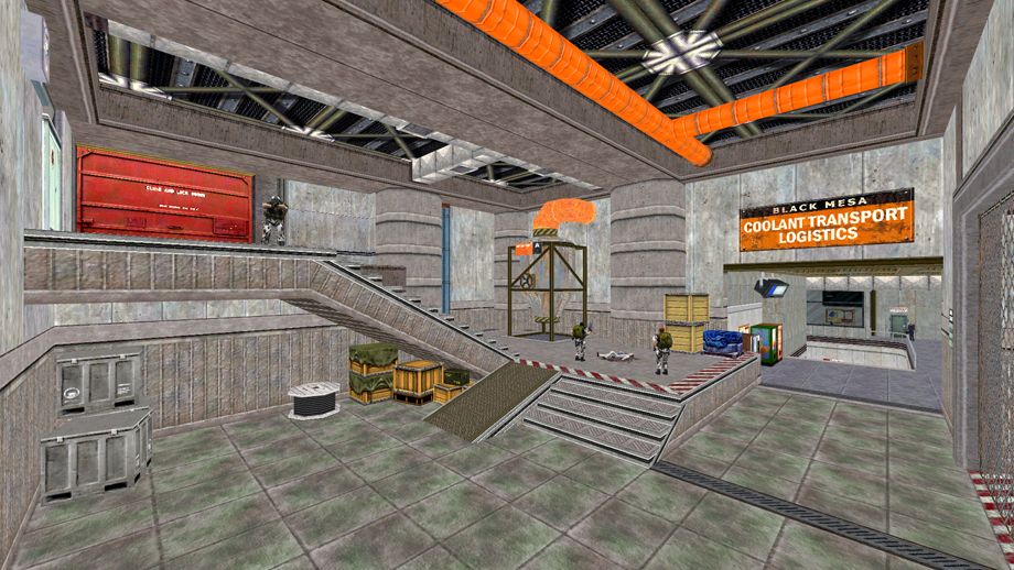
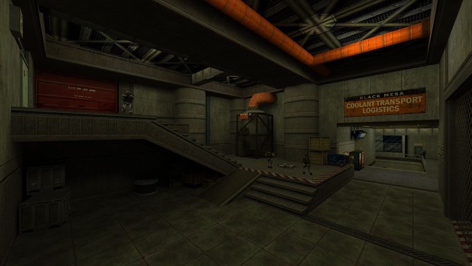
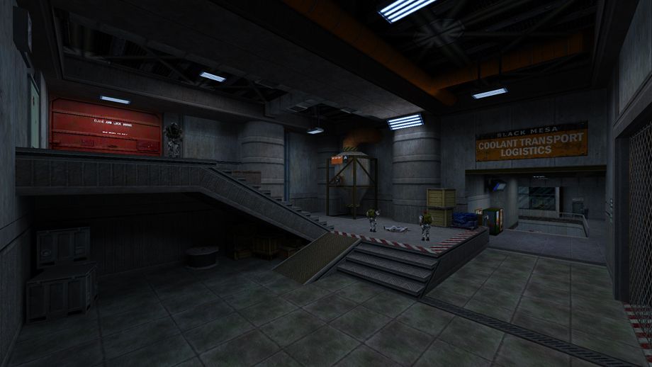
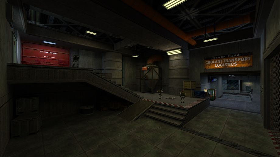
Let’s start with this example. We have a fairly typical black mesa-styled arena with a few grunts. The only custom element here is a sign which is itself a modifiedhalflife.wad asset. Since we’re working with stock game assets, how much control do we really have over the art direction of a scene like this? Actually, quite a lot, and one of our most powerful tools in this endeavour is lighting.Currently, our scene is Fullbright. This is what a Half-Life map looks like without any lighting applied to the entities or map surface, so everything is completely lit. Obviously, this is undesirable. Here’s an example of how a complete beginner may light an area like this. A few
light entities have been put down to fill the area with the default values. We can see a ton of problems right off the bat. Firstly, there are no light sources, so the lighting appears to have no correlation with the world. Secondly, since the second room is smaller, our cloned light entities fill the area more, thus making our larger arena appear quite dark in comparison. Sure, it’s better than a fulbright map, but this lighting is letting down the hard work we’ve spent detailing this area and probably won’t hook our player.Let’s start by changing strategies. First, we’ll add some lighting fixtures. We could simply put our light entities under these fixtures, but this isn’t ideal. For one, our light texture will appear to be lit by an external light rather than a light from inside itself. Plus, the light will spread out in all directions, removing the potential for some atmosphere and focus on the ground level. Instead of light entities, we’ll use either
info_texlights or light_surface to define our light texture and have the light fixtures project light automatically.
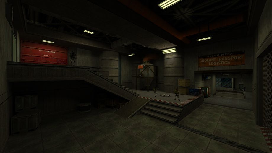
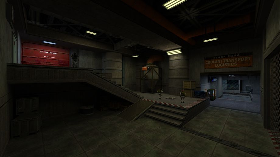
Much better! Our colour scheme is still basic, but now our rooms have a much more even and realistic feel. We’ve also made the ceiling darker than the floor, giving the space a more 3 dimensional look. It should be noted that we could also make use of light_spot entities with a 90 degree angle to project this kind of light. This is more ideal for Source, which de-emphasises using texture lights. But our colour scheme needs work now. This kind of warm light used globally is a pretty clear indicator of a beginners map, so what should we change it to? We could pick a bright, garish colour, but without a design in mind it will probably turn out more headache-inducing than interesting. Let’s have a look at the theory of Colour Temperature and see how it can help us.
The Temperature of Light:
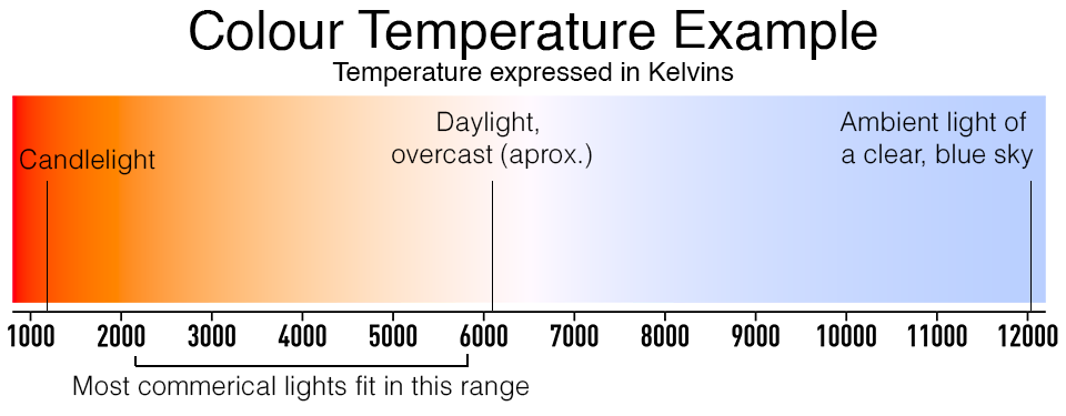
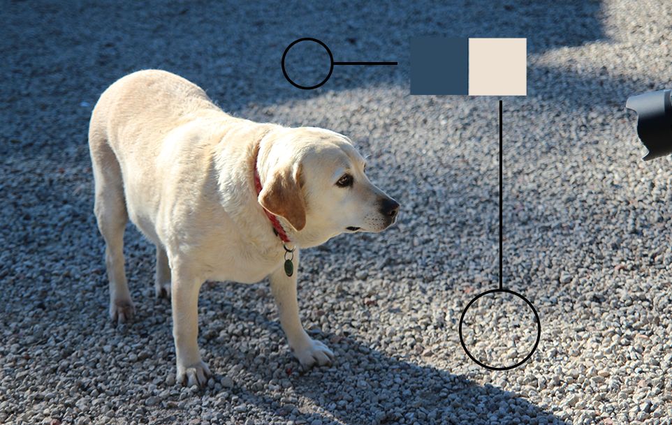
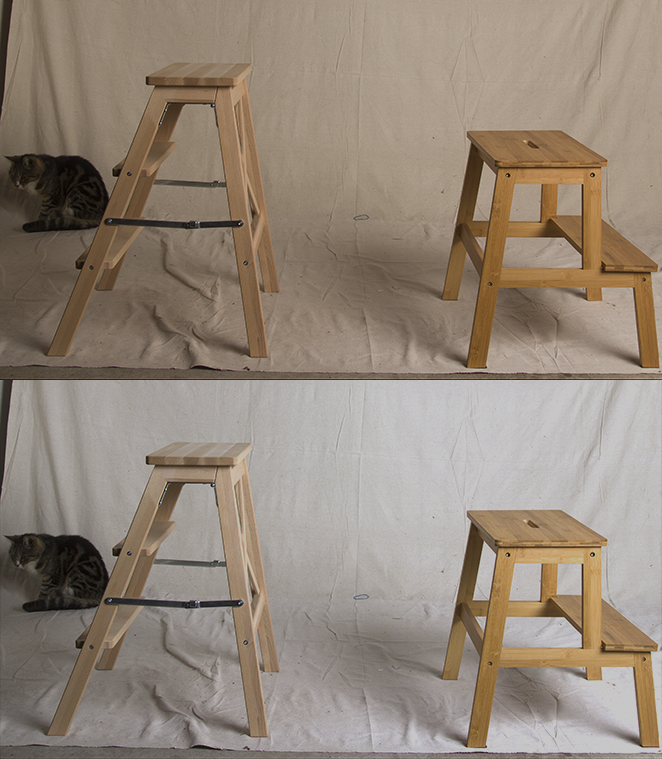
Colour Temperature is an important element in both art, photography and 3D Graphics. Our eyes have a tendency to “correct” lighting around us to white, but an actual true “white” light source is fairly rare. In the chart above we can see this example shown. In theory, a weak light source will give off an orange, dim glow. A bright light source will approach a cooler temperature. Even more interesting is the effect of a blue sky on a clear day. In this photo I took of a dog, we can see areas both in shadow and in direct light to the sky. The sky projects a bright, near-white light that illuminates in a specific direction. If our planet had no atmosphere, all the shadows in this image would be near-dark, like shining a spotlight in a dark studio on a dog. But our planet is surrounded by a bright blue atmosphere that diffuses light, so in an outdoor environment, areas that are shadowed from the sun still receive a blue ambient light. On an overcast day, the bright light of the sun is filtered and diffused throughout the clouds, evenly illuminating everything under the sky.This is all well and good, but how can we apply these principles to an underground industrial facility? Well, as shown in the graph above, man-made sources of light actually differ in temperature depending on their power, age and purpose. Lets change our scene with a cooler light source and check our results. Nice! Our scene definitely looks cooler now, giving a cleaner industrial look to everything. But we’re still limiting ourselves here. We can use a mix of warm and cool lights to both separate our areas, but also highlight sections to draw the players attention. Let's change some lights around. Now we’re seeing the power lighting can have. Our two rooms are now clearly distinct from one another. Our combat arena has a darker industrial look, while the corridor beyond has a cleaner office appearance. Not only that, but by using a cool light in this warm arena, we can subtly highlight the red door on the top to show the player where they might have to go next. Valve maps are filled with examples of using lighting in this way to guide the player's attention. Now you may have noticed something odd. This cooler light technically breaks our colour temperature chart as very few man-made pure light sources really project a blue light like this unless they are tinted. Earlier in the tutorial, I mentioned how our eyes tend to correct light temperature. You’ve probably had the experience of stepping from a room with bright, cool lights into one with dim, yellow lights and needing a second for your eyes to adjust to the change. Lighting has an objective temperature, but the human experience is annoyingly subjective. But in a video game, we don’t really have eyes in the same way we do in real life, we need to represent these flaws with pixels. Even in photography this same principle applies. Here’s an example of a studio set up without and with “white balance”. These professional studio lights give off a very strong light that appears quite white with our eyes, but the camera reads this as a warmer light. It’s necessary to correct the balance of a photo so white actually approaches the white of a digital pixel!
This is all to say that a true, theoretically objective “white” is a bit nebulous in reality So even in photography, the results need to be corrected or exaggerated. Often a scene might be artificially cooled in post-production, especially in cinema. So we don’t really need to worry about reality too much here, only how to exploit it for the “rule of cool”.
It’s the little touches:
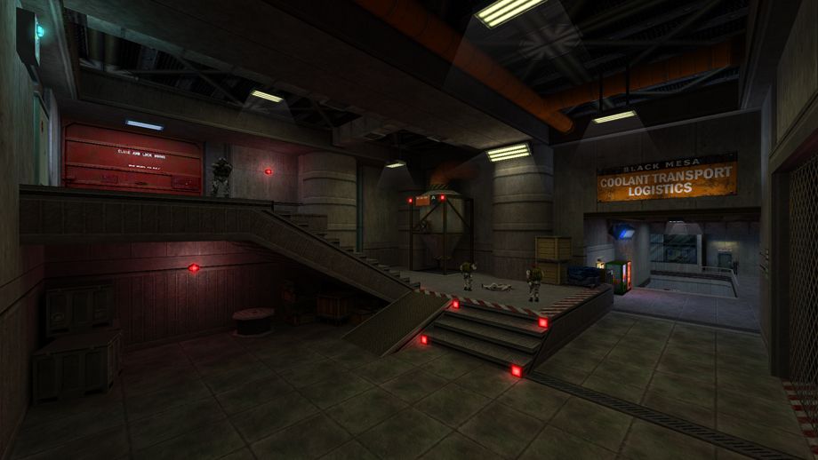
Let's add a little more flair to our map. We have the main light sources, but we can pepper in smaller lights to both high-light areas of interest and give some more visual contrast. Here we’ve added some small bar lights to the sign, above the generators near the door, and a few dotted around the office area. These accent lights are using the opposite colour temperature to the room they are in, so they appear visually distinct. We could just keep adding these “white” lights, but that would be quite boring. Also note your ability to utilize shadows! As a map maker, you can use darkness to de-emphasise areas, letting the important bits stand out. The area underneath the stairs is almost pitch black, while the area with enemies and the red door are much more lit. However, let's say we wanted an item under the stairs, or to emphasize it as a place to seek cover. Adding another fluorescent light might be a bit boring, so let's experiment and finally add some strong coloured lights. These industrial red lights are an easy choice for an environment like this. Instantly they add a nice variety of colour, and we can even add some cyan light to the electrical element above just to contrast this! We’ve also added some lighting to the vending machines in the office. These lights are small and only impact a slight area, but they demonstrate the level of fine detail achievable with lighting. Think of it as painting with lights, adding colour and variation to truly make our scene come alive! We’ve also utilized the red lights to highlight the players path, while also drawing a little attention back under the stairs. Let’s finish off with some atmospheric details. Some fake volumetric lighting on our main lights and someenv_sprites on our small detail lights really complete the scene and give the appearance of an atmosphere in this room. Just like that, we’ve created a visually interesting arena for our player to explore. But even in this example, we’ve been very conservative and careful with our choices, when really there is no limit if you have a strong direction in mind for your environment! How close we hue to realism in our lighting is another design choice you will have to make as you work. Would your map benefit from looking as realistic as possible, or would a slightly unrealistic lighting choice heighten the drama? When filming a battle scene for Lord of the Rings, Sean Astin noticed the slightly unrealistic, dramatic backlighting and asked crew member Andrew Lesnie “Where’s the light coming from?”, to which Andrew replied; “Same place as the music”.
Light Without Limit:
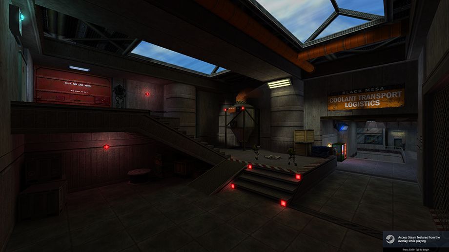
It’s sometimes easy to forget just how much freedom we have when lighting our maps, and it's easy to simply default to the values and techniques we are familiar with. However, adding variety to your maps is an incredibly powerful tool! It allows you to visually paint a picture, hint a mood to your player and establish yourself against the other map makers in our field. Think back to your favourite maps, either from Half Life or another mod you enjoyed. Is there a certain colour that comes to mind? A use of sunlight? Perhaps a use of darkness? Let's look at some alternate examples of how light can be used.Let's say that instead of a deep underground facility, this one is at sky level. Adding skylight instantly changes how we deal with lighting in a map! It's very appealing, especially a clear, sunny light like this. We get a nice warm light that can cover our scene and supply some appealingly contrasted cool shadows. We don’t even need to get rid of our lighting setups, however they are now more used to accentuate these areas. In a way, sunlight can make lighting easier, but it can also be a bit of a cheat if we’re only relying on it! Use shadow and shade smartly to keep control over your visuals. We could even make this a night-time map. While night light is very, very subtle in real life, we can accentuate a soft, desaturated blue light to replicate an artistic effect, similar to a long exposure camera shot.
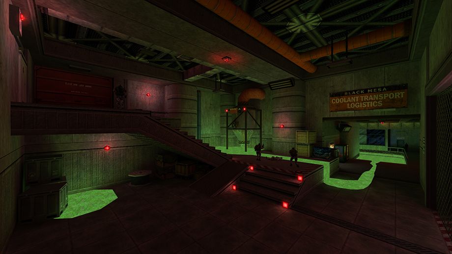
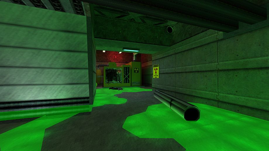
In Goldsrc, it's very easy to assign a liquid texture as a light texture. It provides a very colourful and interesting underlighting that still makes logical sense in a scene. Here, we’ve removed all our neutral lights and are purely relying on these red emergency lights and the toxic green glow to light our scene. This simple change has made our map look much more like Black Mesa mid-collapse as things are going absolutely FUBAR. Green and Red are complementary colours, which mean they reside at the opposite sides of the colour spectrum if we lay it out as a wheel. This is a great artistic method to make an interesting scene!
Some extra examples:
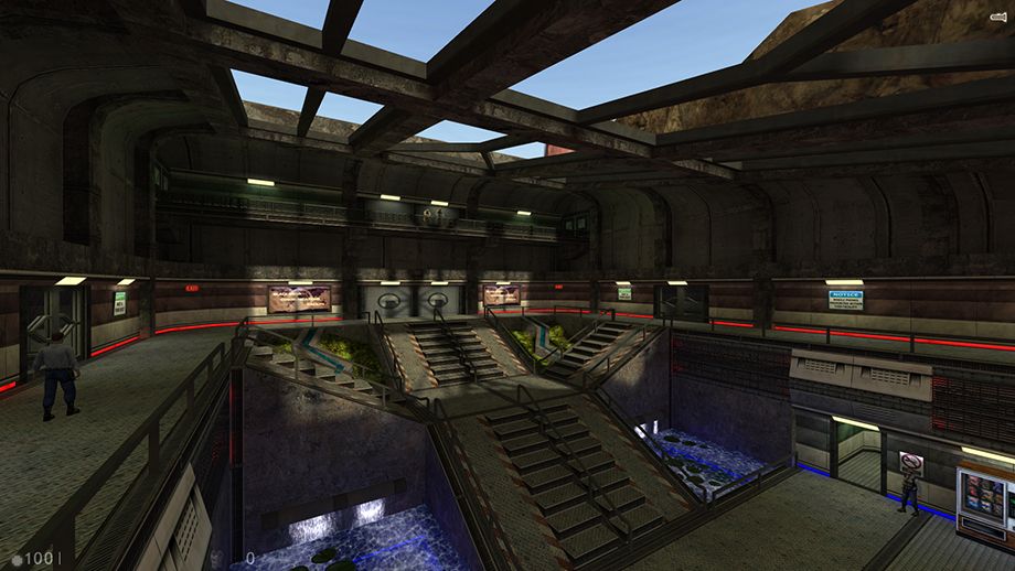
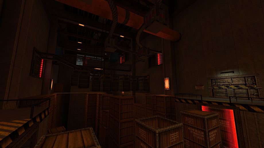
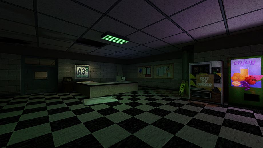
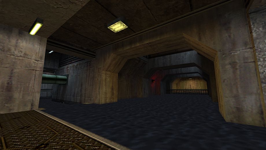
Map by me, focus is given to warm/red lights with very few cool lights used, mainly to accentuate areas of progression to the player. This is to communicate that this area is old, industrial and probably not meant for you to be clambering over through heavy machinery. Map by me, a slightly unrealistic green light is used to highlight the decrepitness of this area. The purple light emanated by the drink machine gives the green a good contrast to prevent the scene from becoming too monochrome. Half life, 1998. Even this early in Goldsrc history, Valves maps are littered with examples of how to mix cool and warm lights, and even adding small accents like the red light in the distance. It’s subtle enough that you’d probably never take notice of it, but without it these scenes would be immensely flat.Lighting forward:
I hope this tutorial has been a helpful primer to an infinitely deep field of level visual design. Remember to load up some of your favourite maps and take special note of how the author has used lighting in these scenes, and how it differs from other maps you’ve found more forgettable!See also
- Tutorial: The Complete Guide to Lighting - a near-exhaustive list of every entity and method for lighting a GoldSrc level.
- Article Credits
-
 sirdownloadsalot
–
Original author
Comments
You must log in to post a comment. You can login or register a new account.

