Map WIP Created 18 years ago2005-10-06 05:30:10 UTC by Wrangler249 Wrangler249

Created 18 years ago2005-10-06 05:30:10 UTC by Wrangler249 Wrangler249

Posted 18 years ago2005-10-06 05:30:10 UTC Post #139685
Does my ass look big in this?
User posted image
Well? Does it?
Comments appreciated :biggrin:
Posted 18 years ago2005-10-06 05:33:00 UTC Post #139687
Cant really see much in just the one dark screen shot, not really a lot to comment on, seems a little bit square to me and blocky.
Posted 18 years ago2005-10-06 05:34:44 UTC Post #139689
it is a bit blocky yes ,but it's a nice basic plan, just needs alot of tweaking hehe, the lighting is also quite boring, try using smaller spot lights, that usualy works good in such dark areas.
Posted 18 years ago2005-10-06 10:49:00 UTC Post #139773
Looks original, thought the lighting is badly done..
Posted 18 years ago2005-10-06 11:20:55 UTC Post #139787
I see no cubemaps but if thats on purpose then ok...Some people do cubemaps last for odd reasons :S
It's very basic, I am not 'thrilled' but it's ok...
Habboi HabboiSticky White Love Glue
Posted 18 years ago2005-10-06 11:43:46 UTC Post #139794
if i put cubemaps in it doesnt make any difference, it just looks precisely the same. Can I got some pointers on the lighting as well, becuase it's not exactly my strongest point.
Posted 18 years ago2005-10-06 11:45:14 UTC Post #139795
u need to type 'buildcubemaps' into the console for cubemaps to take effect

You will only have to do this once per compile of map... e.g in final version, after you buildcubemaps, it is saved with the map
Archie ArchieGoodbye Moonmen
Posted 18 years ago2005-10-06 11:49:25 UTC Post #139797
thanks man ;) apprecaite it
Posted 18 years ago2005-10-06 13:02:18 UTC Post #139832
When you're taking screenshots to show off stuff, crank up your graphics settings. Framerates don't matter when you're trying to capture a single one of them.
Seventh-Monkey Seventh-MonkeyPretty nifty
Posted 18 years ago2005-10-06 14:33:18 UTC Post #139885
I added a lot more stuff into the section now and it looks like this:
User posted image
is it an improvement from what it was before?
Posted 18 years ago2005-10-06 15:10:42 UTC Post #139898
Much better! Hm I actually like now! I feel something can be added but i'm not sure, maybe decals or something...
Habboi HabboiSticky White Love Glue
Posted 18 years ago2005-10-06 15:16:59 UTC Post #139903
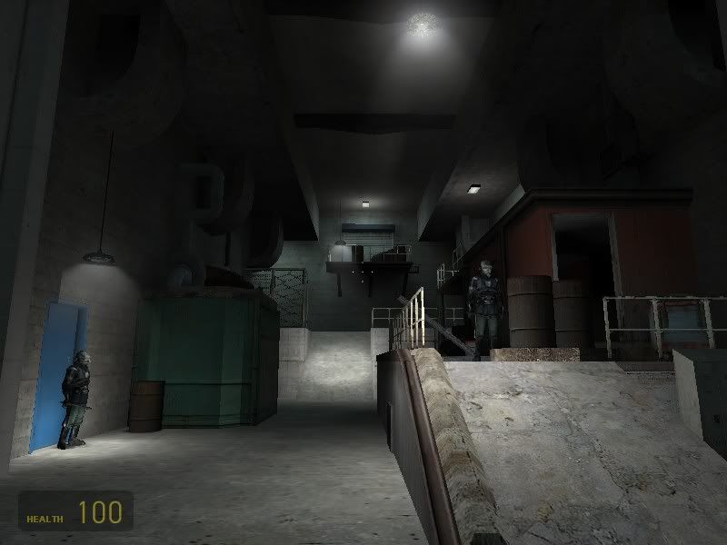
It looks better now, though maybe you could litter that floor a bit so it doesn't look so clean.
Also, I liked the athmosphere in the first shot more. That was too dark, but now it feels much smaller where otherwise it would work stronger on the imagionation of the player. I agree it's hard to strike a balance between these two, but a few more dark spots could do well, just not as much so the player can't see where he's going anymore.

That ramp at the end of the hallway looks too simple, though. Otherwise, looks good. :)
Posted 18 years ago2005-10-06 15:48:21 UTC Post #139905
I think the lighting should be more coloured. Maybe some yellow in the corners from danging bulbs. Looks like some competent mapping, though.
Seventh-Monkey Seventh-MonkeyPretty nifty
Posted 18 years ago2005-10-07 15:52:06 UTC Post #140157
That sure is some improvement, i'd like to see more of this.

Only the lighting, I not like! :zonked:
Posted 18 years ago2005-10-09 06:55:00 UTC Post #140433
What's so bad about it??? I think it looks alright! :zonked:
Posted 18 years ago2005-10-09 07:10:03 UTC Post #140435
Overlays and better lighting are your friends. ;)
AJ AJGlorious Overlord
Posted 18 years ago2005-10-09 07:14:03 UTC Post #140436
but i dont know what you mean??? should i make it darker/lighter bluer/redder??
Posted 18 years ago2005-10-09 07:14:57 UTC Post #140437
There's a difference between "bad" and "not liking". ;)
You must be logged in to post a response.