BrattyLord's: Alise
Created 19 years ago2005-10-01 17:09:46 UTC by
 BrattyLord
Created 19 years ago2005-10-01 17:09:46 UTC by
BrattyLord

Posted 19 years ago2005-11-06 12:00:38 UTC
Post #145706
Okay, good :).


Posted 19 years ago2005-11-24 02:04:40 UTC
Post #148737

Now THATS a Splash

Don't worry, When I finish remodelling the Grunts it will look better

[EDIT]
Woopsy, didn't see that my sky didn't line up

how embarassing


Posted 19 years ago2005-11-24 04:29:22 UTC
Post #148743
Uh, was the text done in Paint? Anti-aliasing!

Posted 19 years ago2005-11-24 05:21:59 UTC
Post #148751
its photoshopped with the inward bevel or inward shadow effect. but yeah.. looks horrible quality

Posted 19 years ago2005-11-24 05:43:54 UTC
Post #148753
Quality is because I coverted it in order to post it here...
Photoshopped?
Paint?
no way dude!
Used a $700 program...

I think I just wasted my money
Photoshopped?
Paint?
no way dude!
Used a $700 program...
I think I just wasted my money
Posted 19 years ago2005-11-24 06:08:55 UTC
Post #148755
The text looks terrible. No, I don't mean compression artifacts.

Posted 19 years ago2005-11-24 06:31:49 UTC
Post #148764
If ya want a splash - I can make somethin up..


Posted 19 years ago2005-11-24 10:39:37 UTC
Post #148784
Cool ship...


Posted 19 years ago2005-11-24 18:25:08 UTC
Post #148861
skip the "BrattyLord's" part. no need to advertise yourself


Posted 19 years ago2005-11-24 18:34:22 UTC
Post #148863
nice work BL

Posted 19 years ago2005-11-24 18:40:23 UTC
Post #148867
no need to advertise yourselfI do enough of that on 5th av.
Thankee 38_98

Posted 19 years ago2005-11-24 19:53:16 UTC
Post #148875
The spaceship is nice, but those grunts in space look odd, plus they make the ship feel so much smaller.

Posted 19 years ago2005-11-24 22:04:08 UTC
Post #148888
hmm...
I'll put the ship over in the distance. The smaller it looks, the farther away it looks, and the larger it appears... odd concept...
I'll put the ship over in the distance. The smaller it looks, the farther away it looks, and the larger it appears... odd concept...
Posted 19 years ago2005-11-24 23:01:14 UTC
Post #148902

Something's not working here...
but looky! I got Gordon in on it!

Posted 19 years ago2005-11-24 23:10:12 UTC
Post #148904
That ship needs a tail fin or somthin'
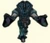
I like the idea, but keep in mind the actual Xen aren't bad, just the ones under Combine control (Similar to the combine soldiers in HL2).
I was thinking of posting an idea similar to this.
After the Human's victory in saving thier world, they decide to repay the Xen for aiding them in thier rebellion, By helping them liberate thier world.
I was thinking of having dropships and stuff similar to the ship in that pic. And sweet looking Human Soldiers with armor and stuff that looked similar to combine uniform(it would be stolen technology) And the xen would have some cool armor stuff as well.
And the leader of the whole thing would be the Gman, with Gordon Freeman and Alyx Vance as field generals, so to speak. Maybe alyx gets her own HEV suit

Posted 19 years ago2005-11-24 23:52:10 UTC
Post #148911
well... except this is HL1...
I'm going to remoddel the Grunts, Barney, and the Scientists to a more... Space mood...
I'll also code it so that the Grunts will behave like Barney (they are on your side).
Hmm...
New Xen Armor?
Maybe I could mess with the storyline and say this is a different Xen fleet or something...
Well,
To be honest... The real storyline has little to do with what I told you. This is only the introduction to the bizzare stuff that's going to happen...
I hope you guys'll like it
Posted 19 years ago2005-11-25 01:47:03 UTC
Post #148933
I have to be honest here
I don't like the splash. It's a piece of flat ground and a badly aligned sky. it just seems very amateurish (sp?). I know you can do better Bratty. use that ship you've got and make a pic with it being in the center.
I don't like the splash. It's a piece of flat ground and a badly aligned sky. it just seems very amateurish (sp?). I know you can do better Bratty. use that ship you've got and make a pic with it being in the center.

Posted 19 years ago2005-11-25 02:08:17 UTC
Post #148934
splashy is trashy.
everything else looks good though. keep it up
everything else looks good though. keep it up

Posted 19 years ago2005-11-25 04:02:49 UTC
Post #148952
I don't like the splash ether, it's so empty.
How about, you see one of these flying things in space from a cool angle.
And the camera is very close to the space ship.
How about, you see one of these flying things in space from a cool angle.
And the camera is very close to the space ship.

Posted 19 years ago2005-11-25 11:33:11 UTC
Post #149014
okay,
I'll Redo it
I'll Redo it
Posted 19 years ago2005-11-25 12:38:32 UTC
Post #149019
And some photoshop filters would be very cool too..
Posted 19 years ago2005-11-25 14:28:07 UTC
Post #149036
I don't have photoshop...

Posted 19 years ago2005-11-25 14:38:03 UTC
Post #149040
Splash looks very dull, with no atmosphere at all.


Posted 19 years ago2005-11-25 18:24:13 UTC
Post #149084
Um...what is Gordon firing from?
Anyway, yeah, that second splash was worse than the first. Maybe get a behind-the-shoulder shot of gordon blasting aliens/soliders on the Alise, or something.
And you can get Photoshop Elements for only $60. If you don't want to waste money, everyone suggests GIMP, but the interface looks far too cluttered for me.

Posted 19 years ago2005-11-25 18:56:26 UTC
Post #149099
$60!!!
I just bought Abobe Illustrator for around $600...
DOH!!
Hmm... I'll figure out a good splash...
Kinda hard to make an action shot, since Ill be blasting aliens in 3rd person... impossible to aim.
I haven't made the entire ship's interior yet...
Guess I'll do the splash last.
P.S. The ship is only the first chapter. The second is on Xen... Then... Things get a little... wierd.
Posted 19 years ago2005-11-25 19:11:05 UTC
Post #149108
Moved this thing...
Hey...
I obviously need some help If Im gonna finish this thing...
Mind If I keep posting screenies of specific problem areas and selfishly asking for critisizm?
Who am I kidding, you LOVE pointing out whats wrong

So, what'd I screw up this time?
Hey...
I obviously need some help If Im gonna finish this thing...
Mind If I keep posting screenies of specific problem areas and selfishly asking for critisizm?
Who am I kidding, you LOVE pointing out whats wrong

So, what'd I screw up this time?
Posted 19 years ago2005-11-25 19:15:57 UTC
Post #149109
oh, and Im not sure what the interier of an normal elevator on a space ship looks like...
Its looking like crap..
What do I need to add?
Maybe a broken car would fix it up?


Its looking like crap..
What do I need to add?
Maybe a broken car would fix it up?


Posted 19 years ago2005-11-25 19:35:24 UTC
Post #149119
looking better, hallway looks to cretie now though
Posted 19 years ago2005-11-25 19:48:34 UTC
Post #149128
The texlights in the first screeni are horribly streched try flipping the texture.
Posted 19 years ago2005-11-26 00:02:58 UTC
Post #149180
$60!!!Yup. Heck, you can get it for $16 on Amazon.
I just bought Abobe Illustrator for around $600...
DOH!!
Posted 19 years ago2005-11-26 00:15:48 UTC
Post #149183
looking better, hallway looks to cretie now thougherg.. I need metal textures...
I might make a .wad for Alise...
The texlights in the first screeni are horribly streched try flipping the texture.I know you know what the texture actually looks like... But I like the effect that it has here...
I'm keeping those lights the way they are, unless I want to go back later and add some 3d details to them...
Yup. Heck, you can get it for $16 on Amazon.woah is me...
I could have given that money to charity...
or bought a nice hat...

Posted 18 years ago2005-12-02 14:31:38 UTC
Post #150188
A few little tips to making the map look better:
1: Give Doors Frames! Doors and entranceways dont just magically appear out of the wall, they have a frame that they fit into, add a frame around those doors in the screeny with the barney lying infront of it.
2: Making Textures Smaller: This is a pretty simple and very effective way of making a texture look better, compress it in the texture apply tool, somwhere around .75 or .5 will greatly increase eye pleasure in game.
3: Not So Many Light Textures / Sources: You will never find a coridoor with light fittings on the wall every 2 foot, lights are spread out, they have to show people where they are going, not eluminate (sp) every nook and cranny.
Follow those three simple rules on that first screen shot and repost it, I garentee (unless your a moron with no taste or skill, which you arnt) that it will look better.
As for the splash, the reason it doesnt look good is because nothing is center stage, examine it from a critical eye, what fills the picture most? Yep, sky texture and Xen rock. Make the space ship center stage, have it so its up so close the tip of it is off the screen, then actually make the grunt models, and put them in an enviroment more detailed that a flat lump of xen roid, and your in business. I seem to have a nack for doing things like that, and as I said before, I would be happy to help.
Anyway, hope that helps you out.

You must be logged in to post a response.