Adobe PhotoShop
Created 19 years ago2005-08-31 19:54:35 UTC by
 Unbreakable
Created 19 years ago2005-08-31 19:54:35 UTC by
![]() Unbreakable
Unbreakable
Posted 18 years ago2006-01-04 23:17:25 UTC
Post #156267
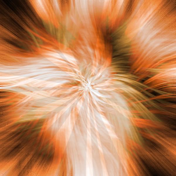
5 min job in photoshop :>
Posted 18 years ago2006-01-04 23:19:05 UTC
Post #156268
Posted 18 years ago2006-01-05 13:43:48 UTC
Post #156325
I don't see how people make that kind of swirly thing in the middle. 

Posted 18 years ago2006-03-30 10:51:40 UTC
Post #171597
I was thinking of making anther thread just like this, but I suppose, that the old one would bring us back some nice forgotten artwork  Go ahead - post your newest artwork!
 Go ahead - post your newest artwork!
Posted 18 years ago2006-03-30 11:55:49 UTC
Post #171601
For my MSN pic...
Posted 18 years ago2006-03-30 12:17:06 UTC
Post #171603
At least I think this one turned out good.
I've trixed with "The dark side of the moon" LP cover picture.
I also tried this, wich was quit cool:
I've mainly played around with filters.
I'm not that good in Photoshop as some of you.
You might ask what I've changed on the first one.
Well, I've made it darker, and the triangle brighter.
Some lighteffects has been added, and I've also increased the color flow in the outgoing spectrum colors.
Posted 18 years ago2006-03-30 12:39:18 UTC
Post #171609
Is this thread old?
Oh, it is.
I didn't bumb it!
Daub did! Points
Oh, it is.
I didn't bumb it!
Daub did! Points
Posted 18 years ago2006-03-30 17:10:53 UTC
Post #171646
Freaking god, how you do that hell? Incredible! Me I draw nice ( like my pic i have now ) but that it's on comp! explain! How I want to do that!!! 


Posted 18 years ago2006-03-30 17:44:26 UTC
Post #171649
Read tutorials.
http://www.google.com
http://www.google.com
Posted 18 years ago2006-03-30 17:44:26 UTC
Post #171650
You use a program titled 'Photoshop' and use the very useful tools to do cool effects like that. Takes experience and a lot of effort as you have to read tutorials on these sort of things.
Posted 18 years ago2006-03-30 22:31:13 UTC
Post #171671
http://www.google.comHeeeeeeeey!!! good idea... :
What I meant it's I have photoshop but i didn't know we could do things like that.
Posted 18 years ago2006-03-31 02:12:47 UTC
Post #171678
Arr.
Posted 18 years ago2006-03-31 10:19:55 UTC
Post #171711
Looks like Usama Binladin! 

Posted 18 years ago2006-03-31 10:24:20 UTC
Post #171712
Posted 18 years ago2006-03-31 11:52:53 UTC
Post #171719
Verrry Gurrrly...But also sexxxxy...In a goooooood way.
Posted 18 years ago2006-04-17 20:54:21 UTC
Post #174870
Latest work, for the compo splash.Supposed to be an eye of some sort.
Posted 18 years ago2006-04-18 01:50:11 UTC
Post #174886
One I whipped up real quick-like
Posted 18 years ago2006-04-18 02:57:49 UTC
Post #174888
Weird, UB. Looks pretty good except for the text.
Posted 18 years ago2006-04-18 09:22:10 UTC
Post #174937
lol, yea, I had the name of the compo map on it, but did'nt want to give my name away, so I just put Unbreakable, and uploaded. 

Posted 18 years ago2006-04-18 10:34:27 UTC
Post #174947
Just experimenting with... stuff. I generally don't use Photoshop for fancy effects, I use it to make layouts and graphics.
Posted 18 years ago2006-04-18 12:54:04 UTC
Post #174973
thats cool ZL, it looks like a very complex painting. 

Posted 18 years ago2006-04-23 01:01:06 UTC
Post #176187
Posted 18 years ago2006-04-23 04:17:12 UTC
Post #176197
That's a good 'h'.
You must be logged in to post a response.


