Brushopolis, coming to a server near you Created 18 years ago2006-09-20 16:28:23 UTC by Soup Miner Soup Miner

Created 18 years ago2006-09-20 16:28:23 UTC by Soup Miner Soup Miner

Posted 18 years ago2006-09-20 16:28:23 UTC Post #197051
Some of you may know that a while ago there was a mini compo to create a miniature city with all the details as possible of a full-scale city. I decided to blow up my entry(seen here) and make it into a HLDM map. Mind you there will be several tweaks and fixes and additions to this blown-up version, which is 4 times as big as the original mini city. I haven't done much on it yet in terms of visual upgrades and additions. So far I've only rescaled the map, realligned the textures, tweaked a few small brushes, and made a small attempt at optimization. It's not much(it really isn't) but here's screenshots of my last [imcomplete] compile.
User posted image

User posted image

User posted image

As you can see, its blatantly fullbright as of now, and looks like bullshit. You can also see that it's bland as crap.The compile was taking forever(roughly 14 hours and going) so I stopped it so I could at least run it ingame and check the scale of things.
Yeah I know, as it stands right now its bland as hell(for a map of it's size) but here's a list of things I plan to do before I release it(if I can get it to compile :| )
-OPTIMIZE! Even with the optimization that I've done so far the r_speeds max at an unheard-of 7500 w_poly :zonked: I'm not surprised, though, considering the size of the map, the scale of textures(most of which remain at 1), and how much of the map is visible at a time.
-Rework the parking garage. Its too short and bland. I'll add some cars and lights.
-Rework many things such as street lights, parking spaces, and small things like that.
-Put a bunch of cars or trailers on the streets so the streets aren't so barren. This should make the gameplay a lot better too(people won't be able to shoot you from a mile away).
-Put fire hydrants on the sidewalk(I'd rather make them brush-based but I think I'll have to go with models considering I don't have much room for brush based props at this point).
-Create first-floor interiors for a few buildings.
-Add a building or 2 in the blank sidewalk space behind the blue-windows, brick building to take of some of that open space.
-Replace the park and parking lot with buildings for a second release which should change the gameplay dramatically.

If you've got any tips of optimization for something like this please tell me. I've already nulled off everything that I can. If it helps, none of the rooftops will ever be visible without noclip.

Now I await the inevitable "you're breaking the engine" complaint.
Posted 18 years ago2006-09-20 16:34:10 UTC Post #197052
You're breaking the engine. :P

Seriously though, with all the stuff you plan on adding, it gonna be a bitch to get the fps up.
Posted 18 years ago2006-09-20 16:57:00 UTC Post #197058
I know your position and preference for HL1 over Source, but I can't refrain myself from saying this type of map is easier to do in Source. Little compile times thanks to func_details, 3D skyboxes, you name it! :P

Now tips for this HL1 "experiment". The first thing I would say would be to avoid box-type layouts, but your city must be beyond that point.
Here's another tip. Get the textures you are using in your buildings and make smaller versions in your WAD file.
For example. You could have a 128x128 texture at a scale of 1.0 in the first four floors of your building, while the rest of the floors have the same texture in 32x32 and a scale of 4.0
From the ground, it won't be that noticeable and could help performance a lot. As a matter of fact, the textures would look just as blurry as they would with the engine?s mip mapping effect.
Posted 18 years ago2006-09-20 17:09:05 UTC Post #197059
you're idea seems good kasperg, about creating smaller versions of textures, but in DM, people can use the gauss to reach these high windows and see the low qualityness of it.

Look'n good, WCD
Archie ArchieGoodbye Moonmen
Posted 18 years ago2006-09-20 17:36:52 UTC Post #197060
The first thing I would say would be to avoid box-type layouts, but your city must be beyond that point.
There's not much I can do about the boxy factor. Its a city, buildings are boxy, everyone knows it. I'm trying to compensate for that with interior design, street details, and building details. I do my best but I can't say much outside of the fact that I just love these kinds of environments.
Get the textures you are using in your buildings and make smaller versions in your WAD file.
For example. You could have a 128x128 texture at a scale of 1.0 in the first four floors of your building, while the rest of the floors have the same texture in 32x32 and a scale of 4.0
I had just thought of that about 15 minutes ago, actually. It really would help a lot, you're absolutely right. About the mip though, there's a console variable with 4 settings that changes the texture filtering that can go roughly equal to antisotropic 4x, but of course even then it wouldn't make a difference at that height. Just wanted to point it out.

Hunter, I won't be putting a gauss in this map for that specific reason(and because good "gaussers" will be able to nail almost anyone from anywhere on the map).

Any ideas on a way to decrease vis time for something like this? Could hint brushes help? I've honestly never even made an attempt at using them so I don't know how well they would work here.
Posted 18 years ago2006-09-20 18:03:15 UTC Post #197062
Hint brushes can help. Use big horizontal hint brushes (as big as the whole map) above the height players will reach.
Posted 18 years ago2006-09-20 18:04:28 UTC Post #197063
damn dude, there aren't stop lights at every corner! too much, put signs in place of some of the lights
Posted 18 years ago2006-09-20 18:07:15 UTC Post #197064
THIS is what I mean.
Posted 18 years ago2006-09-20 18:49:05 UTC Post #197065
Thanks for the tip.
damn dude, there aren't stop lights at every corner! too much, put signs in place of some of the lights
:| There are where I live(or near where I live, since I don't live in the downtown area). i guess all the drivers around here are really stupid or something.
Posted 18 years ago2006-09-23 23:43:28 UTC Post #197347
r_speeds turn on

:P

Looks pretty sweet though, I must say. Like the original, I like you creative/good use of the orginal textures.

My entry was >3000, which is completely impausible at 1/3 scale, let alone full!!1 Curious to see yours too ;)
Posted 18 years ago2006-09-24 12:46:41 UTC Post #197401
was it you who make big city, i love city maps, and as for hl2 city maps, all i have seen is damn run down half life 2 combine citys, I think someone oughta make same new textures (or steal some at least) and make a modern day city (not corrupt). DM is the greatest.
Posted 18 years ago2006-09-30 16:48:49 UTC Post #198114
My entry was >3000, which is completely impausible at 1/3 scale, let alone full!!1 Curious to see yours too
Well mine is only at 7000 right now because I was testing on an incomplete compile. I'm sure vis will reduce the r_speeds(along with other optimization of course).

Problem: The hint brush above the playable area isn't helping vis time. It still takes 16 hours(I start when i go to bed and leave it running untill I get back from school the next day) to get to 80% of vis. I know that stretching textures can help r_speeds and rad, but does it help vis as well? It doesn't make much sense that it would, but does it?
Posted 18 years ago2006-09-30 16:53:05 UTC Post #198115
Stretching textures does help. In HL1, the lighmap scale is usually given by the texture scale. If you stretch them, RAD will make less calculations because the lightmap grid is "bigger".
I don't know about the hint brush. It's hard to get them to do exactly what you want.
Posted 18 years ago2006-09-30 17:00:50 UTC Post #198118
Well I already know that it will help rad :| I'm concerned as to whether or not it will help vis.
Here's a bird's eye view from Hammer for anyone who wants to see this map in a non-fullbright screen.
User posted image
There isn't much difference because I've spent most of my time working on optimizing and trying to get a working compile out of this.
The street "outline" along the edge of the map will be clipped off. I also removed the top layer of the sky because it would have passed through it to see the whole city.
I refuse to let this map die! I will get it working AND it will be playable!
Posted 18 years ago2006-09-30 17:06:38 UTC Post #198119
I like it!
Madcow MadcowSpy zappin my udder
Posted 18 years ago2006-09-30 18:45:32 UTC Post #198124
All right, I got a compile that actually finished. It was on fast vis, but at least it's lit now:
I like this screenshot the best. It makes the map look more "full" if you know what I mean.
User posted image

User posted image

User posted image


I took out a few traffic lights. Still extremely wide open and blocky and the r_speeds are much, much better but still pretty colossal. Meh, I like it and I know how much change a few cars can bring.
Posted 18 years ago2006-09-30 19:11:23 UTC Post #198125
Looks good.

IMO, this would be really cool if it was dusk in the map, with an orangey light_env and long shadows, but I know the Env Map your using wouldn't allow it.
Posted 18 years ago2006-09-30 19:15:03 UTC Post #198126
Breaking the engine you say? No no no, this is breaking the engine. (Note, requires The Specialists to play.)

Its a modification i made to an existing RP map for The SPecialists, and its for my gaming community im part of and our TSRP server. I am literally at every limit when making this map.

EDIT: And compiling it was strange. Took 10 hours to compile at regular and only 8 to compile it fully.
Luke LukeLuke
Posted 18 years ago2006-09-30 19:19:21 UTC Post #198127
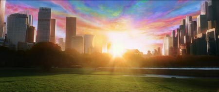
WCD: with the 2D skybox you are using, the Light_enviroment should be a tiny bit more blue. Otherwise it's looking pretty good. Reminds me of the city seen at the very end of Matrix Revolutions!

Edit:
User posted image
Posted 18 years ago2006-09-30 19:45:23 UTC Post #198131
Caboose, nothing against your personal taste, but I think that there is nothing uglier than a city at dusk. An orange lit city is just... ugh to me. I like morning or night personally.

LUKEWHYAREYOUMAKINGASPECIALISTSROLEPLAYMAPYOUBACKSTABBINGLITTLEBASTARD!!!!!!!!!!
Posted 18 years ago2006-09-30 19:46:57 UTC Post #198132
It was a phase :>

Just look at it. Its fucking huge along with the fact almost all buildings you can go in.
Luke LukeLuke
Posted 18 years ago2006-09-30 19:58:16 UTC Post #198135
That's like the best sky for that map whoever started the thread.
Posted 18 years ago2006-10-04 18:30:05 UTC Post #198538
That sky is wicked! (that is matrix, like Kasperg?)

WCD: Yeah, stretching textures will indeed speed up your vis times considerably, just don't over stretch or the lighting will look very bad.

Experiment. When I was doing the lego compo, I had a pretty much empty--yet big-- room, with the textures scaled to .25. At that low scale, it took like 10 minutes--VIS--to compile an empty map!!!

Scaling up the textures to 1.25 cut the VIS time to 45 seconds or some such ;)

Hints don't work very well on wide-open maps, or at all for me--r_speeds always go up when I use them :)

func_walling detail stuff is also a good bet, but don't func_wall your big, vis-blocking buildings!

Hope helps, sorry if I'm being redundant--I feel like I'm beating a dead horse talking about compile times and r_speeds :)
Posted 18 years ago2006-10-06 17:17:18 UTC Post #198746
There's something that just doesn't look right about these bushes. I don't like them being there, any ideas? I can't put in trees, it woul,d be too repetitive and there's not enough room anyway.
User posted image

Also, new street lights with breakable glass cover
User posted image

Edit: I've just dicovered that the size of this map causes a rocket shot form the rpg to actually lose its tracking about a 4th of the way into its path. Now that's big.
Posted 18 years ago2006-10-06 17:25:40 UTC Post #198747
Lower the bushes a little. Might help.
Luke LukeLuke
You must be logged in to post a response.