
I liked the old textures more, this looks awfull. Seriously. (talking about the textures ofc.)
Dark bland lighting aswell.
rowleybob Projects!
Created 18 years ago2006-07-10 02:36:22 UTC by
 rowleybob
Created 18 years ago2006-07-10 02:36:22 UTC by
rowleybob
Posted 17 years ago2006-12-07 09:12:35 UTC
Post #205338


Posted 17 years ago2006-12-07 09:50:21 UTC
Post #205344
Agreed. Although I think the main concourse looks sorta ok, I'll agree the rest of the map looks absolutely ridiculous.
I'll try to do better
I'll try to do better

Posted 17 years ago2006-12-07 09:59:01 UTC
Post #205346
The map begs for custom textures, but I think those used in the screenshot aren't that bad.
The only thing that looks strange is the width of the railings around the central hole. Is there a chance you could make them a lot thinner?
The only thing that looks strange is the width of the railings around the central hole. Is there a chance you could make them a lot thinner?
Posted 17 years ago2006-12-07 10:01:23 UTC
Post #205348
LOL totally.
I made almost this entire map at the 16 grid size--hence teh blocky goodness :). I've never done it that way before, but I found it made many things faster and cleaner/easier imo.
I suppose it may be time to start lowering the grid size
I made almost this entire map at the 16 grid size--hence teh blocky goodness :). I've never done it that way before, but I found it made many things faster and cleaner/easier imo.
I suppose it may be time to start lowering the grid size
Posted 17 years ago2006-12-07 10:06:51 UTC
Post #205350
Nothing wrong with the 16 grid size, I work on it all the time. If I want something smaller I lower the size. :
Well, good luck.
Well, good luck.
Posted 17 years ago2006-12-08 06:26:10 UTC
Post #205463
Nothing wrong with the 16 grid sizeOh don't get me wrong, it's great!
I've built 98% of the map without having to lower it from 16. So much less zooming in/out, and squinting with a bigger grid size
This is the first map I've ever really tried something other than the "1" grid size. ZOMG, Sooooo much better!

Posted 17 years ago2006-12-08 06:32:05 UTC
Post #205467
Wow. You built all your maps on a grid size of "1" before? When I began mapping, I did that too, but after I actually used the grid, I was addicted to it! Now I can't even imagine working without it!

Posted 17 years ago2006-12-08 06:35:08 UTC
Post #205468
OMG I know... me neither!

Posted 17 years ago2006-12-08 06:35:16 UTC
Post #205469
Yeah, I've always worked on the smallest grid size.
Makes all that tricky VM easier. Imo.
Makes all that tricky VM easier. Imo.


Posted 17 years ago2006-12-08 06:36:45 UTC
Post #205470
Yeah, I've always worked on the smallest grid size.Boy do i know all about that.
Makes all that tricky VM easier. Imo.


Posted 17 years ago2006-12-08 06:43:18 UTC
Post #205472
Using grid size 1 all the time actually led to the death of my first mod I put much work into. After I switched to using larger grid sizes, I found it impossible to continue working with all the old maps. I also had a habit of hiding the grid, so I would turn it on, and see a bunch of off-grid vertices I had created by mistake.
Posted 17 years ago2006-12-08 07:40:59 UTC
Post #205478
Seriously you small grid guys... try building your next map on 16, and I guarantee you you'll never go back
It simplifes everything. Makes clipping, hell even VM easier. You can always jump down to the smallest size for the really intricate stuff, but I hardly find it necessary anymore!
It simplifes everything. Makes clipping, hell even VM easier. You can always jump down to the smallest size for the really intricate stuff, but I hardly find it necessary anymore!
Posted 17 years ago2006-12-08 07:44:09 UTC
Post #205479
Ant... You aren't really serious, are you? 
Posted 17 years ago2006-12-08 07:45:09 UTC
Post #205480
I generally stick with 8 unit thick walls, then use 4, or 2 units for borders/trims/frames etc. I only really go down to 1 unit when it's absolutely necessary, neatness is paramount for me to keep interest in my maps.
Posted 17 years ago2006-12-08 07:51:03 UTC
Post #205481
srry: I am. I can't work on the larger grid size. I have a set thickness for certain things though.

Posted 17 years ago2006-12-08 09:07:45 UTC
Post #205484
i work with 64, 16 and 4, 2 and 1 for really small, and for accuracy, i just hold alt to turn off snapping to grid.

Posted 17 years ago2006-12-08 09:15:42 UTC
Post #205486
Gah, turning off snapping to grid is FAIL.
Posted 17 years ago2006-12-08 09:30:25 UTC
Post #205489
So is sticking to a 1 unit grid the whole time.

Posted 17 years ago2006-12-08 11:45:53 UTC
Post #205495
np: (Planet Dub) Alpha & Omega - David & Goliath

Posted 17 years ago2006-12-08 12:01:18 UTC
Post #205497
Wrong thread Jahz?
I always map my walls, floors and ceilings on the 16 grid.
For stuff like windows, trims or whatnot i'll lower the grid.
I always map my walls, floors and ceilings on the 16 grid.
For stuff like windows, trims or whatnot i'll lower the grid.
Posted 17 years ago2006-12-08 12:58:06 UTC
Post #205499
who's the President?

Posted 17 years ago2006-12-08 13:02:43 UTC
Post #205501
I'm a Gridsize 16 guy. I work with gridsize 1 for all the details and VM.
This map looks great fun to play but I agree that Custom Textures would make it much more attractive.
This map looks great fun to play but I agree that Custom Textures would make it much more attractive.

Posted 17 years ago2006-12-08 22:31:58 UTC
Post #205529
I seriously don't see how keeping the grid on 1 can help with VM, at least if you're using it like I do, for terrain. It just makes everything messy, and you have to zoom in really far to line everything up.
I usually stick to grid size 16, but commonly go to 32, or even 64 for building large environments.
Ant: turning off "snap to grid" is the same as bringing the grid down to size 1, so you FAIL!
I usually stick to grid size 16, but commonly go to 32, or even 64 for building large environments.
Ant: turning off "snap to grid" is the same as bringing the grid down to size 1, so you FAIL!
Posted 17 years ago2006-12-09 10:56:14 UTC
Post #205557
Update.
K. Not many asthetic changes, but an interesting gameplay addition. At first, I was just going to have zero-g in the center of the station.
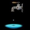
Now, it's been added to the entire main concourse, the main hangar, and the walkway in-between. (Again, the zero-g is achieved by putting water brushes above the player. When the player holds down the spacebar, he will float in the water simulating weightlessness--or at least I hope! :))
Main Hangar
Main Hangar floating in zero-g
(notice that everything darkens when your floating in the water)
--The textures are still generically horrid.
--Started to rebuild the orbiter cockpit.
Download to try out the simulated weightlessness, and let me know what you think!!1
K. Not many asthetic changes, but an interesting gameplay addition. At first, I was just going to have zero-g in the center of the station.
Now, it's been added to the entire main concourse, the main hangar, and the walkway in-between. (Again, the zero-g is achieved by putting water brushes above the player. When the player holds down the spacebar, he will float in the water simulating weightlessness--or at least I hope! :))
Main Hangar
Main Hangar floating in zero-g
(notice that everything darkens when your floating in the water)
--The textures are still generically horrid.
--Started to rebuild the orbiter cockpit.
Download to try out the simulated weightlessness, and let me know what you think!!1
Posted 17 years ago2006-12-09 12:00:18 UTC
Post #205560
Well, I downloaded and has a fast look.
It's kinda silly that you can normaly walk in zero-g till you jump. It's also kinda silly then when you have the feeling you're normaly walking (while you're actually being in zero-g) you shoot bubbles. It also makes no sense that you lose breath if you stay to long in zero-g. It also makes no sense you shoot bubbles in zero-g, it reminds me to much of well...water.
Just my thoughts.
Posted 17 years ago2006-12-09 12:07:49 UTC
Post #205561
I always appreciate your thoughts!
I agree, but do you have an alternative?
Setting gravity in-game does basically the same thing... you walk normally 'till you jump. Then, you fall... not exactly realistic.
It's not perfect, but I think it could be interesting for the game, perhaps not for ever area like I'm testing, but I want to try including the effect someplaces/somehow.
Besides that some weapons won't work, and the bubbles, I hate how it darkens everything, even though the water's rendered invisible.
Also btw, adding that bit of water added over 30 minutes to my compile, so I probably won't be playing around with this effect too much more!:)
Posted 17 years ago2006-12-09 14:16:13 UTC
Post #205569
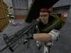
I've cut the shuttle out of the main map to keep compile times down. It's still way too dark, but I think it's starting to look cool:


Posted 17 years ago2006-12-09 14:39:38 UTC
Post #205572
Starting to look cool? That looks like a lot of fun 
You're going to fix the cracks right?
You're going to fix the cracks right?

Posted 17 years ago2006-12-09 14:43:34 UTC
Post #205573
Thanks
Yeah, I can think of a couple of ways to fix the "cracks":
1. Null the inside faces. Sometimes this causes you to see HOM, unfortunately.
2. Change the angle of the brush so the paper thing wedge that's letting you see the other brush isn't so thin.
3. Simplify the design.
4. maybe making them func_walls will help?
Maybe a little of all of them Any suggestions on how else to eliminate those ugly things?
Yeah, I can think of a couple of ways to fix the "cracks":
1. Null the inside faces. Sometimes this causes you to see HOM, unfortunately.
2. Change the angle of the brush so the paper thing wedge that's letting you see the other brush isn't so thin.
3. Simplify the design.
4. maybe making them func_walls will help?
Maybe a little of all of them
Any suggestions on how else to eliminate those ugly things?
Posted 17 years ago2006-12-09 14:54:14 UTC
Post #205574
Here's an idea:
In order to cause the player to immediately float in the zero-g enviornment, create a floor with an indentation leading into the zero-g area. Fill that indentation with a func_illusionary, and texture it so it looks normal. This will cause the player to 'unlock' from the ground (provided that he is actually IN the water before stepping over the illusionary).
Additionally, try to create a new water texture that has no darkening effects. If possible, you may be able to remove the bubble sprites from it (I don't know if this is possible, but meh ).
Finally, I don't know about HL1, but in HL2, the sv_gravity command is pretty handy. Could you hook up a point_clientcommand and use that if it exists?
Lookin hawt at the moment
In order to cause the player to immediately float in the zero-g enviornment, create a floor with an indentation leading into the zero-g area. Fill that indentation with a func_illusionary, and texture it so it looks normal. This will cause the player to 'unlock' from the ground (provided that he is actually IN the water before stepping over the illusionary).
Additionally, try to create a new water texture that has no darkening effects. If possible, you may be able to remove the bubble sprites from it (I don't know if this is possible, but meh
).Finally, I don't know about HL1, but in HL2, the sv_gravity command is pretty handy. Could you hook up a point_clientcommand and use that if it exists?
Lookin hawt at the moment

Posted 17 years ago2006-12-09 15:02:49 UTC
Post #205575
Thanks
HL1 has sv_gravity, but it doesn't work the way I want it to.
You gave me an idea for the water though... I'll let you know if it works!
Your first is fine, but I can't put the water everywhere, else everyone will drown, so I dunno.
HL1 has sv_gravity, but it doesn't work the way I want it to.
You gave me an idea for the water though... I'll let you know if it works!
Your first is fine, but I can't put the water everywhere, else everyone will drown, so I dunno.
Posted 17 years ago2006-12-09 15:06:32 UTC
Post #205576
sv_infiniteauxpower?
Posted 17 years ago2006-12-09 15:11:09 UTC
Post #205577
Does that let you breathe forever?!
Posted 17 years ago2006-12-09 15:43:31 UTC
Post #205579
If O2 is run in HL1 like it is in HL2, then yes, because your power will never run out, so it can continue to create oxygen forever.
Posted 17 years ago2006-12-09 19:38:48 UTC
Post #205608
Aux power is not included in HL1 because you can't sprint and your torch uses a seperate battery. I think the breath in HL1 was time based. I'd say the only solution was coding but then you couldn't have real water anywhere else in the map.
Posted 17 years ago2006-12-11 17:28:33 UTC
Post #205821
Update:
I know the textures suck, so please try to relent unless you have some direct advice like a color scheme or something.
Usually by this stage I quit working on maps, so if for no other reason than that, I'm happy with this map. Also, I'm amazed how much brushworking techniques I also gained making this map... I mean, after doing this for a couple of years, you'd think you'd learned about everything!!1
Even though this is taking much longer than I expected, I think I'm starting to gain some speed, and I'm making some progress. Take a look!
Screens:
http://rowleybob.googlepages.com/clarity0033.jpg
http://rowleybob.googlepages.com/clarity0033a.jpg
http://rowleybob.googlepages.com/clarity0033b.jpg
Try running through it, here. (The shuttle is currently been secreted into a seperate .RMF to save Compile time )
Changes/To Do:
?Starting to build "Telescope" stuff in the middle
?Stating to add more rooms. Still to add/finish:
-Main Bridge
-Telescope Main Control Room
-Maintenance Crawlways
-Crew quarters
-Shower facilities/Bathrooms
-Reactor room
-Maybe more cargo space
?Reading some texture tutorials
?Parusing other Space-themed maps
??
I'd love some layout and style advice if you can spare some!
I know the textures suck, so please try to relent unless you have some direct advice like a color scheme or something.
Usually by this stage I quit working on maps, so if for no other reason than that, I'm happy with this map.
Also, I'm amazed how much brushworking techniques I also gained making this map... I mean, after doing this for a couple of years, you'd think you'd learned about everything!!1 Even though this is taking much longer than I expected, I think I'm starting to gain some speed, and I'm making some progress. Take a look!
Screens:
http://rowleybob.googlepages.com/clarity0033.jpg
http://rowleybob.googlepages.com/clarity0033a.jpg
http://rowleybob.googlepages.com/clarity0033b.jpg
Try running through it, here. (The shuttle is currently been secreted into a seperate .RMF to save Compile time
)Changes/To Do:
?Starting to build "Telescope" stuff in the middle
?Stating to add more rooms. Still to add/finish:
-Main Bridge
-Telescope Main Control Room
-Maintenance Crawlways
-Crew quarters
-Shower facilities/Bathrooms
-Reactor room
-Maybe more cargo space
?Reading some texture tutorials
?Parusing other Space-themed maps
??
I'd love some layout and style advice if you can spare some!

Posted 17 years ago2006-12-11 17:48:23 UTC
Post #205822
Wrong download link.

Posted 17 years ago2006-12-11 17:51:31 UTC
Post #205824
Posted 17 years ago2006-12-11 17:54:00 UTC
Post #205825
I took a look at the last alpha map, and my main issue with the map is the big size, which makes it look empty. It's understandable since it started as a more abstract thing, but it just doesn't make you feel like you're on a spaceship or starbase. They are usually more cramped to save on materials etc, whereas this map has very high ceilings.
Filling it up with more detail would increase r_speeds, which is not always desirable...
In terms of layout I don't remeber any big problems, but it would be best to playtest it with bots.
Filling it up with more detail would increase r_speeds, which is not always desirable...
In terms of layout I don't remeber any big problems, but it would be best to playtest it with bots.
Posted 17 years ago2006-12-12 04:38:32 UTC
Post #205857
I agree, it's quite huge--and getting bigger. Certainly doesn't fit a traditional/contemporary space station design.
Making it smaller would also make it easier to block VIS, and less time/easier to detail.
Still, I'm going to try to finish this in the direction it's going, and maybe the next one will be more realistic/smaller... Maybe the International Space Staion, or Mir, or similar!!1
Making it smaller would also make it easier to block VIS, and less time/easier to detail.
Still, I'm going to try to finish this in the direction it's going, and maybe the next one will be more realistic/smaller... Maybe the International Space Staion, or Mir, or similar!!1
Posted 17 years ago2006-12-13 11:23:32 UTC
Post #205968
Update.

I started building a shuttlecraft for the hangar bay, and somehow it turned into the dropship from Aliens!!1
I didn't use reference pics, so there are probably some major errors in the design--like it mattesrs anyway.
It's still quite raw and blocky--the horrid light and textures don't help much either--, but I like it. Many refinements to come, but I'm quite happy with the initial design. If I have time I might even try brushing out the cockpit
Like the orbiter, I seperated this from the main map so save on resources and compile time--for now.
This may not even make it into the finished map anyway, because it doesn't really fit the theme. Maybe a DM_Suloco someday
More Screens:
http://rowleybob.googlepages.com/claritydropship0001.jpg
http://rowleybob.googlepages.com/claritydropship0002.jpg
http://rowleybob.googlepages.com/claritydropship0003.jpg
Try it here.

Posted 17 years ago2006-12-13 12:03:18 UTC
Post #205969
Posted 17 years ago2006-12-13 13:03:43 UTC
Post #205976
Yeah, I actually spelled it wrong!!1 Can't wait to check it out
You're not missing much with the images, trust me. If there is something really good to show, I'll post thumbnails at least.
I'll scale them down--it's not hard. What's a good size in your opinion?
edit: It's a cool map, but has nothing to do with the "Sulaco" from Aliens--unfortunately
You're not missing much with the images, trust me. If there is something really good to show, I'll post thumbnails at least.
I'll scale them down--it's not hard. What's a good size in your opinion?
edit: It's a cool map, but has nothing to do with the "Sulaco" from Aliens--unfortunately
Posted 17 years ago2006-12-13 16:27:49 UTC
Post #206005

Posted 17 years ago2006-12-13 22:13:24 UTC
Post #206046
have you fixed the floors?
Posted 17 years ago2006-12-14 06:05:36 UTC
Post #206063
Orpheus: I'll try it for my next set of shots.
edit:It works great! From +400KB to 32KB, without any noticable difference in quality!!1! Thanks for enlightening me
edit1: I also tried moving the compression slider down to 70% in Infranview and PhotoFiltre, and the results are nearly identical This will be great for my image map webpage LAWL!!1! Thanks again
Nine: What floors?
Here's the slighty rebuilt dropship, sans errors:

Try it.
And here's the current version of the main map:

Still very raw, big props removed to save on compile. Still at this point just fleshing out new areas of the map, and refining some that are there.
Download. (Only if your in to self-mutilation )
edit:It works great! From +400KB to 32KB, without any noticable difference in quality!!1! Thanks for enlightening me
edit1: I also tried moving the compression slider down to 70% in Infranview and PhotoFiltre, and the results are nearly identical
This will be great for my image map webpage LAWL!!1! Thanks again Nine: What floors?
Here's the slighty rebuilt dropship, sans errors:

Try it.
And here's the current version of the main map:

Still very raw, big props removed to save on compile. Still at this point just fleshing out new areas of the map, and refining some that are there.
Download. (Only if your in to self-mutilation
)
Posted 17 years ago2006-12-17 08:13:28 UTC
Post #206647
Looks okay.
Maybe you should try NS textures.
..or can't they be used for non-commercial projects?
Maybe you should try NS textures.
..or can't they be used for non-commercial projects?
Posted 17 years ago2006-12-17 09:29:00 UTC
Post #206653
Posted 17 years ago2006-12-17 19:43:06 UTC
Post #206712
The diagonal floors that give people head aches
Posted 17 years ago2006-12-18 18:33:39 UTC
Post #206836
Yeah I'm not doing any new texture work 'till the end. Here's the plan:
Stage 1:
Complete the architecture of the map and add weapons. Send to Muzz's to playtest.
Stage 2:Amend architecture/layout/bugs as necessary per feedback.
Stage 3: Dive into the world of custom textures and try going to town. If I can't texture it good enough myself, I'll hire someone or use existing textures from some other source.
Regarding NS Textures: I never thought they looked that great, but maybe I just played the wrong maps. If somone has a paticular map/texture set to recommend, I'll certainly check it out for inspiration.
This all said, I'm briefly--a week--putting a hold on this map's progress to work on my current Christmas map. There will be no teaser screens or hints for this map. I hope to fininsh it before Christ's birthday--it's about 30% done right now.
You must be logged in to post a response.