Abbreviated Life Span HL2EP2 Single Play Created 16 years ago2008-02-23 22:31:14 UTC by Tycell Tycell

Created 16 years ago2008-02-23 22:31:14 UTC by Tycell Tycell

Posted 16 years ago2008-02-23 22:32:01 UTC Post #246458
Alright so I?m looking for one or two level designers to join me in making my mod ?Abbreviated Life Span? or ABLISP for short. I began work on the mod many moons ago and already have a couple of maps half built. Much of the time working on this mod has been a learning curve in the Source Engine, in fact the original first map (which took me some two months of mapping and was rather large) was scrapped because I wasn?t happy with all the mistakes I had made and trying to fix them all would have turn the map into a mess.

Anyway, as I said I am looking for one or two level designers to join me in making this mod. A quick rundown of what this would encompass; four chapters, each chapter is three maps long, each chapter is released episodically. So the team (me and whoever else joins) would make three maps together, polish them and then release them. Currently there are only four chapters planned in detail so far with a big finish at the end of chapter four. Though I hope to complete the mod in total and end up with eight episodes I am waiting to see how one to four go first. Essentially this means a total of 15 maps with the possibility of another 15 if all goes better than average.

A little about the story;

You?re Gordon Freeman, its set after the events in Episode Two; it doesn?t conflict with the Half-Life story line, your ?working? for the G-Man still, no major NPC?s feature. As for the game story itself; you have a brief glimpse of the G-Man, there is a flash of light, and as usual you quickly find yourself knee deep in trouble shortly after. You are sent to help some rebels who have stumbled across an old pre 7 hour war Geo-Thermal plant. You set out to help them set up camp their and soon find yourself roped in to much more than you bargained for with monsters, combine and secret projects.

Well, I don?t want to give the full story away of course and ruin it but suffice to say I have already had some offers from people on IRC who would be willing to join the team. Though with all respect to them I don?t want to make a rushed decision and want to have the best people who will benefit the mod join as the team. This means offering the positions to everyone and then picking the best candidate.

So here are a few screen shots to whet your appetite and give you an idea of the level of quality. They are all WIP of course and I am not looking for the best looking map designs ever made more fun with good game play maps. Screen shots below.
User posted image
User posted image
User posted image
User posted image
User posted image
User posted image
User posted image
So what do you say? Any critisism is welcome, feedback please. :)
Posted 16 years ago2008-02-24 01:20:22 UTC Post #246486
I like the concept, And it's good that you have media in the very first release of the mod concept. I can see this going somewhere if you put as much energy into the rest as you did with this original.
Tetsu0 Tetsu0Positive Chaos
Posted 16 years ago2008-02-24 01:47:44 UTC Post #246490
Tycell is alive!?

Awesome work but the yellow light beam in pic.2 looks out of place.
monster_urby monster_urbyGoldsourcerer
Posted 16 years ago2008-02-24 07:45:49 UTC Post #246504
Yes I know, the yellow light beam has been commented on before. Unfortunatly I have yet to come up with a better way of pulling off the effect - It doesnt look so bad in game when its rotating. :)

++Hi Urban ^_^ Long time no see.
Posted 16 years ago2008-02-24 13:21:52 UTC Post #246521
The first screenshot is a bit too plain, looks like the walls can use a bit more detail. And yea the yellow light beam looks a bit weird ^^

Also those buildings can have some more destruction. Like broken pieces of glasses everywhere, some flames coming out of a window maybe, some chairs or tables inside the rubbles (they were not living in a cave, you know :lol:), some random metal pieces hanging out from the walls, broken water pipes or some blood on the walls. These are what I can think of so far, but if you want to scare the player a bit more those can come in handy.

Also, It's good to see you back in action :)
Good luck with your mod.
I would really like to join but I don't map for source :(
Posted 16 years ago2008-02-24 17:33:49 UTC Post #246541
Ah but see those wrecked buildings have been destroyed for many years. I could have put flames and all sorts in but its meant to be abandoned and lifeless. Fire once went through the building (hence no furniture, paint, items etc).

But yeah, your suggestions are good but not for the look I am going for. :)

good to see you too Sajo :D
Posted 16 years ago2008-02-24 21:57:02 UTC Post #246550
New screen shots of todays work.

As you can see I have taken some advice and altered the HL1 light beams.
User posted image
This corridoor is a WIP, it will have enemies in it later to flesh it out a bit. Still I feel there is more detail that could be added but I am going for gameplay and story with "better than average" visuals, not "omg it looks the sex".
User posted image
More of that same corridoor.
User posted image
This next one looks very dark but remember when your in game full screen with no white internet site boder its a lot easier to see. Also I want this area to be dark and gloomy. I'm quite happy with the result seeing as their are no lights inside this tall stairwell yet you can still see what your doing all the way through.
User posted image
A gloomy dark room mid way up the stairwell. Originally I had a zombine pounding on the glass panel door but removed it as the zombine never broke through and looked a bit silly TBH doing the same 3 second animation for as long as the player cared to watch.
User posted image
This is about mid way up the stair well. Gives you some idea of the feel of the area. Yet to add another floor opening on the far wall so it wont always look quite so bland. :)
User posted image
The top of the stairwell. Remember this is all WIP but critisism is of course welcome.
User posted image
So what do you guys think? Its all WIP at the moment but I am happy with the results so far. No it doesnt look as good or flash as EP2 but its steady work and the gameplay should be fun. There'll be bonuses for explorative players as well. Not so much easter eggs as advantages.

Anyway what do you think of the new screens?
Posted 16 years ago2008-02-24 22:06:35 UTC Post #246551
looks a lot better =]

First room still needs some more definition in the lighting though... Something bold.

I like the way this is going
Archie ArchieGoodbye Moonmen
Posted 16 years ago2008-02-24 22:25:25 UTC Post #246553
First room still needs some more definition in the lighting though... Something bold.
Please elaborate (which room, how you think the lighthing could improve etc.)
Posted 16 years ago2008-02-25 00:34:03 UTC Post #246561
Heh, cool.
TheGrimReafer TheGrimReaferADMININATOR
Posted 16 years ago2008-02-25 01:43:34 UTC Post #246567
I think the lighting in the first room needs more contrast, and a bit more color. I would try making the fluorescent lights a bit dimmer, and give them a slight yellow or blue tint. Think about it, how many pure white lights do you come across?
Posted 16 years ago2008-02-26 18:52:29 UTC Post #246668
someone earlier said one of the first pics could use a higher level of detail. All walls aren't filled with details, mixing plain and detailed walls are much better than placing props and brushes all over every wall ye make. But ofc, that's my opinion
Posted 16 years ago2008-02-26 19:32:05 UTC Post #246673
I think the map needs a make over in the section I call lighting. I think using Valve's style of BLUE/GREEN or PEACH/YELLOW with excessive GLOW would do it justice.
Habboi HabboiSticky White Love Glue
Posted 16 years ago2008-02-26 20:02:54 UTC Post #246675
Yeah the lighting has improved as the map has progressed, I'm going with light yellows and dull reds with natural light contrasts and dark lower levels.

Should get some new screens up tonight, stay tuned.
Posted 16 years ago2008-02-26 21:44:58 UTC Post #246677
Ok so didnt get much work done on monday, but got a fair bit done today. New areas of the map are shaping up quite nicley. I've modified the lighting a bit in the first room (white lights) but am still not happy with it (hence no screen). These four screens are of the new areas I've added in today.

This is the final area I added which connects to the Stairwell. I'm happy with the way it turned out in the end even though technically most of that was accidental.
User posted image
A new room you caught a glimps of in the first screen shot. This room took a little longer to set up than the others for reasons I wont go into (play it and find out your self, one day). Quite happy with the result, again, no polish as of yet.
User posted image
This whole area was a complete accident. I realised I needed somthing to connect the stairwell to the V******** O****** ( :P 
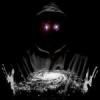
) and this is what came out of that. Unfortunatly I was nubish and made the light models physics props (so they dont show) but I'll fix that tommorrow.
User posted image
Another new area. This one WAS planned however and is comming together quite nicley. You may notice (how can you not) the large peice of machinery on the left of the shot. This is a large peice of machinery which moves (spot the operating lever).
User posted image
So, more feedback please. :) Keep in mind none of these screen shots have any polish at all. I'll be going back through the whole map adding in detail and alike once the layout is done and the main set peices are all in place.

How you guys liking it so far?
Posted 16 years ago2008-02-26 22:32:56 UTC Post #246678
Hmmm, this is starting to look like something I would hump.
monster_urby monster_urbyGoldsourcerer
Posted 16 years ago2008-02-27 09:31:38 UTC Post #246699
Not bad, not bad.

I'd have to comment on the second screenshot tho.
That vent looks wrong and kinda outta place.
Also, I couldn't help but wonder why the lamps have a white glow (on the steel cage thingy around the actual lightbulb) on them while producing dark yellowish light. But heh, this could just be me neatpicking or the way you screenshotted them. :)
Posted 16 years ago2008-02-27 09:48:47 UTC Post #246701
Yeah, blame the models. :P :)++ not all cubemaps are in place yet. I map a bit then go through and splash them everywhere. :)
Posted 16 years ago2008-02-27 21:09:59 UTC Post #246749
Hey guys, new screens below. This is the latest work on the first map. This basically now marks the main part of the map as done (but yet to be polished), and only the big final area battle remains. Man what a haul!

This is the latest work on the ceter of the map. You'll be passing through this area at least three times (all different routes) so I've made an effort to get it to look good (even before polish). I'm really happy with the result, its all come together really nicely.
User posted image
This next shot shows the first part of the first puzzle area. This area totally changed when I actually came to make it from what I had in my minds eye. I am happy with the result though, especially as I stumbled accross a model which fitted the fuction perfectly.
User posted image
More of that puzzle area from further back. Not overly sure about this area but it all looks fine in game.
User posted image
This is that large ventalation area I posted up before from a different angle. I was hoping to get more in the shot but it seems the screen shot cut off the top of the screen in game. :\
User posted image
This is the top area of the center of the map. In game its fantastic with the water far below you, really turned out well.
User posted image
The centeral area from a wider shot. The walkway on the right will be the center peice of the map once I actually do anything to it, at the moment its just a normal brush so you can ignore it for now. ;) Again really happy with the way this has all come together, it looks most excellent.
User posted image
So what do you guys think? Looking better so far? I am really enjoying this, been mapping every day since sunday to get this all up and running (and a little bit before ages ago). The first map is almost out of the alpha stage and into the beta (polish) stage. All I really have to do now is put together the big final battle for this map and stick it on. That and get some voice acting done, put in the enemies etc. :P

Feedback please. :)
Posted 16 years ago2008-03-14 19:08:34 UTC Post #247682
Just to let you guys know this project is being mothballed.

My main reasons are the critisism - not to say it was bad, no, infact it helped a lot. From various people looking at the work I hear a lot of "Its very like HL1 and doesnt have the feel of HL2 very much." This is true.

So I am mothballing the idea, sorry guys. There will be a spin off I am working on ATM, should be a bit of fun and the map will probably wind up used for somthing else.

I'm going to have to play with source a bit more to get a "feel" for HL2 style of maps and not HL1.
Posted 16 years ago2008-03-14 19:58:21 UTC Post #247683
Well seeing as I've been trying to mimic the style as well...I say it just comes from making loads of Source maps.

But for now why not turn that map into a DM map :>
Habboi HabboiSticky White Love Glue
Posted 16 years ago2008-03-16 11:00:45 UTC Post #247716
Hmm.... could very easily make it a DM map... Add in a few new routes here and there... Anyone else think thats a good idea? Not too sure myself.
Posted 16 years ago2008-03-18 10:09:35 UTC Post #247769
Hm this thread wasn't green so I didn't notice your reply. Yeah go for it :>
Habboi HabboiSticky White Love Glue
Posted 16 years ago2008-03-18 11:00:44 UTC Post #247770
Anyone else think thats a good idea? Not too sure myself.
Why not? It can only help. :crowbar:
You must be logged in to post a response.