Of course they are. But they are not perpendicular to the wall, so you'd kinda have to walk sideways when you're near the top floor.
If you were an architect and put this in an actual building, I'd punch you in the face.
Post your screenshots! WIP thread
Created 17 years ago2007-12-16 00:58:58 UTC by
 doodle
Created 17 years ago2007-12-16 00:58:58 UTC by
![]() doodle
doodle
Posted 14 years ago2010-04-30 16:11:30 UTC
Post #280911
Posted 14 years ago2010-05-02 18:38:58 UTC
Post #280947
Left 4 Beer has been mistakingly saved over by a trigger testing map. At least I have my triggers setup and gameplay in place, but all progress with mapping so far is completely gone.
Sadface... :_(
Sadface... :_(
Posted 14 years ago2010-05-02 19:11:36 UTC
Post #280948
Have you checked the Hammer autosaves?
Posted 14 years ago2010-05-02 21:39:49 UTC
Post #280951
autosaves? where are they?
Posted 14 years ago2010-05-03 00:35:12 UTC
Post #280954
Check the General tab in the options menu, it should list a default folder for autosaves. I think they save every 15 minutes by default(?).
Posted 14 years ago2010-05-03 01:19:21 UTC
Post #280957
I checked it, it was gone. Apparantly the autosaves we of my testing map so it must have happened a while back.Angry mapping = get shit done.
I like this new version better. I have uglied it up yet with overlays or debris but most of it is back and is a bit cleaner or optimized.
Also, let's see some spraypaint for the walls, please contribute some writing
I like this new version better. I have uglied it up yet with overlays or debris but most of it is back and is a bit cleaner or optimized.
Also, let's see some spraypaint for the walls, please contribute some writing

Posted 14 years ago2010-05-03 04:04:48 UTC
Post #280959
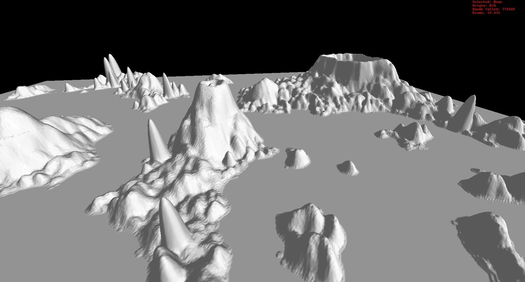
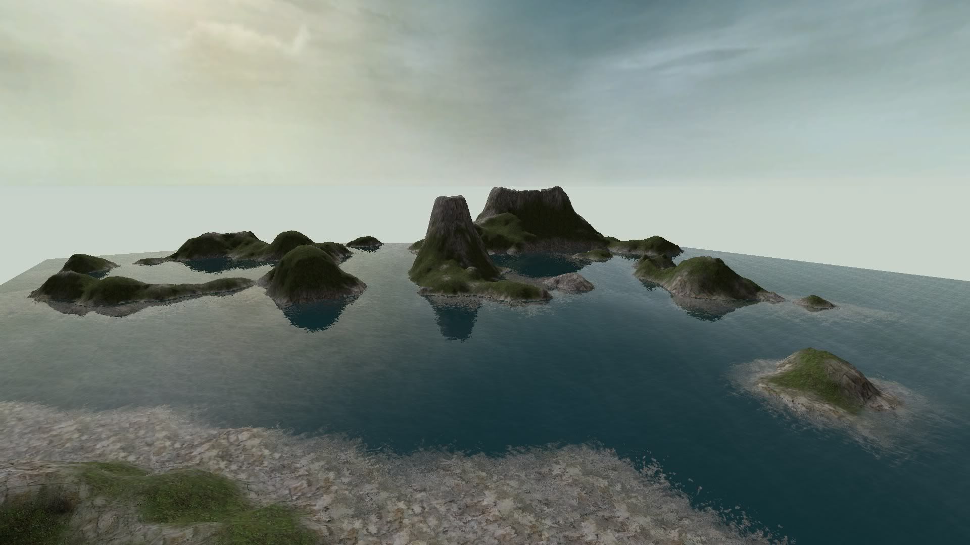
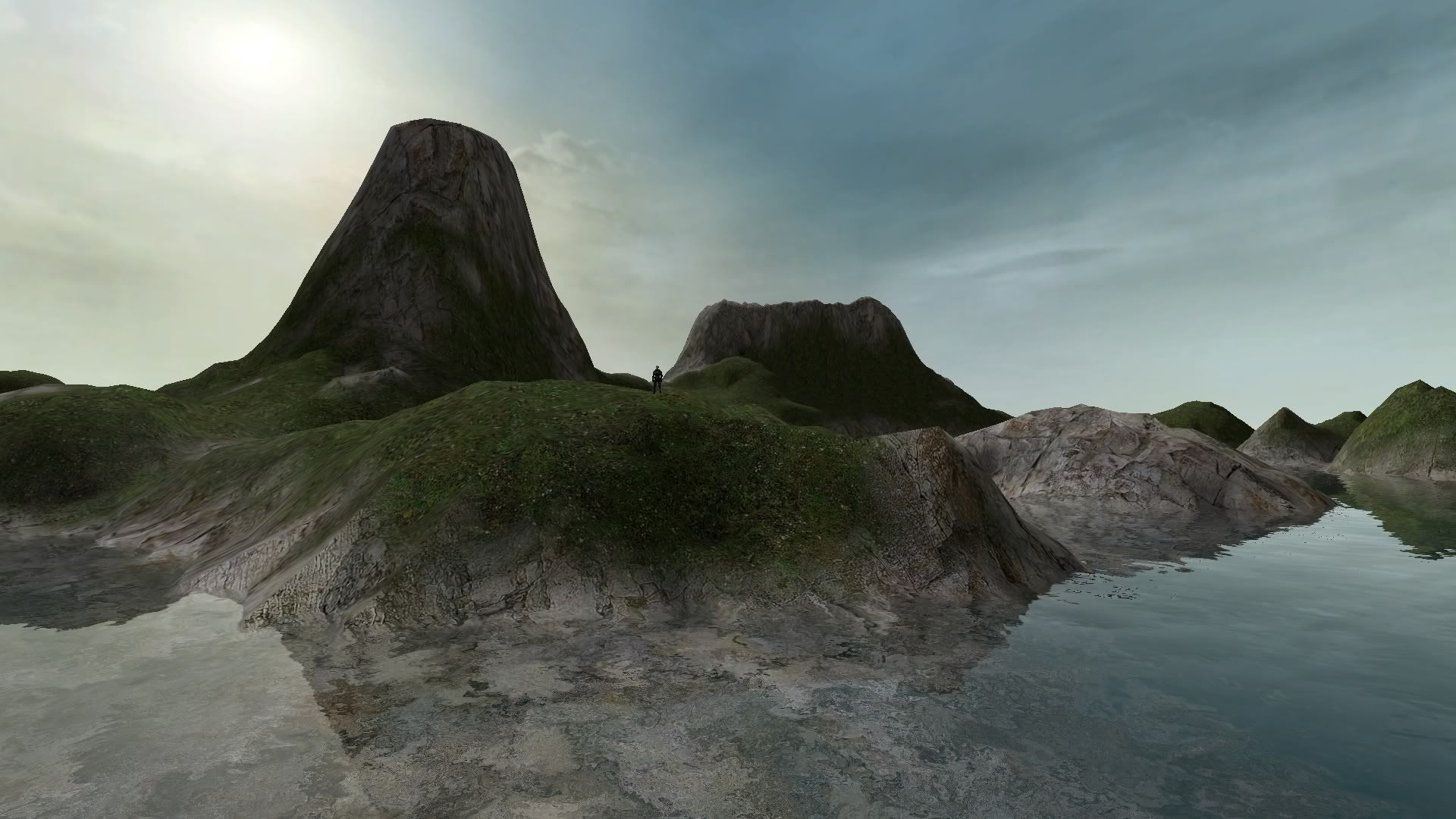
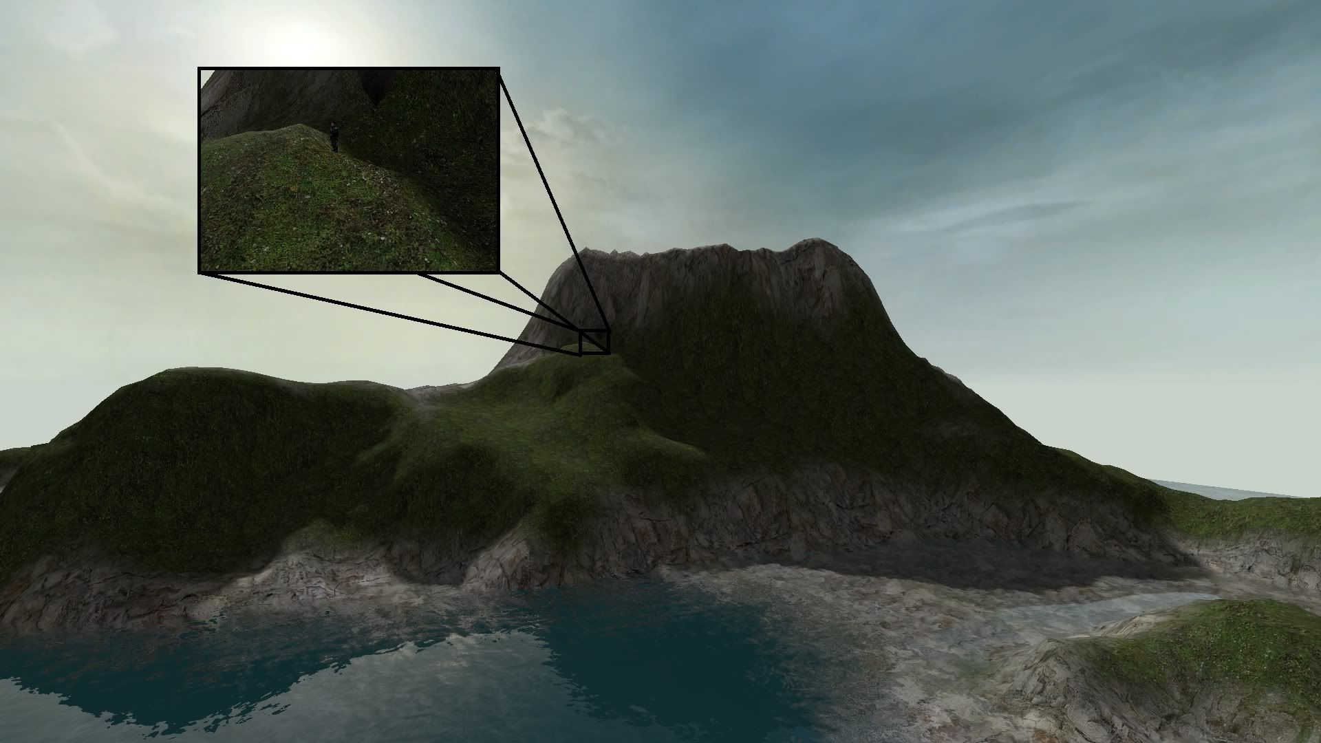
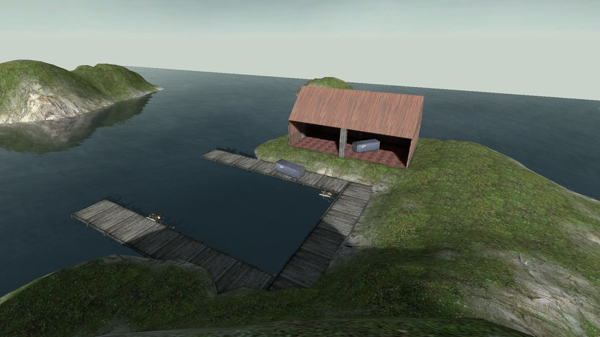
Secondary project I am working on for a Naval Battle mode.
Progression so far
Progression so far
Posted 14 years ago2010-05-03 13:28:42 UTC
Post #280963
needs a skybox to make the water endless but i'm sure that's on your to-do list. nice work so far 

Posted 14 years ago2010-05-03 14:43:35 UTC
Post #280964
Klobb: Nice stuff nice to see you around still! = )
Rim: yeah it sucks to lose work like that =(. I do manual backups to a seperate folder in my maps folder every hour or so of work, or if i change anything major...
DonPunch: Great stuff! = )
Rim: yeah it sucks to lose work like that =(. I do manual backups to a seperate folder in my maps folder every hour or so of work, or if i change anything major...
DonPunch: Great stuff! = )
Posted 14 years ago2010-05-04 00:05:25 UTC
Post #280972
I was totally expecting that to be gman 

Posted 14 years ago2010-05-04 02:50:41 UTC
Post #280973
heh, yea that pic was just to show scale.
Posted 14 years ago2010-05-04 21:09:55 UTC
Post #280977
Rebirth sucks. At least its better.
Posted 14 years ago2010-05-04 22:55:21 UTC
Post #280979
Solid mapping. The only thing I'd suggest is more rubbish/damage props and some colour in your lighting.
Posted 14 years ago2010-05-05 01:48:02 UTC
Post #280980
yes, lighting needs a tweakin.
May I suggest:
Combine lamp
Brightness 147 226 240 3000
Ambience N/A
Tungsten bulb
Brightness 254 216 146
Ambience N/A
Fluorescent bulb
Brightness 159 237 215
Ambience N/A
May I suggest:
Combine lamp
Brightness 147 226 240 3000
Ambience N/A
Tungsten bulb
Brightness 254 216 146
Ambience N/A
Fluorescent bulb
Brightness 159 237 215
Ambience N/A
Posted 14 years ago2010-05-05 02:50:35 UTC
Post #280982
the lighting is heaps dull. this is the zombie apocalypse!! that building needs to be torn to shreds with ceiling collapses and fires and shit! get some inventive lighting going imo. possibly try and turn it into a place that's being used by the survivors as a safehouse/stronghold to defend from oncoming zombies...
Posted 14 years ago2010-05-05 09:32:10 UTC
Post #280983
Working on all that. This is what I had by the end of last night.
Posted 14 years ago2010-05-05 16:09:18 UTC
Post #280989
The first steps in the making of CC:A World Gone Grey
that's all the name i'll display. you'll just have to wait to find out the full name.The screenshots of the first level so far.
that's all the name i'll display. you'll just have to wait to find out the full name.The screenshots of the first level so far.
Posted 14 years ago2010-05-05 16:35:51 UTC
Post #280991
Rim. It's still all too clean. Needs more ceiling tiles on the floor, scorch marks, etc.
Joebama: Looks interesting. I wonder how the rest will be.
Joebama: Looks interesting. I wonder how the rest will be.
Posted 14 years ago2010-05-05 17:48:07 UTC
Post #280993
@Rimrook: First picture seems blandish compared with the others. It's a little too neat.
Posted 14 years ago2010-05-05 19:10:29 UTC
Post #280997
Shit. Well ok i'll work on it.
EDIT: I just did +showbudget on this for the first time and the amounts are practically nothing. gj valve :]
EDIT: I just did +showbudget on this for the first time and the amounts are practically nothing. gj valve :]
Posted 14 years ago2010-05-05 21:16:33 UTC
Post #281002
@Joebama: Did you hand-draw those textures?
Posted 14 years ago2010-05-05 22:43:57 UTC
Post #281006
Ya know, there are at least 9 other areas I need to work on. :[
Posted 14 years ago2010-05-05 22:56:11 UTC
Post #281007
Better.
Posted 14 years ago2010-05-05 23:04:17 UTC
Post #281008
I'm going to add maybe 2 or 3 stains on the ceiling and do graffiti.
AND FOR THE LAST TIME! POST SOME WALL WRITING AND GRAFFITI! YOU ARE A PART OF THE BEERFORT! THE BEERFORT IS A PART OF YOU!
I left the walls mostly blank for that reason.
AND FOR THE LAST TIME! POST SOME WALL WRITING AND GRAFFITI! YOU ARE A PART OF THE BEERFORT! THE BEERFORT IS A PART OF YOU!
I left the walls mostly blank for that reason.

Posted 14 years ago2010-05-05 23:44:53 UTC
Post #281009
I'll scan the scribbles I showed you tomorrow probably 

Posted 14 years ago2010-05-06 03:12:19 UTC
Post #281011
Prop work is nice, but... yellow lighting = icky.
Go for contrasting colours (like very faint blue and orange) for common light sources, they'll add a bit of hostility to the scene.
Then use more intense coloured lighting on rare feature lights, like fires, spotlights etc.
Go for contrasting colours (like very faint blue and orange) for common light sources, they'll add a bit of hostility to the scene.
Then use more intense coloured lighting on rare feature lights, like fires, spotlights etc.
Posted 14 years ago2010-05-06 08:16:49 UTC
Post #281016
yeah that yellow lighting is gross... strongly recommend decompiling valve maps just to see how they do their lighting. or use the ones which are freely available (idk if there are any for l4d2...)
Posted 14 years ago2010-05-06 12:04:16 UTC
Post #281019
I might do you some graffiti when I get home.
Posted 14 years ago2010-05-06 12:28:23 UTC
Post #281020
Rim that looks wicked! i really need to buy l4d2...
Posted 14 years ago2010-05-06 16:43:40 UTC
Post #281022
Yes, all the textures in the mod will be handdrawn
Posted 14 years ago2010-05-06 16:56:14 UTC
Post #281023
Posted 14 years ago2010-05-06 17:18:52 UTC
Post #281024
NOOOOOOOOOO! Someone had the idea before me!

It's on an older engine though. Nothing for Half-Life yet.

It's on an older engine though. Nothing for Half-Life yet.

Posted 14 years ago2010-05-06 18:43:35 UTC
Post #281025
My first real source map, a supermarket:It going VERY slowly, tho i try to work on it at least a little bit every day. Originally it was to be for CS:S but i may change it over to a L4D survival map....
Posted 14 years ago2010-05-06 18:45:51 UTC
Post #281026
Looks good Terror! The lot looks very blank though, but I assume that'll change in time.
Posted 14 years ago2010-05-06 19:52:56 UTC
Post #281027
ha thanks! =)
and chea, definitely i need to add more things to the lot tho i have no idea what i'm going to put in there, besides more cars and shopping carts of course, lol.. =)
1 sides of the map will be bordered by mini wood stockade fence and a denny's resturant, and three other sides will be borderd by streets and buildings beyond, with 3d skybox. the playable area tho will be limited to the parking lot and inside the super market.
Posted 14 years ago2010-05-06 21:14:09 UTC
Post #281028
I want to post some screens of what I'm working on, but I can't get those giant yellow boxes that enclose props to go away /sigh.
Here's a pic anyway.
Here's a pic anyway.
Posted 14 years ago2010-05-06 21:20:09 UTC
Post #281029
Looks good. Might I make one suggestion at this point?
Turn the brushwork paint lines into decals- it looks a bit off, and will probably increase compile times a bit.
Other than that, looks great. Can't wait. (even though I have neither CS:S or L4D yet :P)
Turn the brushwork paint lines into decals- it looks a bit off, and will probably increase compile times a bit.
Other than that, looks great. Can't wait. (even though I have neither CS:S or L4D yet :P)
Posted 14 years ago2010-05-06 21:36:04 UTC
Post #281030
"Turn the brushwork paint lines into decals"
I'm not exactly sure what you mean by this. Can you elaborate?
EDIT: Never mind, that was for Terror xD
I'm not exactly sure what you mean by this. Can you elaborate?
EDIT: Never mind, that was for Terror xD
Posted 14 years ago2010-05-06 21:40:11 UTC
Post #281031
On those parkinglot stripes, you could try to nodraw the sides and bottoms of the brushes on all of them, then make them a little bit transparent to blend more with the surface below them. Just a thought.
Posted 14 years ago2010-05-07 00:51:58 UTC
Post #281033
It would be much better for performance if they were decals. They'd look nicer, too, with no hard edge.
Posted 14 years ago2010-05-07 02:02:55 UTC
Post #281034
Some supermarkets have a sort of tents to leave carts under (to protect them from weather), I guess you could put a few of those.
Also, those windows look awful
Also, those windows look awful

Posted 14 years ago2010-05-07 13:51:10 UTC
Post #281038
de_aztecruins. My first counter strike condition zero map. Just started.
Posted 14 years ago2010-05-07 13:58:44 UTC
Post #281039
I used to play CSCZ... a while ago, I admit, but nevertheless that is looking very good for a gldsrc map. I wont give you constructive critism because you said you just started.
EDIT: Would show you one of my upcoming maps, however Valve decided to break the grids in the EP2 SDK.
EDIT: Would show you one of my upcoming maps, however Valve decided to break the grids in the EP2 SDK.
Posted 14 years ago2010-05-07 17:48:02 UTC
Post #281044
Yea plus you can't tell much from a screen shot. And it will look much different when finished.
Posted 14 years ago2010-05-07 23:35:49 UTC
Post #281046
I can't get those giant yellow boxes that enclose props to go awayIn hammer options, 3D views or general tab. Can't remember which. There's a slider for "model render distance"
Posted 14 years ago2010-05-08 22:20:40 UTC
Post #281081
Thanks all for comments i will look into decal creation or i might try rims method in nodrawing the edges and making them partially transparent, just because i feel it gives much more flexibility adding the parking stripes. (if i take the extra work and brush them directly into the floor, they look perfect, but i don't know if i feel like doing the extra brushwork, lol)
Zeeba: looks sweet man!
Zeeba: looks sweet man!
)
Posted 14 years ago2010-05-09 09:13:15 UTC
Post #281094
Deving out a new multiplayer map. All brush and lighting work so far, no models except for batteries as item placeholders. Floating lights are to mark lighting positions.
Posted 14 years ago2010-05-09 11:38:08 UTC
Post #281100
nice maps ^^
source engine does well job!
i wonder how u guys map so cool maps without dynamic lighting in map editor:)
i have been working on CS 1.6 map
source engine does well job!
i wonder how u guys map so cool maps without dynamic lighting in map editor:)
i have been working on CS 1.6 map
Posted 14 years ago2010-05-09 16:55:11 UTC
Post #281112
TF2 map, Strider?
Posted 14 years ago2010-05-09 17:01:03 UTC
Post #281113
Wait, green dev texers?
It better be a HL2DM map.
It better be a HL2DM map.
You must be logged in to post a response.


