Post your screenshots! WIP thread
Created 17 years ago2007-12-16 00:58:58 UTC by
 doodle
Created 17 years ago2007-12-16 00:58:58 UTC by
![]() doodle
doodle
Posted 14 years ago2010-07-15 23:47:28 UTC
Post #283084
i like the damaged hev arm more. 

Posted 14 years ago2010-07-16 04:17:18 UTC
Post #283091
I borrowed a sleeve from the ones I had and modeled a new Hand. Looks really good. I wasn't going to remake the sleeve since... well its like beating a dead headcrab.The HL1 Chrome effect is balls on view models anyway.
Posted 14 years ago2010-07-16 06:05:57 UTC
Post #283092
Nice job.
Posted 14 years ago2010-07-16 13:44:42 UTC
Post #283102
not if you make it additive and overlay the chrome on the hev. I've seen it done, it looks nice.
Posted 14 years ago2010-07-17 09:20:24 UTC
Post #283130
You would have to double your poly count for that to happen and it would still not exactly look right. The chrome effect is best for world models like Barney's helmet.
Posted 14 years ago2010-07-18 13:51:52 UTC
Post #283151
Short trailer video of the Supercars II Mod, a fun remake of a racing game from 1991 where you compete with friends and AI in cars equipped with rocket launchers and a bunch of other purchasable upgrades.
http://www.youtube.com/watch?v=MyRMmu2skZ4Enjoy
http://www.youtube.com/watch?v=MyRMmu2skZ4Enjoy
Posted 14 years ago2010-07-19 00:44:39 UTC
Post #283160
More small progress on "My Dream"Don't worry, not all of the CenCom labs will look like this.  Also, Jerkin' That
 Also, Jerkin' That
Posted 14 years ago2010-07-19 01:24:18 UTC
Post #283162
You really need to fix the lightning there. It's very blank and monotonous. And ughh.. yellow, yuck!
Posted 14 years ago2010-07-19 12:09:20 UTC
Post #283176
It doesn't help that the bulb is yellow.
But, I guess.
But, I guess.
Posted 14 years ago2010-07-19 12:26:44 UTC
Post #283178
Normally i'd say the lighting is boring and bland and that you should add more colors, but this is a dreammap, so i guess its fine. There's no reality in dreams.
Posted 14 years ago2010-07-19 12:45:16 UTC
Post #283179
^ True that, But by no means it will give him a better rating than upgraded lighting. Sure It's a dream so It doesn't require realistic lighting, but what stops him from "dreaming" better lighting and hence upgrading his current one for more ratings?
Edit: My maps are going to be shorter than planned, (They're still big however.) Since I am going on a holiday on the 22nd for two weeks. I have some pressure on me, since I haven't finished the major tweaking for my second map (which took around 5 days for my first map). I'll try to finish it within these 3 days and tweak it for the remaining 5 when I get back. I'm satisfied with the results of my map however. I've had doubts if it's dreamy enough, but I hope the random changes of environment and the unlisted stuff is good enough.
Edit: My maps are going to be shorter than planned, (They're still big however.) Since I am going on a holiday on the 22nd for two weeks. I have some pressure on me, since I haven't finished the major tweaking for my second map (which took around 5 days for my first map). I'll try to finish it within these 3 days and tweak it for the remaining 5 when I get back. I'm satisfied with the results of my map however. I've had doubts if it's dreamy enough, but I hope the random changes of environment and the unlisted stuff is good enough.
Posted 14 years ago2010-07-19 14:41:55 UTC
Post #283182
Do you actually pay any attention to the lighting in your dreams? Because I never have. Ever. I could very well be dreaming in wireframe and I'll never know.
I doubt it, though. I suppose the lighting in my dreams is like the diffuse lighting in overcast days.
I doubt it, though. I suppose the lighting in my dreams is like the diffuse lighting in overcast days.
Posted 14 years ago2010-07-19 18:11:50 UTC
Post #283207
Next low-poly model is going to be a bot with no hands, canons instead..
Here's a concept piece that I'm going for.
Also, sorry but the scanner is downstairs packed away, and I'm to lazy to fetch it.. I just took a quick pic. of my sketch.
Here's a concept piece that I'm going for.
Also, sorry but the scanner is downstairs packed away, and I'm to lazy to fetch it..
 I just took a quick pic. of my sketch.
Posted 14 years ago2010-07-20 00:37:43 UTC
Post #283224
Joebama, I agree with the masses that it is quite... yellow.
Although sounds and entity work could add so much more that we're not seeing. Cant wait to see how it all develops.Joebama thinks it's sexy so i posted it.
Some more spoilers/teasers/progress on my map.
I know. It's just a displacement, sprite, and some models, but hey... it looks nice.
Although sounds and entity work could add so much more that we're not seeing. Cant wait to see how it all develops.Joebama thinks it's sexy so i posted it.
Some more spoilers/teasers/progress on my map.
I know. It's just a displacement, sprite, and some models, but hey... it looks nice.
Posted 14 years ago2010-07-20 15:57:20 UTC
Post #283273
Your map looks very dreamy tetsuo. Nice!
Posted 14 years ago2010-07-22 19:48:55 UTC
Post #283337
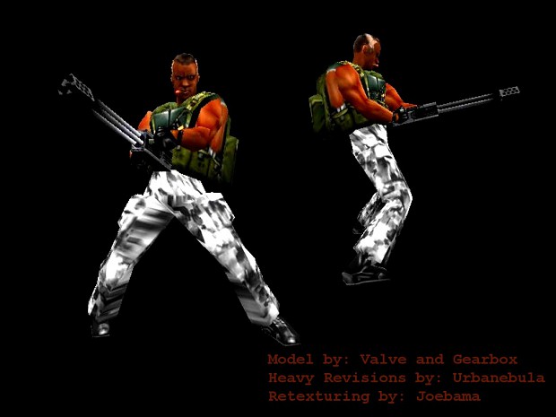
Nothing but awe from anyone who has seen it.
Take a look at his cigar, it almost looks like it's burning.
Take a look at his cigar, it almost looks like it's burning.
Posted 14 years ago2010-07-22 20:10:58 UTC
Post #283338
Looks good, guys. But you two may want to look into fixing the arms- they look a bit odd with all that skin showing on the sides. And is it just me, or do his shoes point backwards in the side view?
If this is for Urby's SP mod, I suggest making the cigar emit a smoke sprite ingame. (I assume it is because he remodeled it)
If this is for Urby's SP mod, I suggest making the cigar emit a smoke sprite ingame. (I assume it is because he remodeled it)
Posted 14 years ago2010-07-22 21:12:45 UTC
Post #283339
The chest stretches, there really isn't that much skin showing. (on the texture itself, that is)
Posted 14 years ago2010-07-22 21:22:40 UTC
Post #283340
Well, get Urby to fix the stretching then. It makes it look silly.
Posted 14 years ago2010-07-22 23:04:23 UTC
Post #283342
Haha, tell that to Valve.
Posted 14 years ago2010-07-22 23:27:17 UTC
Post #283343
I have decided to start scripting.
Doesn't look like much, but that scene took about 1.5 hours to get right.
Doesn't look like much, but that scene took about 1.5 hours to get right.
Posted 14 years ago2010-07-23 00:35:27 UTC
Post #283344
the girl's face looks like she's in awe
maybe she just saw the rendering of the new hassault. lol jk, looks like a good start. I can't script sequences worth a shit so yeah.
maybe she just saw the rendering of the new hassault. lol jk, looks like a good start. I can't script sequences worth a shit so yeah.
Posted 14 years ago2010-07-23 08:20:25 UTC
Post #283345
Proof i'm still working on my c28 entry:Very slow going but i won't quit.(chess piece is a gag just wanted to see what it would look like) =)
Joe: kinda looks the same to me as the last one, but it's decent! You already know what i think about most of those default hl textures, and i also agree about the yellow lighting,
urby/joe: op4 model looks great!
Tetsu0: that looks awesome!(you are reminding me how badly my entry lacks varied terrain.) =) are those trees from ep2? and if so, would i be able to use them in my cs:s map?
I need to do some scripting for my map too, but i'm afraid since i never done any before, even did HL1.. =(
Posted 14 years ago2010-07-24 11:02:39 UTC
Post #283392
theres a thought, someone should make the game chess in source.. It would be awesome!
Anyway, some update on my latest character. Having a real hard time with his legs.. His arms are cannons but they seem to short.. once the legs are done I'll start to think about scale.
Backstory of the concept;
I was actually going to 'Sam's Restaurant' for lunch one day at going in, they have a 25 cents machine out front with little Hershy cube-like chocolates.. so I got one. Once seated, I ate the tiny chocolate bar.. then with the wrapper, I crushed it into a little ball. The candy wrapper then looked like a head, so once home I sketched it.
Moral of story; Inspiration can come from anywhere! I took a snapshot with my camera of the wrapper next to the sketch, I'll have to got it and upload it for you guys..
Anyways, progress;
my poly limit is 2000. Right now its at 1176.
Anyway, some update on my latest character. Having a real hard time with his legs.. His arms are cannons but they seem to short.. once the legs are done I'll start to think about scale.
Backstory of the concept;
I was actually going to 'Sam's Restaurant' for lunch one day at going in, they have a 25 cents machine out front with little Hershy cube-like chocolates.. so I got one. Once seated, I ate the tiny chocolate bar.. then with the wrapper, I crushed it into a little ball. The candy wrapper then looked like a head, so once home I sketched it.
Moral of story; Inspiration can come from anywhere! I took a snapshot with my camera of the wrapper next to the sketch, I'll have to got it and upload it for you guys..

Anyways, progress;
my poly limit is 2000. Right now its at 1176.
Posted 14 years ago2010-07-24 11:33:33 UTC
Post #283394
yeah the trees are from Ep2.
And i'm having a hard time using custom sounds. I have the time so i might as well do some voice acting. only thing is now i need to figure out how to get the mouths to move with the sound.
There's gotta be a tutorial around somewhere.
That and i need a higher quality mic... hmm...
There's only so much of a story you can tell without your own script. lmao.
Posted 14 years ago2010-07-24 12:37:42 UTC
Post #283396
I was going to do voice acting for my compo. Then I realized my voice is still shit as far as recording goes.
EDIT: Some pics of misc areas I've been working on;And yes, I know I still have to decrease the lightmap on the first, and I know the third has horrid green lighting.
EDIT: Some pics of misc areas I've been working on;And yes, I know I still have to decrease the lightmap on the first, and I know the third has horrid green lighting.
Posted 14 years ago2010-07-24 18:02:37 UTC
Post #283400
The "horrid green lighting" gives a different ambience. The foreground lighting makes it look like a beautiful warm summer morning, while that greenish glow back there gives me an uneasy feeling. As if something wasn't so bright and pretty and warm. You might want to use that to your advantage.
Posted 14 years ago2010-07-25 11:15:44 UTC
Post #283418
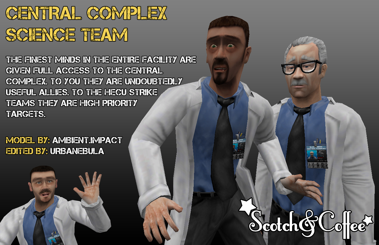
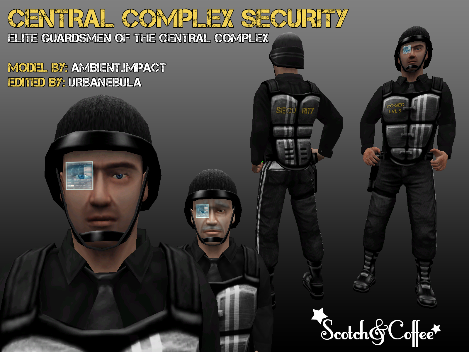
Been busy on the mod recently. Mostly hacking together new models but there's a little mapping going on too....and a WIP map remake.Currently looking for a coder at the moment if anyone here is / knows of one. 

Posted 14 years ago2010-07-25 12:44:48 UTC
Post #283421
"Holographic Eye... Burns into your soul..."
Posted 14 years ago2010-07-25 13:06:40 UTC
Post #283422
Looks SICK urby. Good work!
Posted 14 years ago2010-07-25 22:12:32 UTC
Post #283471
The "horrid green lighting" gives a different ambience. The foreground lighting makes it look like a beautiful warm summer morning, while that greenish glow back there gives me an uneasy feeling. As if something wasn't so bright and pretty and warm. You might want to use that to your advantage.That's exactly why I'm using it. I was just expecting someone to come and say "yuck, change that green lighting"

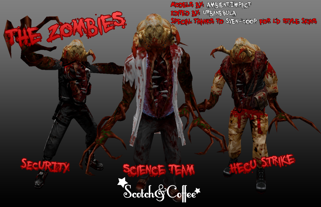
Urby: Looks good! But is it just me, or does the Security Zombie have metrocop pants?
Posted 14 years ago2010-07-25 22:33:36 UTC
Post #283472
Unless the security guard two pictures below it has them too, it's just your impression.
Posted 14 years ago2010-07-26 00:51:47 UTC
Post #283473
3 pictures.
Yes i am just posting this so you can't correct it.
Yes i am just posting this so you can't correct it.
Posted 14 years ago2010-07-26 01:24:03 UTC
Post #283474
Wow Urby those screens are really hot.. Good luck with the coder I'm not sure why you need 1.. But if it's just for the custom models then you can easily replace them or add them as seperate skins that's how we did it in my mod. In that case you need a skinner. Should you add new monsters however with new sounds and ai or things like fog then yes. Then you need a coder.
Posted 14 years ago2010-07-26 08:02:13 UTC
Post #283476
I expect he's using Spirit, but probably needs new weapons or monsters that can't be made with the original HL AI.
Posted 14 years ago2010-07-26 14:15:43 UTC
Post #283495
Sick stuff y'all! =)
Small addition to my cubicles map comin in hott:I don't know why i keep working on this, but sometimes you have to map where your inspiration lies, right?
Small addition to my cubicles map comin in hott:I don't know why i keep working on this, but sometimes you have to map where your inspiration lies, right?
Posted 14 years ago2010-07-26 15:28:32 UTC
Post #283496
Not willing to criticise your modelling skills, but you gotta accept that the car does look a bit blocky.
Posted 14 years ago2010-07-26 16:02:23 UTC
Post #283500
Stu, stop nitpicking; but you're right. 

Posted 14 years ago2010-07-26 21:09:02 UTC
Post #283510
lol Stu, you're a dick
Posted 14 years ago2010-07-26 21:26:17 UTC
Post #283511
Captain Terror that's my dev texture on that floor! I've been looking all over for it, give it back!
Posted 14 years ago2010-07-26 21:46:05 UTC
Post #283512
Thats some sick brush work captain!
Posted 14 years ago2010-07-26 23:57:38 UTC
Post #283514
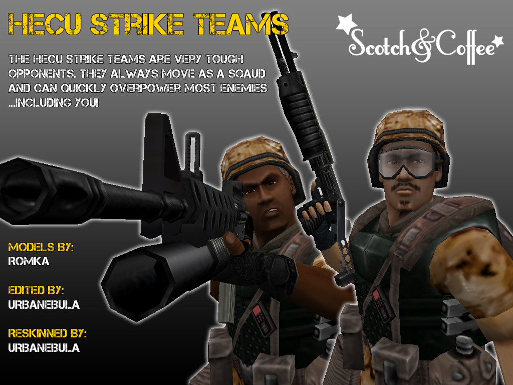
Urby I'm liking the Marines that are actually in something resembling Desert Marpat instead of that winter/urban shit.
Posted 14 years ago2010-07-27 12:38:17 UTC
Post #283527
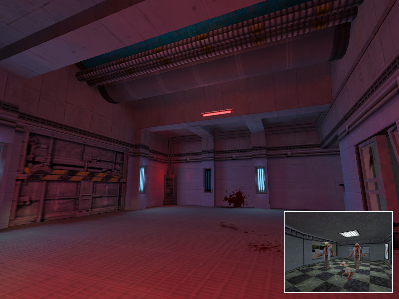
Progress on remaking my "Aquatos" map. (Xen aquarium)
Posted 14 years ago2010-07-27 14:25:23 UTC
Post #283530
that hallway looks pretty slick 

Posted 14 years ago2010-07-27 15:32:15 UTC
Post #283534
That's the sterilization chamber before you enter the Experimental Laboratories.
thanks
thanks
Posted 14 years ago2010-07-27 17:52:06 UTC
Post #283539
Joebama you need to stop using so many yellow lights. Just mix it up a bit and add some color.
Posted 14 years ago2010-07-27 18:10:34 UTC
Post #283540
yeah i already fixed that problem
thanks for the advice though
thanks for the advice though
Posted 14 years ago2010-07-27 18:11:14 UTC
Post #283541
Thanks for the comments.
For those who asked, I need a coder to implement a note system and a keypad security system. The mod has a slight puzzle element to it, but its entirely optional. You won't find a door that requires a code that prevents you progressing the campaign, but you will receive weapons earlier by opening security lock ups and such.
@JeffMOD: That's just the design of the security uniform.
Posted 14 years ago2010-07-27 18:21:42 UTC
Post #283542
@ Urby
Keypad system: http://www.twhl.co.za/vault.php?map=5389
It might need a little editing but it should work.
Keypad system: http://www.twhl.co.za/vault.php?map=5389
It might need a little editing but it should work.
Posted 14 years ago2010-07-27 18:40:24 UTC
Post #283543
moar updates!!!!
You must be logged in to post a response.


