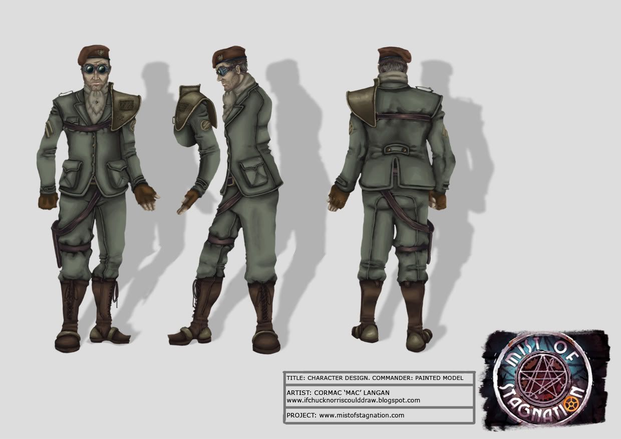
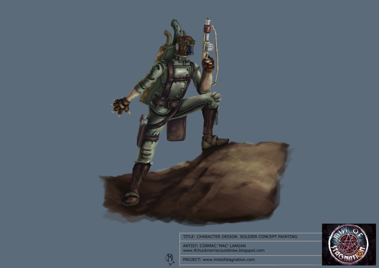
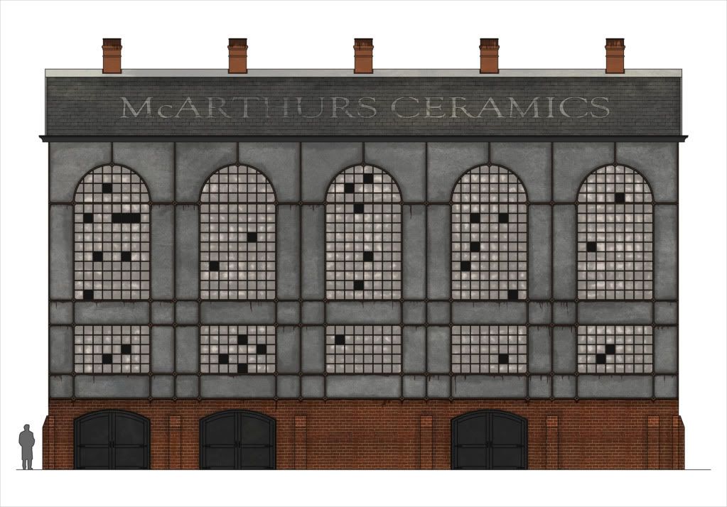
Mist of Stagnation is a multiplayer conversion of Half-Life 2 that will put you into fast paced, objective based game play, in a Steam Punk world. Two teams will battle for control of the few remaining resources left on the war ridden planet, in order to advance their technology.The core game play will be based on gathering resources in the forms of Control Points, to then be used by a ?Commander System? to build upgrades for their team. Upgrades to weapons, vehicles, and armor to name a few will be the fundamentals for a winning team.
Can you survive as the Commander, or work your way up the chain of command and lead your team to victory? Will you fight on the front lines or lead from the rear? Can you make the important decisions that will determine the outcome of the battle, or are you a natural born killer? Throw on some goggles and lace up your boots, salvation lies ahead in the Mist of Stagnation.
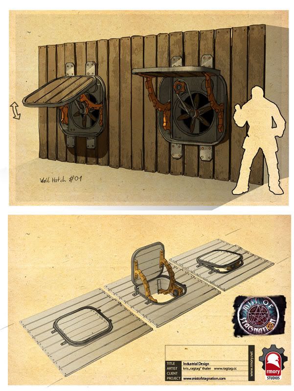
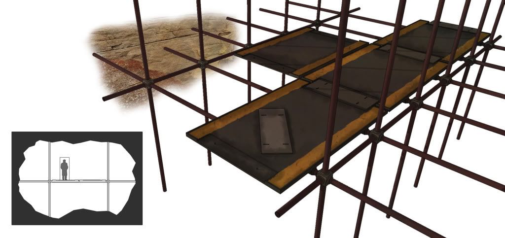
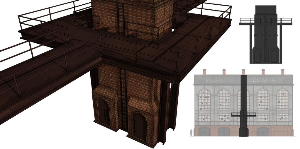
Some Concept art:Moddb - http://www.moddb.com/mods/mist-of-stagnation
Offical website - http://mistofstagnation.com
Offical forums - http://mistofstagnation.com/forums
Mist of Stagnation
Created 14 years ago2010-10-12 00:57:17 UTC by
 Don Punch
Created 14 years ago2010-10-12 00:57:17 UTC by
![]() Don Punch
Don Punch
Posted 14 years ago2010-10-12 00:59:48 UTC
Post #286300
Posted 14 years ago2010-10-12 03:25:26 UTC
Post #286302
Nice concept art.
Does this have anything to do with the Lovecraft mythos anymore (that was your old mod idea, right?), because it seems a bit odd to be using the Necronomicon 'seal' if it's no longer related.
Does this have anything to do with the Lovecraft mythos anymore (that was your old mod idea, right?), because it seems a bit odd to be using the Necronomicon 'seal' if it's no longer related.
Posted 14 years ago2010-10-12 06:37:51 UTC
Post #286306
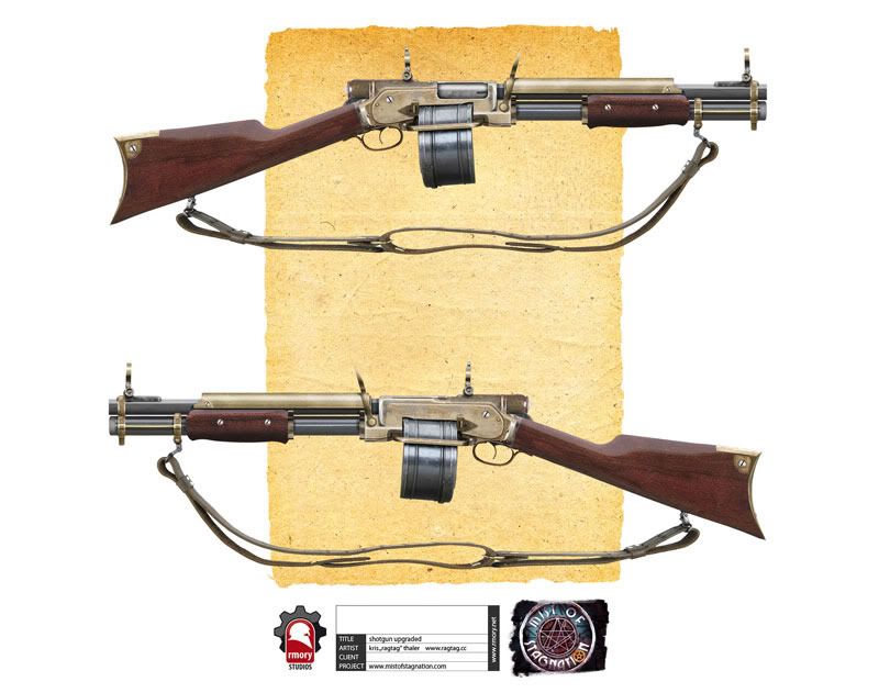
Nice. I like your concept art- especially the drum-fed unit.
Good Luck on this!
Good Luck on this!
Posted 14 years ago2010-10-12 10:16:40 UTC
Post #286309
concept art looks real nice.
Posted 14 years ago2010-10-12 12:32:38 UTC
Post #286315
@ strider
The Singleplayer/CoOp side will still be as talked about earlier, we decided to build a playerbase faster with a MP game though.
The Singleplayer/CoOp side will still be as talked about earlier, we decided to build a playerbase faster with a MP game though.
Posted 14 years ago2010-10-12 14:36:54 UTC
Post #286318
almost reminds me of a natural selection gameplay. with resource nodes an commanders. but that isn't a bad thing at all! I'm tracking this thread to keep tabs
Posted 14 years ago2010-10-12 16:02:24 UTC
Post #286320
The idea is real good and I think this would be pretty successful if done correctly, but the amount of coding required for it would be massive. If you've got the knowledge to do all that why don't you just do the whole thing in unreal engine and then sell it? 

Posted 14 years ago2010-10-21 13:07:59 UTC
Post #286565
Some of you have started coming to see us at the forums, and we thank you for the support.
We have recently added a new modeler to the group who will primarily be working on player models, but decided to knock out one of our prop concepts while we wait for the finishing touches on our player concept art.And a WIP demo of this model in alpha stages
http://www.youtube.com/watch?v=Kr-fYKWwvo0
Our composer has been working on our theme music for a while now too, and I am glad to share it with you guys. It captures the mood of the mod perfectly.
http://www.moddb.com/mods/mist-of-stagnation/videos
Work continues on the level design, weapons modeling, and player concepts. Next update will have a preview of one of the maps for the Attack/Defend game mode. If it is ready, I will also add some teasers of the player concept wips.
We are still reviewing applications for Level Desingers, so if you are interested we will be deciding by the end of the weekend.
Thanks for stopping in to see us, and be sure to keep your goggles on tight.
Posted 14 years ago2010-10-21 20:54:15 UTC
Post #286571
sent ya a pm, and im on the forums over at MOS
Posted 14 years ago2010-10-21 21:03:53 UTC
Post #286572
cool, replied
Posted 14 years ago2010-10-22 02:58:55 UTC
Post #286573
I wanted to say I'm interested, but then I saw Tetsu0 applied, so I backed down.
Posted 14 years ago2010-10-23 22:02:00 UTC
Post #286590
bleh, i might be interested but i want to see some level design screenshots before i bother with anything.
Posted 14 years ago2010-10-24 11:13:22 UTC
Post #286595
lol skals, why?
Posted 14 years ago2010-12-27 01:56:11 UTC
Post #288249
An exclusive teaser for TWHL. We will have a huge media release this Wednesday. Weapon models, character concepts, music, maps, and more.
Posted 14 years ago2010-12-27 02:59:19 UTC
Post #288250
I'm liking where this is going.
Posted 14 years ago2010-12-27 03:03:49 UTC
Post #288251
Not looking bad, but the background bit (outside the window) needs work - especially with the lighting.
Posted 14 years ago2010-12-27 06:08:41 UTC
Post #288252
I'm thinking that's looking quite nice bro. If you can create an entire mod as good as that screen shot you may have a winner!
Posted 14 years ago2010-12-29 01:13:55 UTC
Post #288297
We have all been very busy since our last update, and we want to share with you our progress.
We have added some new people to the team, and we are moving along nicely. 1st I would like to show you some of the new assets the team has been working on.
I want to start you all off with some new music written and performed by our talented secretcaptivation. Enjoy it as you browse through this news post.
http://www.youtube.com/watch?v=5hgjK0HtItI
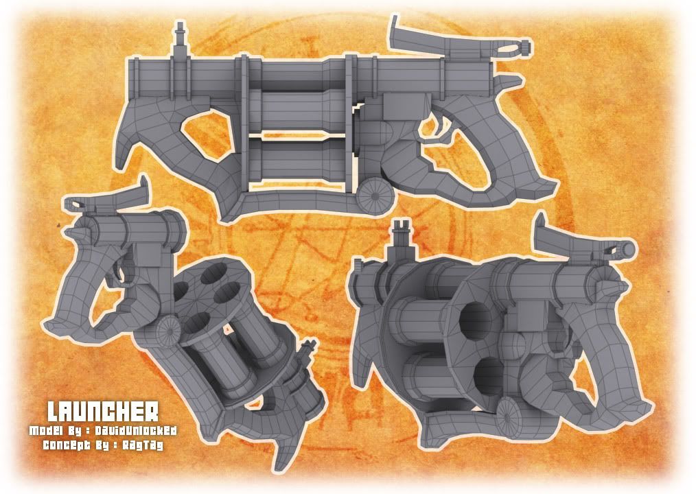
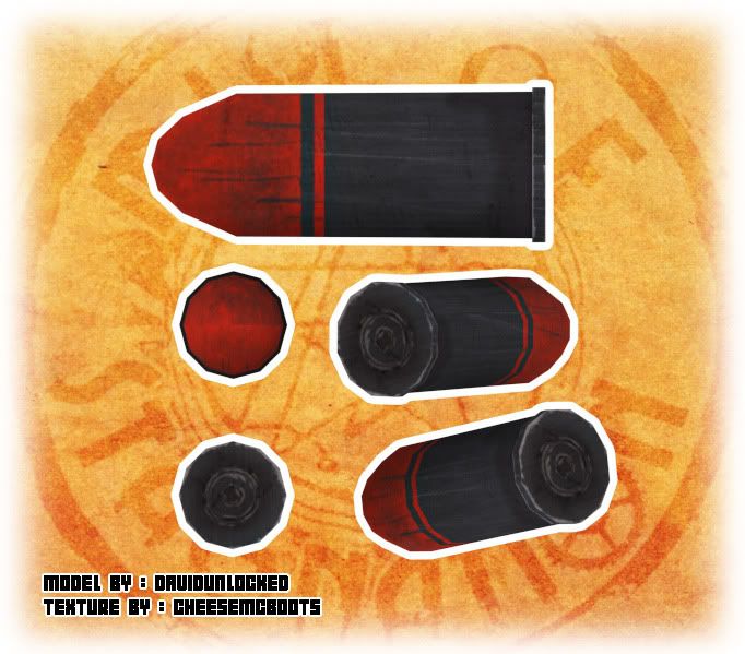
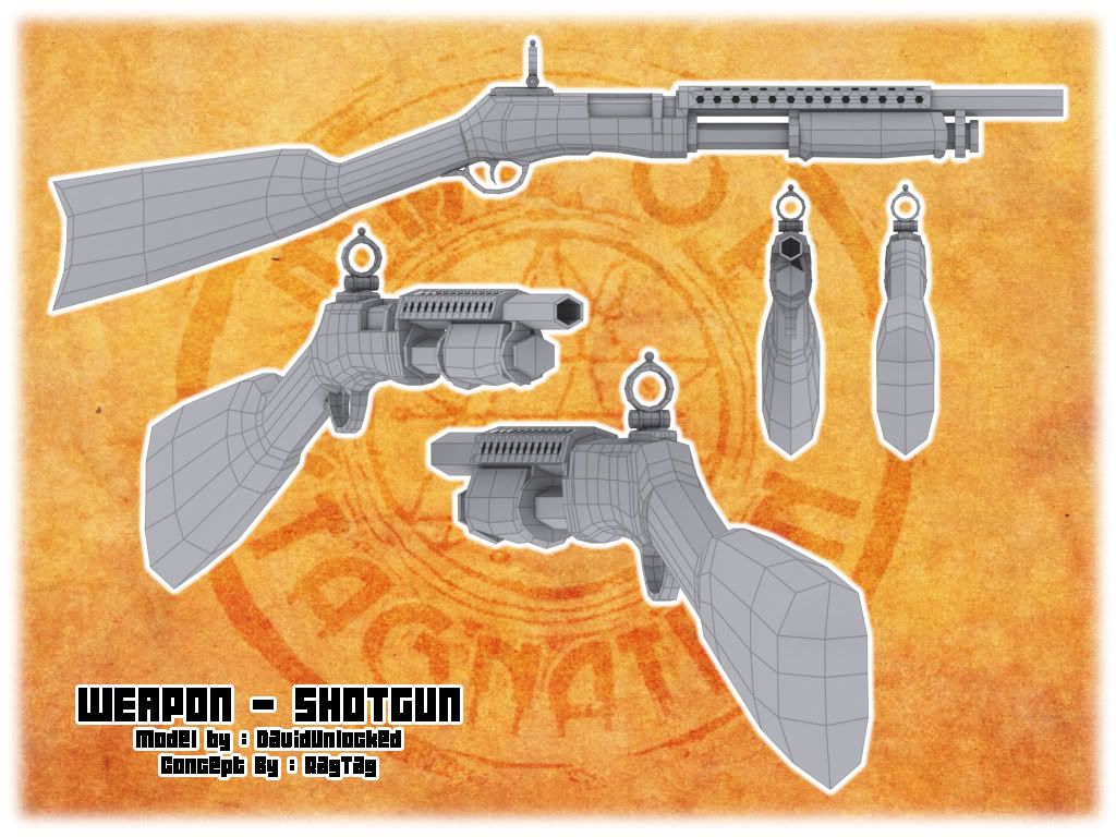
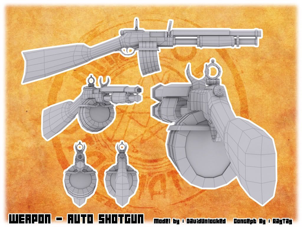
With the addition of DavidUnlocked, our weapon modeling & animation have been moving ahead very quickly.concept by RagTagModels by DavidUnlocked, texture and skinning by cheesemcboots
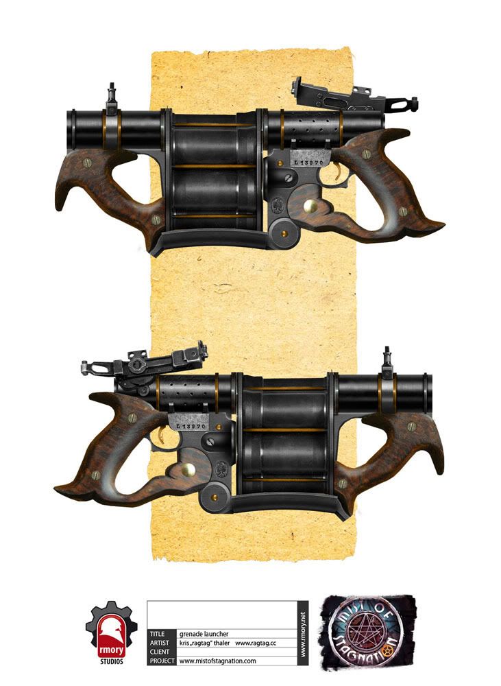
This should be a favorite among many. A heavy damage weapon with splash damage, and a slow rate of fire. Ammo will be limited on this monster of a weapon.
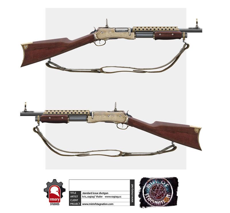
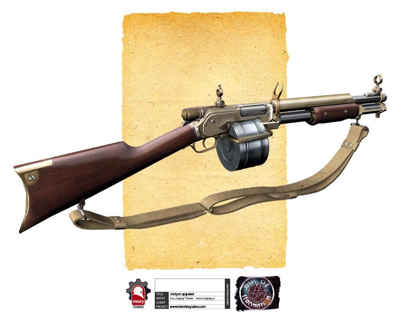
This is an example of our upgrade system for weapons.For the initial beta, there will be 3 upgrades to the shotgun:
The sights for improved accuracy, the Drum system for extra ammo, and the full auto upgrade for rapid fire.
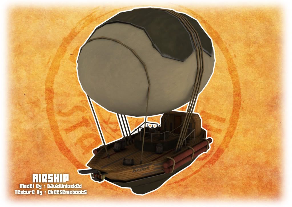
To complement our maps, we have also made a variety of map models, but this one deserves a little bit more attention than the rest.
Ladies and Gentlemen, I present the SS Maria.Model & concept by DavidUnlocked, Texture by cheesemcboots.
Artwork
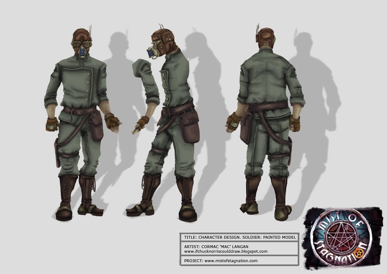
Our character artist Cormac ?Mac' Langan has been hard at work too with some very nice concepts for us. He has been very patient with me and is truly one who can take notes, and take them well.Cheesemcboots has also been very busy outside of texture mapping our models, and giving us mappers a bit of inspiration.Mapping
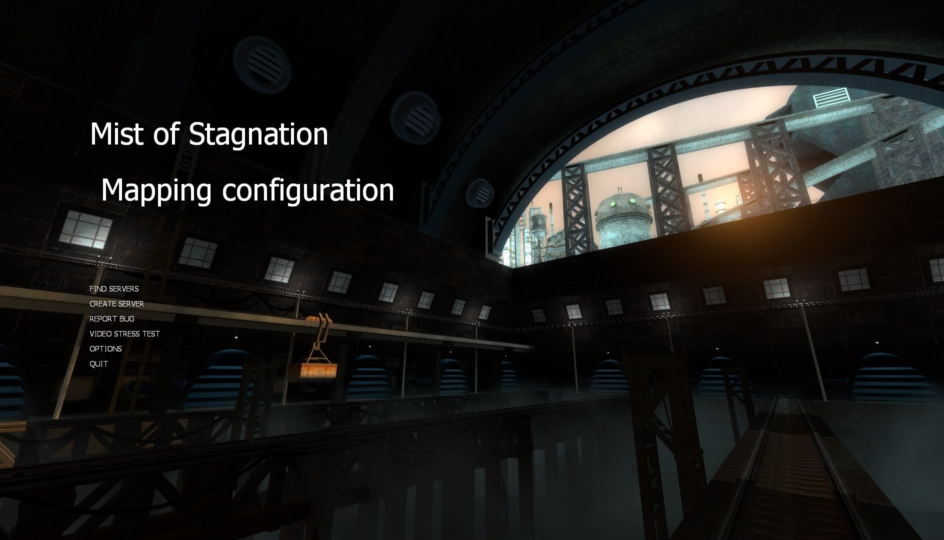
Last I would like to show you the background menu map we have been working on.http://www.youtube.com/watch?v=cAIWx8SLgdw
We have also started our weekly ?Meet the Team' news posts on the official MoS forums. Get to know some of the lunatics making this mod, you might just find some extra goodies along the way.
We are currently looking to expand our team in the mapping department. If you are interested, please contact DonPunch on Moddb.com or on mistofstagnation.com.
*Needs to be a self motivated individual with experience in multiplayer mapping (TF2, CSS, DoD:S, etc).
*Ability to work with and without provided concept art.
*Have released finished maps in the past.
*Be able to spend at least 10 hours a week on level design.
Moddb Page: http://www.moddb.com/mods/mist-of-stagnation
Offical Site: http://mistofstagnation.com/
Offical Forums: http://mistofstagnation.com/forums/
Posted 14 years ago2010-12-29 01:14:30 UTC
Post #288298
Looks really cool, i could be a mapper.
Posted 14 years ago2010-12-29 01:35:42 UTC
Post #288299
Very impressive. I love that you have a very solid idea in mind with the concept art. Would like to see more of the map though.
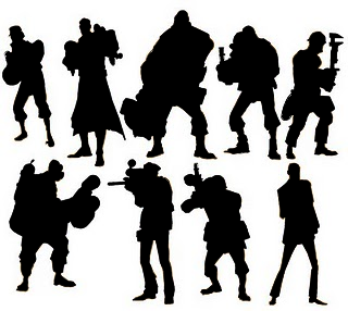
If I can make one suggestion though: your current characters are not unique enough. I think one of things that makes a lot of multiplayer games successful is being able to quickly and easily identify who you're looking at: not in terms of the actual player, but the class. Take TF2 for instance: Valve very heavily pushed the old character design principle of silhouette. If you can't identify what class a character is simply from their shadow, then you haven't done it right. The team that worked on BioShock 2's multiplayer component also factored this in. It's actually an old animation rule of thumb back in the old Disney days and it very much still applies today.
The silhouettes of your current characters are very similar, so it'd be hard to tell them apart in-game.
Posted 14 years ago2010-12-29 01:50:13 UTC
Post #288300
I wish to propose some ideas:
1: A bomb map
It could be a map where the two teams have to construct some type of bombs by getting correct materials from a scrapyard. It would be awesome if a player could get some type of tools to be able to construct from materials, and if you could dismantle parts from the enemy team's bomb and construct it to yours. Also, you could make some corrupt materials that you cant tell the difference from, causing the bomb to not work. Once the bombs work, the team could find a way to launch it, destroying the enemy bases in a fiery explosion that would be a better site to see than the bomb maps in Team Fortress 2.
2: An escape map
By an escape map, I do not mean the type where you would go through places like in HL1 or in HL2. I mean where you try to escape on a rocket and be able to leave the dreaded planet of war. It could start out with a briefing as to where: "Your rocket is prepared... Wait, an unexpected error has happened! You must head to the abandonded safehouse in the depths of the battlefield to salvage enough fuel to complete our mission." Much like the bad materials in the bomb map, it could have tainted or something wrong with the fuel, and it would also take many tanks of fuel. The first team to fill it with fuel will get to see the inside of the rocket and run around, and look out the window as they blast off watching their enemies below them.
3: An all-out war map
A map with bombs, lazers, and weapons that you construct. It could be a mixture of everything, and it would be interesting if the teams could create robots (NPCs) to destroy the enemy team.
Watcha think?
Posted 14 years ago2010-12-29 02:14:38 UTC
Post #288301
@ Ant, In TF2 they use specific shaders that enhance the outline of the character like you see in many cartoons, we are going for a more realisim art style, but there will be a definate way to identify the commander on the battlefeild.
@ Dimbark, please send me some examples of your work if you are interested in helping us out with mapping. As for your ideas, I think they are great. Unfortunatly we are at a stage of development where core gameplay funcitonality is in a locked state until we release a beta. We do this to have a clear set of attainable goals, that get reached.
That is something we would definatly consider in the future though.
Posted 14 years ago2010-12-29 03:00:31 UTC
Post #288302
A realistic art style doesn't mean you drop the idea of identifying the characters via their silhouette. This isn't to do with using effects to make characters stand out, it's about their physical appearance. Again, look at the BioShock 2 multiplayer characters. While they're all essentially spliced people, each one is easily identifiable by their silhouette. Look at Uncharted 2's enemies as well: every single enemy type is distinguished by their body shape. You can tell who they are in a single second. It doesn't matter what kind of art style you adopt, be it cartoony or realistic: if the characters aren't identifiable by their silhouettes alone, you've designed poor characters.
Posted 14 years ago2010-12-29 04:41:02 UTC
Post #288303
I love the weapon models and concept art, very unique stuff.
If you fill in the front shots of your commander and solider concepts up there, there's not a whole lot of difference in their shapes. I don't know how the game plays, so maybe you can get away with it, but if they're running around together in a battlefield you could easily confuse the two.
In TF2 they use specific shaders that enhance the outline of the character like you see in many cartoons, we are going for a more realisim art style, but there will be a definate way to identify the commander on the battlefeild.The shaders have more to do with their appearance up close. Particulary the way they're lit (rim highlights and so on), which doesn't apply to the silhouette design. The outline of the character comes purely from their polygonal shape.
If you fill in the front shots of your commander and solider concepts up there, there's not a whole lot of difference in their shapes. I don't know how the game plays, so maybe you can get away with it, but if they're running around together in a battlefield you could easily confuse the two.
Posted 14 years ago2010-12-29 05:40:56 UTC
Post #288304
The concept art and weapon models are fantastic. Were those weapon concepts made exclusively for the mod? They're very well done, and it's rare to see such slick artwork coming from the Source mod community. Great stuff.
The airship model needs a little work. The texturing is a bit bland, and the ropes holding the balloon down could do with a few more polygons.
The lighting in the outside area in the menu background map still looks a bit boring - don't add a big glare to cover it up, just add some more interesting lighting and shadows to the structures outside the window so they don't appear to be fullbright.
These are minor nitpicks, however. Looking very nice overall. I agree with Ant and Strider about the silhouette stuff, though.
Posted 14 years ago2010-12-29 07:01:55 UTC
Post #288307
I'm liking the mod a lot.
Posted 14 years ago2010-12-29 10:12:41 UTC
Post #288309
Liking the weapon concepts, hoping for more ingame/map screenshots. The lighting in the background map looks pretty bland; you could really do a lot more with the sunlight there to really make it look great I think.
You must be logged in to post a response.


