Post your screenshots! WIP thread Created 16 years ago2007-12-16 00:58:58 UTC by doodle doodle

Created 16 years ago2007-12-16 00:58:58 UTC by doodle doodle

Posted 13 years ago2011-01-05 08:52:15 UTC Post #288681
If you simply must use yellow lighting, use the tungsten value from the VDC:
Car Headlights
Brightness 231 223 192
Note:Taken from L4D2 SDK
City 17 day
Brightness 237 218 143 800
Ambience 190 201 220 100
Ravenholm night
Brightness 175 230 239 50
Ambience 43 45 57 5
Combine lamp
Brightness 147 226 240 3000
Ambience N/A
Tungsten bulb
Brightness 254 216 146
Ambience N/A
Fluorescent bulb
Brightness 159 237 215
Ambience N/A
Notewell NotewellGIASFELFEBREHBER
Posted 13 years ago2011-01-05 09:08:26 UTC Post #288682
If you're trying to power a lift, you'd use a generator, not a random collection of capacitors.
AJ AJGlorious Overlord
Posted 13 years ago2011-01-05 10:07:00 UTC Post #288683
Just to add my two cents, it needs windows. (I assume there are some on the far wall, but most big buildings like that have windows on more than one wall)
Posted 13 years ago2011-01-05 18:52:27 UTC Post #288684
I am using the reference Archie and Strider posted. I wasn't convinced at first, but it does change a bit the atmosphere. Actually it makes it even more warm.
If you're trying to power a lift, you'd use a generator, not a random collection of capacitors.
Fair observation, but what if it's a big lift and you suddenly need a big power consumption to put it at work? Besides, they add detail. It's not like I added chairs on the walls for detail, you know.
Just to add my two cents, it needs windows.
It is underground.

[edit] Quick question: How can I display an image from a camera or something like that on a fancy combine monitor? Do you know any tutorial about this?
Striker StrikerI forgot to check the oil pressure
Posted 13 years ago2011-01-05 19:02:49 UTC Post #288695
This is a similar principle.

Even if its a big lift, it'd still be powered by a generator. It's about making logical sense, not 'they add detail'.
AJ AJGlorious Overlord
Posted 13 years ago2011-01-07 07:03:17 UTC Post #288762
I do have a problem though. I have 3 cameras with their coresponding info_camera_link and func_brushes that act like monitors, but it seems that every func_brush renders the image from a single camera. What am I doing wrong ?
Striker StrikerI forgot to check the oil pressure
Posted 13 years ago2011-01-07 07:44:04 UTC Post #288763
I think Source can only render one camera display by default.
Strider StriderTuned to a dead channel.
Posted 13 years ago2011-01-07 08:37:09 UTC Post #288764
Yeah. People have coded it to use more than one, but unless you want to code a mod, you'll need to make it a 'switch' monitor like in HL2.
Notewell NotewellGIASFELFEBREHBER
Posted 13 years ago2011-01-09 23:15:42 UTC Post #288900
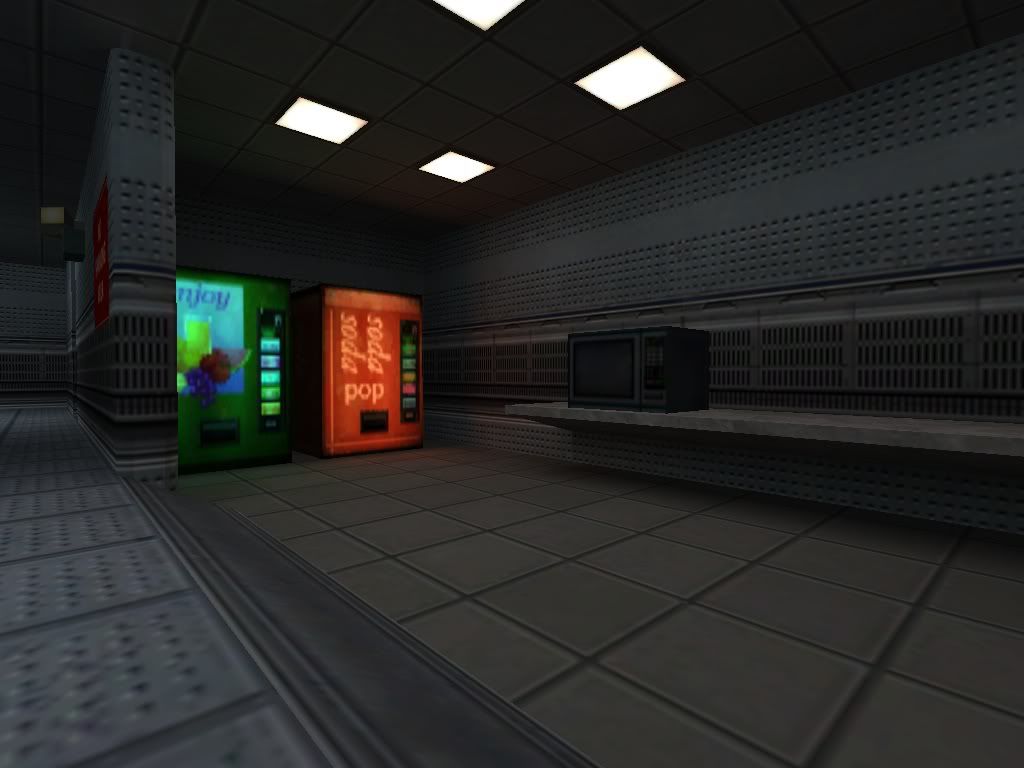
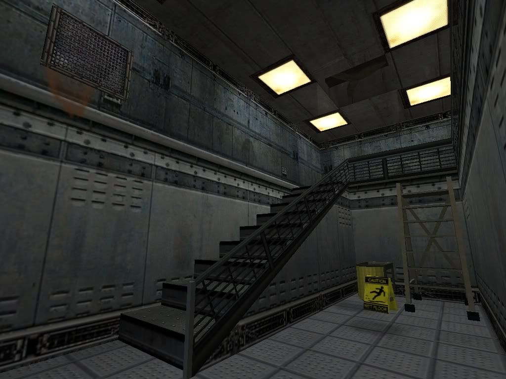
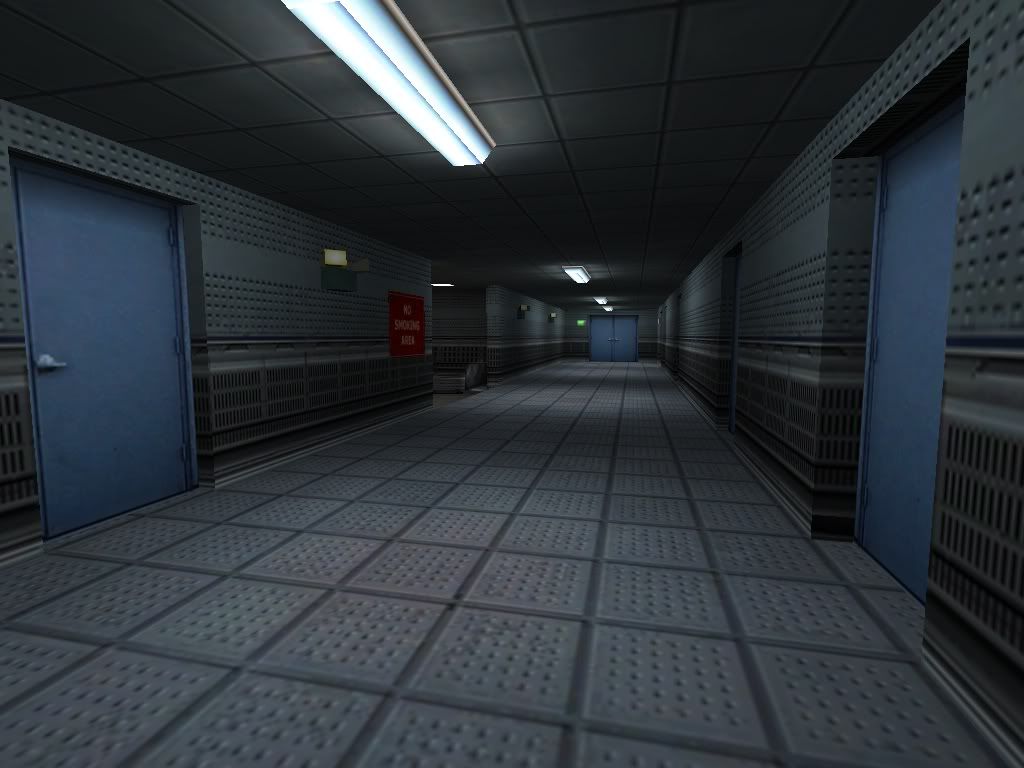
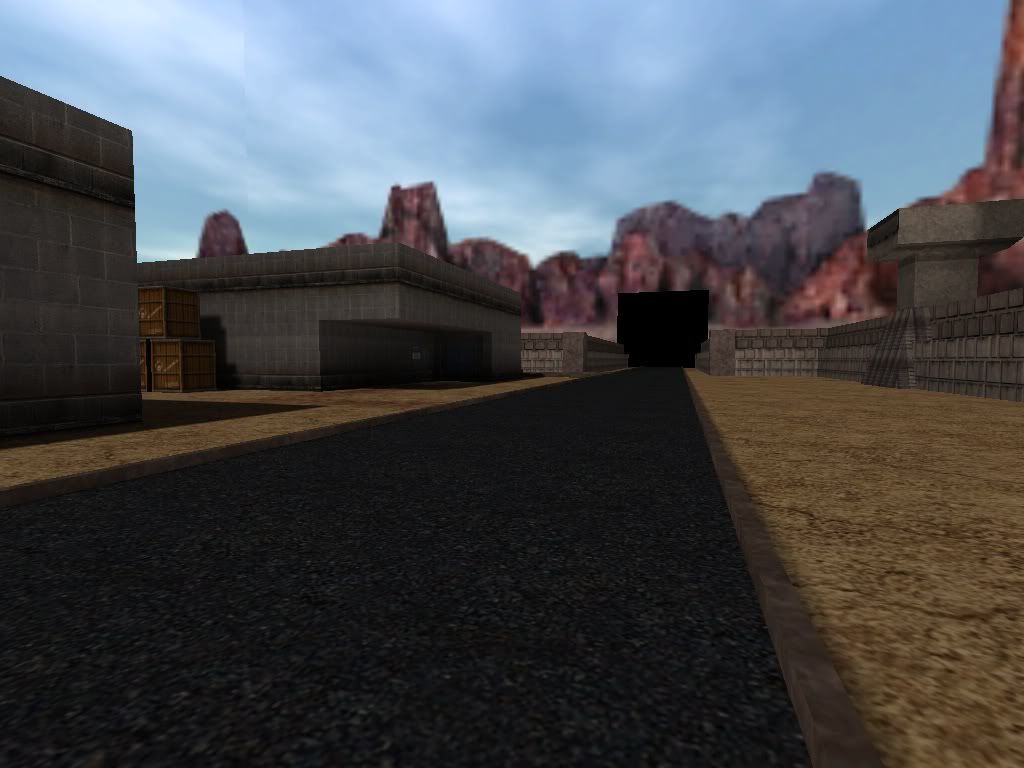
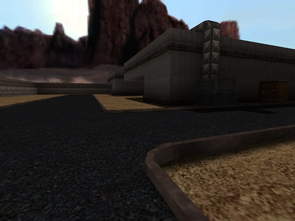
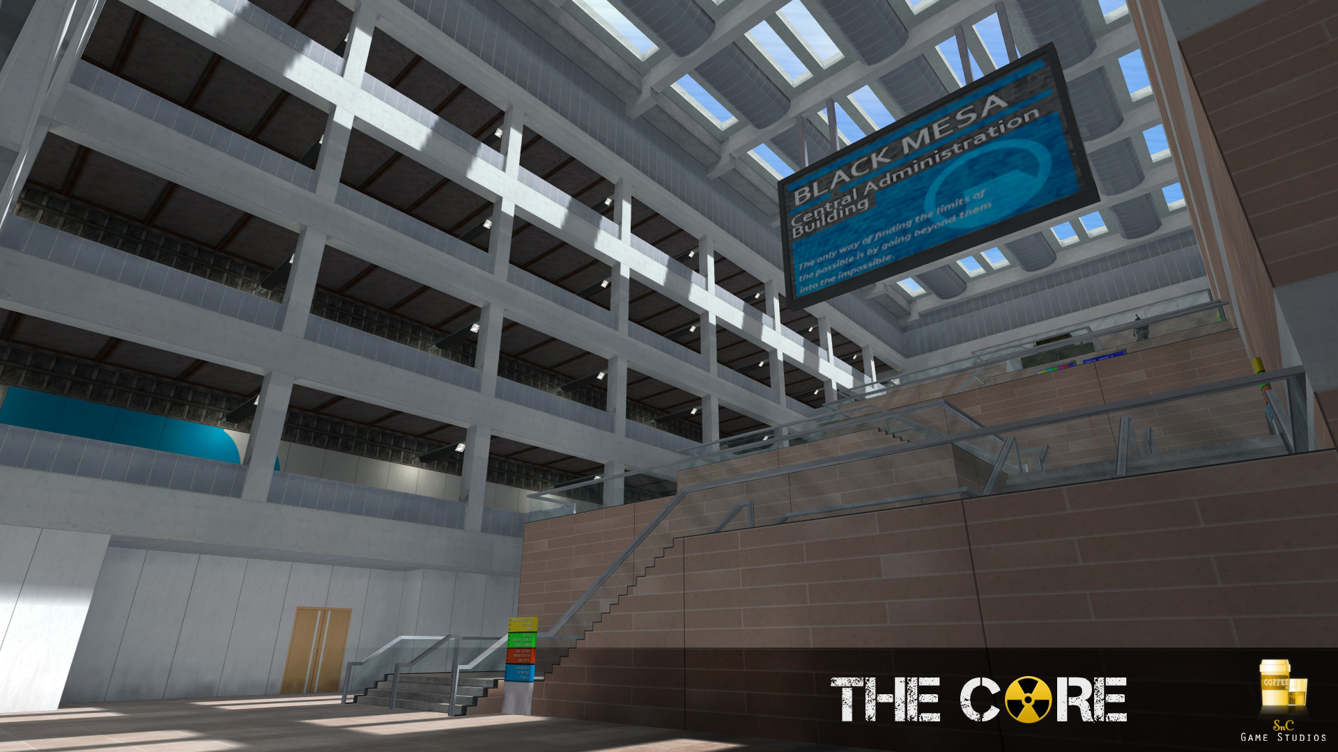
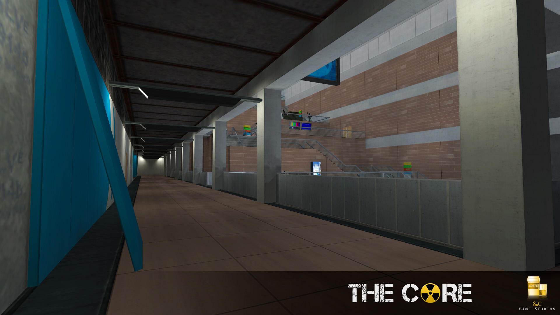
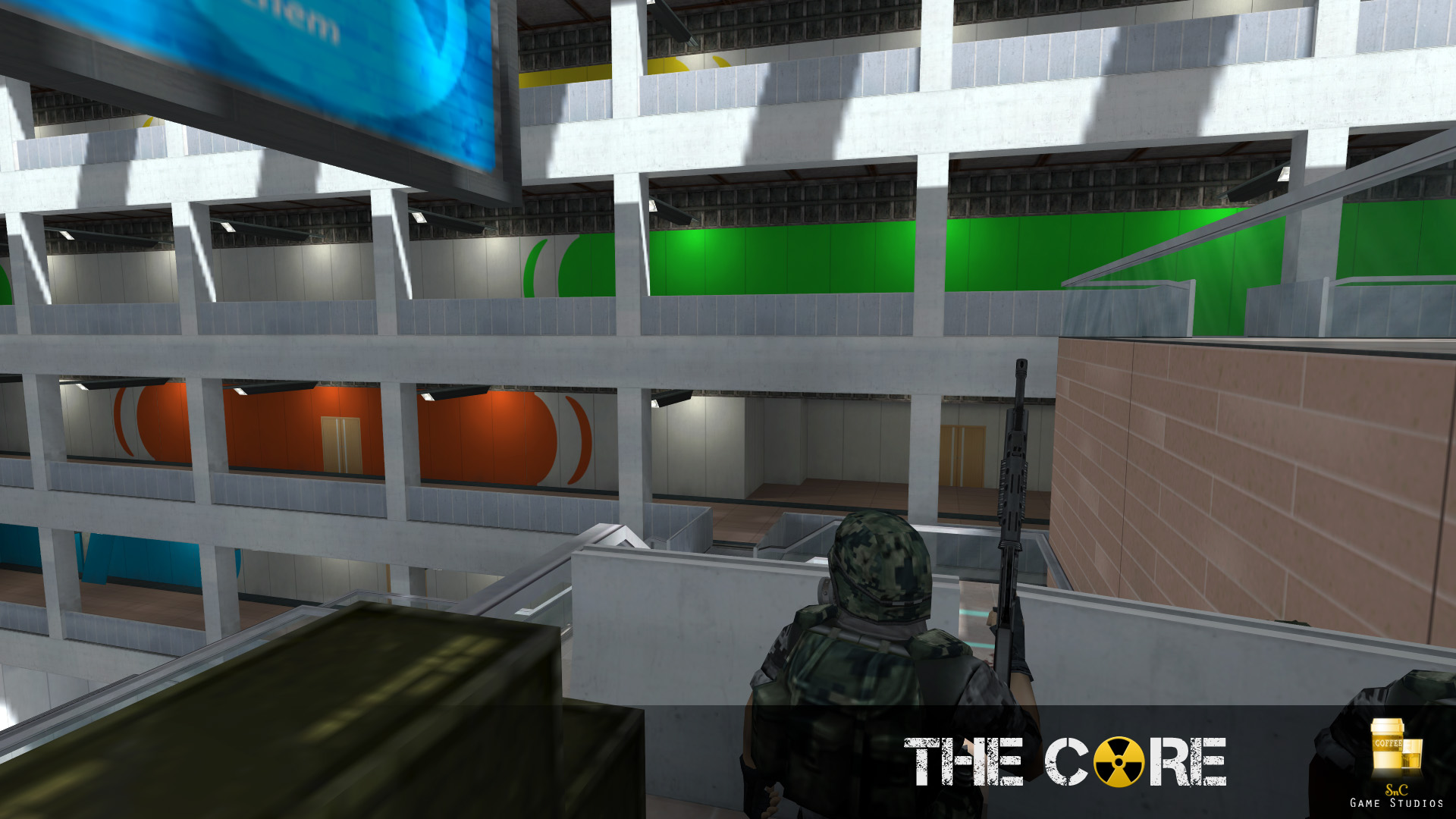
Something I'm working on.
User posted image
User posted image
User posted image
User posted image
User posted image
Ignore the black wall of death in the second to last picture. I haven't expanded that area yet.
Posted 13 years ago2011-01-09 23:27:36 UTC Post #288902
With regards to this screenshot, pull some extra detail out of those textures with more brush-based architecture. It may be tempting to leave it as is because the textures are nicely detailed, but I still see it as a flat wall. Same goes for your other shots.
AJ AJGlorious Overlord
Posted 13 years ago2011-01-09 23:34:58 UTC Post #288904
looking pretty kickass there, AT
Suparsonik SuparsonikI'm going off the edge to meet my maker.
Posted 13 years ago2011-01-12 05:16:42 UTC Post #288991
I agree with Ant, there needs to be some more detailed architecture.

The last shots in particular caught my eye, the large buildings(Cargo depots?) are far, far too flat and box-like. Although many depots are quite box-like architecturally, they generally have some finer detail.
Posted 13 years ago2011-01-12 06:00:08 UTC Post #288992
Put some trim along the doors, ATD. When's the last time you saw a door just connected to the rest of the wall?

As a matter of fact, just put trim everywhere. Fucking EVERYWHERE.
Trim makes everything look better.
The end of that wall in screenshot 1? Trim!
That vent in screenshot 2? Metal Trim!

Also, be sure to fix up the textures on the outside of your building there. Half of the brick texture is being cut off at the zenith of the building, and it looks none too great. Don't be afraid to stretch it a bit to fit properly with the height.
Posted 13 years ago2011-01-12 07:42:36 UTC Post #288996
ATdestroyer, what textures did you use for the second screenshot?
Skals SkalsLevel Designer
Posted 13 years ago2011-01-12 08:22:25 UTC Post #288997
one of Blazeeer's other packs. I used it in industriosus.
Suparsonik SuparsonikI'm going off the edge to meet my maker.
Posted 13 years ago2011-01-12 12:15:47 UTC Post #288999
You can download Blazeer's textures from his website.
Oskar Potatis Oskar Potatis🦔
Posted 13 years ago2011-01-12 12:21:47 UTC Post #289000
@striker: It is true, source can only render one camera at a time. I have successfully used up to 16 cameras but you have to switch them and you are only seeing one at a time.

I use logic_relays for each camera. I usually just cycle thru with a switch so the relays are on/off.

I have a nice tutorial somewhere if you need it.

@Huntey: Awesome light information. Never quite looked at it that way before but I suck at lights anyways.
Posted 13 years ago2011-01-12 14:17:06 UTC Post #289001
You should post that in the source tips thread :P.
Striker StrikerI forgot to check the oil pressure
Posted 13 years ago2011-01-18 18:39:20 UTC Post #289298
User posted image
Well, I am waiting for some suggestions. The area, as you see it, is just at the beginning. How should I improve the area? I must specify that the bottom floor will probably have more connections to other areas. Need ideas for "ceiling"(well, the top part) details. Do some truss supports work in this case? I am also willing to add some env_dustmotes in the ballspawner for a more defined effect.

I am also very sorry to disappoint you, but the basic dome structure is not done by me(I could do it with penguinboy's twister anyway, I is lazy it seems! ). I've taken it from an old halflife free rmf pack. The author is unknown(on my hdd at least).

[edit] Yeah I know those light glows are ugly as crap, I should change them to point_spotlight instead of env_sprites...
Striker StrikerI forgot to check the oil pressure
Posted 13 years ago2011-01-18 19:13:18 UTC Post #289299
Using the rule of logic that I mentioned earlier in this thread, let's take a look at this screenshot.

First up, what are we looking at here? I'm sensing that this is some kind of high energy beam: if so, why is it completely in the open like that? Should there not be safety rails and protection for anyone that needs to get near it?

You've got four connecting bridges to reach this rather plain looking object. Give the object a reason for needing four bridges: perhaps it's such a large and unstable structure that it can only be approached by staff wearing appropriate exo-suits, which limits their movement. Perhaps there's some kind of function on the object that requires four people to use at the same time.

Trust me, logic works even when you're dealing with fantasy settings/objects. Nearly everything in Half-Life 2 and the Episodes, be it the biggest set piece or the tiniest detail, made logical sense. If you look at the reactor in Episode 1, it had a grand feel but because Valve looked at it logically too, you got the sense that the Combine built it with safety measures in mind as well.
AJ AJGlorious Overlord
Posted 13 years ago2011-01-19 05:26:11 UTC Post #289315
Striker: Looks good, just stretch out that repetitive ground texture. I would also suggest using a totally different texture for the actual dome, something sleeker.

Here's an early Hammer shot of something I started today. I sort of... outright stole OxiB00ST's he_fenestra layout. Hope he's OK with that :|
User posted image
Shitty concept edits for the sake of showing TWHL the general idea.
User posted image
I'm not even trying to make sense with the theme, by the way.
Posted 13 years ago2011-01-19 08:19:52 UTC Post #289317
Is this one of those weird assed Deathmatch maps? :P

Looks good anyhow.
Suparsonik SuparsonikI'm going off the edge to meet my maker.
Posted 13 years ago2011-01-19 08:43:26 UTC Post #289319
wow that looks gorgeous GoldSrc screens soup!1 I will shit if you tell me those vines models are brushwork.
Captain Terror Captain Terrorwhen a man loves a woman
Posted 13 years ago2011-01-19 08:51:00 UTC Post #289320
Just paint brushes in Gimp right now ;)

But I was going to use models for wires and vines, not brushes. I've found a way to import maps into Milkshape, so I can model around the map itself.
Posted 13 years ago2011-01-19 08:55:29 UTC Post #289321
And I thought that was source until Captain Terror had it clarified for me.

[EDIT]
Just paint brushes in Gimp right now
Another illusion...
Striker StrikerI forgot to check the oil pressure
Posted 13 years ago2011-01-19 09:25:59 UTC Post #289322
Looking good Soup.
monster_urby monster_urbyGoldsourcerer
Posted 13 years ago2011-01-19 10:06:37 UTC Post #289323
fuck my ass that looks great, WCD
Archie ArchieGoodbye Moonmen
Posted 13 years ago2011-01-19 10:34:41 UTC Post #289324
Very nice Soup Miner.
Skals SkalsLevel Designer
Posted 13 years ago2011-01-19 15:13:46 UTC Post #289331
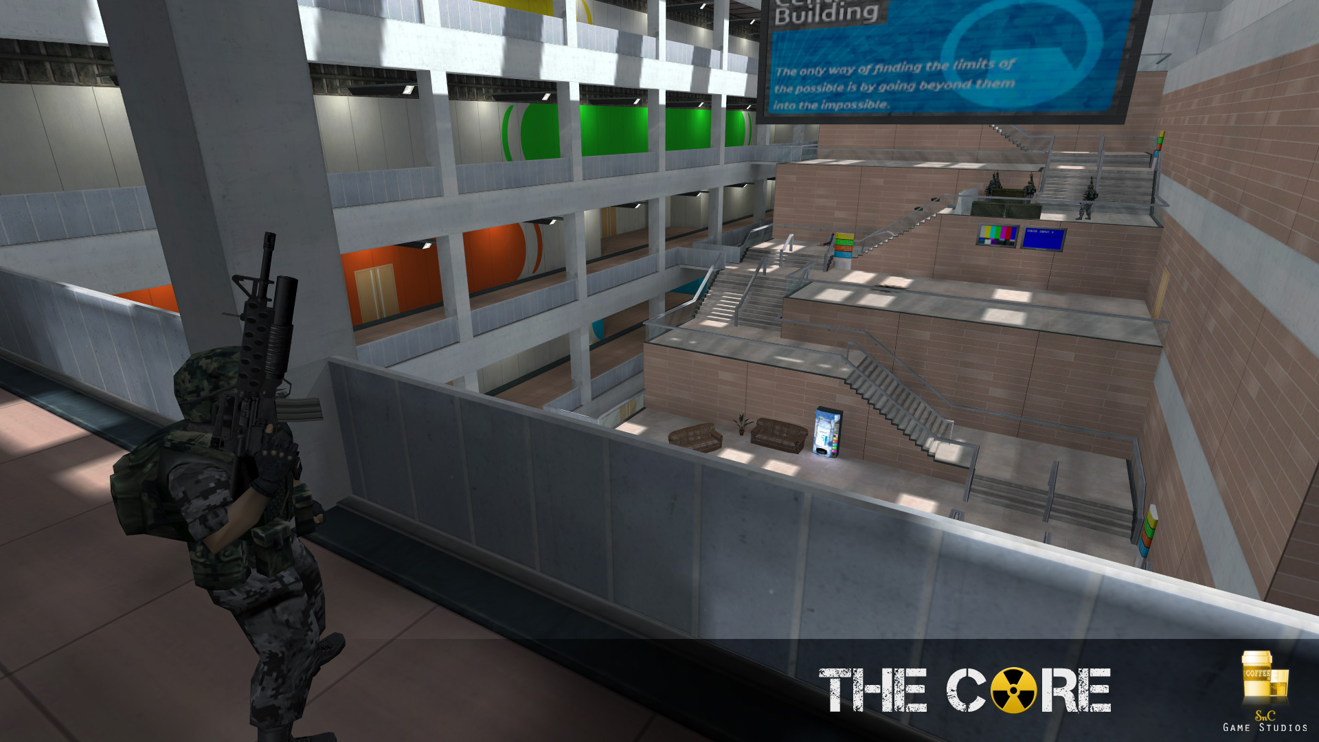
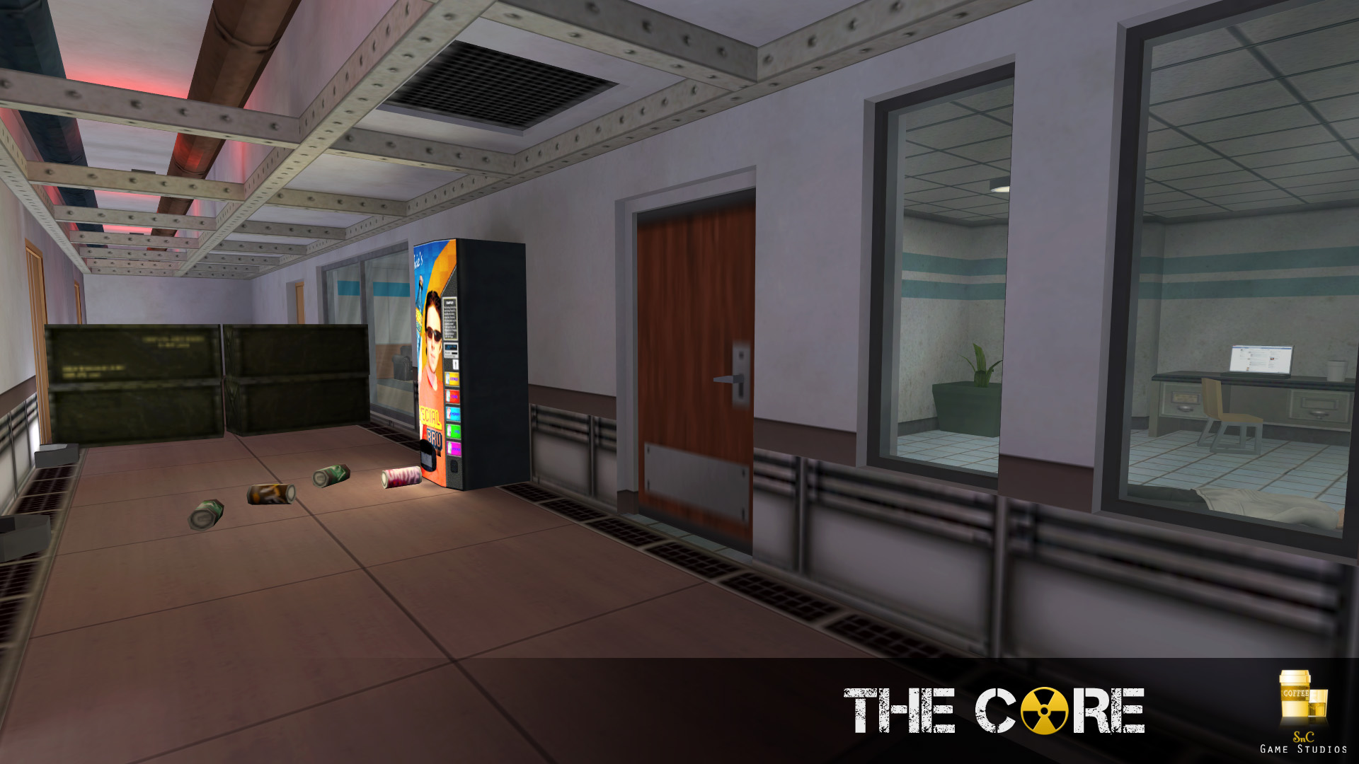
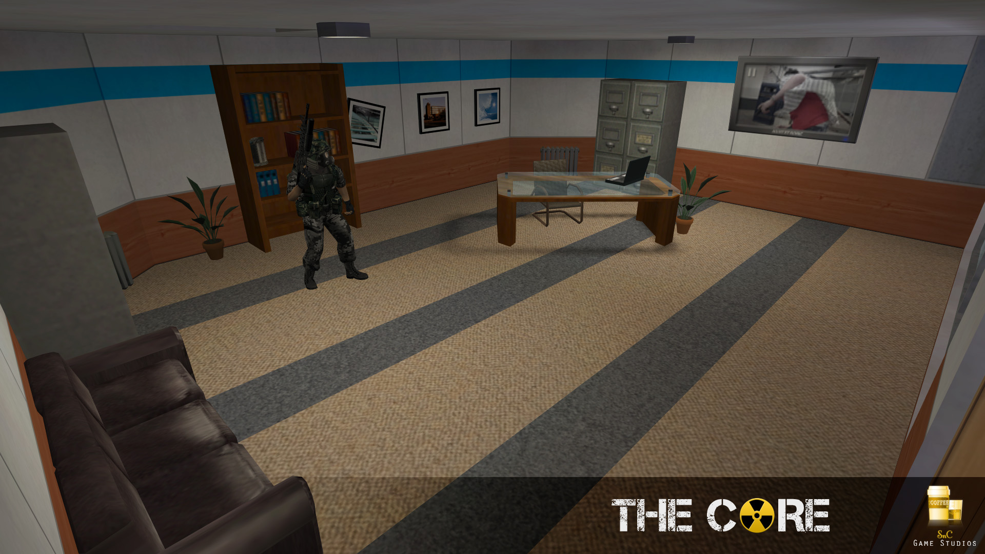
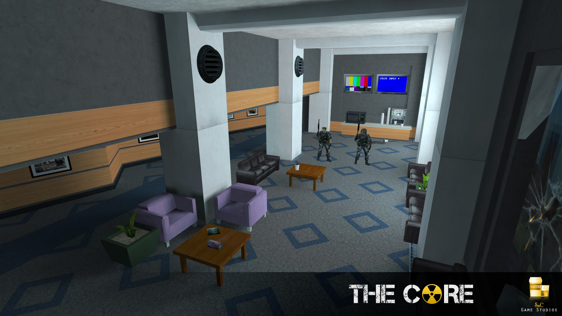
Massive media dump incoming!
User posted image
User posted image
User posted image
User posted image
User posted image
User posted image
User posted image
Archie ArchieGoodbye Moonmen
Posted 13 years ago2011-01-19 15:26:39 UTC Post #289332
brb i have to go check my pants! +)

holy shi is this HL:HS reborn? Nice spiffied-up original textures(are those from HL:S?). Last one is my fav, the monitor with the test pattern is a nice touch.

Superb stuff! =)
Captain Terror Captain Terrorwhen a man loves a woman
Posted 13 years ago2011-01-19 15:29:47 UTC Post #289333
All textures are either from Half-Life or made by myself or Urby. As far as I know HL: Source never had higher definition textures than the original, but I only played it once, so I might be wrong.

Thanks for the nice comment :]

Edit:
Oh, and it's totally unrelated to HL:HS, but I have taken some textures I made for HS and used them in this.
Archie ArchieGoodbye Moonmen
Posted 13 years ago2011-01-19 15:37:28 UTC Post #289334
User posted image
It's a W.I.P. of a HLDM map I'm working on. It's kind of inspired in this drawing, made by me too:
User posted image
Posted 13 years ago2011-01-19 16:09:34 UTC Post #289338
looks nice!
Posted 13 years ago2011-01-19 21:34:12 UTC Post #289362
fuck my ass
I'd love to! :glad: Anyway, hammer screens. Ew, I know.
User posted image
User posted image
User posted image
Suparsonik SuparsonikI'm going off the edge to meet my maker.
Posted 13 years ago2011-01-20 00:07:21 UTC Post #289375
My map is a vagina.
User posted image
Posted 13 years ago2011-01-20 00:36:05 UTC Post #289377
stunning visuals, though I wish someone would make single player maps
Posted 13 years ago2011-01-20 02:45:18 UTC Post #289382
Joe, that's absolutely amazing.
Oskar Potatis Oskar Potatis🦔
Posted 13 years ago2011-01-20 08:22:37 UTC Post #289388
Thanks, br0ski.
Suparsonik SuparsonikI'm going off the edge to meet my maker.
Posted 13 years ago2011-01-20 08:54:22 UTC Post #289389
User posted image
Holy crap it's rotated. How in the hell did you get a brush-based desk that complex to rotate on-grid?
My map is a vagina.
I seem to recall someone else made a map like that... Oh yeah, psilous!
Looking good, everyone.
Notewell NotewellGIASFELFEBREHBER
Posted 13 years ago2011-01-20 08:55:16 UTC Post #289390
Actually, the desk is perfectly straight. I rotated the room around it.

(that's a lie. I just rotated it and tied it to a func_wall like usual)
Archie ArchieGoodbye Moonmen
Posted 13 years ago2011-01-20 09:03:57 UTC Post #289391
I'm really impressed that it's all on grid like that.
I need to get me some skills like that.
Notewell NotewellGIASFELFEBREHBER
Posted 13 years ago2011-01-20 09:07:25 UTC Post #289392
It's not all on grid :3
Archie ArchieGoodbye Moonmen
Posted 13 years ago2011-01-20 09:32:44 UTC Post #289396
I lol'd hard soup
Posted 13 years ago2011-01-20 10:01:06 UTC Post #289399
Lol Then we need a GF for the lil one
Ghost129er Ghost129erSAS1946 Certified Nuisance
Posted 13 years ago2011-01-21 12:59:02 UTC Post #289493
@2muchvideogames: I only make single player maps....

@JeffMod: Practice makes perfect. And it's not hard to rotate ANYTHING in map. Just right click->tranform and rotate it however you like.

@Huntey: Really nice map. How much time do you have in? Actual, that is.
Posted 13 years ago2011-01-22 21:48:10 UTC Post #289541
User posted image
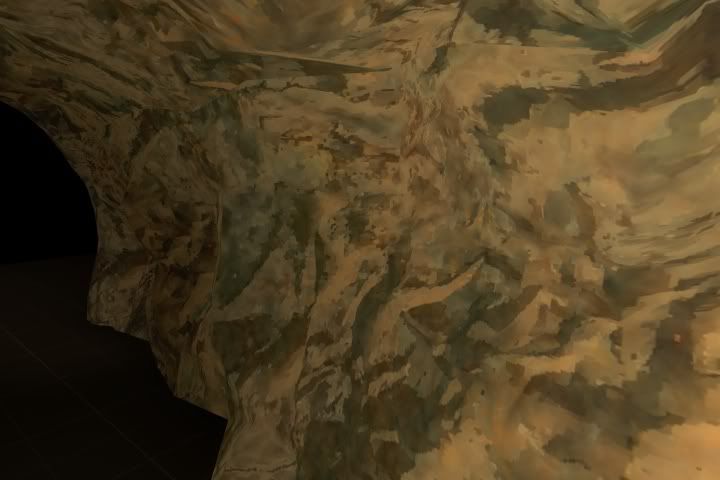
Above: Hand-painted rock texture (it doesn't look like rock but you'll see why below.
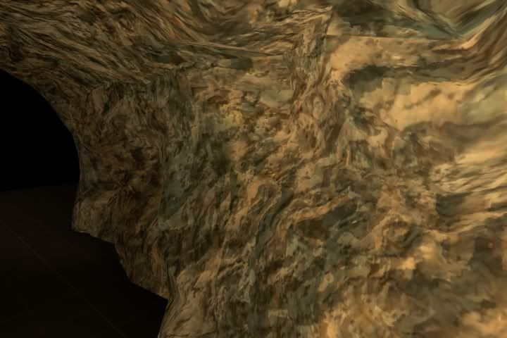
Below: Hand-painted rock texture with a hand-generated ssbump applied to it:
User posted image
These things are a real pain to get decent-looking. You end up having to paint your textures with absolutely no lighting or AO to speak of, which makes using photographic references in the albedo next to impossible. That said, those two elements are both entirely dealt with when the heightmap is compiled into the ssbump and the ssbump is rendered in-game, which can be pretty handy. Your heightmap has gotta be spot-on, though; mine isn't.

I was inspired by this screenshot and artist posted on Interlopers a while back. Wish I had Shopping skills like he has...:
User posted image
Posted 13 years ago2011-01-23 01:35:55 UTC Post #289544
Look on the bright side, if it always turns out shitty you can just say, "Oh yeah, it's a TF2 texture." :)

But it looks good for what it is. I certainly couldn't do it, so props there. I'd say tone down those green patches first and foremost. If the green is a shadow issue, then I don't know what to do. Secondly, change that yellow tone to something a little earthier. I'd hate to say brown, but that's where it should probably be leaning. Right now it looks more like a vomit yellow than a rocky yellow.

The intensity of your bump map seems off. Look at how the only deep parts of the bump map are at certain edges in that L4D2 screenshot. Elsewhere it's just a bunch of very small, very shallow dotted bumps. Contrarily, your texture looks like it's just riddled with very large, deep holes with virtually no edges. So make those holes more shallow, and define your stone edges a little more.

I hope this comes off more as helpful than arrogant.
Posted 13 years ago2011-01-23 02:40:55 UTC Post #289545
Use a modeling program then bake the normals, THEN use the normals to make the self shadowing bumps. Never heard of making hand painted ss bumps before, that must of taken a while.
Posted 13 years ago2011-01-23 08:19:39 UTC Post #289546
What is the actual difference between and ssbump and a bumpmap and how do you apply it?

Also, talking about baking the normals, I listened to Lost Coast commentaries and Valve said they did the same thing(ex:for the sand with stones texture).
Striker StrikerI forgot to check the oil pressure
Posted 13 years ago2011-01-23 13:20:35 UTC Post #289557
ssbump means Self Shadowing Bumpmap. Basically, with a standard bumpmap, raised sections of the texture are highlighted by light. With an ssbump applied, the raised section will also cast a shadow across the lower parts of the texture.
monster_urby monster_urbyGoldsourcerer
You must be logged in to post a response.