Tutorial: Introduction to Colour Correction Last edited 2 months ago2024-09-20 03:11:47 UTC
Intro
One of the most important tools in a level designer's arsenal is lighting. Lighting can be used to make the most boring room exceptionally visually interesting. It can be used to send a chill down the player's spine or let them know that a room is safe.However, lighting is limited in most pre-Portal 2 Source games, because it's static and requires a huge amount of fiddling in Hammer to get your shadows just right, and of course requires a compile every time you change it.
This is where colour correction comes in. Colour correction is available in every Source2009 onwards Source game, and allows you to change the depth of the shadows, the hue of light, the contrast curves and the saturation of a room in real-time and can be triggered just by walking into a room. It's an incredibly powerful tool and one that Valve have taken full advantage of in their recent titles. Left 4 Dead, particularly, uses colour temperature to subconsciously lead the player to safety as they head towards the warmer areas of a level.
This tutorial assumes you are comfortable in the knowledge of how to create a playable map from scratch, compile it and load it in-game.
With that in mind, it's also a good idea to have a solid idea of the mood you want an area to have before you begin using this tool. Got one? Sitting comfortably?
Good, let's begin.
Step by Step
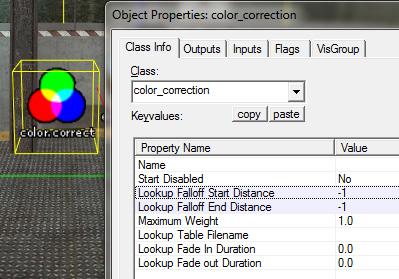
Start by loading up your scene in Hammer and creating an entity roughly in the middle of the area you want your colour correction.Either use the drop-down menu or type in the Class field: color_correction
Then in the properties, change the Lookup Falloff Start Distance to -1, as well as the Lookup Falloff End Distance. This will make the entity global throughout the map, and is what we want while the entity is not configured.
It should look like this:
 You'll have to get used to the American spelling, I'm afraid.
Now open up the console and type the following:
sv_cheats 1
colorcorrectionui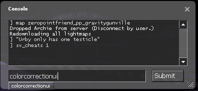 This will open up the colour correction editor
In some but not all cases, your screen gamma will have shot right up as well. Nobody seems to be able to definitively say why this happens, but it makes accurate colour correction impossible, so if it happens you should just click anywhere in the "Lookup View" window to fix it. If this doesn't work, reloading the map sometimes will.
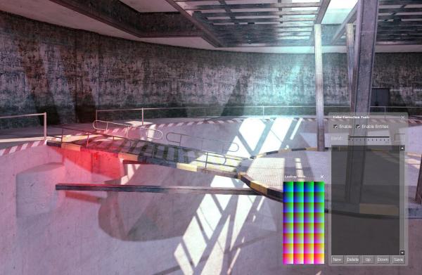 Good grief, why is my screen so bright?
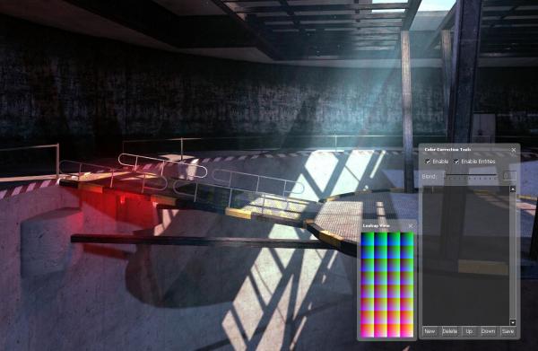 Ah, that's much better.
This will bring up this window:
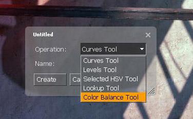 New Adjustment Layer
Not sure what any of these mean? Don't worry, you'll find that by playing about with the settings in each that they're all very easy to use.
The Curves tool adjusts tonal range, either by stretching it or compressing it. This can be done across the entire RGB range, or only to a specific colour. It is an extremely powerful tool.
The Levels Tool adjusts contrast, brightness and darkness. It can make shadows much deeper, without making the bright spots any darker.
The Selected HSV Tool allows for incredibly specific editing of colours. You are presented with a thumbnail of the image on-screen, and you can literally select a colour from it to modify. This is also the tool you use if you want to de-saturate a scene. Remember Sin City, where only specific colours appear in scenes, like bright yellow on black and white? That can be achieved with this tool.
The Lookup Tool allows you to load a pre-existing lookup table. I've never actually needed to use this as I treat each scene I colour correct individually.
Finally, the Color Balance Tool is the one you'll probably use most. It works very intuitively, and lets you decide how much R, G or B is in the shadows, the mid-tones and the highlights.
Going into more detail would be pointless, as the best way to learn tools like these is just having a play with them.
So, select the tool you want to start with. I'm going to choose Color Balance. You don't have to name it, but It helps with complex scenes. Here's an example of how much it can instantly change the look of a scene. I've selected the highlights radial, and boosted the Red channel significantly.
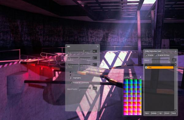 Now the brightest parts of the map have a pink look to them.
When you're happy with the colour, you might also want to change the contrast, so close the colour balance window and click New again in the bottom left of the Color Correction Tools window. This can be done as many times as you want, with as many tools as you want. It also operates under a layers system, just like Photoshop, so you can give certain tools priority over others, as seen here:
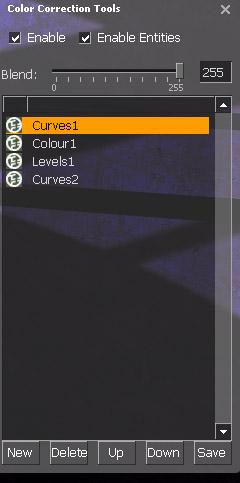 Curves1 is at the top of the list, so it is the first adjustment that is made
It'll bring up a standard save dialogue window. Navigate to your game's materials directory (steamapps/username/half-life 2 episode 2/ep2/materials for example) and create a new folder called correction.
In that folder, give your colour correction a name prefixed by cc_ and click save.
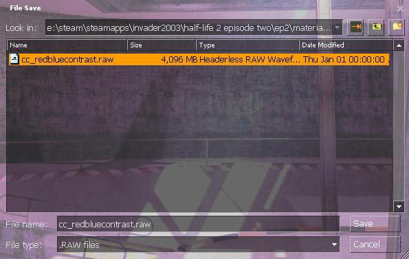 Note the cc_ at the start of the filename
Back in Hammer
Now that you have your colour correction settings, go back into the properties of your color_correction entity and find the Lookup Table Filename field. In there, you want to point the entity to your newly created colour correction settings. Start with the materials directory, and make sure it has the .raw file extension on the end. Mine was materials/correction/cc_redbluecontrast.raw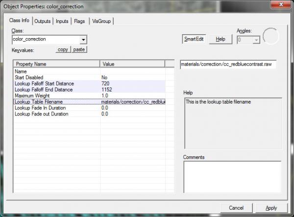 It's important to keep the file extension
Changing these values will also change the size of two spheres surrounding the entity, most visible in 2D views.
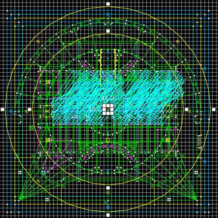 The space between the two rings is where the colour correction either fades in or out
If you keep the values at -1, you can also trigger the colour correction by an event using any of the standard Hammer triggering methods.
Save and compile, and hopefully you'll end up with a much improved scene.
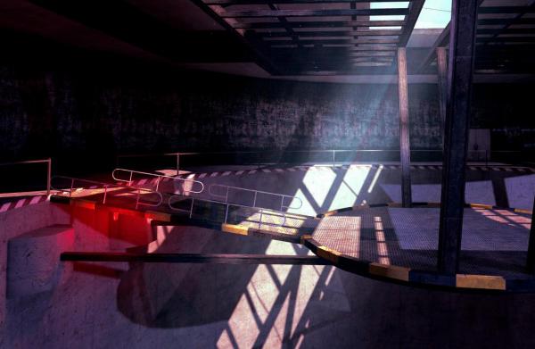 There's more emotion in this area now
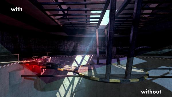 Comparison
- Categories
- Tutorials
- Intermediate Tutorials
- Mapping
- Source Tutorials
- Article Credits
-
 Archie
–
Original author
Archie
–
Original author
8 Comments

Dimbeak
Commented 13 years ago2011-08-07 23:04:53 UTC
Comment #101025
Very nice tutorial! Made good sense and thoroughly explained!

dexter
Commented 13 years ago2011-08-07 23:28:48 UTC
Comment #101026
Great tutorial - very neat. Unfortunately, I've already messed with Color Correction, so I don't need it, but well explained nonetheless. Great use of images (I guess I can thank the field - mapping - for that, too). 5/5!

Captain Terror
Commented 13 years ago2011-08-24 16:01:15 UTC
Comment #101027
Very-nicely written and formatted sir! can't wait to mess around with this! TY

Daubster
Commented 13 years ago2011-10-25 12:03:43 UTC
Comment #101028
Quality stuff - nicely done!

Xylem
Commented 12 years ago2012-01-10 07:08:28 UTC
Comment #101029
I don't know but I actually kinda like it without CC.
Xylem
Commented 12 years ago2012-01-10 07:08:54 UTC
Comment #101030
Well written article regardless.

Skals
Commented 11 years ago2013-10-06 18:15:19 UTC
Comment #101031
Thank you, I'm now using CC in one of my CS:GO levels 

Striker
Commented 9 years ago2015-04-05 17:18:48 UTC
Comment #101032
Thanks, I just applied this to a concept map and it looks incredible.
You must log in to post a comment. You can login or register a new account.