Post your screenshots! WIP thread
Created 17 years ago2007-12-16 00:58:58 UTC by
 doodle
Created 17 years ago2007-12-16 00:58:58 UTC by
![]() doodle
doodle
Posted 15 years ago2009-12-24 06:48:04 UTC
Post #276902
Map I've been chipping away at for the past couple of weeks:I also finished that little G-Man experiment, but I'm not exactly happy with it. I had to scrap an ending segment because of some hiccups, so it's just a small demonstration-type thing.
Posted 15 years ago2010-01-03 14:13:27 UTC
Post #277253
haha nice.. what I did on my horrormap for HL1 was I put; 'GOD IS NOW HERE!' painted in blood... man, thats the only map I wish I still had. Anyway man, keep it going. 
I've always been interested with swat or army guys so I figured I'd model one on my break.
The head for the model was made using facegen, and a photo of Hugh Laurie (Dr. House).. it ended up looking like crap so I fixed up the uv of his face, and it turned out well. Other than that, not much to see yet... but its coming;
Comments and suggestions welcomed..
(The images of another model is for scale purposes)btw Strider.. is that a mod of L4D?
Posted 15 years ago2010-01-03 14:55:23 UTC
Post #277254
are you talking about last exit?
I had it in my map archive tho i don't ever remember playing it. just did a quick run-through now.. very impressive stuff! It has the feel of one one of IMUS's neat SP horror maps.. You should throw this on the dm server!
I had it in my map archive tho i don't ever remember playing it. just did a quick run-through now.. very impressive stuff! It has the feel of one one of IMUS's neat SP horror maps.. You should throw this on the dm server!
Posted 15 years ago2010-01-03 15:04:38 UTC
Post #277255
it's pretty clearly a l4d map, Unbreakable 
My question is why?
L4D2 please.

My question is why?
L4D2 please.
Posted 15 years ago2010-01-03 15:04:50 UTC
Post #277256
Strider. Those images and that video both make me very sad.
How is it you manage to make your maps so... so... not as shit as mine?
How is it you manage to make your maps so... so... not as shit as mine?

Posted 15 years ago2010-01-03 16:03:29 UTC
Post #277257
Captain Terror.. I've been trying to get it back, since I lost my backup dvd about a year ago.. I've posted in the forums, wondering if anyone has it, if I can get it back.. noone responded.. 
You have no idea at how happy that makes me! Can you please host.. wait a minute, you already did. Thank you so much man.

You have no idea at how happy that makes me! Can you please host.. wait a minute, you already did. Thank you so much man.
Posted 15 years ago2010-01-03 16:23:44 UTC
Post #277258
I wasn't paying attention I first, I assumed it was a half-life 2 horror map. L4D didn't cross my mind until someone said something. And by L4D I hope you mean 2, it'd be silly to make it for L4D1...
Posted 15 years ago2010-01-03 19:46:33 UTC
Post #277270
Why would it? For one thing I prefer the characters in L4D 1 @_@
Strider. Even though you're not happy I am. I thought it was awesome. Oh and post it in Interlopers map pimpage. I wanna see their replies
Strider. Even though you're not happy I am. I thought it was awesome. Oh and post it in Interlopers map pimpage. I wanna see their replies

Posted 15 years ago2010-01-03 20:17:20 UTC
Post #277271
Strider, that Gman thing was awesome. I had no idea you could even do some of those things in Hammer.
Posted 15 years ago2010-01-04 06:37:15 UTC
Post #277284
Thanks guys. I think I just feel bitter about that G-Man thing, my big ending was ruined. 
The map's for Left 4 Dead 1. There's no chance of me going to 2 anytime soon, I simply do not care for it. If the only reason for me to get it is to port my map over, it's going to have to be very cheap.
Doesn't L4D2 support custom L4D maps anyway?
EDIT:
3 other screens I didn't post:

The map's for Left 4 Dead 1. There's no chance of me going to 2 anytime soon, I simply do not care for it. If the only reason for me to get it is to port my map over, it's going to have to be very cheap.

Doesn't L4D2 support custom L4D maps anyway?
EDIT:
3 other screens I didn't post:
Posted 15 years ago2010-01-07 19:26:39 UTC
Post #277501
Hurray! My very own detail sprite setup!Blasted render distances, though.
Posted 15 years ago2010-01-07 21:09:33 UTC
Post #277504
Looks nice 

Posted 15 years ago2010-01-07 21:10:24 UTC
Post #277505
whistles
thats classy
thats classy
Posted 15 years ago2010-01-07 22:07:45 UTC
Post #277508
If the only reason for me to get it is to port my map over, it's going to have to be very cheap.AKA gift it to the poor bastard. not only is the game totally not worth the money, but if we aussies buy it we get the shit censored version. gifting totally fixes that. hint hint.
Posted 15 years ago2010-01-08 00:13:28 UTC
Post #277510
I wasn't asking that at all, Trapt. 

Posted 15 years ago2010-01-08 03:03:28 UTC
Post #277517
 sure
sure
Posted 15 years ago2010-01-13 17:51:43 UTC
Post #277863
Had to get screenshots in 3d flat, because I don't have any textures on it yet, the top left one is in 3d textured and it all kind of looks like a big mess.
This is my entry for rooms, as far as i believe it
I think i'm going to make a deathmatch version of it too.. im thinking, hide exactly 1 of every gun, spawn with full ammo for everything / a 357
This is my entry for rooms, as far as i believe it
I think i'm going to make a deathmatch version of it too.. im thinking, hide exactly 1 of every gun, spawn with full ammo for everything / a 357
Posted 15 years ago2010-01-13 17:58:06 UTC
Post #277864
You have to work on your textures, man. That would look so great if the textures weren't so awful. They aren't even seamless textures.
Edit: Whoops, totally skipped over the "haven't even textured it yet" part. My bad.
Do the gears move?
Edit: Whoops, totally skipped over the "haven't even textured it yet" part. My bad.
Do the gears move?
Posted 15 years ago2010-01-13 18:07:38 UTC
Post #277865
Trippiest set of placeholder/dev textures I've ever seen. D:
Posted 15 years ago2010-01-13 18:22:55 UTC
Post #277869
I always make about 3-4 base textures and make them rainbow colour.. 
its so aweso/err.. a headache
..
yeah all the gears move (in seemingly appropriate manner too) except 2 of them are off set slightly.. its obvious)
also theres a max_map_clipnodes that i'm about to deal with now that i've gotten my beauty slumber

its so aweso/err.. a headache
..
yeah all the gears move (in seemingly appropriate manner too) except 2 of them are off set slightly.. its obvious)
also theres a max_map_clipnodes that i'm about to deal with now that i've gotten my beauty slumber
Posted 15 years ago2010-01-13 18:24:23 UTC
Post #277870
Do you have an oxygen generator in your room ?
Posted 15 years ago2010-01-13 18:26:26 UTC
Post #277871
Use the BEVEL texture to reduce your clipnode counts. Helped me when working on complex terrain.
Posted 15 years ago2010-01-13 18:32:05 UTC
Post #277872
Had to get screenshots in 3d flat, because I don't have any textures on it yet, the top left one is in 3d textured and it all kind of looks like a big mess.It doesn't look like a mess because it's on 3D textured. It is a mess. The textures only contribute to it.
Posted 15 years ago2010-01-15 02:01:53 UTC
Post #277954
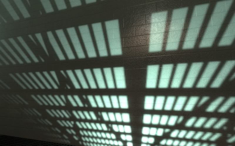
I've been playing a little Mirror's Edge recently; there are some gorgeous textures in that game. So gorgeous, in fact, that I was inspired to make my own painted cinder block texture from scratch, a lot like the one you see in that game everywhere. Exciting, I know.I started work on it by beginning with the height map I would make the normal map from, then creating the diffuse texture from there. I never used any photographic references for this texture, which is a first for me. The reflections are a little strong in these shots because the room is relatively dark, but I may dial them back anyway. I also haven't added any grunge to the texture, and I'm debating whether I want to and, if I did, how I would go about adding it.
What do y'all think?
What do y'all think?
Posted 15 years ago2010-01-15 02:46:01 UTC
Post #277957
Looks as good as a flat wall can, I suppose.
The first one looks cartoony, and I'm not sure why.
The second is spot on.
What engine is that?
The first one looks cartoony, and I'm not sure why.
The second is spot on.
What engine is that?
Posted 15 years ago2010-01-15 04:04:31 UTC
Post #277961
Source, of course! It's running in Episode Two after an HDR compile. My goal was realism.. so cartoony wasn't the response I was expecting, but I did, however, like the result in the second screenshot, too. The texture looks 10 times better when you can look at it in the game instead of from just a static screenshot, but I guess that's true about a lot of things. 

Posted 15 years ago2010-01-15 04:05:44 UTC
Post #277963
Sexy stuff. I like your lightmap work too. ;>
Posted 15 years ago2010-01-15 15:01:57 UTC
Post #277982
It looks cartoony because it's clean. Add dirt, dust, moths, chewed gums, etc.
Posted 15 years ago2010-01-15 15:05:45 UTC
Post #277984
The second one is also clean, though.
It could be because all the little holes are the same size and the same depth. It's just too "perfect" looking.
It could be because all the little holes are the same size and the same depth. It's just too "perfect" looking.
Posted 15 years ago2010-01-15 15:56:24 UTC
Post #277987
So is the second one, but the projected shadows divert your attention from that.
Posted 15 years ago2010-01-16 01:10:35 UTC
Post #278007
Cartoony isn't a word I'd used to describe it. It looks exactly like those very glossy painted brick walls you see around.
The only thing that throws people off I think is that it is actually clean, which is different, considering most games (grungy and brown = realistic!).
The only thing that throws people off I think is that it is actually clean, which is different, considering most games (grungy and brown = realistic!).
Posted 15 years ago2010-01-16 17:23:38 UTC
Post #278028
yes.. is the shadowy parts of the first screen shot it looks very nice..
.. maybe tone back on some light to get mour of that effect.
I LIKE IT!!
now mod hlgold so you can summersault when falling from heights
.. maybe tone back on some light to get mour of that effect.
I LIKE IT!!

now mod hlgold so you can summersault when falling from heights
Posted 15 years ago2010-01-16 17:30:38 UTC
Post #278029
I don't know if it has to be brown to look real, but at least it has to be dirtier. Even my recently painted walls have leftover marks from squashed bugs which I haven't been able to remove.
Posted 15 years ago2010-01-17 04:36:32 UTC
Post #278046
After dicking around a lot, I finally managed to get the look I wanted. The light is too yellow, come to think of it.
Slow mapping is slow. What's new.
And here you can see 2 of the unnecessarily complex window styles.
Unfortunately, I am not being creative enough.
Also, I have a cubemap on each window. That's 102 cubemaps. Is this bad?
Slow mapping is slow. What's new.
And here you can see 2 of the unnecessarily complex window styles.
Unfortunately, I am not being creative enough.
Also, I have a cubemap on each window. That's 102 cubemaps. Is this bad?
Posted 15 years ago2010-01-17 04:43:53 UTC
Post #278047
Looks nice. The wind generators are a nice touch. That wall texture seems a little flat to me, though, unless that's the look you're going for. Are you basing this off a photograph (I haven't been browsing the forums much until recently)? I don't think lots of cubemaps will have much of an effect in terms of performance, but it might be worth your while to toggle mat_specular on and off a few times and check if there's any noticable change in your framerate.
Posted 15 years ago2010-01-17 05:31:18 UTC
Post #278048
That wall texture seems a little flat to me, though, unless that's the look you're going forI guess. It's supposed to just be a plain, flat wall, but out of all of HL2's and CSS's textures, only 2 from de_inferno fit the bill.
I'm not really building it after anything so as much as building it with the same concept in mind. The layout is still mostly from compo 27.
Posted 15 years ago2010-01-20 15:05:19 UTC
Post #278181
update on my swat guy
Posted 15 years ago2010-01-20 15:24:45 UTC
Post #278183
your modelling work continues to impress me, unbreakable
Posted 15 years ago2010-01-20 21:10:01 UTC
Post #278201
PSILOS_LESBIA
now with in the proper thread action!
now with in the proper thread action!
Posted 15 years ago2010-01-20 22:56:40 UTC
Post #278204
One truly has to wonder what goes on in your head.
Posted 15 years ago2010-01-20 23:14:08 UTC
Post #278205
I'm wondering what else is in that map that ISN'T in the screenshots.
Posted 15 years ago2010-01-21 12:22:17 UTC
Post #278231
First one is a render of the swat guy more focused on his knee pads, boots, and Flashnades;I tried to explain what vertex lighting was to a friend;Just a concept pic I drew for a Steampunk type of game the class is working onblah! 
So ya, comment if you want.

So ya, comment if you want.

Posted 15 years ago2010-01-21 14:32:06 UTC
Post #278238
I think the flashbangs are too small. They look shorter than my finger.
Posted 15 years ago2010-01-21 14:39:04 UTC
Post #278239
you must have big fingers 

Posted 15 years ago2010-01-21 17:48:39 UTC
Post #278244
Wewt!
Posted 15 years ago2010-01-21 18:57:08 UTC
Post #278247
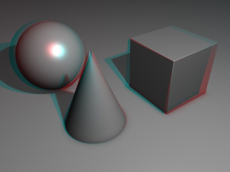
do you know how to do it in photoshop by using a depth map? more precise than my old way and that one.. works awesome.. I'll see if I can find it and upload it
Edit, meh I can only find this one;
Edit, meh I can only find this one;
Posted 15 years ago2010-01-21 19:30:51 UTC
Post #278248
Sorry, I left my 3D goggles in the '80s.
Posted 15 years ago2010-01-21 21:00:25 UTC
Post #278249
I didn't. Looks really cool unbreakable!
Posted 15 years ago2010-01-22 01:44:26 UTC
Post #278282
Nah, I've never done any depth map work, but I never knew that you could do this sort of stuff in purely in Photoshop. My process involves rendering from two cameras that are right next to eachother, tinting the results red and cyan, and multiplying them together in Photoshop.
I was inspired by Avatar.
I was inspired by Avatar.

Posted 15 years ago2010-01-23 22:07:39 UTC
Post #278337
I just saw that today, It was rather good, effects were great.
You must be logged in to post a response.


