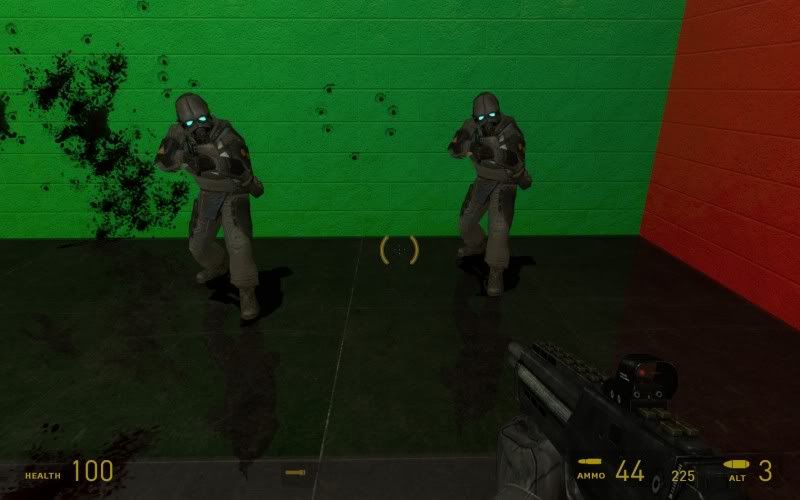
Real-time reflections!!
EDIT:
Shitty lighting in that picture; I'm going to illuminate it better and get some better screenshots
Post your screenshots! WIP thread
Created 17 years ago2007-12-16 00:58:58 UTC by
 doodle
Created 17 years ago2007-12-16 00:58:58 UTC by
![]() doodle
doodle
Posted 15 years ago2010-01-23 22:13:25 UTC
Post #278338
Posted 15 years ago2010-01-23 22:14:50 UTC
Post #278339
Did you use the water shader on a tile texture?
Posted 15 years ago2010-01-23 22:19:22 UTC
Post #278340
I used the water shader on an unanimated normal map, then made a 1-unit-thick brush just above that, turned it into a func_brush, and lowered the opacity to let the reflection through. There needs to be a barrier between the water and the player/bullets/grenades/etc.; otherwise splashing occurs.
Posted 15 years ago2010-01-24 00:55:13 UTC
Post #278341
Looks cool, but there's a better way for doing that, now. ;>
Posted 15 years ago2010-01-24 01:06:34 UTC
Post #278343
Nice. But hey!
Also, I think I prefer the traditional approach of duplicating the room under the floor and making the floor semitransparent. It's backwards compatible with everything
Note:This entity will not show a player their own reflection, however it will render other players.That's not cool.
Also, I think I prefer the traditional approach of duplicating the room under the floor and making the floor semitransparent. It's backwards compatible with everything

Posted 15 years ago2010-01-24 01:52:30 UTC
Post #278345
This is source. We have better ways of doing things.
Posted 15 years ago2010-01-24 02:39:30 UTC
Post #278346
Except mirrors, it seems...
Posted 15 years ago2010-01-24 02:56:32 UTC
Post #278347
Well all the HL2 games by default don't even have a player model, so that's no biggy if you're mapping single-player. Could look odd in multi, though I wonder what kind of an impact it would have on performance in a busy server anyway.
Posted 15 years ago2010-01-27 14:56:13 UTC
Post #278450
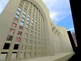
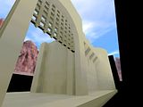
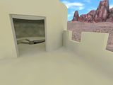
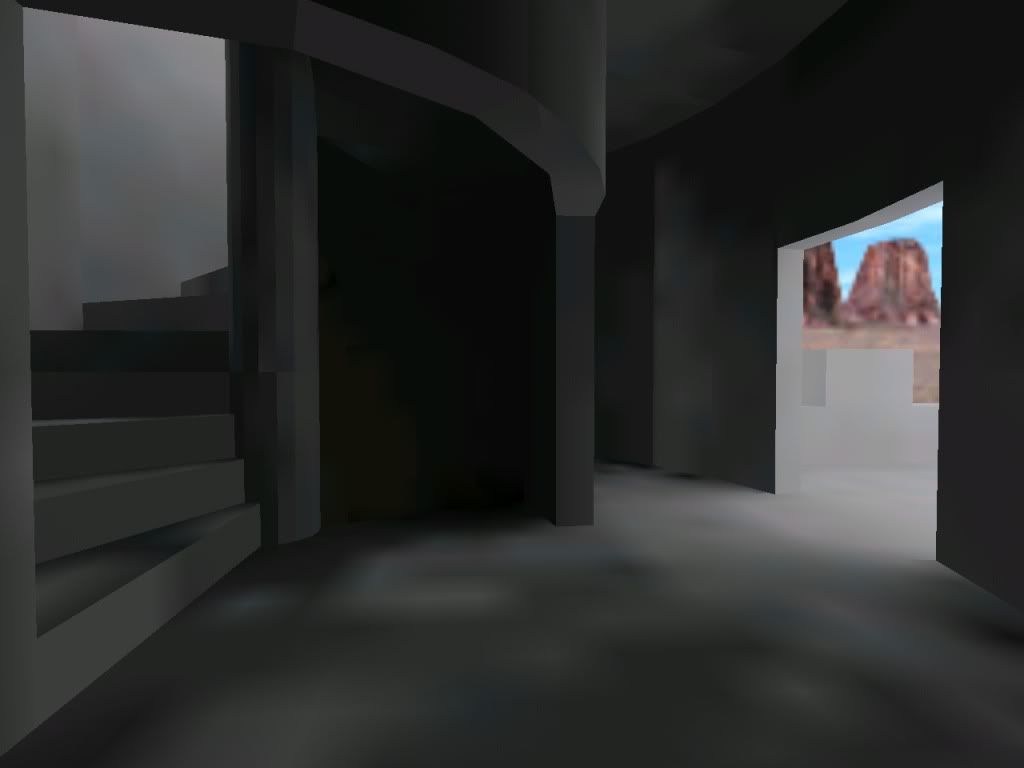
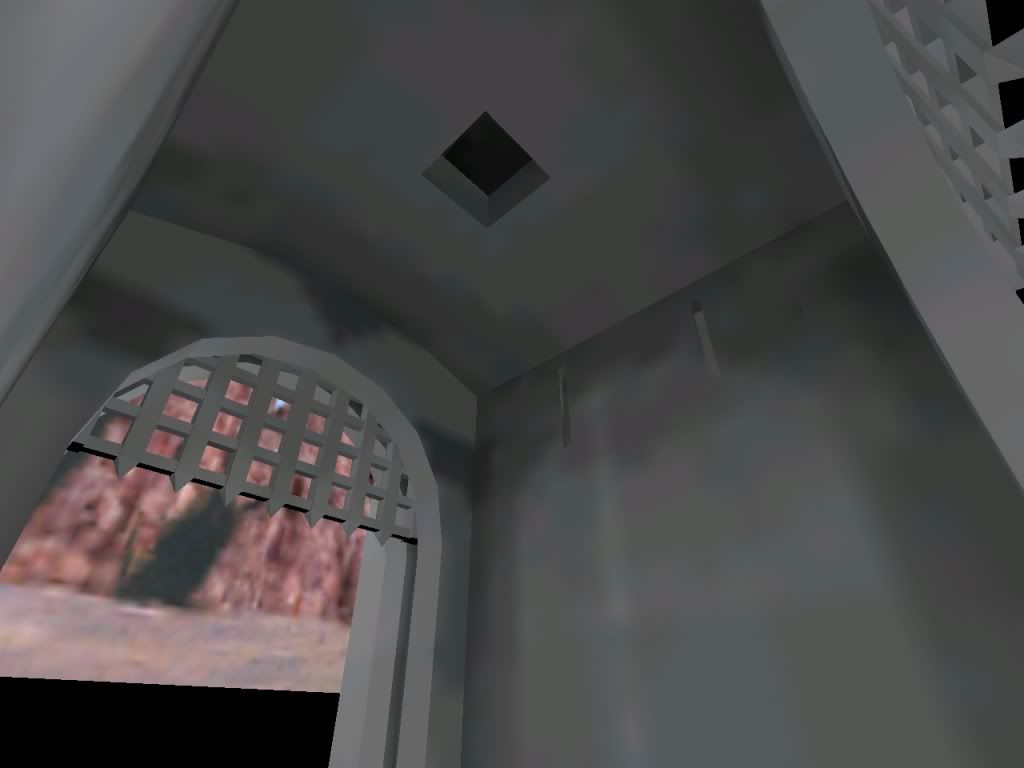
I needed a break from my rooms entry, so I picked up an architectural test project I had a few months ago. I hereby present you, the WIPPEST WIP!
As an aspiring architect, I always wanted to make a castle. It's probably one of the first things I tried to map when I started. Hence it was complete shit. 99% invalid solid structure errors, horribly plain and desperatingly disproportioned architecture, improper use of decals (say, to put a painting on a wall, I placed it as a decal instead of texturing a brush). With a lot of textures from de_cbble (I mapped for CS in the beginning). And the hugest skybox you've ever seen - my reasoning was, it appears to be far away, so I probably have to actually place it far away. Just try to imagine. I'm sure I still have that rmf somewhere, maybe I'll upload it to the Vault for amusement.
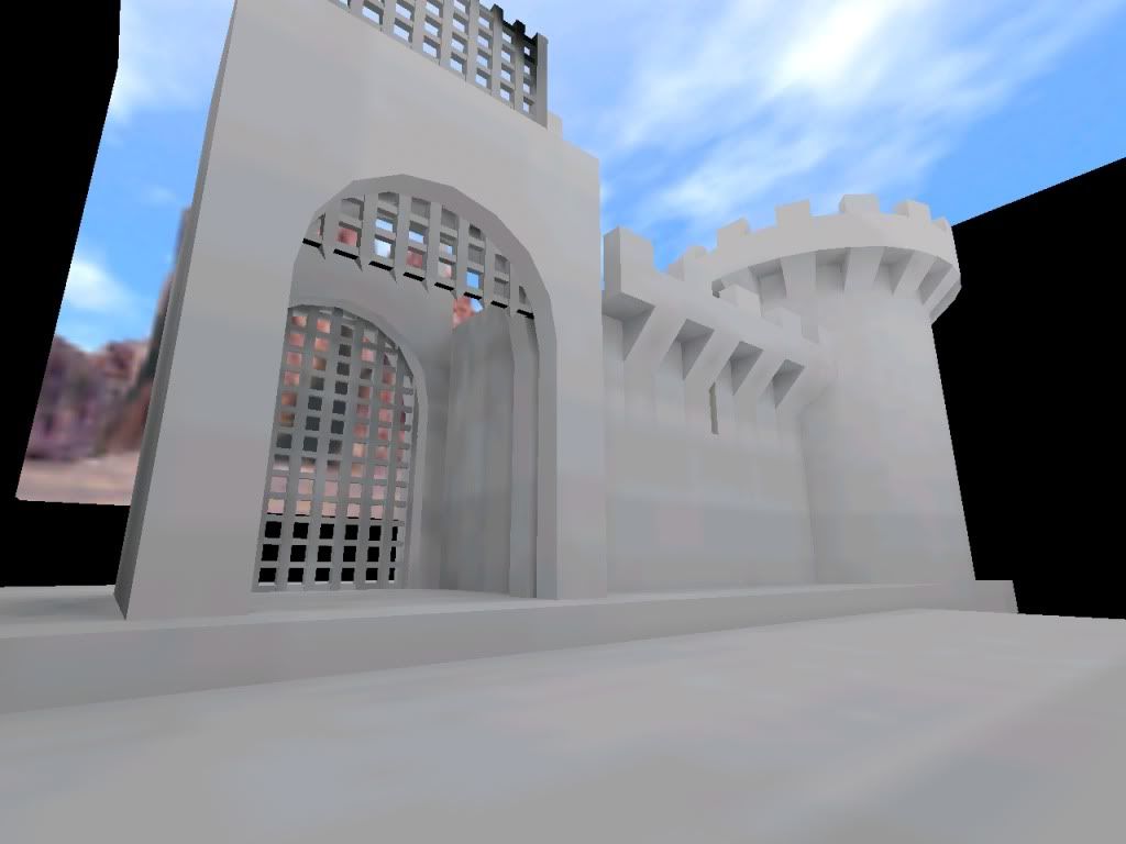
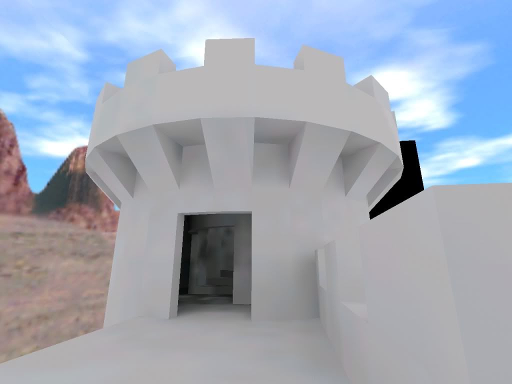
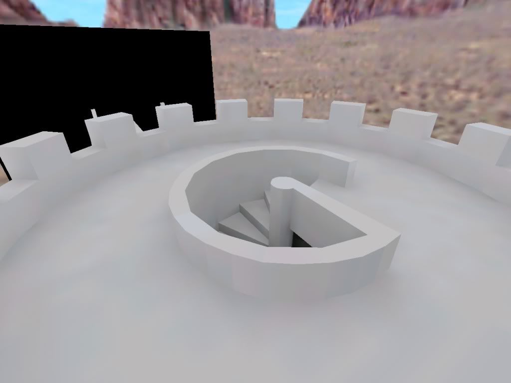
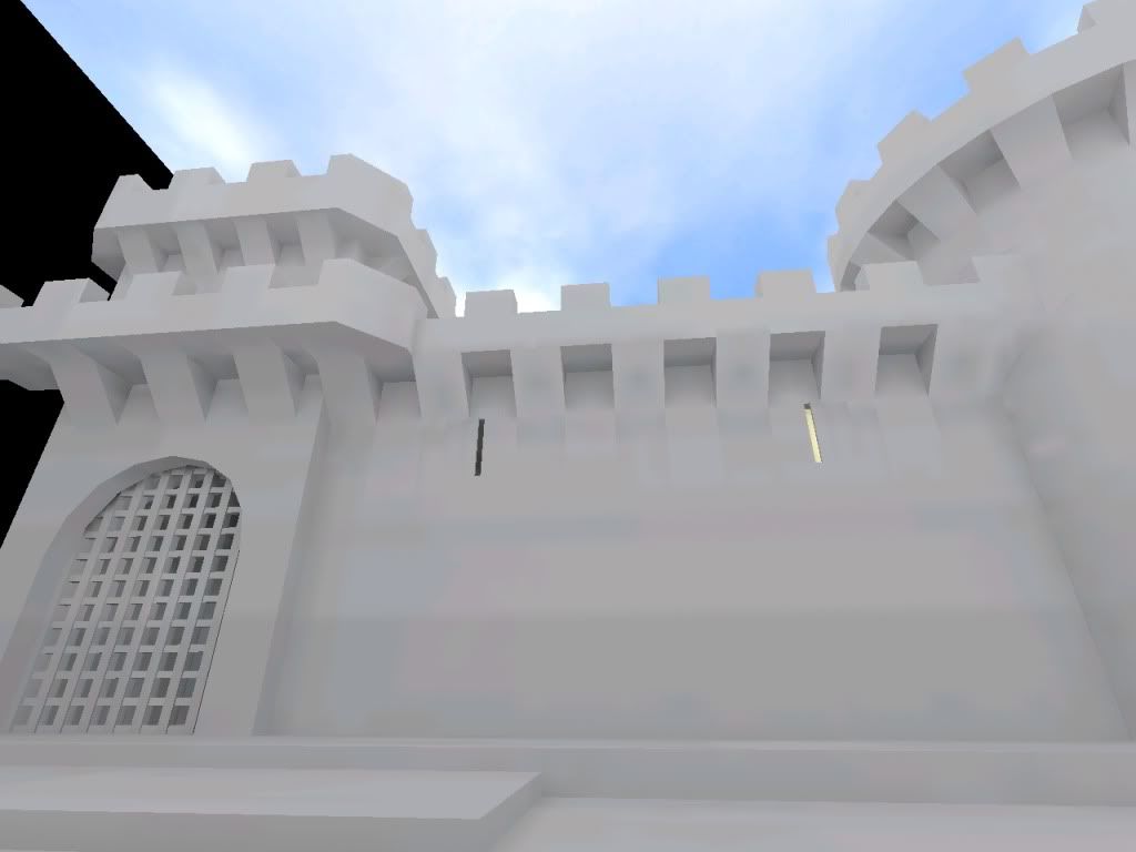
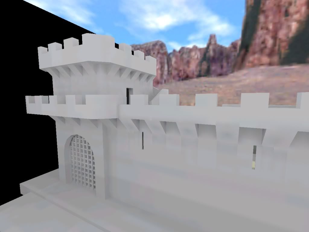
Anyway, some time ago I decided to experiment with castles again. This time having an idea of what a castle actually looks like, I made a round tower with more sides (the early one was octagonal... brbrbrbr). And a (half) gatehouse with a portcullis. It's intended to have a moat and drawbridge someday. Anyway, screenies!
Notice it's all untextured. Just testing shapes atm.
Sorry for the wall of text. I just love it when things have a background story and I like to share those when I have them.
Posted 15 years ago2010-01-27 15:33:25 UTC
Post #278452
looks really promising. keep at it
Posted 15 years ago2010-01-27 16:20:49 UTC
Post #278458
I present to you all.. the Satanic Circle Maker 5000!
http://www.yousendit.com/transfer.php?action=batch_download&batch_id=S1VERkJaQk53NUpMWEE9PQ
Boredom created it, and its cool anyway.
http://www.yousendit.com/transfer.php?action=batch_download&batch_id=S1VERkJaQk53NUpMWEE9PQ
Boredom created it, and its cool anyway.
Posted 15 years ago2010-01-28 18:45:23 UTC
Post #278460
It makes nice Moroccan ceiling designs 
And thanks Huntey.
Update:
Here I introduce the Inner Portcullis, and corbels and crenellations on the tower.
I'm starting to like it, but everything still looks too small. The walls are still not thick enough, and the radius of the tower is also too small for my likes. I'm afraid that at this rate, the complete castle will be too large for Goldsrc and would only be suitable for Source...
Posted 15 years ago2010-01-28 20:02:22 UTC
Post #278516
nice work! I'm loving it
Posted 15 years ago2010-01-28 20:46:31 UTC
Post #278518
^ Should be what Castle Disposed looks like ^
Posted 15 years ago2010-01-28 21:20:46 UTC
Post #278520
You do know i'm overhauling that right? 
But you are correct!
I'm throwing aside fashion for function at the time being. once i get all the level changes and stuff down i'll work on aesthetics of the main building.

But you are correct!
I'm throwing aside fashion for function at the time being. once i get all the level changes and stuff down i'll work on aesthetics of the main building.
Posted 15 years ago2010-01-28 21:45:03 UTC
Post #278521
I'd love to see that when it's finished.
Posted 15 years ago2010-01-28 23:22:42 UTC
Post #278524
I'm digging that spiral stairs except you need to do something about the facetted ploppy-ness on the central collumn.
Posted 15 years ago2010-01-29 00:41:05 UTC
Post #278525
I'm aware of it. Any suggestions? Perhaps func_walling it should do the trick? Maybe I should func_wall the steps too, I made the bottoms slanted so the "ceiling" wouldn't be stepped, and that looks odd as well.
Right now it's not meant to be perfect, I'm just experimenting. If I like it and decide I should make a map off it, I'll work on embellishing it.
Right now it's not meant to be perfect, I'm just experimenting. If I like it and decide I should make a map off it, I'll work on embellishing it.
Posted 15 years ago2010-01-29 03:51:17 UTC
Post #278527
If anything just func_wall the central column. That should look fine.
Posted 15 years ago2010-01-29 05:58:28 UTC
Post #278528
http://i39.photobucket.com/albums/e167/discostugs/twhl/castle_test20006.jpgHawt! ;o
Great stuff so far, looking forward to more.
Posted 15 years ago2010-01-31 17:44:10 UTC
Post #278571
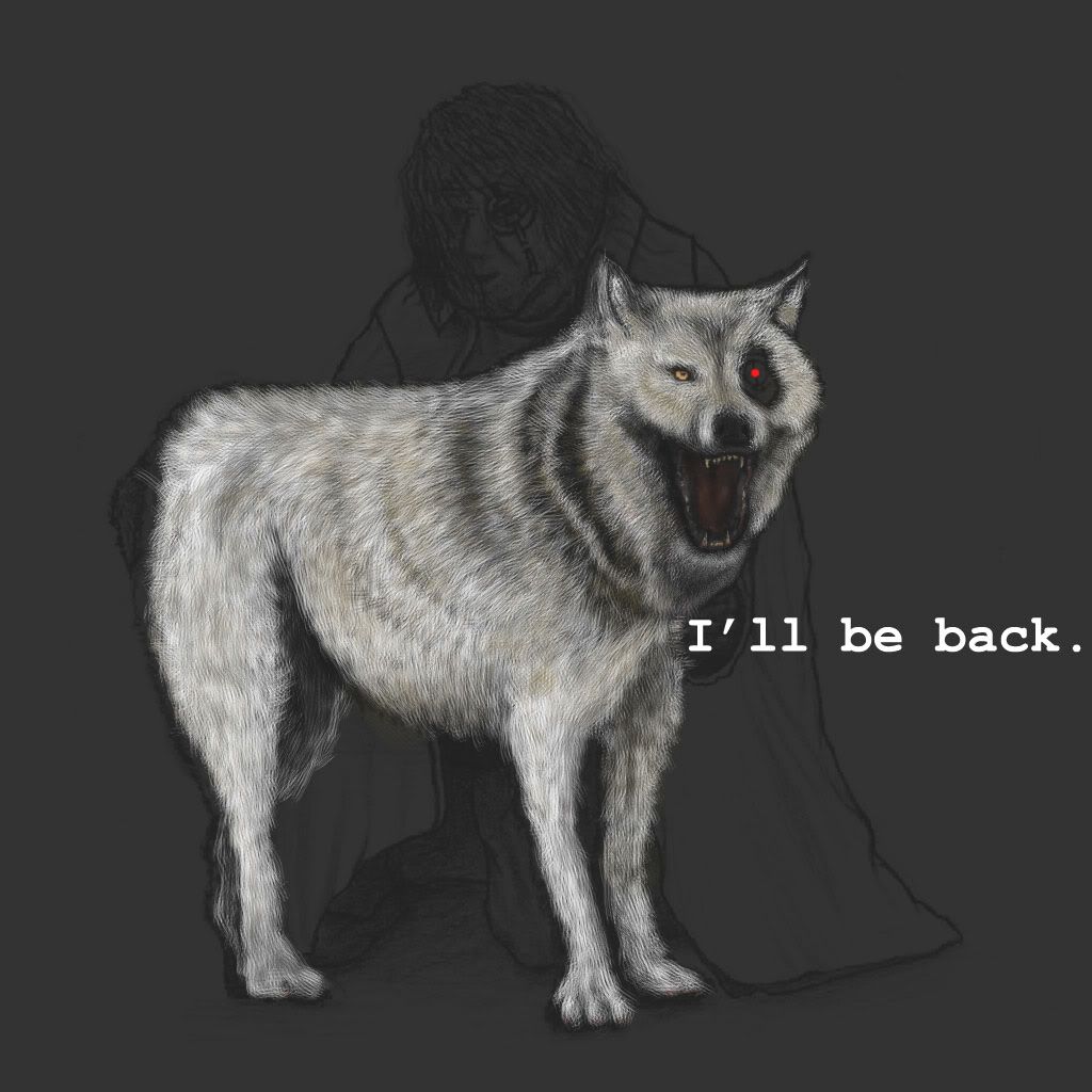
so I started painting my Oldman with the wolf. I'm just learning painter so yeah;Please Comment
Posted 15 years ago2010-01-31 18:09:17 UTC
Post #278575
Good. The missing eye looks creepy, though.
Wait... I just noticed the "oldman" from the title- Subtle.
Wait... I just noticed the "oldman" from the title- Subtle.
Posted 15 years ago2010-01-31 18:51:30 UTC
Post #278577
The darker eye of the wolf looks really awkward. I'm guessing it's supposed to be damaged/blind?
Other than that, lookin' good. ;o
Other than that, lookin' good. ;o
Posted 15 years ago2010-01-31 19:12:15 UTC
Post #278578
Looks like a mechanical eye to me, but it needs a little more definition.
Posted 15 years ago2010-01-31 20:32:17 UTC
Post #278581
If it is mechanical, perhaps it could use a red dot? 

Posted 15 years ago2010-01-31 21:07:21 UTC
Post #278582
what your seeing is just the drawing, the eyepiece is not painted yet. 

Posted 15 years ago2010-02-01 09:19:47 UTC
Post #278603
Disco: Hey that castle looks great man! can't wait to see more..
)
Unbreakable: yeah, i thought it would be a portrait of your father when you said "old man"...D
Posted 15 years ago2010-02-01 13:50:15 UTC
Post #278608
Posted 15 years ago2010-02-01 14:00:41 UTC
Post #278609
Posted 15 years ago2010-02-01 14:28:32 UTC
Post #278610
Oh man, looking good there, Sajo!
I'd only recommend that you tone down those beams.
I'd only recommend that you tone down those beams.
Posted 15 years ago2010-02-03 10:25:47 UTC
Post #278651
Looks nice Sajo! I think tho those L-shaped lights would look better as models, or, brush them out so you can see individual light bulbs under inside a semi-transparent glass cover... I think it would look a lot better than just those textures; at the very least, try a new texture.
Posted 15 years ago2010-02-06 01:00:28 UTC
Post #278734
Tonight, I introduce to you... a finished gatehouse! With what's known as... The Murder Hole.This is looking very much like it'll take about a quarter of Hammer's grid, and I'm trying to make a rather small castle. Had I built one with dimensions true to what I first wanted (and true to an actual castle) it would take about 3/4 (or more) of Hammer's grid. And this would be the castle alone, without surrounding forest. I suppose I'll have to stick to the small one... 

Posted 15 years ago2010-02-06 01:05:05 UTC
Post #278735
I don't know how you can map without textures.
Posted 15 years ago2010-02-06 01:36:27 UTC
Post #278736
I don't really intend this to be a finished map, it's only an experiment for testing my architectural abilities, and currently I'm only interested in shape, not colour. I believe texturing this would divert my attention too much from the main subject of the experiment. Besides, I don't have any proper textures for this theme.
If it makes you feel happier, if I ever make a map out of this, I absolutely will texture it.
If it makes you feel happier, if I ever make a map out of this, I absolutely will texture it.
Posted 15 years ago2010-02-06 02:14:33 UTC
Post #278738
People map without textures all the time. Dev textures accomplish the same thing, ultimately. It's an interesting look too, because it really does put all the emphasis on the architecture, which is nicely done by the way, DiscoStu.
Posted 15 years ago2010-02-06 02:42:21 UTC
Post #278739
That is a really nice castle. Much more interesting than the ones I've seen around here. But then again they are mostly just ruins.
And I know that if I mapped with dev textures, I would without doubt miss some places when texturing it for real, which I would only realise after releasing the map.
And I know that if I mapped with dev textures, I would without doubt miss some places when texturing it for real, which I would only realise after releasing the map.
Posted 15 years ago2010-02-06 06:44:41 UTC
Post #278740
I mean that mapping in all white I would hardly be able to distinguish anything.
Posted 15 years ago2010-02-06 06:53:19 UTC
Post #278741
DiscoStu I think you won't be able to compile that map, but would be nice to see it finished and compiled.
Posted 15 years ago2010-02-06 13:29:40 UTC
Post #278742
Posted 15 years ago2010-02-06 19:02:11 UTC
Post #278745
DiscoStu I think you won't be able to compile that mapIt's already compiled in the pictures.

Posted 15 years ago2010-02-06 20:16:28 UTC
Post #278748
Glad you guys are liking it. I'm not too happy with some of the details but that'll likely change later on.
@Rimrook: That looks very interesting. I'm downloading it right now.
@Rimrook: That looks very interesting. I'm downloading it right now.
Posted 15 years ago2010-02-08 19:11:17 UTC
Post #278785
Some random teleporter contraption i came up with:
Posted 15 years ago2010-02-08 19:48:10 UTC
Post #278786
Omg boobs!
Posted 15 years ago2010-02-08 21:06:12 UTC
Post #278787
This is why we can't have women on the site. Because people like you.

So...imature.

So...imature.
Posted 15 years ago2010-02-08 21:24:32 UTC
Post #278788
Oh please. :/
Posted 15 years ago2010-02-09 00:27:15 UTC
Post #278791
Well I laughed.
It's a cool looking portal thingymabob (technical term), though I think it needs something extra on the centre platform.
It's a cool looking portal thingymabob (technical term), though I think it needs something extra on the centre platform.
Posted 15 years ago2010-02-09 04:39:39 UTC
Post #278793
I think it needs more lasers.
Posted 15 years ago2010-02-09 13:07:51 UTC
Post #278795
Great detail brushing Atom (as usual), but you can barely tell with those textures. HL original textures are so beat... =(
Posted 15 years ago2010-02-09 15:21:25 UTC
Post #278797
I dont know about you guys, but I like boobs! oh and did you check out street view for google maps? I found ma house!
Posted 15 years ago2010-02-13 01:40:42 UTC
Post #278888
Heyguys!
Wooooow I just found this site after I forgot all about mapping for over a year!
I was working on this at the time (I found it only a few pages back):Which, sadly, never worked out. But now I have a computer that would literally fart all over my old one. I've gone from 10fps in software mode on GoldSrc... to 30fps in maxed out Crysis.
So now that CSPromod is out and about (check it at cspromod.com), I've been inspired back into mapping. I'm taking it slowly this time, making small aim maps. Here's what I'm just adding the finishing touch to now ($*&?ing overview won't work!!)...
You must be logged in to post a response.

