Absolutely brilliant, Mr.Pro Map.
It's clearly Goldsource, but it still looks great. Maybe stop arguing and appreciate the work that has gone into it?
Post your screenshots! WIP thread
Created 16 years ago2007-12-16 00:58:58 UTC by
 doodle
Created 16 years ago2007-12-16 00:58:58 UTC by
![]() doodle
doodle
Posted 13 years ago2011-08-22 12:31:56 UTC
Post #298295
Posted 13 years ago2011-08-22 12:33:53 UTC
Post #298296
Oh please, I'm just having fun.
Posted 13 years ago2011-08-22 14:44:38 UTC
Post #298297
If I can't spot more than one HL texture then obviously he's doing a good job in texturing the area to where I can't tell if it is or not. Now, fuck off. Thanks.
Posted 13 years ago2011-08-22 16:16:46 UTC
Post #298298
Crollo: I would have at least one of those programs, but I'm extremely short on HD space at the moment. Hence the whole thing about getting a new hard drive.
Although I wasn't aware that they're unusable. I gave Joe that model and got a working one back after a while. :
I shall have to learn not to make assumptions.
Although I wasn't aware that they're unusable. I gave Joe that model and got a working one back after a while. :
I shall have to learn not to make assumptions.
Posted 13 years ago2011-08-23 22:46:56 UTC
Post #298339
After taking a break from the Duke Nukem 3D editor I decided to try out working with Hammer again. After my first release, which was over 2 years ago, I always wanted to go back and do something more. So after about a month of work I've finished two maps, the second one shown below, and another one set on Xen but it's so fucking small I won't bother taking any shots of it. Planning on making 3 or 4 maps but it depends on how much time I've got and before my patience runs out.
Posted 13 years ago2011-08-24 01:16:26 UTC
Post #298340
those look great luke loke! i hope you will release for us to play! Also like the title btw 

Posted 13 years ago2011-08-24 01:29:07 UTC
Post #298341
yeah Loke, great stuff.
Posted 13 years ago2011-08-24 02:23:09 UTC
Post #298342
i'm calm as hellCalm people don't use the F-bomb. It's okay man, they are just textures, lets just say instant is a boss a mapping and end it there lol!
good job!
see fucking lazy ignorant obama?
oh by the way, you fail, Joebama.
Posted 13 years ago2011-08-24 05:25:20 UTC
Post #298344
Like theres always great stuff in this thread.. and whoever made it, congrats.
The screenshots from loke, and instant mix and others are incredible.
The screenshots from loke, and instant mix and others are incredible.
Posted 13 years ago2011-08-24 05:56:05 UTC
Post #298345
high-five!
Posted 13 years ago2011-08-24 07:55:47 UTC
Post #298347
Also nice work Loke, keep it up!
Posted 13 years ago2011-08-25 17:23:34 UTC
Post #298385
Would be so much better if the PC with hammer installed didn't decide to suddenly fail to connect to every wireless connection... lovely. Won't be progressing with that map for some time then...
Posted 13 years ago2011-08-25 17:28:24 UTC
Post #298386
Nice Loke! Good to see there is still some life in those textures. 

Posted 13 years ago2011-08-29 00:49:22 UTC
Post #298466
So, I've been working on a HL2 map. Breen shows his similarity to everybody else by being a lazy bastard.That's a TV screen, by the way.
Posted 13 years ago2011-08-29 21:00:47 UTC
Post #298480
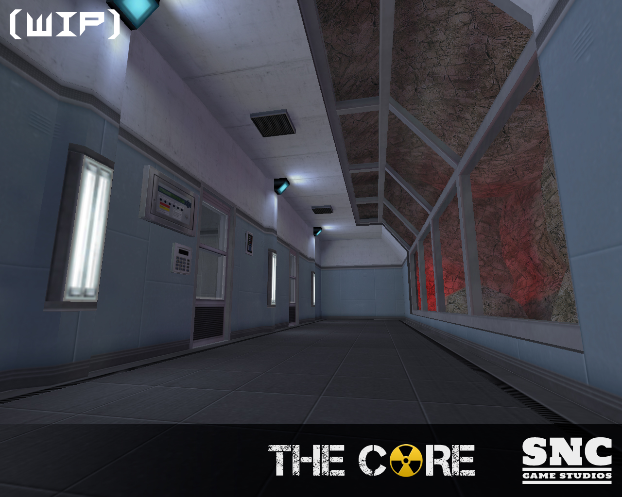
2 new screens from The Core for those not on Moddb.
Posted 13 years ago2011-08-29 21:23:11 UTC
Post #298482
Wow!
Posted 13 years ago2011-08-30 04:33:32 UTC
Post #298488
Loving the lighting.
Posted 13 years ago2011-08-30 09:50:27 UTC
Post #298496
Could be better but not bad.
Posted 13 years ago2011-08-30 10:17:00 UTC
Post #298497
Could be better but not bad.Could you be more specific? What could be improved in your opinion?
Posted 13 years ago2011-08-30 11:35:35 UTC
Post #298501
The first screen looks good. Maybe a bit too clean. Try adding some props. Try making one of the lamps not working for variation. The ground texture is a bit too clean. Try a more dirty, more realistic, more concrete like ground texture with more variation.
The second and third screens look a lot more poor than the first one. Very blocky and boring architecture. The lighting isn't too good. The mix of old low res textures and new high quality ones looks terrible. Some of them are very dirty while others are very clean. The ground is also way too clean. The glass is way too bright, make it more transparent. The railings are way too blocky and thick. The design of this area is just way too random. Try making a more consistent theme.
The second and third screens look a lot more poor than the first one. Very blocky and boring architecture. The lighting isn't too good. The mix of old low res textures and new high quality ones looks terrible. Some of them are very dirty while others are very clean. The ground is also way too clean. The glass is way too bright, make it more transparent. The railings are way too blocky and thick. The design of this area is just way too random. Try making a more consistent theme.
Posted 13 years ago2011-08-30 14:55:22 UTC
Post #298506
Those Screens from The Core are awesome! I think the lighting is good, though ya know me, its either well lit or high contrast. Maybe use some spotlights, and perhaps a subtle flare sprite on the lights. On the second and third image down, the light on the ceiling seems a bit large for the low amount of light given to the room. Just an opinion though.
Posted 13 years ago2011-08-30 15:29:26 UTC
Post #298507
while i respect dragos comments and knowledge, i disagree on some points
I feel the first screen looks perfectly detailed(no props needed imo), but the only distraction for me is the vertical flourecent lights on the wall, which just look a little. Very nice mapping!
2nd pic looks good to me though i'll agree some textures are a little too "clean" looking. (not bad just a little sterile)
I don't like anything that resembles a HL original wooden crate, so that is a bit of a distrcation for me in the second to last pic.
Last pic looks fine and that reenvisioned HL door looks nice. Is it bumpmapped?
can't wait to play the core good work guize! =)
Posted 13 years ago2011-08-30 16:24:35 UTC
Post #298509
You see it's not only about looks. There is also logic. You don't want to waste huge amounts of space in a research facility deep underground.
Posted 13 years ago2011-08-30 17:08:30 UTC
Post #298510
Meet the Yiang class gunship. Because while US vs China has been kind of done to death at this point, it hasn't been done to death enough.Also, I like Urby's first pic. I like clean, there wouldn't really be that much reason for an administrative area to be too dirty.
Posted 13 years ago2011-08-30 17:08:55 UTC
Post #298511
ya, but think of unlimited black budgets to tunnel out whatever the BM doodz deem necessary. =) No matter how you present them, small cramped areas are displeasing to look at, no matter how realistic, at least imo.
Posted 13 years ago2011-08-30 18:36:39 UTC
Post #298512
As I said it's not only about looks. Reality is not always nice.
Posted 13 years ago2011-08-30 18:43:13 UTC
Post #298513
Have to consider if any sort of traffic goes through, or if utility carts or golf carts travel through the long tunnels as well. Things do have to fit some how. As for the screenshots, I think they all work space-wise. However I just noticed the third screenshot has a large hydraulic platform for large items. However, the door behind it on the wall is half of its width. It doesn't make sense because anything small enough to go through a door that size could go down a ramp. Make the door bigger perhaps?
OR ignore everything we say say :3
OR ignore everything we say say :3
Posted 13 years ago2011-08-30 18:56:50 UTC
Post #298514
The funny thing is, that tends to be one of my failings at mapping. I concentrate so much on making everything realistic that my brain melts and I don't finish.
Posted 13 years ago2011-08-30 18:57:20 UTC
Post #298515
TJB: you snuck that in and i didn't even see it; and it isn't even a gun! =) Looks great what is it from?!
Posted 13 years ago2011-08-30 20:24:15 UTC
Post #298517
It is based of a photo of a Lego spaceship I found.I decided to build it, and then make a little area around it to display it. I'm actually going to modify the design to reduce the level of plagiarism somewhat, and then it will be used in my current mapping project.
Posted 13 years ago2011-08-30 21:39:18 UTC
Post #298518
@TJB: That's awesome!
Also, thanks for the feedback Dragos and everyone else. I'm going to do some more work on the warehouse area and take some of the critisism on board.
Also, thanks for the feedback Dragos and everyone else. I'm going to do some more work on the warehouse area and take some of the critisism on board.

Posted 13 years ago2011-08-30 22:38:17 UTC
Post #298522
Ah Lego ftw! Man I miss those days
Posted 13 years ago2011-08-31 06:39:24 UTC
Post #298536
lego technic ftw!!! but it costs a fortune ;p
i remember when i was "mapping" with Lego when i was yoooounger...
i remember when i was "mapping" with Lego when i was yoooounger...
Posted 13 years ago2011-08-31 08:39:35 UTC
Post #298538
I LOVE lego but they are soooo expensive.
So many memories of mapping with lego.. as well construx, wooden blocks, even the really old sets like lincoln logs and tinker toys and others. =)
Modeling with playdoh, silly putty and crayola clay!
CUSTOM TEXTURES AND TEXLIGHTS BY LITE-BRITE!
So many memories of mapping with lego.. as well construx, wooden blocks, even the really old sets like lincoln logs and tinker toys and others. =)
Modeling with playdoh, silly putty and crayola clay!
CUSTOM TEXTURES AND TEXLIGHTS BY LITE-BRITE!
P
Posted 13 years ago2011-08-31 08:42:45 UTC
Post #298539
C'mon guys. There's nothing stopping you from getting back into lego  There's usually at least one large container full of the stuff around this house.
 There's usually at least one large container full of the stuff around this house.
Posted 13 years ago2011-08-31 10:37:10 UTC
Post #298543
@TJB: How about a model of that beast to replace the apache/osprey? 

Posted 13 years ago2011-08-31 11:44:12 UTC
Post #298544
I wish there was Propper for GoldSource...
Posted 13 years ago2011-09-01 17:39:36 UTC
Post #298575
It would probably be better for the Apache rather than the Osprey, there doesn't seem to be much room for troops in it. Unless of course I modify it to make a troop transport. :
And I would make a model, but it would be useless. I need to get 3DS Max. :
And Lego is awesome.
I was supposed to be getting some for my birthday but it never arrived. D:
And I would make a model, but it would be useless. I need to get 3DS Max. :
And Lego is awesome.

I was supposed to be getting some for my birthday but it never arrived. D:
Posted 13 years ago2011-09-10 21:47:45 UTC
Post #298792
Here's a TFC map I'm working on:Any thoughts?
Posted 13 years ago2011-09-10 21:59:37 UTC
Post #298793
I think your architecture is inspiring, but you're not showing very much of your map. Or it's just that it's a wip?I've started this map in spring... I blame Vrad.exe for slow progress.
Posted 13 years ago2011-09-11 01:56:40 UTC
Post #298798
That's pretty much it so far, there is another area behind that door, check a few pages back for a screenshot of it.
I like the lighting in the shot above, though the buildings seem a little flat and the side walk seems odd, needs a different texture. Other then that it's not bad.
I like the lighting in the shot above, though the buildings seem a little flat and the side walk seems odd, needs a different texture. Other then that it's not bad.
Posted 13 years ago2011-09-11 10:12:26 UTC
Post #298807
slowly but surely , less goldsrc textures are being used..
Posted 13 years ago2011-09-11 11:04:55 UTC
Post #298808
Technically, every texture in that screenshot is goldsource.
Posted 13 years ago2011-09-11 11:16:47 UTC
Post #298810
He means HL textures
Posted 13 years ago2011-09-11 13:43:00 UTC
Post #298813
By the way , how's the core coming on urby / archie?
Posted 13 years ago2011-09-11 14:03:49 UTC
Post #298815
Still plugging away at it bit by bit. 

Posted 13 years ago2011-09-11 18:28:12 UTC
Post #298843
He means HL texturesDon't shit in his food.
Posted 13 years ago2011-09-13 02:31:08 UTC
Post #298900
Instant Mix, I love that shot, such a good use of stock/new textures.
Posted 13 years ago2011-09-13 06:51:58 UTC
Post #298902
Instant, that looks pretty damn good as is, if that was implying you were gonna change the rest of the standard textures too.
Posted 13 years ago2011-09-13 09:18:43 UTC
Post #298904
You wanted to see it compiled, so there you go:The shape of curved structure itself is made by removing and connecting certain segments of a simple circular arch. The curved slopes are made of triangles to avoid any invalid structures. To texture it nice and seamlessly I used a very simple trick: flatten the whole structure, apply texture to world and expand again.
Some experimenting with stained glass:It's done by making the glass opaque to block light and using zhlt_customshadow to change the color of the shadow.
Some experimenting with stained glass:It's done by making the glass opaque to block light and using zhlt_customshadow to change the color of the shadow.
You must be logged in to post a response.


