Post your screenshots! WIP thread
Created 17 years ago2007-12-16 00:58:58 UTC by
 doodle
Created 17 years ago2007-12-16 00:58:58 UTC by
![]() doodle
doodle
Posted 12 years ago2012-11-04 19:33:31 UTC
Post #310787
AGS, what is that ?
Posted 12 years ago2012-11-04 20:12:19 UTC
Post #310789
Adventure Game Studio 3.2.1
Posted 12 years ago2012-11-05 09:15:46 UTC
Post #310803
Started this one long time ago. Might get this one done eventually 

Posted 12 years ago2012-11-05 21:40:50 UTC
Post #310812
That's cool. Got a Perfect Dark vibe from it for a second. Probably the duel wielding.
Posted 12 years ago2012-11-05 22:08:35 UTC
Post #310813
NoSick I'm confused. Am I looking at a map for UT or are you just using those totally badass pistol models?
Either way, good looking stuff.
Either way, good looking stuff.
Posted 12 years ago2012-11-06 07:21:36 UTC
Post #310817
Yeah, that's UT map. I should put more lights there indeed.
Posted 12 years ago2012-11-07 21:48:54 UTC
Post #310833
Since I've been watching through the Hellraiser films, I decided to try making the Lament Configuration to give myself some practice at making textures.The creepy thing is though, I decided to divide it up and rotate pieces so it looked like it was open, mainly to see if it could be done without having off grid vertices. But once I did that, I clicked on it to realign some vertices and my computer died.
... Did I just summon the Cenobites into my map?
[Edit]
I thought I might add, I didn't make the fancy metal patterns, I got them from here. I'm not that good.
... Did I just summon the Cenobites into my map?
[Edit]
I thought I might add, I didn't make the fancy metal patterns, I got them from here. I'm not that good.
Posted 12 years ago2012-11-13 22:29:53 UTC
Post #310952
I can't quite decided which sort of atmosphere I prefer for my map. I posted 2 of these a few pages back but I'll put them up again for comparison purposes. A lot of you ruled out the first one as being a little bland in lighting but again, comparison.NOTE: The last picture has a large shadow that needs fixing on the ground.
Posted 12 years ago2012-11-13 23:13:06 UTC
Post #310953
#2 with improved lighting 

Posted 12 years ago2012-11-15 09:00:58 UTC
Post #310969
#2 looks really nice, but I'm not sure whether #3 would be better. They both look pretty good.
Posted 12 years ago2012-11-15 12:46:01 UTC
Post #310975
Posted 12 years ago2012-11-15 12:50:04 UTC
Post #310977
I like, very much.
And while I like the colours of the last screenshot, I think it needs some kind of trim between the walls and the ceiling. It looks a slight bit odd as it is now.
And while I like the colours of the last screenshot, I think it needs some kind of trim between the walls and the ceiling. It looks a slight bit odd as it is now.
Posted 12 years ago2012-11-15 13:02:20 UTC
Post #310978
Oh shit. Thanks for reminding me.
I was actually going to do that before I took the screens and uploaded. Guess I forgot...
I was actually going to do that before I took the screens and uploaded. Guess I forgot...
Posted 12 years ago2012-11-15 14:07:56 UTC
Post #310983
i love the second picture!
Posted 12 years ago2012-11-15 14:19:58 UTC
Post #310984
Wow, you're a lot better than Archie :>
Posted 12 years ago2012-11-15 16:59:38 UTC
Post #310989
aww 

Posted 12 years ago2012-11-16 12:49:10 UTC
Post #311009
Grade A complisult right there.
Black Mesa is looking a lot more stylish these days, I like it!
Black Mesa is looking a lot more stylish these days, I like it!
Posted 12 years ago2012-11-16 12:58:45 UTC
Post #311010
I like to think that some of the facilities budget would be put towards modernisation of those dank fifties areas. There will be evidence of that taking place in this section of the mod. 

Posted 12 years ago2012-11-16 16:53:35 UTC
Post #311011
Extremely WIP:I'm making the Boeing Monomail, because it's an interesting looking plane.
Posted 12 years ago2012-11-16 19:06:38 UTC
Post #311013
A bit of lightning tweaking...
Posted 12 years ago2012-11-18 04:01:46 UTC
Post #311030
Seemingly all the other parts of my [previously completed] M16 have disappeared. Oh well.
EDIT: I also appear to have given my M16A4 full auto capabilities. Oops.
EDIT: I also appear to have given my M16A4 full auto capabilities. Oops.
Posted 12 years ago2012-11-18 05:54:50 UTC
Post #311031
@noSICK: Is that GoldSrc? The textures and the shadows look great.
Posted 12 years ago2012-11-18 11:21:53 UTC
Post #311034
Nope, that's good old UT99 which is still able kick ass if treated right  Actually, it is pretty easy to recreate such lightning with vluzacan on GS though. It's my last thing made for "old gentlements" UT and GS. Moving to UDK now.
 Actually, it is pretty easy to recreate such lightning with vluzacan on GS though. It's my last thing made for "old gentlements" UT and GS. Moving to UDK now.
Posted 12 years ago2012-11-18 13:58:37 UTC
Post #311036
Elliot Lucak that is an amazing model, the texturing is perfect, that's something I'd expect of an AAA game, very nice!
Stojke keeps asking me to post new screenshots of my gothic cathedral models, so I'll put some screenies here:
Stojke keeps asking me to post new screenshots of my gothic cathedral models, so I'll put some screenies here:
Posted 12 years ago2012-11-18 22:38:42 UTC
Post #311044
Thanks Skals, though it's hardly AAA worthy, haha.Almost done. Need to redo the magazine because it ended up looking like poop.
Posted 12 years ago2012-11-18 23:05:37 UTC
Post #311045
The church of doom 
Awesome. Also Crolos models are pretty damn cool. Great job dude!
And No sick , that looks sick
@Moaby - 2nd screen shot - with out a doubt the best

Awesome. Also Crolos models are pretty damn cool. Great job dude!
And No sick , that looks sick

@Moaby - 2nd screen shot - with out a doubt the best
Posted 12 years ago2012-11-19 12:37:35 UTC
Post #311048
NoSick, what's that vluzacan?
Posted 12 years ago2012-11-19 13:15:33 UTC
Post #311049
Posted 12 years ago2012-11-21 15:33:34 UTC
Post #311063
Slightly less WIP:I've done the wings and the tail surfaces, and the general shape of the fuselage. I still need to do quite a bit though.
[Edit] I've done most of the structure at this point.I still need to do the landing gear, the propeller, engine exhaust, and then detail the cockpit. I might put in some windows to make it the passenger version.
The engine itself is done, but it needs reworking. I noticed a few minutes ago that the drawings I was basing my measurements off were slightly off, in that the engine and cowling appeared as one size in the plan view, and another in the elevations. Looking at some photos, it turned out I chose the wrong one.
Posted 12 years ago2012-11-24 12:07:19 UTC
Post #311116
That looks really promissing TJB! Keep up 

Posted 12 years ago2012-11-24 12:40:09 UTC
Post #311120
Very nice! 

Posted 12 years ago2012-11-24 17:11:19 UTC
Post #311130
Considering that the Unreal Engine is superior to our beloved Goldsource, it still baffles me how you could make Toughworks practically identical to these shots. Great job! 

Posted 12 years ago2012-11-25 11:56:49 UTC
Post #311148
hl ep2
i dont know what i am going to map @.@
i dont know what i am going to map @.@
Posted 12 years ago2012-11-25 14:30:28 UTC
Post #311149
Ninja Defuse, looking good 
But for the broken floor, you should add displacements otherwise it doesn't look right, and you should replace that piece of metal on the bottom left with a model, because it looks too well cut, just like the floor.

But for the broken floor, you should add displacements otherwise it doesn't look right, and you should replace that piece of metal on the bottom left with a model, because it looks too well cut, just like the floor.
Posted 12 years ago2012-11-26 11:29:14 UTC
Post #311169
Got no crits from me although it might look nice with lots of green aka grass, vines, overgrowth etc.
Posted 12 years ago2012-11-26 17:20:47 UTC
Post #311179
Um.. I don't know if it was only me who experienced Hammer shitting everywhere in windows 7, but as soon as I upgraded to windows 8, the programme is suddenly more stable. Sure, the zoom tool is still invisible but at least the grids aren't disappearing and hammer isn't randomly shutting down every half second.
Posted 12 years ago2012-11-26 18:10:44 UTC
Post #311181
That never happened to me in Win 7.
Posted 12 years ago2012-11-26 19:07:08 UTC
Post #311185
Same here. The only issues I've ever had with Hammer were down to that shitty ATi Radeon HD.
Posted 12 years ago2012-11-26 21:11:23 UTC
Post #311193
@skals and haiboi 
i am goldsorc mapper going to checkout displacement and grass models

i am goldsorc mapper
 going to checkout displacement and grass models
Posted 12 years ago2012-11-26 21:14:00 UTC
Post #311194
Funny, i'm running it on a Radeon HD 7870.. runs like a dream.
Posted 12 years ago2012-11-26 21:19:27 UTC
Post #311196
To be fair the 7870 is a Beast.
Also, noSick's pics made me wet a little.
Ninja's looks really great too, but I can't help but wonder where that gigantic boulder in the tracks appeared from in an urban environment
Also, noSick's pics made me wet a little.
Ninja's looks really great too, but I can't help but wonder where that gigantic boulder in the tracks appeared from in an urban environment

Posted 12 years ago2012-11-26 21:37:10 UTC
Post #311198
It came from the sky obviously. It's a meteorite.
Posted 12 years ago2012-11-26 21:46:45 UTC
Post #311199
Let's just leave it at that.
Posted 12 years ago2012-11-26 22:03:35 UTC
Post #311203
lets say that somebody of out there farted 

Posted 12 years ago2012-11-26 22:10:19 UTC
Post #311204
Well, I can't debunk the meteor theory. The rock stays.
Posted 12 years ago2012-11-27 01:36:40 UTC
Post #311208
tech demo of a laser-based parking lot monitoring system https://www.youtube.com/watch?v=mxkWxlGk6wA
school project
still WIP
school project

still WIP
Posted 12 years ago2012-11-27 02:07:55 UTC
Post #311210
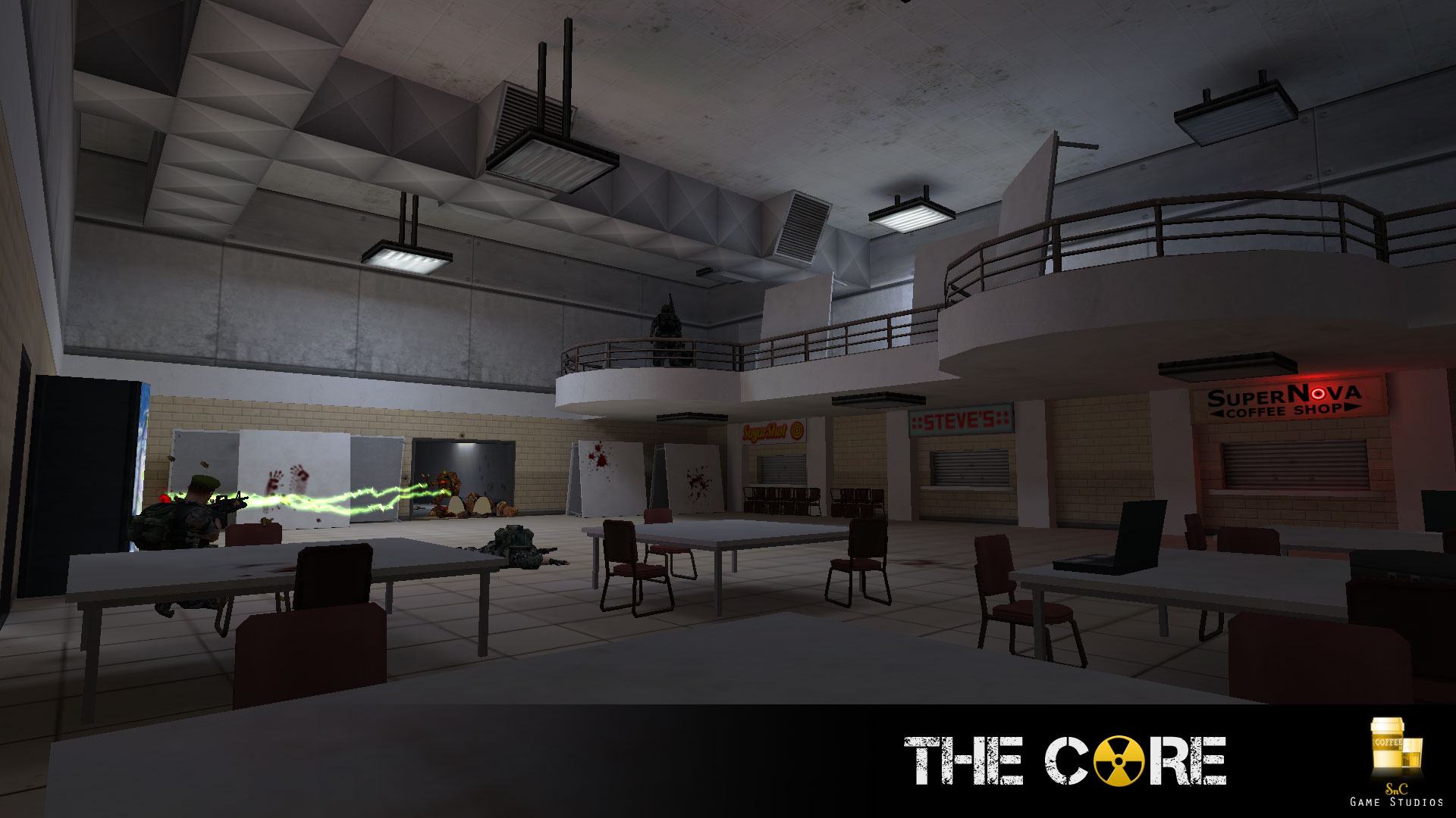
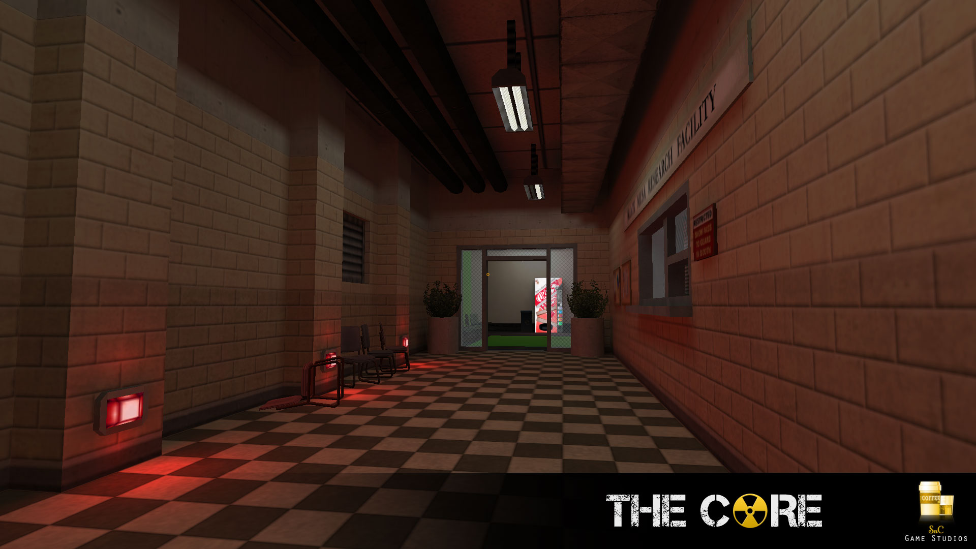
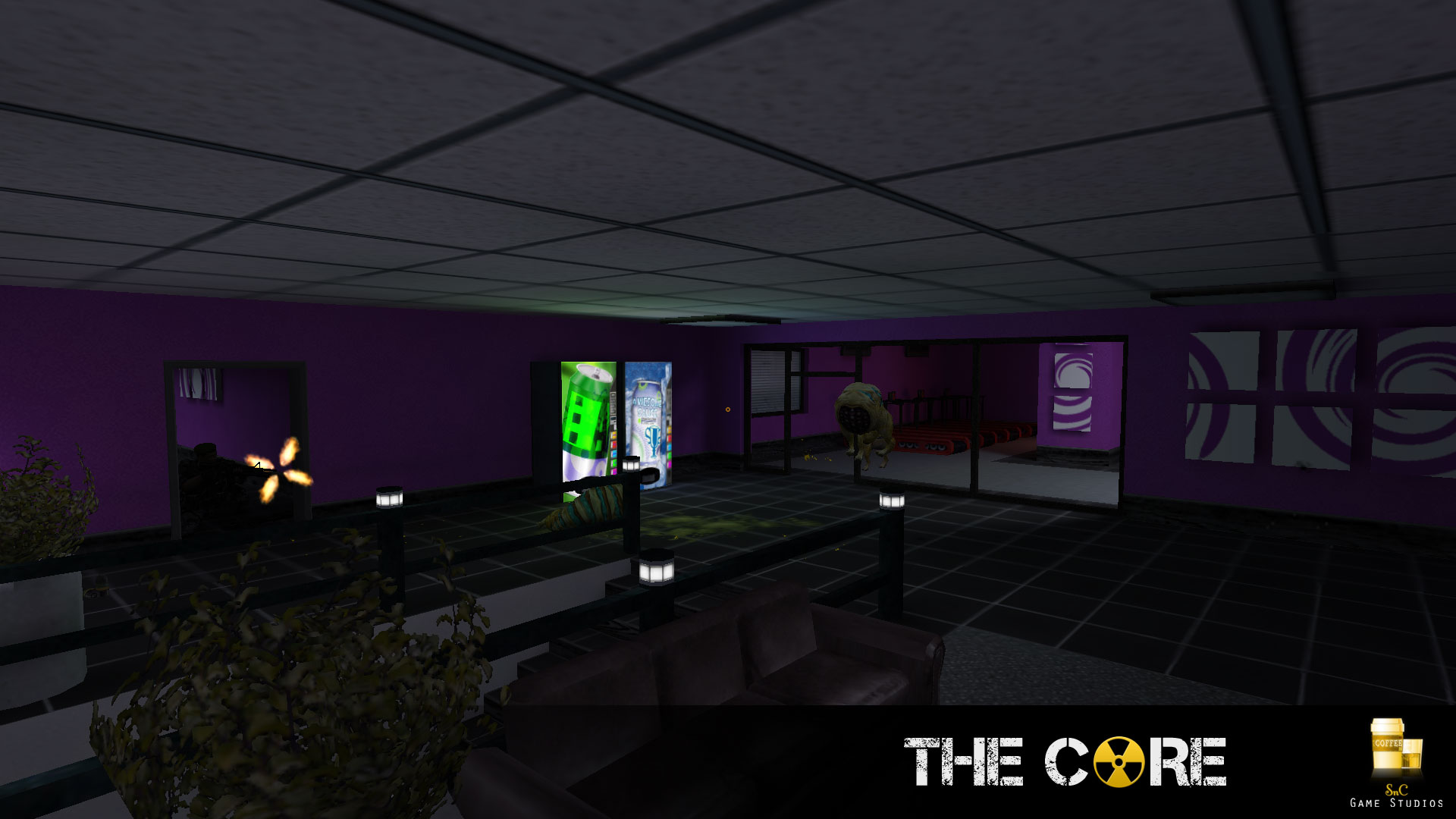
Core mapping from tonight (extremely WIP). This hallway is the result of about 4 hours work, textures and all, partially distracted by a movie on my other screen.
Posted 12 years ago2012-11-28 16:28:42 UTC
Post #311223
The light texture could be a little more crisp.
The vent textures look fantastic.
throw some couches in there and you're golden
The vent textures look fantastic.
throw some couches in there and you're golden
Posted 12 years ago2012-11-28 22:27:15 UTC
Post #311224
I think the vents are a bit too chunky and take up too much space. Rather I'm assuming you didn't use a reference? If so I would make them thinner and have beam supports holding them up to the ceiling.
And if you have spare erm...HL poly's? I haven't mapped for HL in a long time then I would have one or two ceiling panels exposed.
I also appreciate it's early WIP so take my comments with a grain of salt. Otherwise keep it up.
And if you have spare erm...HL poly's? I haven't mapped for HL in a long time then I would have one or two ceiling panels exposed.
I also appreciate it's early WIP so take my comments with a grain of salt. Otherwise keep it up.
Posted 12 years ago2012-11-30 03:37:38 UTC
Post #311237
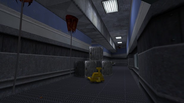
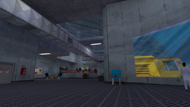
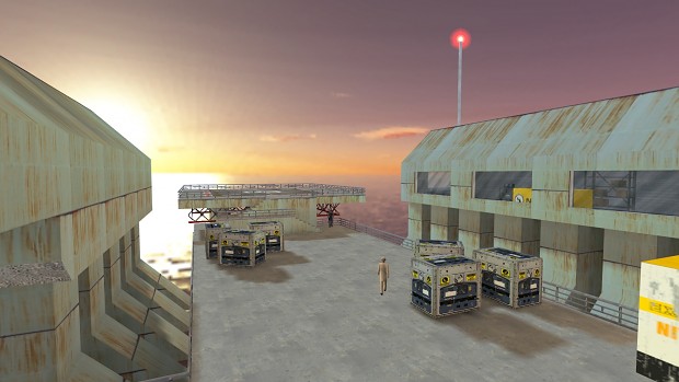
Shots from the forthcoming Challenger Deep 2 mod for Half-Life
http://www.moddb.com/mods/the-challenger-deep-2
http://www.moddb.com/mods/the-challenger-deep-2
You must be logged in to post a response.


