I finished brushwork and texturing in my upcoming HLDM release, Oceanic. The only thing left to do is weapon, spawn and ammo placing.
http://img246.imageshack.us/img246/5140/oceanicbr7.jpg
I also missed working with Source these past weeks, so I've begun the conversion of Suspended. Very early work >> http://img222.imageshack.us/img222/5296/compareop5.jpg
For this map, I'm introducing some custom materials, between them my first normal mapped + reflective masked material. Thanks to Xyos on the mini tutorial for that.
http://img176.imageshack.us/img176/2408/material1il4.jpg
(By the way, the texture won't be right there, it was just a test)
Kasperg Projects!
Created 18 years ago2006-04-25 18:24:30 UTC by
 Kasperg
Created 18 years ago2006-04-25 18:24:30 UTC by
![]() Kasperg
Kasperg
Posted 18 years ago2006-08-26 20:03:03 UTC
Post #194683

Posted 18 years ago2006-08-27 07:51:39 UTC
Post #194743
Gasp
The HL1 map above is well...Just like you to make pwnful maps.
Not so sure I like the conversion although early could later become better so I'll hold back my comment.
The HL1 map above is well...Just like you to make pwnful maps.
Not so sure I like the conversion although early could later become better so I'll hold back my comment.

Posted 18 years ago2006-08-29 19:10:56 UTC
Post #195068
More progress.
I have made several custom materials to make it slightly more original and refreshing than those hundreds of HL2DM maps out there (I coun't some of my own in that group...)
Unfortunately, I keep running into the problem of overlays turning dark in displacement maps after building the cubemaps. Sometimes I manage it to get it working, but not now (third picture)


I have made several custom materials to make it slightly more original and refreshing than those hundreds of HL2DM maps out there (I coun't some of my own in that group...)
Unfortunately, I keep running into the problem of overlays turning dark in displacement maps after building the cubemaps. Sometimes I manage it to get it working, but not now
(third picture)
Posted 18 years ago2006-08-29 19:15:50 UTC
Post #195070
Nice. I like the normal mapped dirt. Is that blue material custom also? Its a nice change of color from the Hl2 materials. Also like the custom signs.
I believe every map needs some custom materials. To truely innovate you cant be stuck with materials that were not made by the individual. Materials are a BIG part of a map. You can have amazing brushwork, but wrong material choice can make the difference. (That and lighting!)
Anyway, nice job!
I believe every map needs some custom materials. To truely innovate you cant be stuck with materials that were not made by the individual. Materials are a BIG part of a map. You can have amazing brushwork, but wrong material choice can make the difference. (That and lighting!)
Anyway, nice job!

Posted 18 years ago2006-08-29 19:22:10 UTC
Post #195071
Yes, the blue is also custom. And the concrete is based on an existing one, but with a slight bluish hue. If you look 4 posts above, there's a tiled texture I made thanks to your minitutorial thread 
Posted 18 years ago2006-08-29 21:08:02 UTC
Post #195076
Damn, thats nice! It really gives the appearance of "depth" between the tiles. And the map looks pwn too 

Posted 18 years ago2006-08-29 22:38:20 UTC
Post #195079
they look really overly wet. it needs to be tweaked down a bit
Posted 18 years ago2006-08-30 10:47:09 UTC
Post #195112
I dont think it looks wet at all. Tiles have high reflections on them. I hate when people say that!

Posted 18 years ago2006-08-30 11:11:44 UTC
Post #195113
Geezz... How can you map with that horrible editor, with all of its bugs...
HL1 FTW!
HL1 FTW!


Posted 18 years ago2006-08-30 17:17:26 UTC
Post #195128
Those Oceanic screens look fantastic

Posted 18 years ago2006-09-04 05:37:19 UTC
Post #195543
Today I made a new discovery. Don't laugh, but I hadn't noticed I could change the last number in the values of a light enviroment to make it brighter. No wonder all my Source maps had dull lighting up to now!
You can compare this image to one I posted a while ago of the same place.
http://img71.imageshack.us/img71/6137/brightul3.jpg
You can compare this image to one I posted a while ago of the same place.
http://img71.imageshack.us/img71/6137/brightul3.jpg
Posted 18 years ago2006-09-04 07:33:56 UTC
Post #195553
YAY I knew something Kasperg didn't know about till now!
Posted 18 years ago2006-09-04 12:30:51 UTC
Post #195605
o_0
Posted 18 years ago2006-09-07 05:30:58 UTC
Post #195849
I did a new compile of cs_fallingwater thanks to my recent purchase of extra RAM.
I also have a new GFX card, with twice the amount of memory.
BUT, the performance of this map is still not satisfactory. There are a lot of trees I need to include, and then there's the bots and hostage models. If we add those things to the existing map, it might just be unplayable.
Some door spaces are not wide enough to run through them easily, and they would also need changes.
I'm not saying I quit, but I would like to know how much of the original map do people need to see in this CS version. I took out the whole Guest Wing, but it didn't help that much either
http://img167.imageshack.us/img167/8701/csfallingwatergw5.jpg

Posted 18 years ago2006-09-07 05:47:48 UTC
Post #195850
The screenies above, while nice, still lack detail. You need props.

Posted 18 years ago2006-09-07 05:52:26 UTC
Post #195851
True, I'm adding props but only in the places where the brushwork is final.
Pipes and cables will probably be the last.
Anyway, I don't really see why we should place props everywhere if it defies logic. In real life, just because a concrete wall is 4 meters long doesn't mean it has a door, 2 graffities and pipework
Pipes and cables will probably be the last.
Anyway, I don't really see why we should place props everywhere if it defies logic. In real life, just because a concrete wall is 4 meters long doesn't mean it has a door, 2 graffities and pipework
Posted 18 years ago2006-09-07 06:00:24 UTC
Post #195852
True, but it makes for a shitty looking map. Just because it follows a real world example religiously doesn't mean it looks interesting.

Posted 18 years ago2006-09-07 06:13:11 UTC
Post #195853
FEAR is a prime example. Boooooring!

Posted 18 years ago2006-09-07 06:19:14 UTC
Post #195854
I don't know. I don't hear people saying de_dust for source looks shitty because it needs more pipes & stuff. Every map has different needs. I wouldn't expect de_venetia to have the amount of props I saw in dm_petrol, for example
Edit: FEAR is a game so it can't be use as an example for a map. If the office part of the game was just one or two maps, I don't think I would have found the theme boring.
Edit: FEAR is a game so it can't be use as an example for a map. If the office part of the game was just one or two maps, I don't think I would have found the theme boring.
Posted 18 years ago2006-09-17 14:55:53 UTC
Post #196790
Updates: I have made a videowalkthrough which shows more or less what the map is becoming. http://www.youtube.com/watch?v=eY3hhZ9DlB8
What puzzles me is that it takes so much more time to make the Source conversion than what It took me to make the original HLDM version.
@Satchmo: this one will have to be for HL2DM... I found no way to make it a good cstrike map
What puzzles me is that it takes so much more time to make the Source conversion than what It took me to make the original HLDM version.
@Satchmo: this one will have to be for HL2DM... I found no way to make it a good cstrike map

Posted 18 years ago2006-09-17 15:09:49 UTC
Post #196791
looks great.
erm.. why is there an APC tyre in there?
erm.. why is there an APC tyre in there?

Posted 18 years ago2006-09-17 15:13:02 UTC
Post #196792
I don't know if you can read it in the video, but the shop signs read:
"Mech Bazaar Pawn Shop - Supplies"
and
"Barney's Electronic Appliances"
"Mech Bazaar Pawn Shop - Supplies"
and
"Barney's Electronic Appliances"
Posted 18 years ago2006-09-17 16:53:32 UTC
Post #196795
Looks very nice. I dont think it needs props, since no prop would fit its theme. Just throwing props in a map makes no sense, and its a very bad habit. I would suggest brushwork physboxs for gravity gun battle.
I really like how the shadows are cast on the floors due to the building structure on the ceiling. You probably know this, but I think you should turn down the lightmap scale on the floor to accentuate the shadow definition. It would look VERY nice. MAybe add the model: effects/volumelight.mdl under the windows to show light coming in. That could really add even more amazing-ness to the map
Bevelled corners, rails, custom materials actually done correctly, awsome lighting, you could release it now and it would be great. I really do not see any reason for meaningless props skattered around, except for pipes, or computer terminals. Whatever matches the theme
Posted 18 years ago2006-09-17 17:13:41 UTC
Post #196797
I initially set the whole lightmap scale to 32 and I have been lowering it and adjusting it. That way, my compile times have been lower.
The floor is actually the first place where I changed it, but the video doesn't really show it. I also made a custom 2D skybox that matches the angle and brightness of the sun. This is usually an issue I have with HL2 maps. The default skies have a very low sun angle.
The theme is very generic so the HL2 props will fit. I originally intended to use the glass physboxes I made for Tinnos:Source, but now that the map is so detailed it feels out of place.
Things I need to do:
-Finish tweaking the lightmap grid
-Add more physics props
-adding some more floor rubble
-making cables

Posted 18 years ago2006-09-17 17:17:06 UTC
Post #196798
@Satchmo: this one will have to be for HL2DM... I found no way to make it a good cstrike mapThat's fine. It's always nice to have a well-made map, regardless of the game.
And that's one fine-looking map you've got there. I'm going to feature the YouTube movie at GamingParents.

Posted 18 years ago2006-09-18 07:21:58 UTC
Post #196825
After dm_suspended, I am going to stop mapping for a little while.
I want to do something about Carceri (HL2SP) because I don't quite like what I have so far in terms of gameplay >> http://www.youtube.com/watch?v=vTd8WfaGnSM
I really want to think up a story to justify the scenario and I want to script some really big sequences. It will take planning, imagination and learning the ropes of the NPCs.
As for my HL1 work... the Star Trek "Antimatter" mod is at the top of the list in that sense, but Source mapping will be my priority.

Posted 18 years ago2006-09-18 11:49:22 UTC
Post #196840
Dm_suspended looks stunnig kasberg.I havent even gotta play it cause I know its goin straight on the 22g servers when your done.Cheers for supporting the game I love with all these stunning maps you keep making,and if you ever need any beta testers for your maps gimmie a shout.
http://www.22g.co.uk/forum/
http://www.22g.co.uk/forum/

Posted 18 years ago2006-09-18 13:20:21 UTC
Post #196850
That's a nice video, but I also agree that you need better scripting and combat planning to maximize the existing architectural elements in gameplay.
Did the gunship move around in the video? What about more ground troops in that arena? How about spawning the gunship only after the antlion guard dies? Gunship versus antlion guard is quite unfair to the antlion. How about two gunships?
Did the gunship move around in the video? What about more ground troops in that arena? How about spawning the gunship only after the antlion guard dies? Gunship versus antlion guard is quite unfair to the antlion. How about two gunships?
Posted 18 years ago2006-09-18 17:33:44 UTC
Post #196876
The gunship moves around, but only following a set of path tracks.
I think I will start the map over from scratch, planning everything on paper first (story, architectural style etc). I have some thoughts on how I really want it to look.
Besides gunships and antlions, I will learn how to use striders (I said use, not overuse) and I want to create an area for the buggy or the airboat.
I have a question regarding something I want to make but it might not be possible. I was thinking of making a material with transparency, reflection and scrolling properties, which I would use as a waterfall in a displacement map. I know displacements are always solid, but is it possible to have a displacement with transparency? I've never tried.
Posted 18 years ago2006-09-24 16:47:50 UTC
Post #197453
Top view!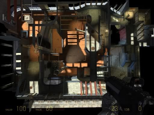 Bottom view!
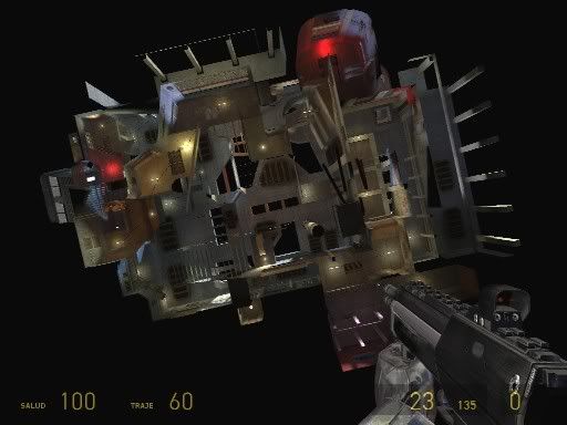 I know the map seems kind of random, but I think it's part of its charm!

Posted 18 years ago2006-09-24 17:06:22 UTC
Post #197463
It looks really good but messy.Cant say much but it would make a good commandos 3 map

Posted 18 years ago2006-09-24 17:10:38 UTC
Post #197464
LoL. That would be fun. Isometric-view deathmatch!
Posted 18 years ago2006-09-29 19:14:39 UTC
Post #197968
I'd say the map is 99% complete. I finally learned how to use those Smoothing Groups and I'm making the final lighting adjustments.
Entity placement will be harder. I might need to release a beta, playtest it and then make a final version. It's been more than a year and a half since I last played HL2DM!!
http://img176.imageshack.us/img176/3569/pic1ia3.jpg
http://img291.imageshack.us/img291/9203/pic2ao5.jpg
http://img291.imageshack.us/img291/5661/pic3lk5.jpg
http://img165.imageshack.us/img165/9182/pic4vw9.jpg

Posted 18 years ago2006-09-29 19:16:14 UTC
Post #197969
Those pics make me wish I still had HL2. 


Posted 18 years ago2006-09-30 06:42:41 UTC
Post #198001
Looks terrible.
edit: no, that is not sarcastic.
edit: no, that is not sarcastic.

Posted 18 years ago2006-09-30 06:51:53 UTC
Post #198003
Uh yeah, Kasperg, can't say that's up to your usual standards at all. The texturing is very random, there's an over use of brushwork (which basically means you haven't balanced it out enough with props. And don't try and give some excuse about the fact the Source uses props, because all modern games use props). The lighting is very bland as well: I dunno if it's your light_env or the lights themselves, but something definately looks amiss.
Posted 18 years ago2006-09-30 06:56:53 UTC
Post #198005
the only thing i dont like is how orange the sand looks. everything else, i like.. maybe a few more props, though.
Posted 18 years ago2006-09-30 07:36:07 UTC
Post #198008
You obviously haven't played the HLDM version of which this is a remake
-random texturing? please explain. There are certain color codes present in the map. You are joking if you say it's random.
-Props? Are you referring to physics objects or static props? Which are the props this map needs? I don't need an excuse for not putting props. I would need an excuse TO PUT props. I am not a modeller, so don't ask from me more than what I can do. For a prop-less map (in your POV) I think it looks OK. (Btw, most areas in the screenshots are high traffic areas, where models hurt performance the most)
-Lighting? One of the best aspects of the map. High contrast, different colors, interesting shadows, etc. Nothing about the lighting is bland. Are we looking at the same screenshots?
-Orange sand? That was one of the main ideas from the original HLDM map. I think it gives it a unique look. Anyway, the sand color is a matter of taste, not technique. I tried other "normal" colors for the sand but the map seemed much more dull with them.

Posted 18 years ago2006-09-30 07:51:23 UTC
Post #198009
The custom textures don't work well at all with the normal Half-Life 2 textures.

Posted 18 years ago2006-09-30 07:59:07 UTC
Post #198010
Ok, if its a remake, I would gather there's a certain amount of familiarity to be upheld, but honestly, it doesn't stand on its own as a Source powered map.
I direct your attention to this screenshot: http://img165.imageshack.us/img165/9182/pic4vw9.jpg - now, in this example, you've got a yellow plaster texture that's clashing horribly with the concrete textures which is also clashing with the red. If you were going for a creative look, I would've created an entirely new texture set for the map (maybe even adopt a cartoon style, which'd be very easy to create).
As for props, I refer to both sorts. There's a distinct lack of detail in the map, which can only be supplied by props. Given the setting of the map (which seems to be some sort of industrial setting), a lot of the HL2 props would work quite well. As for physics props, I understand what you mean, but I would've put a bit more trash around, just for looks: heck, you can disable the physics for them to save on lag.
As for lighting, you may consider it to be the best, but I consider it to be extremely bland, owning to the fact that it's overly bright. You've basically got white light streaming in from the sky, when it should be somewhat yellow. High contrast isn't generally always a great thing.
As for the sand, well heck, I just don't get it.
Posted 18 years ago2006-09-30 08:02:28 UTC
Post #198011
Ant is right.
Textures clash terribly and look seemingly random.
Lighting is boring. Really really boring.
Propwork is just poop.
Not up to your usual standards, and frankly I'm surprised everyone is still sucking your dick about it.
Textures clash terribly and look seemingly random.
Lighting is boring. Really really boring.
Propwork is just poop.
Not up to your usual standards, and frankly I'm surprised everyone is still sucking your dick about it.
Posted 18 years ago2006-09-30 08:34:58 UTC
Post #198013
I agree. The map looks crappy and textures clash. They are totally random. I can't see the blue concrete on the big surfaces, the orange sand in the floors, the yellow concrete in vertical supports, the blue in the railings, the yellow-orange-red in the thinner structures... it must be a random coincidence!
Industrial props... I guess the tires, car parts, barrels, canisters, benches, electronic appliances, trash piles, dumpster, boxes, pipes etc don't count as props to you. Maybe you mean the map needs bigger props getting in the way and substracting from the performance budget. I'll think about it!
Sunlight coming down in a 60 degree angle should be yellow. Wait, even orange! Orange lighting pwns! Specially if it's not bright. Bright lights and contrast make really dull maps!
Anyway, I'm always open to suggestions as long as they make sense and don't rely solely on personal taste and preconceived visual theories.
You can also point out these flaws in the snarkpit entry for this map if you wish to. I still think it's better than most of my previous maps
Posted 18 years ago2006-09-30 08:42:14 UTC
Post #198014
Your openness to suggestions greatly contrasts with the sarcastic overtones of your post Mr. Kasperg.
Posted 18 years ago2006-09-30 08:44:10 UTC
Post #198015
Indeed, you're coming across as rather arrogant to be honest. I guess a man's ego just inflates when a whole community continually sucks his dick.
Posted 18 years ago2006-09-30 08:46:55 UTC
Post #198016
I used sarcasm to explain why I don't agree with those particular observations. I think my reasons are solid and clear.
A good suggestion would be "you could place prop A in that B spot", instead of "brushwork is poop" or "lighting is extremly bland".
A good suggestion would be "you could place prop A in that B spot", instead of "brushwork is poop" or "lighting is extremly bland".
Posted 18 years ago2006-09-30 08:49:03 UTC
Post #198017
No one said the brushwork is poop.
BUT THE LIGHTING IS EXTREMELY BAD!
BUT THE LIGHTING IS EXTREMELY BAD!
Posted 18 years ago2006-09-30 08:49:34 UTC
Post #198018
Actually, no. I outlined some general suggestions in a serious manner and you essentially said "screw you". If you do not wish to take my advice as you're too ingrained with your map and your pride then so be it. Just don't think about ridiculing me for giving you genuine advice.
Posted 18 years ago2006-09-30 08:50:00 UTC
Post #198019
I think the architecture is great kaspy, but damn those textures are baaaaaad.
Posted 18 years ago2006-09-30 08:50:13 UTC
Post #198020
THAT HAS MORE ZING THAN A KFC ZINGER BURGER
(boo VOX, you spoilt my post. THIS IS IN RESPONSE TO ANT'S POST!)
(boo VOX, you spoilt my post. THIS IS IN RESPONSE TO ANT'S POST!)
Posted 18 years ago2006-09-30 08:55:16 UTC
Post #198021
I mean the textures themselves are good...but they don't fit together. Sand? huh? And the light fixtures are too futuristic for the setting.
You must be logged in to post a response.