Competition 24: Map from Layout
Created 17 years ago2007-09-30 05:57:14 UTC by
 AJ
AJ
Created 17 years ago2007-09-30 05:57:14 UTC by
![]() AJ
AJ
Posted 17 years ago2007-10-05 06:33:07 UTC
Post #235698
Ah dev textures, my old friend.
Posted 17 years ago2007-10-05 06:47:08 UTC
Post #235699
wouldn't that be, your old friends?
Posted 17 years ago2007-10-05 10:49:15 UTC
Post #235723
http://img214.imageshack.us/img214/6777/91927945wo9.jpg
here's what i have for 1.5 hours of work. more to come.. when i have time.
here's what i have for 1.5 hours of work. more to come.. when i have time.
Posted 17 years ago2007-10-05 10:51:12 UTC
Post #235724
That's rather nice. You'd want to align the texture on the curve to face. That'd hide the stretchyness.
Posted 17 years ago2007-10-05 10:54:05 UTC
Post #235726
its actually just the middle of the texture i created.. if you notice the right hand corner, its the same... 'streak width' as the rest, i was going to edit my post but you beat me to it daub 
i was going to say that i'm changing the textures when i have the whole map slightly detailed; such as this part..
this is the lower right part of the map, another waterfall drops off from there replacing the stairs. From there, it leads into a river, and the river is the bottom of the level

i was going to say that i'm changing the textures when i have the whole map slightly detailed; such as this part..
this is the lower right part of the map, another waterfall drops off from there replacing the stairs. From there, it leads into a river, and the river is the bottom of the level

Posted 17 years ago2007-10-05 11:14:43 UTC
Post #235731
Cool. Very different to how I'm interpreting the layout, that's for sure.
Posted 17 years ago2007-10-05 11:16:05 UTC
Post #235732
thats why i love map from layouts.
EVERYbody does SOMETHING different with the same start
EVERYbody does SOMETHING different with the same start
Posted 17 years ago2007-10-05 14:06:40 UTC
Post #235749
Yeah I can't wait to see what other's look like.Looking towards bottom right of map. Btw there's a sweet forklift model in CSS that I'd like to chuck in. Do I need any programs or anything to port it over to HL2DM?
Posted 17 years ago2007-10-05 14:16:31 UTC
Post #235750
That's looking really good! I can't wait to see what the other Source dudes come up with for outdoor environments. Mines not ready to show yet :(.
And you should just be able to include the forklift model just like you would any other model.
And you should just be able to include the forklift model just like you would any other model.
Posted 17 years ago2007-10-05 20:57:08 UTC
Post #235789
The pics motivated me to enter...so I am.
-How many people are entering for gold ?
-How many people are entering for gold ?
Posted 17 years ago2007-10-05 23:35:36 UTC
Post #235796
I think I might enter this one (havn't mapped in about 7 months tho, but I got a month) , but I need your guys opinion. Should I make it single or multi-player?
Posted 17 years ago2007-10-06 00:50:47 UTC
Post #235799
I'm in for Gold. As you can probably tell
Posted 17 years ago2007-10-06 04:12:45 UTC
Post #235801
I'm for GS aswell.
EDIT: Screenie of the first well-detailed room of my entry:
EDIT: Screenie of the first well-detailed room of my entry:
Posted 17 years ago2007-10-06 05:47:39 UTC
Post #235804
@Masta Killa: I think it could use a different floor texture. Otherwise its stylin'. It's going to involve zombies, isn't it?
@Snpbond: I vote multiplayer.
EDIT:
I'm...I'm a crate whore Oh and that forklift model I was talking about, its a CSS model. So it doesn't show up in the models list when I'm editing under HL2DM.
@Snpbond: I vote multiplayer.
EDIT:
I'm...I'm a crate whore
 Oh and that forklift model I was talking about, its a CSS model. So it doesn't show up in the models list when I'm editing under HL2DM.
Posted 17 years ago2007-10-06 12:30:47 UTC
Post #235830
@Biax: Well, actually it's gonna be a multiplayer map. So, no zombies.
About the floor texture: Go see Hard Boiled. Or play with Max Payne. Tile floors own.
About your map: Looks nice, but a bit empty at the moment. Gonna fill it up, right?
About the floor texture: Go see Hard Boiled. Or play with Max Payne. Tile floors own.

About your map: Looks nice, but a bit empty at the moment. Gonna fill it up, right?
Posted 17 years ago2007-10-06 13:29:00 UTC
Post #235840
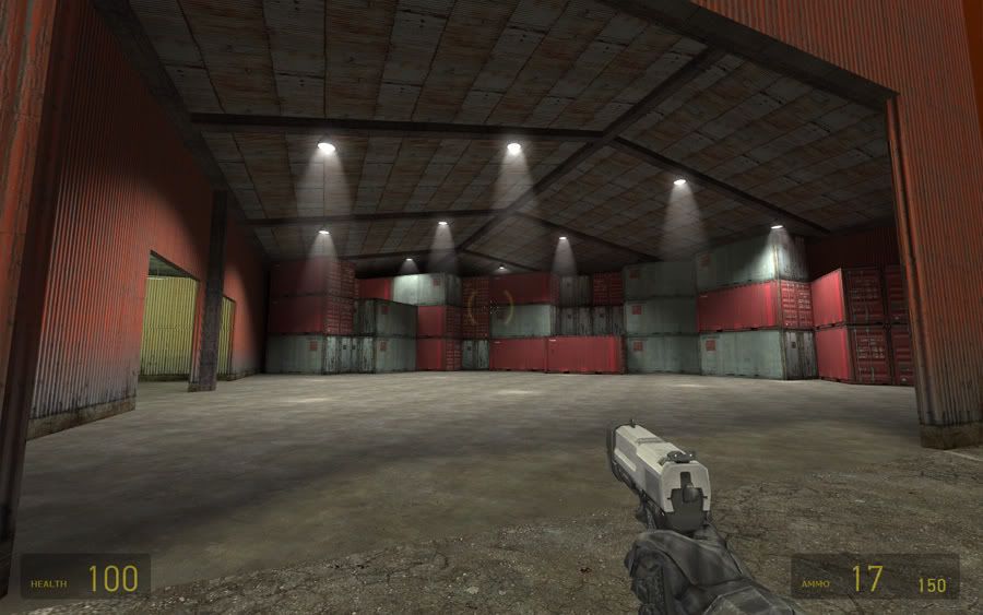
And the lighting is too white. You don't get white lighting in real life. Add a tone of orange to it. Also may I suggest you place some of those crates in the middle to form a sort of maze...Or at least a few pathways. Perhaps one leads to a powerful weapon.
Posted 17 years ago2007-10-06 22:16:04 UTC
Post #235900
fluorescent lightbulbs produce purely white light.
Posted 17 years ago2007-10-06 23:30:16 UTC
Post #235901
no, it has a blue tinge to it.
Posted 17 years ago2007-10-07 00:20:13 UTC
Post #235902
I think those energy efficient lights product white light. Not sure though. As far as I know most fluorescent lights I've seen produce green light. Most of the lights in my map are green or orange at this point. With the exception of these warehouse lights. I suppose I'll play with the colours.
http://en.wikipedia.org/wiki/Metal_halide_lamp
Apparently these types of lights, which are used in industrial settings, emit a close-to-white light. Or it can be more red to more blue. So I think I'll just give my lamps a slight red tint.
As for filling it up, most definitely. Still just texturing the brushes that make up the layout itself. Once I've done that I'll be filling it up much more. There's alot going to be going on in that warehouse area.
Masta Killa: It's just that the rest of the flooring is wooden, just seems out of place going into a patterned tile floor like that. Maybe have a wooden landing, or something? Just throwing the idea out there.
http://en.wikipedia.org/wiki/Metal_halide_lamp
Apparently these types of lights, which are used in industrial settings, emit a close-to-white light. Or it can be more red to more blue. So I think I'll just give my lamps a slight red tint.
As for filling it up, most definitely. Still just texturing the brushes that make up the layout itself. Once I've done that I'll be filling it up much more. There's alot going to be going on in that warehouse area.

Masta Killa: It's just that the rest of the flooring is wooden, just seems out of place going into a patterned tile floor like that. Maybe have a wooden landing, or something? Just throwing the idea out there.
Posted 17 years ago2007-10-07 01:45:39 UTC
Post #235903
fluorescent lightbulbs produce purely white light.The one next to my bed right now has a slightly yellowish tone to it, but I've seen blueish ones before too.
I think those energy efficient lights product white light.We have one an energy efficient light in our house that produces a deep orange/yellow color.
So basically, any light can be any color, and I believe it usually only depends on the color of the glass. Debate over.
Posted 17 years ago2007-10-07 02:18:03 UTC
Post #235904
Somehow I don't think a real warehouse would stack crates like that...
When I map, I like to establish as much background in a map's setting as I can. For example, on your screenshot, the crates are stacked to the very top of the ceiling: how did they get there? Does the roof retract and does a crane drop them in? Adding small touches like that will make a scene make more sense (even in a surreal scene) and will give a better sense of realism.
If I have a roadway, or an enclosed area, I always make something that shows how someone could've reached that enclosed area. CS:S maps do that a lot: they're essentially boxed in, but there's also a hint of a larger world outside.
Posted 17 years ago2007-10-07 02:27:34 UTC
Post #235905
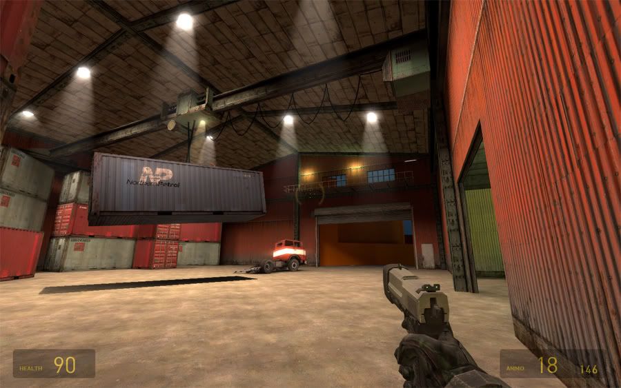
Aye, the crates are ridiculous. I actually plan to lower them alot and have a bridge crane in there.
I believe it usually only depends on the color of the glass.It depends on the gas inside the light the most, I believe. But yeah, you can pretty much pick any colour you want. Though blues-greens-yellows-oranges are most appropriate. Purple? Seems kind of weird to me.
Posted 17 years ago2007-10-07 03:04:41 UTC
Post #235906
Heres my one:I've only done a half of the bottom bit tho :/
I hope i wont complete this 2 l8
I hope i wont complete this 2 l8
Posted 17 years ago2007-10-07 04:09:15 UTC
Post #235909
Biax:
And Ghetto, those stair railings might have been acceptable in Half-Life, but in Source they look wayyy too thick. You should also make the steps thinner unless you want to rebuild them as concrete stairs.
...on your screenshot, the crates are stacked to the very top of the ceiling: how did they get there? Does the roof retract and does a crane drop them in? Adding small touches like that will make a scene make more sense (even in a surreal scene) and will give a better sense of realism.Haha, there are a ton of places like that in Opposing Force, and even some in Half-Life 2 if I remember correctly. Rooms with only small doors and a ceiling just barely high enough to fit a container. Makes no sense.
And Ghetto, those stair railings might have been acceptable in Half-Life, but in Source they look wayyy too thick. You should also make the steps thinner unless you want to rebuild them as concrete stairs.
Posted 17 years ago2007-10-07 04:35:49 UTC
Post #235910
@Biax: I see your point, but this room is supposed to be a part of a chinese restaurant, and they often look something like this. I know, that it doesn't fully have that effect yet, but I'll add some chinese letters and stuff like that, to make it more obvious.
Posted 17 years ago2007-10-07 06:02:51 UTC
Post #235914
Haha, there are a ton of places like that in Opposing Force, and even some in Half-Life 2 if I remember correctly. Rooms with only small doors and a ceiling just barely high enough to fit a container. Makes no sense.That's cos Valve suck LOL
But yeah, I do think showing a plausible reason or entryway, even if its unaccesible to the player adds to the map.
Posted 17 years ago2007-10-07 11:28:14 UTC
Post #235928
duh, they obviously build the crates there then fill them with stuff
Posted 17 years ago2007-10-07 11:53:11 UTC
Post #235932
@Masta Killa: Ah fair enough. It'd be fun making these:
http://www.splashoccasions.com.au/Web%20pictures/Oriental%20lantern.JPG
@Ghetto: Looking nice and sterile (it's a hospital, isn't it?). But I agree with srry, you've got some serious blockiness going on with the details. Maybe flick through the prop_statics and see if you can't find some nice railings. I'm pretty sure there's entire staircases in there.
Also maybe experiment with some trim textures to accentuate the spaces, since the floors, walls and ceilings are all white at the moment.
Posted 17 years ago2007-10-08 00:08:45 UTC
Post #235952
Yall should spend more time on each part of the map. Don't forget, this is a competition. It is a chance to show off all of your skills to the max. Look at each part of the floor plan once at a time/ Not the entire thing at once. Go the extra mile and add that vent or trim. And really plan it out before you get started. 2nd place means your the first to lose!
Posted 17 years ago2007-10-08 01:01:06 UTC
Post #235953
Yeah I find that if I go slow and really add some detail to an area before even building the next one, I'm less likely to overlook things when it's polishing time. Of course I build a very basic layout first, but I don't build from it like Biax is doing in his first screenie. I built basically a 3D version of the layout pic, very basic, and am building the actual map on a different part of the grid using the layout for measuring and reference. If I do that, I am less likely to end up with something that looks like a shitty layout with textures.
Everybody looks good so far! Maybe I'll get a screenie up tomorrow.
Everybody looks good so far! Maybe I'll get a screenie up tomorrow.
Posted 17 years ago2007-10-08 01:15:13 UTC
Post #235954
I'm working in an iterative detailing cycle. Layout the whole map with dev textures, texture and mold the map, then refine detail over and over until I'm satisfied that it's 'polished'. That way if I run out of time at any point in the development I still have a completely functional, completely laid out and consistently detailed map.
But you've motivated me more, nonetheless...
EDIT: Ok, I got focused on the bridge crane, kind of contradicting everything else I've said in this post. Oh well, I'm very happy with how it turned out.
But you've motivated me more, nonetheless...
EDIT: Ok, I got focused on the bridge crane, kind of contradicting everything else I've said in this post. Oh well, I'm very happy with how it turned out.
Posted 17 years ago2007-10-08 20:55:14 UTC
Post #236008
shit man all ur maps are looking spectacular and i haven't touched mine in a week. life's been throwing curve ball after curve ball.
i really want to enter this too
i really want to enter this too
Posted 17 years ago2007-10-08 21:21:53 UTC
Post #236009
Dude that looks great. The crane definitely fixed it.
Posted 17 years ago2007-10-08 22:28:53 UTC
Post #236015
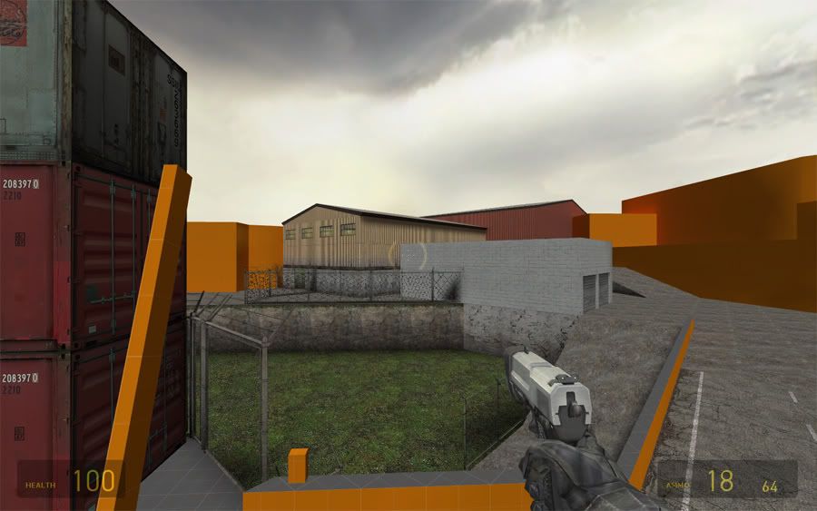
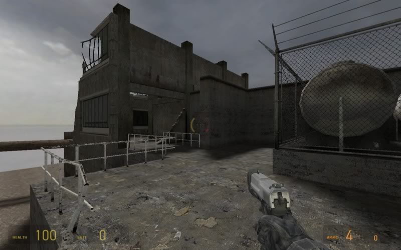
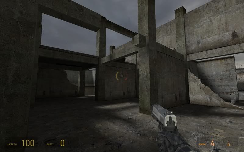
Alright so I took a couple shots.I just made a quick sunlight for testing the map, so the lighting isn't what it will be when I'm done. This is a couple shots of some of the more detailed areas, but I still have a long long way to go.
Posted 17 years ago2007-10-09 13:25:26 UTC
Post #236047
I cant believe so many of you are givin away all yalls ideas. I like being surprised.
Posted 17 years ago2007-10-09 14:08:50 UTC
Post #236050
Blitz that looks rly cool  i guess i wont be getting first place
 i guess i wont be getting first place
Posted 17 years ago2007-10-09 14:21:18 UTC
Post #236051
Thanks dude, but I wouldn't worry about that too hard. I picked the best part to show, the rest is shit. 

Posted 17 years ago2007-10-09 18:10:13 UTC
Post #236065
I have some awesome ideas but with college mon-thurs and 9 hour work shifts fri-sun at home gaypo I don't know if ill beable to giterdone-> But ima try 


Posted 17 years ago2007-10-09 21:24:39 UTC
Post #236072
i'm a little astonished at the results so far... or maybe its just source. i dunno.


Posted 17 years ago2007-10-09 22:57:59 UTC
Post #236073
It seems us source guys are using the extra power to make larger outdoor entries. Of course the bigger you go the less detail there is. It'd be cool to see someone make an indoor source entry that really blew everyone away.
Posted 17 years ago2007-10-09 23:23:54 UTC
Post #236075
Thanks Blitz. Your shots are looking solid. It yearns for some girders and trim on the ground, I reckon. It looks more playable than mine I think; nice tight shotgun alleys...damn!
I cant believe so many of you are givin away all yalls ideas. I like being surprised.Heh, I was waiting for someone to say that! I've been withholding alot of shots to leave something for people to explore.
Of course the bigger you go the less detail there is.I just found out about the +Showbudget command. Was wondering how to get something like r_speeds in Source. And some parts of my map are hitting 20fps...ewww. I kind of went overboard with props in one room.
Posted 17 years ago2007-10-10 11:10:47 UTC
Post #236081
I still havent even touched hammer towards my map besides seeing if I could get something to work. I have a lot of plans on paper and will probably pretty much finish the plans today and start tomorow. According to my plans so far it will be pretty complex and hopefully my computer can handle it. Im not worried about it being too big, but it just has a lot of stuff inside it. Also I hope theres a few gold entries that put some effort towards their maps because otherwise all this effort will seem pointless.
Posted 17 years ago2007-10-10 12:50:51 UTC
Post #236089
otherwise all this effort will seem pointless.Not if you win!!!
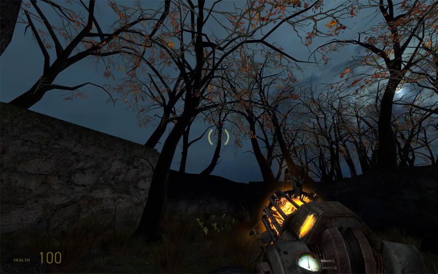
 Does anyone know what the deal is with these glowing leaves? They're really bugging me.
Posted 17 years ago2007-10-10 13:18:36 UTC
Post #236091
No idea. I wouldn't have guess I'd be seeing trees based on the shots you showed before, I'm interested to see how you work them into the theme. You don't have to show me how, let's leave a few things to look forward to!
Posted 17 years ago2007-10-11 18:44:41 UTC
Post #236176
I'm in, should be fun.
2 small complaints:
The competition page submission rules seem a little overly complicated imo, and I'm calling the the thumbnail police on this thread... I mean really. I even use wide aspect ration and I have to almost maximize the width on my browser window lol! :,( , ,,
2 small complaints:
The competition page submission rules seem a little overly complicated imo, and I'm calling the the thumbnail police on this thread... I mean really. I even use wide aspect ration and I have to almost maximize the width on my browser window lol! :,( , ,,
Posted 17 years ago2007-10-11 21:04:04 UTC
Post #236182
hl1 or hl2?
Posted 17 years ago2007-10-12 06:21:54 UTC
Post #236191
I'm about 2/3rds done with my entry!
Posted 17 years ago2007-10-12 18:16:31 UTC
Post #236238
HL1 for me...
Also, a question. When I started building my level I was wondering if it would be ok if we can put doors at the stairwells.
One more. Can we add minor additional connections from one area to another, like a fire escape or duct or piles of boxes? It's not really changing the layout but it kinda is... If these have been addressed already I make sorries.
Posted 17 years ago2007-10-12 20:36:56 UTC
Post #236246
you can add doors, you can't add extra connections.
Posted 17 years ago2007-10-16 20:59:31 UTC
Post #236498
Does everything in the map have to be brand new never released before? or can we use things (such as models) that we've used in previous map releases?
You must be logged in to post a response.

