VERC: Style Guide #2 Last edited 2 years ago2022-09-29 07:55:34 UTC
Introduction
Lab 2 is far more technical than the Lab 1 style. Lab 1 is effectively what I call 'reception' while Lab 2 shows more of a 'research' style, showing people actually doing scientific stuff. The architecture doesn't change a huge deal - there are still many curved walls (probably more, in fact) and just about everywhere is well lit. Yet, it also exhibits a wider variety of light styles, adding various coloured tints to rooms in an attempt to make everything far more techy. Platforms are used slightly more, and the lifts are quite complicated to produce - you'll find many varying heights of small platforms (such as on the three tubes with the headcrabs). I'm not a massive fan of the texture scheme, as every time I try to match it my version looks tacky... but the original Valve maps look very cool.Just so you know, just about all the textures needed for this scheme can be filtered out (so you see only them, and not others) by using the keyword c1a1 in your editors texture browser.
General Notes
Texture names for the main textures used in visible scenes are typed after my comments in italics. These are about 90% correct, but there may be a few innaccuricies, and bear in mind I have only included the fundamental textures and not those used for fine detail.If you find that the material here is not enough, I suggest you go around the levels yourself taking as many screenshots as you can. By the end of your shooting, you should have enough material in terms of images to recreate most of the structures pictured... However, just to save your time, a .zip of these images and quite a few more are available at the bottom of this page.
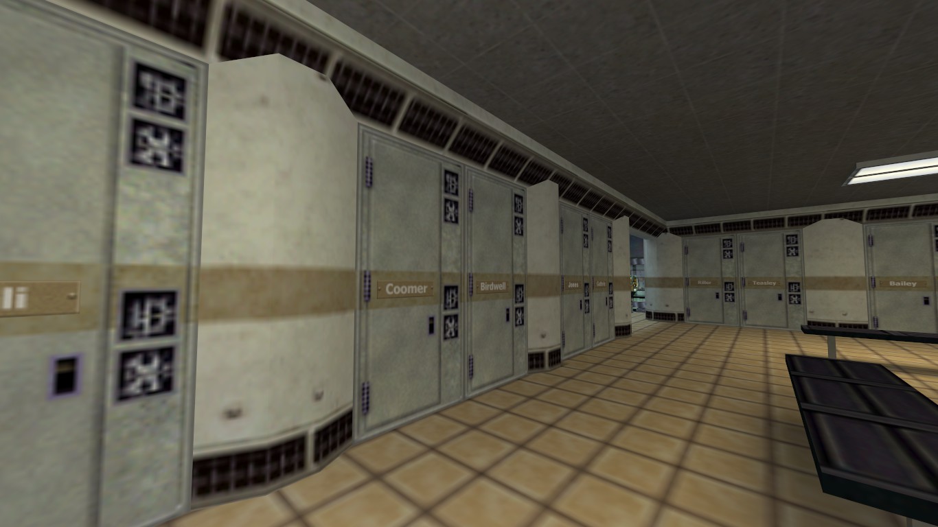
Although not technically part of the Lab 2 style, this is really the first time you encounter it in the game. Look at the way the walls are curved outwards every couple of lockers, and see the lighting is only just about adequate in this area, and not overbrighted.
- tc1a1_locker
- c1a1_names*
- c1a1_w1b5
- c1a1_flr2c
- fifties_flr5
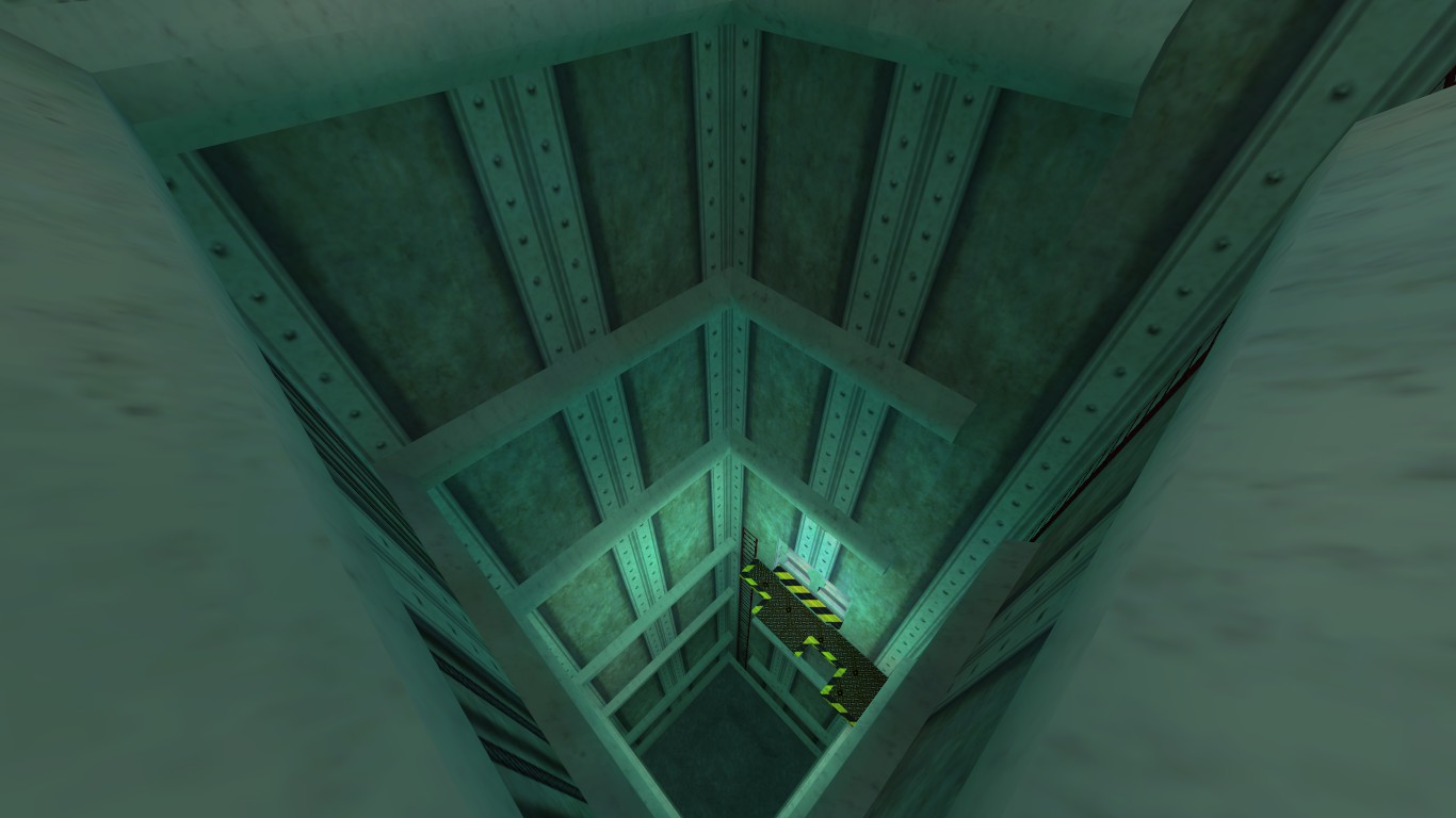
A very simple view of the elevator shaft shows that there is not a huge amount of effort needed. The outer wall textures are c1a1w1n, while supports are added every 192 units or so with c1a1_w1d. The only light sources are those used to highlight the doors, and are in a subtle green flavour.
- tc1a1_w1n
- c1a1_w1d
- stripes2
- generic015n
- +0~generic86b
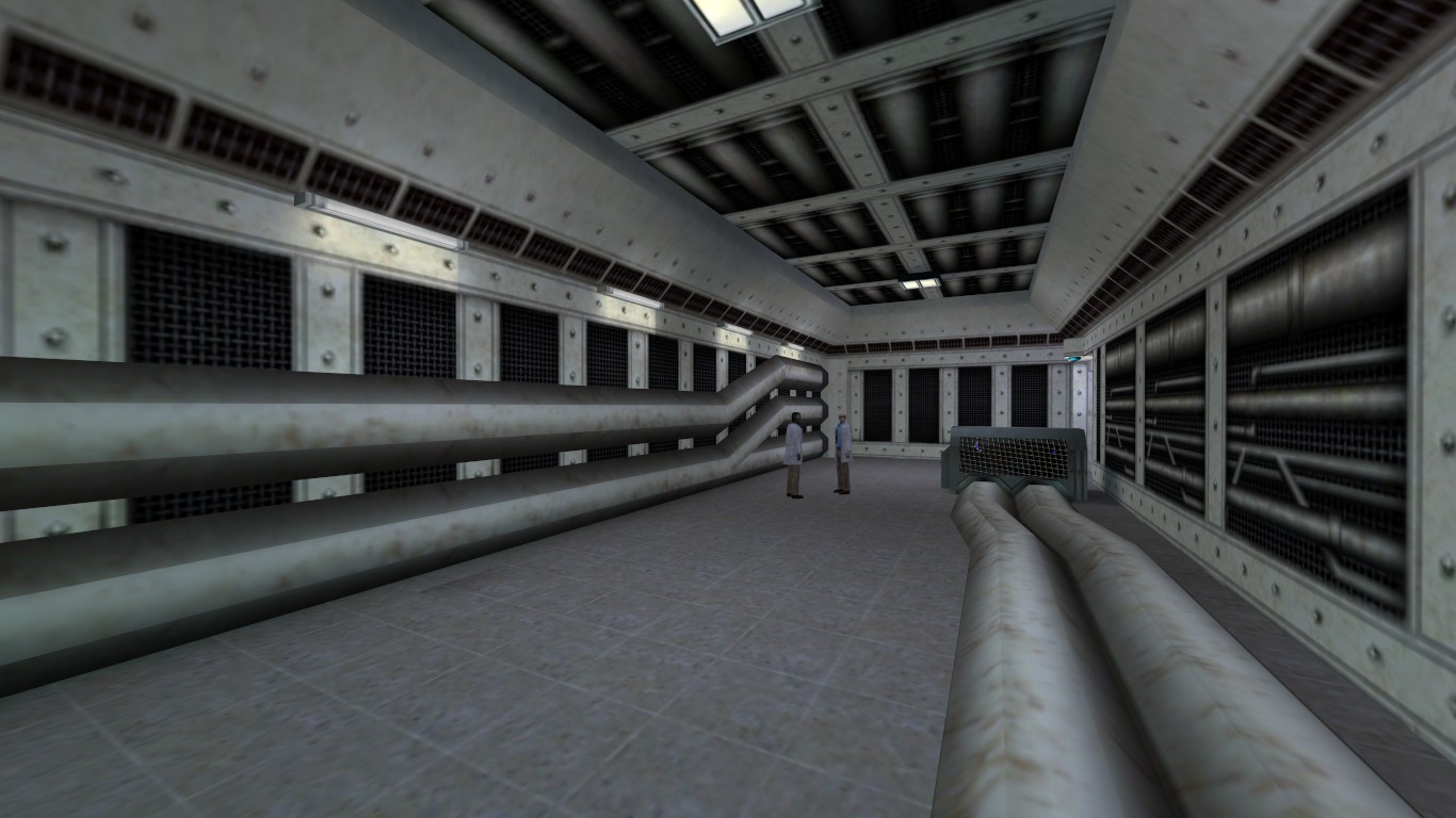
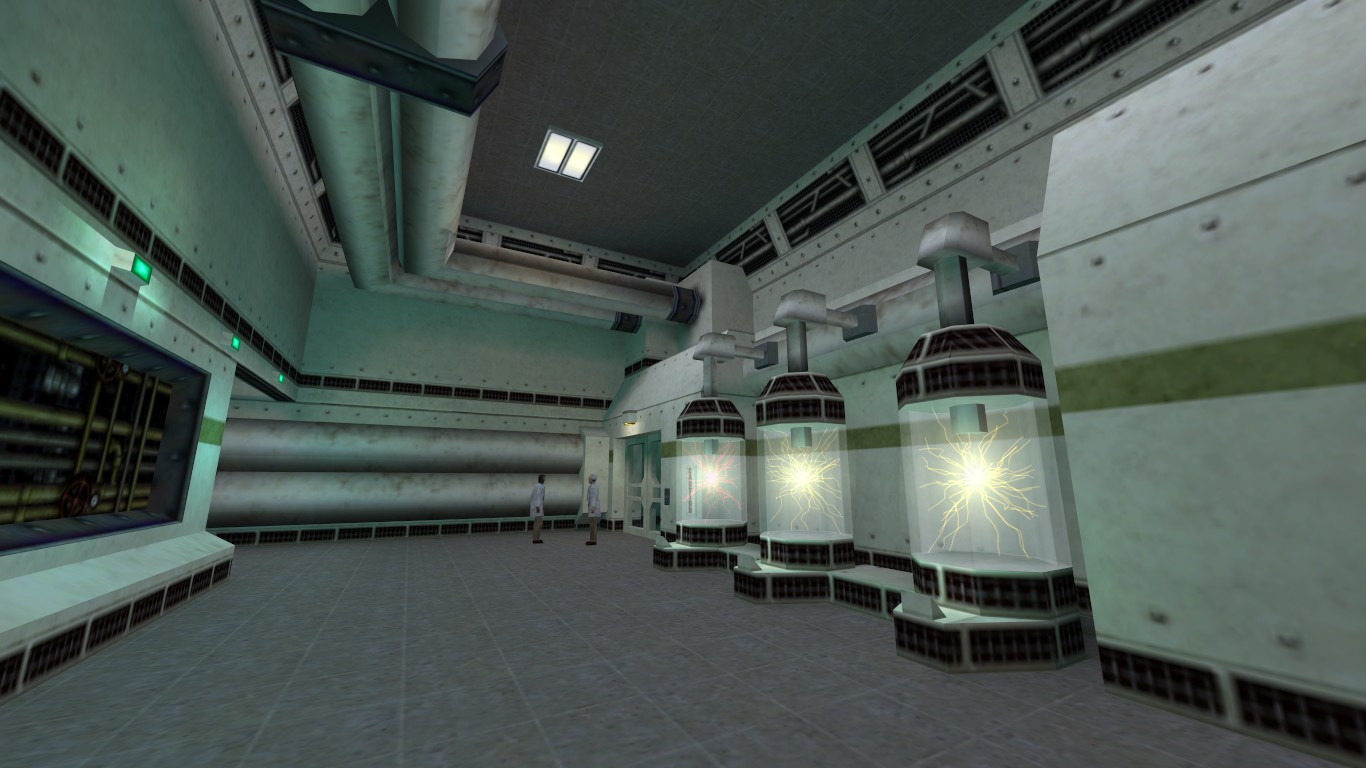
The big clunky pipes in this image in comparison to the height of the scientists demonstrates just how much power is being transferred around. Like the last shot, the lighting here is just about adequate, with wall fittings highlighting the pipes on the left. Actually, it's quite a simple room, this.
- tgeneric031b
- c1a1w1j
- c1a1w1k
- c1a1w1l
- c1a1_w1b
- c1a1_flr2b
- +0~fifties_lght2
- +0lab1_w7
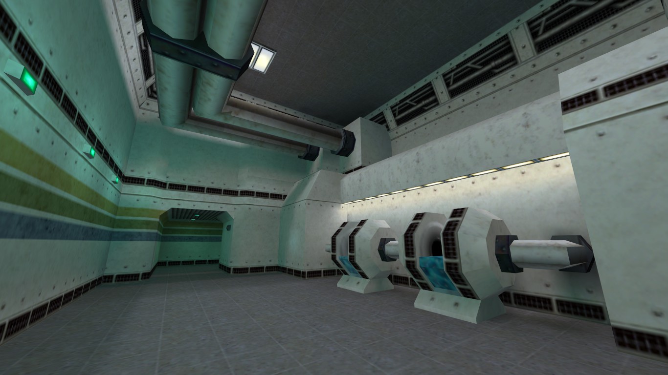
I find this room quite amazing in it's structure. If we think of it as a normal square room, then to the right we have one huge machine showing just one sole purpose. The large pipes overhead provide you will another boost to the 'realism factor', making the whole place more believable. Also, notice how curvy the room is.
- tc1a1w1d
- c1a1_trim2
- c1a1_w1b
- c1a1a_w3a
- c1a1w1j
- generic031b
- +0+generic86b
- +0lab1_w7
- !waterblue
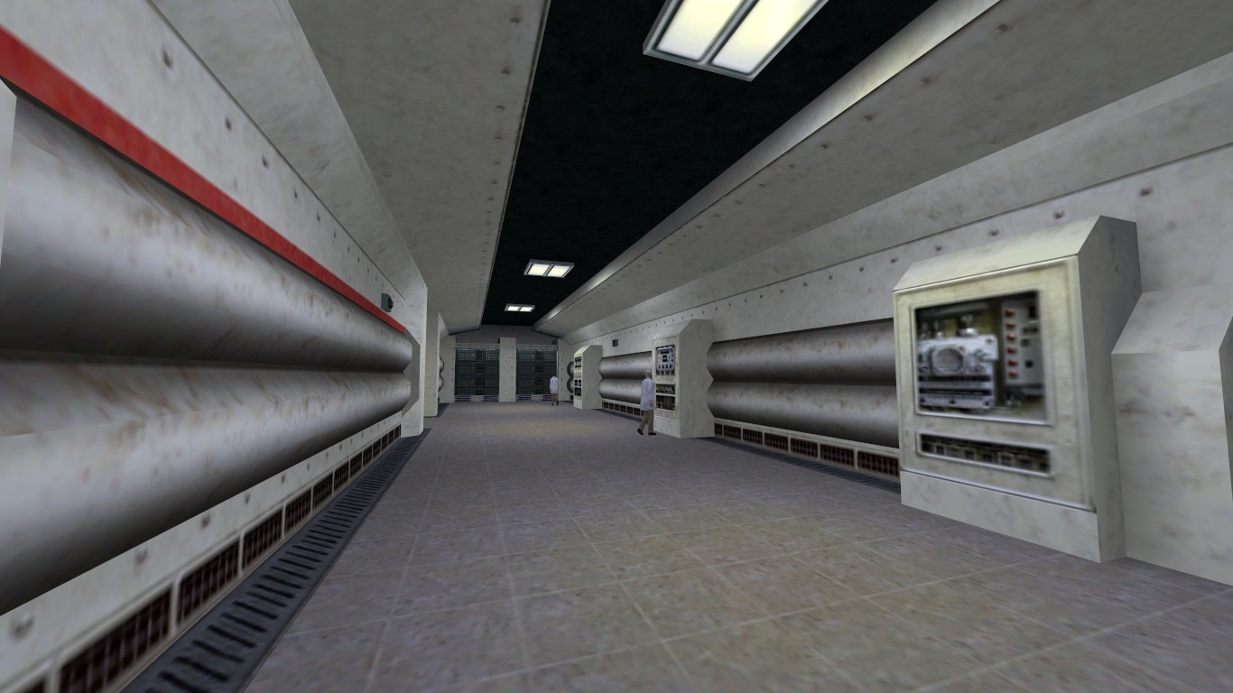
The room in this shot is actually quite similar to the previous one. Both show the same pipes, and a similar machine on the right (albeit doing something different). Also, we have a small alcove in the far left corner hiding all the computer junk. See how colour coding is still used on the walls.
- tc1a1_w1
- c1a1_trim1
- c1a1_trim2
- c1a1_w1b5
- c1a1_flr2c
- generic031b
- c1a1w1j
- metal_bord05
- +0lab1_w7
- +0~generic86b
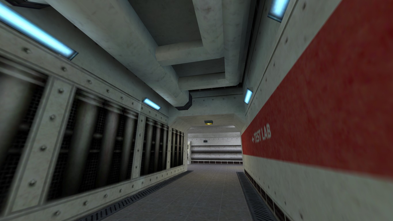
One short corridor. Above us you see more pipes, but you can't actually see the ceiling, as it is masked by darkness. In fact, the light only reaches high enough to lighten the bases of the pipes. If you also look at the floor, you can see how 'gutters' are either side where it meets the walls.
- tc1a1a_w4
- c1a1a_w4a
- c1a1_w1l
- c1a1_flr2a
- c1a1w1d
- tnnl_flr1a
- +0~light1
- +0~generic86
You should see in this image how the ceiling is actually made up of 3 brushes, the outer ones slanted upwards towards the middle, with the centre brush inset. On the right we see the usual pipes and computer equipment (same style as the walls - off-white).
- tc1a1_flr2a
- tnnl_flr1a
- c1a1_w1b
- c1a1a_w4
- c1a1_w1
- c1a0_c1
- c1a1_gad3
- c1a1_gad4
- +0~lab_w7
- generic031b
Notes From The Author
There you have a style guide... not the 'official' version though, should one exist. Valve Software would probably have something to say about my observations above, as they are the ones who decide what the real 'Lab 1' style is. The above therefore, is merely a guide to save you some time. Like anything, take it with a touch of salt - there will always be a time where you can break the suggestions above to slightly personalise the style should you so wish.- Article Credits
- Dave Johnston – Author
This article was originally published on Valve Editing Resource Collective (VERC).
The original URL of the article was http://collective.valve-erc.com/index.php?doc=1046751125-43592600.
The archived page is available here.
TWHL only publishes archived articles from defunct websites, or with permission.
For more information on TWHL's archiving efforts, please visit the
TWHL Archiving Project page.
Comments
You must log in to post a comment. You can login or register a new account.