Exactly the same as a corridor level change, just make the second map something completely different! Use env effects (fades and... Well, pretty much just fades) to hide the transition.
info_landmarks simply tell the engine which part of each map in a changelevel corresponds to the opposing map. They don't need to be anywhere near the changelevel and serve only to provide a point of reference in each map. The landmark must be in both maps.
The player will not 'spawn' anywhere in a standard changelevel. They will simply transition between maps in exactly the same place they leave the previous map - this is what the landmark entity exists to accomplish.
Wherever the player is relative to the info_landmark is where they will appear relative to the info_landmark in the next map, basically. This is the case no matter how you trigger the changelevel entity (it can be triggered like any other entity, or used as a walk-into trigger itself).
Here are two examples:The yellow box is the landmark, the green box is the player and the orange rectangle is a trigger_changelevel.
Note that regardless of how the changelevel occurs, the player will always be in exactly the same position relative to the landmark.
In the second example, the trigger_changelevel has been triggered by something else - perhaps a button on the wall. The location of the trigger_changelevel has no bearing whatsoever on the location of the player in the next map.
Forum posts
Well I'm just about a week into my Windows 10 experience and so far it's performed great! I've had no compatability issues whatsoever, and my niggles are so minor that they're barely worth mentioning - and will almost certainly be addressed in the first Service Pack, if not in smaller patches.
Firstly, the aforementioned inability to rename items in my Quick Access list.
Second, after finally adding an easily-accessed New Folder button in W7, it's been hidden away again behind another menu. Mildly irritating.
Thirdly, programs don't automatically come to the front when they start up. This is good in some ways - dialogue boxes no longer reduce games to the taskbar, for example. However, I use a lot of keyboard G-key binds as shortcuts to my browser, my email and media players and it's a little annoying that they don't start in the foreground. I've caught myself waiting for a program to start for quite a while before noticing it's just sitting behind whatever else is running.
These are all barely even problems. Overall, I think W10 is a winner. It's exactly what we wanted - Windows 7 with all the performance advantages of Windows 8 and none of the horrendous design choices.
drops microphone
Would any of you guys be up for putting together a championship table in Rocket League? Mibbe teams of 2 or 3 members so that games can keep coming thick and fast regardless of timezones.
Team SnC look forward to annihilating you all!
(although none of us have ever actually played before)
Team SnC look forward to annihilating you all!
(although none of us have ever actually played before)
The question is simple:
How can you set it up in Source to have an entity (let's say for the sake of argument a func_button) fire output A until a specific event makes it fire output B.
In other words, to have the behaviour of a trigger_changetarget in Goldsource.
I know I've done this before and I don't believe it was particularly complicated, but I haven't touched Source in so damn long I can't remember.
Regardless,
As a general rule, make your basic geometry at gridsize 16 or above. You can go much smaller when it comes to specific detailing, but for the majority of your brushwork, stay as tidy as possible to avoid exactly this situation.Use the square bracket keys to adjust it.
It looks like you built this either not snapped to the grid, or with your grid set to 1.
All of these sections, as well as giving other mappers nightmares, are liable to be full of microleaks that are damn near impossible to lock down.Keep your wall widths consistent and your geometry neat. I can't imagine how tiring it must be to work with such disorganised brushwork. As a general rule, make your basic geometry at gridsize 16 or above. You can go much smaller when it comes to specific detailing, but for the majority of your brushwork, stay as tidy as possible to avoid exactly this situation.
All of these sections, as well as giving other mappers nightmares, are liable to be full of microleaks that are damn near impossible to lock down.Keep your wall widths consistent and your geometry neat. I can't imagine how tiring it must be to work with such disorganised brushwork. As a general rule, make your basic geometry at gridsize 16 or above. You can go much smaller when it comes to specific detailing, but for the majority of your brushwork, stay as tidy as possible to avoid exactly this situation.
I work with video 

Can't believe how quickly Scott has grown up! 
I'm not entirely sure why, but I pulled the trigger on this today. Immediately it's infinitely better than 8.1 was - I don't feel like I'm constantly having to fight with it to set it up how I like it. Personalisation options are once again front and centre and basic things aren't hidden behind abstract, irritating menus.
It starts up wonderfully quickly, and while I think I prefer the explorer interface of 7 just in aesthetic terms, it does seem very effortless to use. Only complaint is that I can't seem to rename my quick access links, which has resulted in two "common" folders from separate Steam libraries.
So far things are looking positive! I shall report back if things change.
that is a bloody fantastic competition idea.
Thanks, guys! 

Striker, that chick is adorable! It's not far off being a Pixar poster!

What's the max aperture on that lens?It's not a particularly expensive or fast lens. 4.0 at its widest, 5.6 at its most telephoto. The really good thing about it is that it's internal zooming (no turret) and constant focus throughout the whole range. I'd have to pay a lot more for constant aperture as well.
Gotta say Chi, you have quite the view at night.I find it quite appealing during the day as well! Also never underestimate the power of a balcony when it comes to dating. Gdamn. Couple of glasses of champagne and a cityscape? She's in a movie!
How did you take the 2nd last, Archie?It's a secret!
I'd guess he changed the zoom level during the exposure.You ruined the secret!

Striker, that chick is adorable! It's not far off being a Pixar poster!

Interesting method. I leave the atmospheric stuff until very late in the process. My pre-planning includes gameplay and layout only - though usually with a vague idea of how it'll end up looking in my head.
I used to try to cater my gameplay to my designs - but after reworking so much of The Core, it turns out my strongest chapters all contain content that started as a gameplay idea which lead to the design; not the other way round.
I used to try to cater my gameplay to my designs - but after reworking so much of The Core, it turns out my strongest chapters all contain content that started as a gameplay idea which lead to the design; not the other way round.
Try deleting config.cfg from your mod directory as well.Called it!
New 90-300 zoom lens is a lot of fun!
Woah, weird. I assumed you meant a camera entity, but you mean the actual player view?
Go into options and make sure everything under the 'Mouse' tab is unticked except 'Mouse-Look'.
Also, unplug any USB Game Controllers you may currently have attached.
I can't think why a base mod with no coding changes would behave differently, so I'm only guessing that it's something in options.
Try deleting config.cfg from your mod directory as well.
Win8 has performance advantages over Win7, but it has so many flaws it's not really worth the pain. This is a similar situation that we saw with XP to Vista.
Windows 7 came out after Vista and was great almost immediately. It would be ridiculous to go from XP to Vista after Win7 came out.
In the same way, it would be ridiculous to go from Win7 to Win8 now that 10 is out.
Windows 7 came out after Vista and was great almost immediately. It would be ridiculous to go from XP to Vista after Win7 came out.
In the same way, it would be ridiculous to go from Win7 to Win8 now that 10 is out.
Interesting! I think I'll still leave it for a few months, but I'll definitely upgrade soon. I have 32GB of RAM and only recently realised that my Win7 Home Premium actually has a 16GB cap so it's only using half of it, whereas reports are that Windows 10 will support 512GB - although there is no officially released figure as far as I can see.
I don't trust Win 10 yet.This is the equivalent of 'upgrading' from XP to Vista after Windows 7 came out.
If I will upgrade, I will with Win 8.1.
What do you think so far? Those icons in the coloured squares look ugly as hell - can you configure it to just display the icons without an opaque square?
Edit:
Or even better, can you just get rid of the launchpad?
Edit:
Or even better, can you just get rid of the launchpad?
Yeah, Valve did it around 2003/2004. The entity you're looking for is prop_static
Try reading again 

I'm sure I'm being stupid, but I can't find "Go to Brush Number" (as opposed to brush ID), and also I can't copy text from the compile progress window at the bottom.
I have some errors displaying as per usual in the compile as 'Entity: ###, Brush #' and I can't see how to go to them in Sledge. I tried to copy them to notepad to revert to using Hammer and couldn't do that, either.
I have some errors displaying as per usual in the compile as 'Entity: ###, Brush #' and I can't see how to go to them in Sledge. I tried to copy them to notepad to revert to using Hammer and couldn't do that, either.
Landmarks simply tell the engine which part of each map in a changelevel corresponds to the opposing map. They don't need to be anywhere near the changelevel and serve only to provide a point of reference in each map. The landmark must be in both maps.
The player will not 'spawn' anywhere in a standard changelevel. They will simply transition between maps in exactly the same place they leave the previous map - this is what the landmark entity exists to accomplish.
Wherever the player is relative to the info_landmark is where they will appear relative to the info_landmark in the next map, basically. This is the case no matter how you trigger the changelevel entity (it can be triggered like any other entity, or used as a walk-into trigger itself).
Here are two examples:The yellow box is the landmark, the green box is the player and the orange rectangle is a trigger_changelevel.
Note that regardless of how the changelevel occurs, the player will always be in exactly the same position relative to the landmark.
In the second example, the trigger_changelevel has been triggered by something else - perhaps a button on the wall. The location of the trigger_changelevel has no bearing whatsoever on the location of the player in the next map.
haha, it actually was Ant's idea 

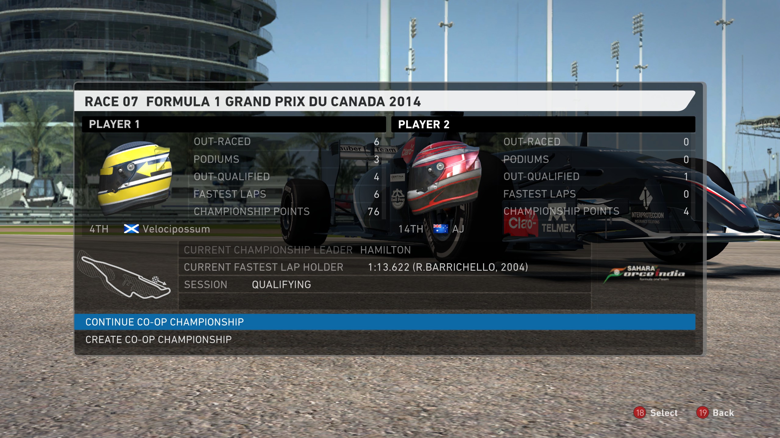
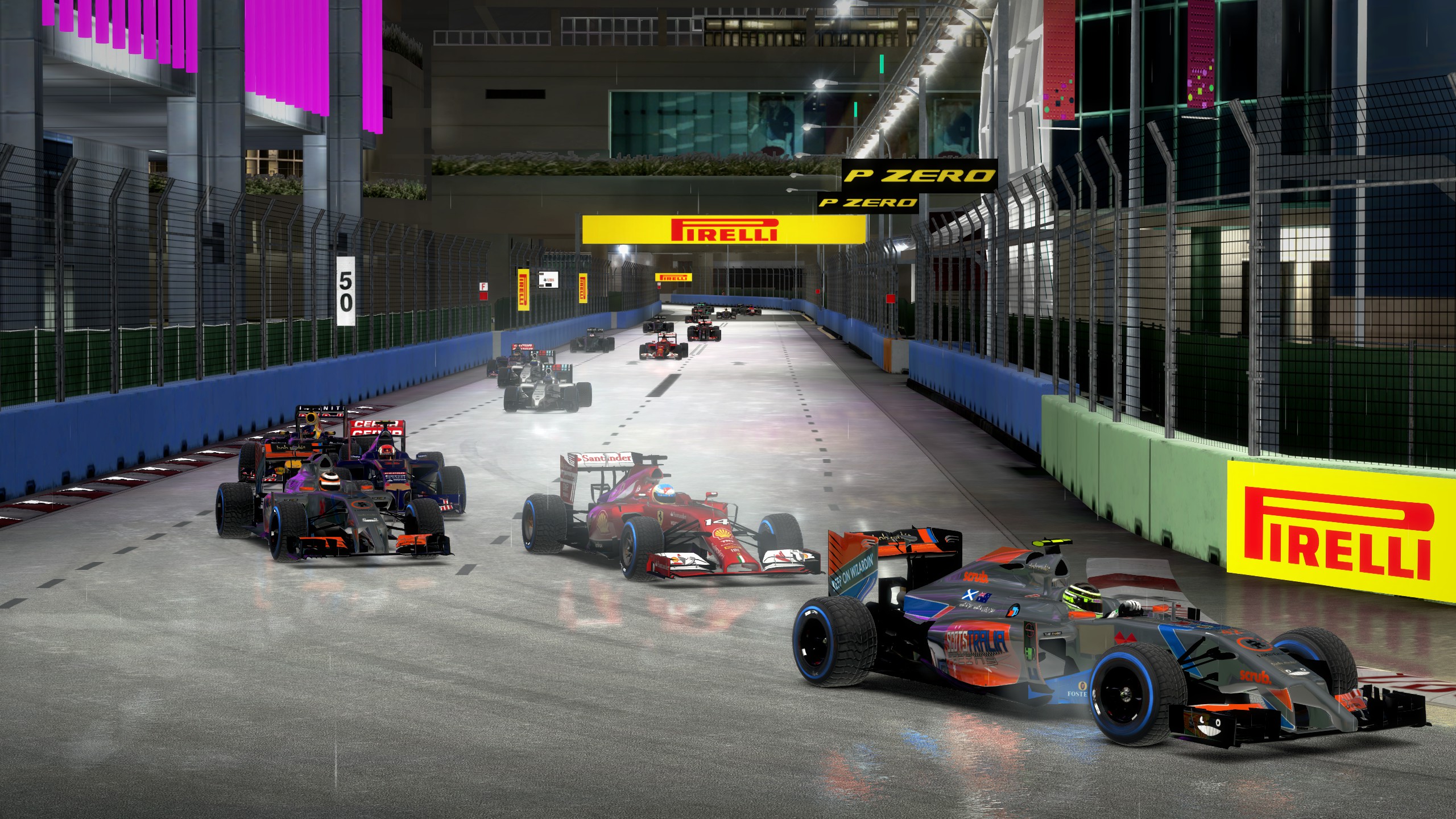
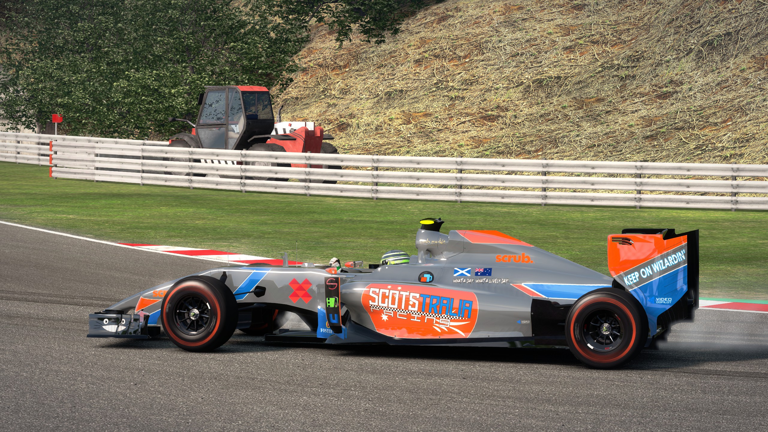
Ant and myself have finally taken up a co-op career in F1 2014. We are proud to reveal... Scotstralia Racing!
After six of twenty races, Ant has some catching up to do!
After six of twenty races, Ant has some catching up to do!
Nice one, Strideh. I approve of your correct (yet incorrect due to proper noun rules) spelling of Dishonoured.
I should really replay HL2. I haven't played through it for probably around five years. I think if I was to put a HL2 level in my list, though, it'd probably be one of the Ravenholm maps simply because of how memorable that whole chapter was.
Bringing this down to five was more challenging than I anticipated, and I know for a fact I'll remember potentially better choices at a later date and kick myself.
With that said, let us begin.
5. Invitation to a Party - Hitman 2: Silent Assassin
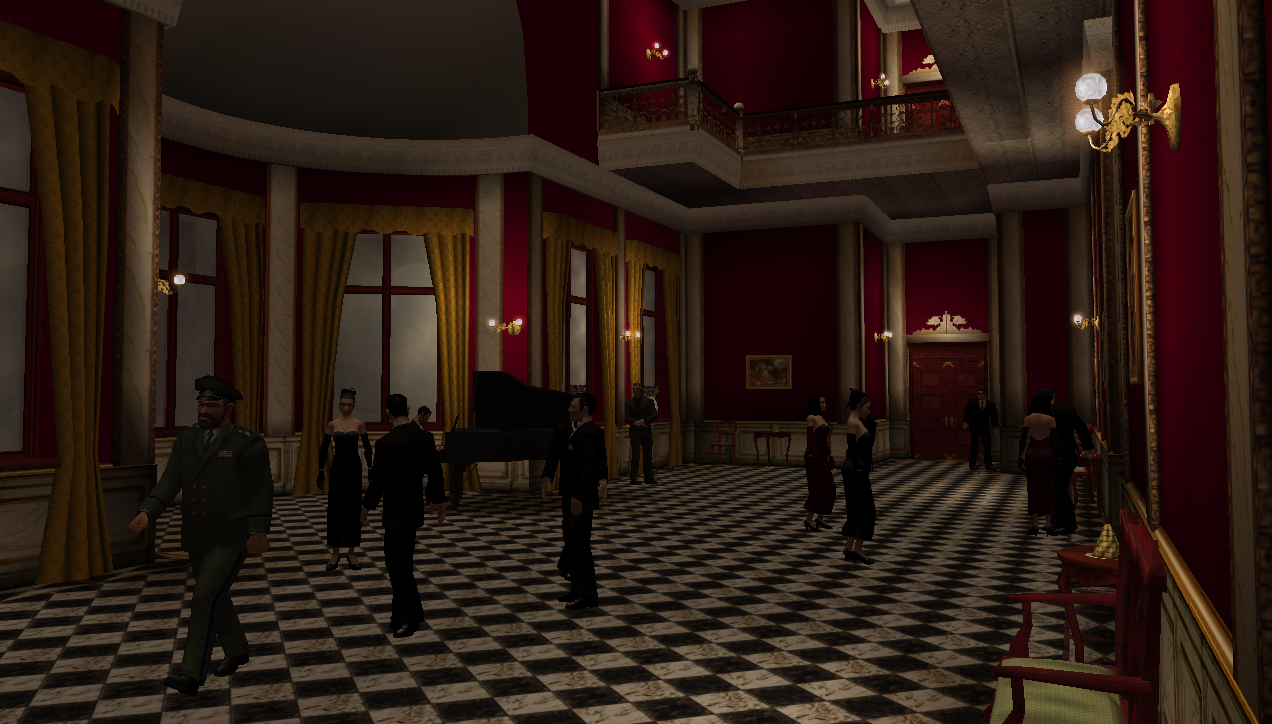
September 2002 - Thirteen years ago and a young, bright eyed Archie tears open his copy of PC Gamer magazine. On the disc included - a demo of a game so hotly anticipated by me and my friends that I was basically shaking with excitement. It's Hitman 2!!! There are arguably more tactical levels in the game, and certainly prettier ones, but in the month leading up to the game's full release I must have played through this level two hundred times, trying every possible method to silently eliminate the target and complete the objective. It's the perfect example of a great Hitman mission: A primary target, an optional target and an objective briefcase which must be secured. Beyond that, you are free to complete the mission however you see fit. Glorious.4. Vire River Valley - Company of Heroes
Three intensely contested bottlenecks and some unimaginably defendable landscape beyond lie on either side of the Vire River in this classic RTS map. Locking down all three crossing points creates an extremely tense stalemate where artillery, airstrikes and cunning ploys become far more important than in other less linear maps. This really, really played to the strengths of CoH's ingenius cover system and created some of the best balanced, most tense encounters I've ever had in gaming.3. The Map - Dota 2
I mean, yeah. It's the definitive version of the definitive MoBA map layout. Balanced down to the pixel, subtle routing provides some absolutely incredible opportunity for clever tactics and teamplay. Incredible Dota plays are more watchable than just about any other game, and it usually comes down to playing the map so brilliantly that even an opponent with thousands of hours clocked wasn't expecting the move. It's a tug of war with one of the most restrictive Fogs of War I've ever seen in gaming, and that means vision of the map is absolutely paramount. With wards providing vision of the map, even a team pushed back to their very last towers can still create a tactical play and win. It's the evolution of the chess board.2. Strike at Karkand - Battlefield 2, Battlefield 2142, Battlefield 3
This was a real toss-up between Karkand and Wake Island - and even potentially Gulf of Oman. They're the three maps I would consider to be iconic Battlefield locations, and they are utterly brilliant. Strike at Karkand wins the spot because it arguably allows for slightly more tactical play than the others, with the fantastic blend of wide, open streets and tight close-quarters back alleys. It's the perfect example of Battlefield's strongest point which is blending vehicle and infantry combat in an incredibly fun way. BF4 really suffered from its map design either being too vehicle-friendly or too infantry-friendly. It never matched the perfect combination of the two seen in Strike at Karkand.1. cs_assault - Counter-Strike
Arguably completely imbalanced and ugly even by the standards of when it was first released in CS Beta 1, Assault still really stuck with me for some reason. I think I first encountered it in CS 1.5 which is what was shipped with the HL Anthology edition. It was the first map I played in Counter-Strike, and therefore it was my first example of an online tactical shooter. Up until that point I'd only ever played deathmatch games online. It was a total game changer, and despite its many flaws, I would still love to play a few rounds on this right now. I honestly can't even say why I love it so much - I just have so much history with this map.
I should really replay HL2. I haven't played through it for probably around five years.
 I think if I was to put a HL2 level in my list, though, it'd probably be one of the Ravenholm maps simply because of how memorable that whole chapter was.
Bringing this down to five was more challenging than I anticipated, and I know for a fact I'll remember potentially better choices at a later date and kick myself.
With that said, let us begin.
5. Invitation to a Party - Hitman 2: Silent Assassin
September 2002 - Thirteen years ago and a young, bright eyed Archie tears open his copy of PC Gamer magazine. On the disc included - a demo of a game so hotly anticipated by me and my friends that I was basically shaking with excitement. It's Hitman 2!!! There are arguably more tactical levels in the game, and certainly prettier ones, but in the month leading up to the game's full release I must have played through this level two hundred times, trying every possible method to silently eliminate the target and complete the objective. It's the perfect example of a great Hitman mission: A primary target, an optional target and an objective briefcase which must be secured. Beyond that, you are free to complete the mission however you see fit. Glorious.4. Vire River Valley - Company of Heroes
Three intensely contested bottlenecks and some unimaginably defendable landscape beyond lie on either side of the Vire River in this classic RTS map. Locking down all three crossing points creates an extremely tense stalemate where artillery, airstrikes and cunning ploys become far more important than in other less linear maps. This really, really played to the strengths of CoH's ingenius cover system and created some of the best balanced, most tense encounters I've ever had in gaming.3. The Map - Dota 2
I mean, yeah. It's the definitive version of the definitive MoBA map layout. Balanced down to the pixel, subtle routing provides some absolutely incredible opportunity for clever tactics and teamplay. Incredible Dota plays are more watchable than just about any other game, and it usually comes down to playing the map so brilliantly that even an opponent with thousands of hours clocked wasn't expecting the move. It's a tug of war with one of the most restrictive Fogs of War I've ever seen in gaming, and that means vision of the map is absolutely paramount. With wards providing vision of the map, even a team pushed back to their very last towers can still create a tactical play and win. It's the evolution of the chess board.2. Strike at Karkand - Battlefield 2, Battlefield 2142, Battlefield 3
This was a real toss-up between Karkand and Wake Island - and even potentially Gulf of Oman. They're the three maps I would consider to be iconic Battlefield locations, and they are utterly brilliant. Strike at Karkand wins the spot because it arguably allows for slightly more tactical play than the others, with the fantastic blend of wide, open streets and tight close-quarters back alleys. It's the perfect example of Battlefield's strongest point which is blending vehicle and infantry combat in an incredibly fun way. BF4 really suffered from its map design either being too vehicle-friendly or too infantry-friendly. It never matched the perfect combination of the two seen in Strike at Karkand.1. cs_assault - Counter-Strike
Arguably completely imbalanced and ugly even by the standards of when it was first released in CS Beta 1, Assault still really stuck with me for some reason. I think I first encountered it in CS 1.5 which is what was shipped with the HL Anthology edition. It was the first map I played in Counter-Strike, and therefore it was my first example of an online tactical shooter. Up until that point I'd only ever played deathmatch games online. It was a total game changer, and despite its many flaws, I would still love to play a few rounds on this right now. I honestly can't even say why I love it so much - I just have so much history with this map.
since u broke the rule of the limited space.Check again, she did no such thing.
Alberto: All our Core textures are designed to fit brushwork at 0.50 scaling. We've tried to keep this as consistent as possible to avoid the flashlight beam changing size on different faces.
Dr Orange: Yes?
Instant: You're goddamn right I am!
Dr Orange: Yes?
Instant: You're goddamn right I am!

Yeah there's loads of software that uses it, but Photoshop was certainly the first program I encountered it in.
Nobody is suggesting your map be removed, Malle, but your 'puzzle' being infuriatingly difficult and hard to understand does not make it good and you should modify it to be more of a puzzle and less of a test of patience.
Making it impossible to succeed without dying numerous times is not a good strategy for fun game design.
"the point of my map is that you really need to think"This bit is flagrantly untrue. There is no part of your map that requires thinking to solve it. The first stage is about noticing a button which appears after a vent opening into an invisible wall makes the player think the map is broken. The second stage is about insanely strict control of the player's movement over an arbitrary platforming problem which requires more brute force and ignorance than skill. The third stage is literally trial and error.
Making it impossible to succeed without dying numerous times is not a good strategy for fun game design.
Hmm? It's not particularly complex; only about 10 brushes.
Newp, just brushwork
A lot of the central office complex has been reworked to use colour and signage more to aid the player's navigation.
Also a little tease of my new health charger texture which I'm really pleased with.
Also a little tease of my new health charger texture which I'm really pleased with.
Hammer uses the same system as Photoshop with spacebar+leftclick allowing free panning in 2D views. Pengy brought Sledge in line with more modern software, though, and added middle-click panning.
Both options are more precise and faster than scroll bars.
Both options are more precise and faster than scroll bars.
Muzz most likely used HLfix since it's built into the compilator.
Ground Floor: Lobby/Logistics - Urby
I'm so used to Urby's maps in The Core that I forget how well he can do classic HL mapping as well. Every so often he pulls a dm_rust or a Then and Now out of his ass and I'm reminded just how good he is with mostly vanilla resources. This feels unfinished, but it's quite lovely.
Floor 1: Recreational - 2muchvideogames
I love the audio room, the sentences and the great humourous touches, but I spent the longest time in the first room completely clueless about what the hell I was doing. I eventually pressed the button through the wall and after it produced no tangible effect I was close to giving up. Eventually found the key and the map was able to progress, but it was an unfortunately sour experience for my first challenge of the mod. I hate key puzzles, but at least signpost that that's what you're doing!
Floor 2: Lab Complex - Dr. Orange
Felt very Half-Lifey, which I enjoyed. Voice acting was bad, but in a brilliant sort of way and it's a shame more people didn't use their vocal charms. Very well constructed level overall.
Floor 3: Rebellatrix Media Group - JeffMOD
Loved this one. Lots of cool things to look at, and very unique when compared to the other maps. Never noticed any framerate drops, but then I've got the hardware to back it up.
Floor 4: Crystalline Energy Dept. - Urby
Almost died here several times playing on hard. Lots of baddies well positioned to provide a hell of a challenge. Nice mapping, nice effects and a good change of pace.
Floor 5: Status Reporting / Admin - NineTnine
Brilliant idea. Mapping was blocky as hell and the lighting was atrocious, but I don't even care. It was fantastic. Reminded me of Vault 108.
Floor 6: Riddler's Complex - Malle
This was an abomination in terms of gameplay. Sorry, there's really no way to be nice about it. Invisible walls, inconsistent rules, blink-and-you'll miss it buttons and unimaginably frustrating 'puzzles'. It took every ounce of patience I have not to noclip this. The end 'puzzle' would maybe work if you'd at least followed the tiles on the floor, but adding the diagonal route was just sadistic.
Floor 7: Bernier & Co - Tetsu0
I like the look of this, and plugging in the wall things was a nice take on a traditional key puzzle. Oh, and a very nice faucet effect! I dunno what on Earth happened with prop scaling, though! Also, this was literally impossible on hard mode afaik. Even on medium I barely scraped by.
Floor 8: Time Labs - Jessie
Give this woman a medal. Seriously, this is fantastic. It was creative, loads of fun to solve and is something I've genuinely never seen pulled off in Goldsource before. I think I know how you did it, but I don't know for sure; considering I've been mapping for over ten years now, that's one hell of an achievement.
Floor 9: Aerodynamics - TJB
Lots of cool stuff to look at, but a slightly disappointingly brief visit as the puzzle is over before it's even started. I feel like you could add more gameplay into this nifty environment!
Floor 10: Upper Management - The Mighty Atom
You made a key puzzle that I loved. I didn't think that was possible! Great map, great treasure hunt and a sweet attention to detail. Muzzeh really is the king of Goldsource mapping. Have you gotten Alizée's phone number yet?
Floor 11: Chairman - Strider
Damn. I mean come on. Payday 2 meets Japan done flawlessly in Goldsource? Fuck off, you demon wizard. Holy shit, this place is beautiful.
Awards time!
Eye Candy Award - Strider
Fun Award - The Mighty Atom
Humourous Award - NineTnine
Entity Award - Jessie's own dang self ^^
Who on earth uses scroll bars on... anything in 2015?? We've had middle click for near-enough twenty years.
Hey Stormy, how's 'lopers doing? Haven't visited in aaages! No Source support yet, but it's coming.
Hey Stormy, how's 'lopers doing? Haven't visited in aaages! No Source support yet, but it's coming.
Some of those are gorgeous, dude! Just so you know, you can use simg tags to removed the thumbnail's "open in new window" link!
Really nice work, and you can never have too many lenses ^_^
Since upgrading from the S3 to the S5, I've been using my phone as a camera a lot more recently. Results are mixed, but I'm not overly concerned about it getting wet, for example, so I'm able to take it places where I wouldn't be comfortable taking my GH3.But I still always choose my GH3 on dry land

are you sure you're not opening a copy of the .wad in Wally? Make sure it's the one Hammer is referencing
Make sure all the wads you are using are in your mod folder or the valve folder
Using Wadfile: \program files (x86)\steam\steamapps\common\half-life\hrafd\textures\halfrats.wad


These are looking immensely cool. I was going to mention that they both seem a bit narrower than their source material, but you said the size can't be helped? Curiouser and curiouser. I'm excited to see what you're doing here.
Ha, holy shit are they seriously shipping the official 'HL1 SDK' with qtools? Yikes.
What does the crash say?
Also post the compile log, please.
Also post the compile log, please.
Where, in the game?
Make sure all the wads you are using are in your mod folder or the valve folder.
For example, the following are all correct:
These are what Hammer should be pointing to as well.
Make sure all the wads you are using are in your mod folder or the valve folder.
For example, the following are all correct:
steamapps \common\Half-Life\thecore\core2.wadsteamapps \common\Half-Life\valve\zhlt.wadsteamapps \common\Half-Life\valve\decals.wadThese are what Hammer should be pointing to as well.
Create a new .wad file and name it something unique. The game will be referencing its vanilla halflife.wad from the pack files which is not the .wad you modified.
You don't need to copy any of the half-life textures into the new wad. Simply have your new wad and halflife.wad both added in Hammer.
As a general rule, try to be as non-destructive to original files as possible when it comes to modding (i.e. don't overwrite halflife.wad). This also means that when it comes to distributing your mod, you only need to include a 250kb .wad instead of the ~450MB halflife.wad for the sake of one texture.
This about sums it up, Pebs
-bounce 3 -extra
I barely come up with anything. I've said it before, and I'll say it again; almost all of my maps are based on places I've worked/spent time in.
Yarp, it's why there's a specific monsterclip entity
Texturing is all a bit too uniform for me, Ezry. Add some details around the arches, spires and windows 

Do you have any faces with textures scaled <0.1 or >10.0?


