Post your screenshots! WIP thread
Created 17 years ago2007-12-16 00:58:58 UTC by
 doodle
Created 17 years ago2007-12-16 00:58:58 UTC by
![]() doodle
doodle
Posted 14 years ago2010-03-21 19:50:32 UTC
Post #279884
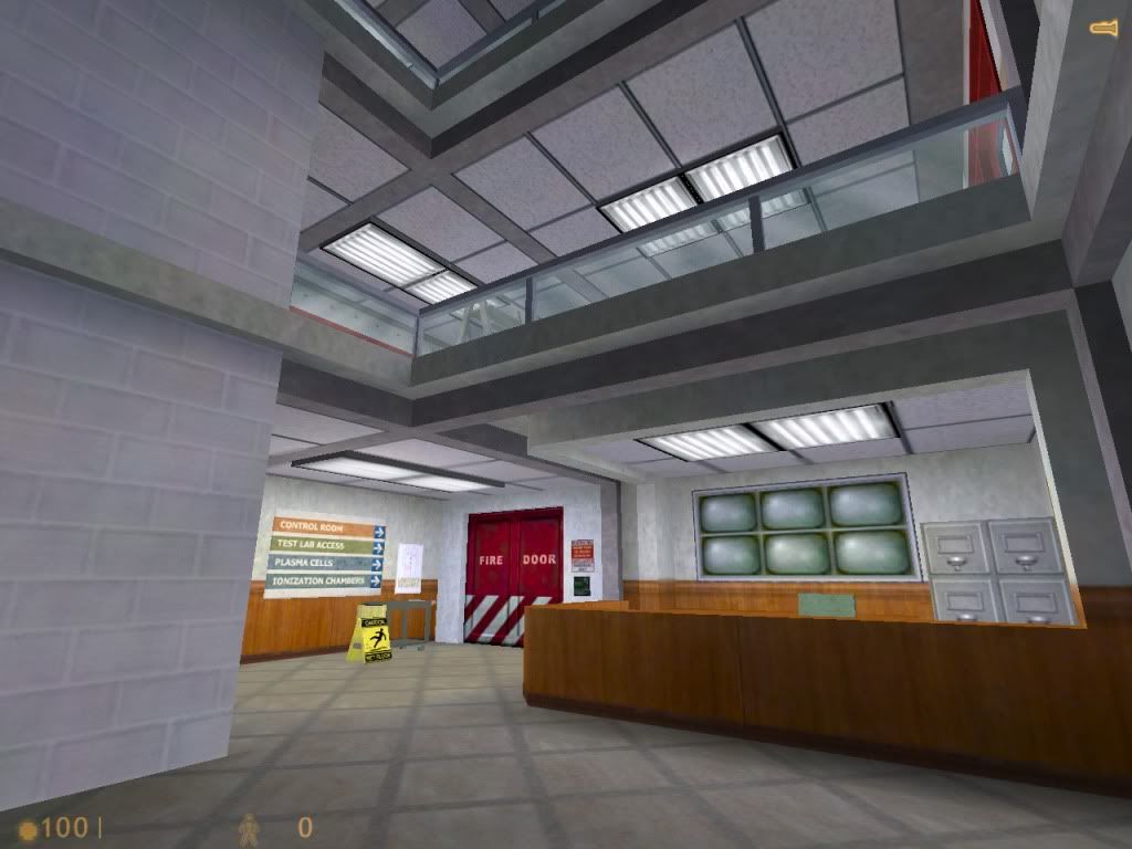
GoldSource.
Posted 14 years ago2010-03-21 22:25:56 UTC
Post #279885
That's weak of you potatis. The ceiling tiles give it away 

Posted 14 years ago2010-03-22 00:49:54 UTC
Post #279886
Wow, nice basement there.
Posted 14 years ago2010-03-22 02:27:17 UTC
Post #279887
Needs more shelves.
Posted 14 years ago2010-03-22 04:59:29 UTC
Post #279897
I don't know why Atom, but when I look at that I think AVGN :/
Posted 14 years ago2010-03-22 05:30:26 UTC
Post #279899
I don't know exactly why, but as simple as that looks, it still seems really good.
EDIT: Like the filename, too.
EDIT: Like the filename, too.
Posted 14 years ago2010-03-22 11:25:55 UTC
Post #279906
Your intuition is correct, Urby, it is the Nerd's basement, better known as the Nerd Room:I have a lot of work to do...
Posted 14 years ago2010-03-22 21:04:09 UTC
Post #279927
do you play dungeons & dragons down there?
)
Posted 14 years ago2010-03-22 21:05:39 UTC
Post #279928
My wierd experiment with DOOM textures is coming along nicely me thinks.The lighting is way better in the map. This is a horrid screenie if you want to see the lighting in the map.Same applies.One of my faves here.Showing the full hallway.Showing the next (unfinished) room.Just a screenie capturing the computers.
You guys are the first to see, so feel special.
You guys are the first to see, so feel special.

Posted 14 years ago2010-03-22 21:11:00 UTC
Post #279929
Some of them look...stretched. Or like they're (for example) .01x1.00
Other than that, it looks okay.
Other than that, it looks okay.
Posted 14 years ago2010-03-22 21:13:40 UTC
Post #279930
All the doom textures unfortunately look stretched as hell. I don't know how id did it but they did a damn good job at making the levels look good.
Also had to use a shitload of point lighting because the textures don't emit light.
Also had to use a shitload of point lighting because the textures don't emit light.
Posted 14 years ago2010-03-22 21:21:57 UTC
Post #279931
Try using info_texlights
[copypasted from the rooms thread]
[copypasted from the rooms thread]
How to use:
info_texlights
This is special entity that Zoners Compile Tools uses to extract light data for a compile. It is very simple to use and Half-Life doesn't use it so it simply won't spawn making it a error free replacement for a .rad file.
How to use:
Create an entity, any entity, and rename it to info_texlights. Hammer will automatically disable smartedit because it does not recognise the entity. This is a good thing because you don't want to use smartedit. Now, lets say you have a light texture and want it to emit, hey, light. Edit the info_texlights and ADD a keyvalue. In the 'key' box enter the name of your texture, eg, mylight01. in the value box, enter the colour and brightness values, just like you would in a light.rad file. (red, green, blue, brightness) Its that simple. You can have as many entries as you want.
Posted 14 years ago2010-03-22 21:24:00 UTC
Post #279932
oh well, i'll just edit the rad file eventually.
for now i'll just decrease the light brightness on the lights
for now i'll just decrease the light brightness on the lights
Posted 14 years ago2010-03-23 14:45:41 UTC
Post #279949
Looks good there, Joe.
Normally, you should avoid having textures stretch that much, but in your case, it makes the map look good, in a shiny metal kind of way.
But i agree with TJB that you should use texturelights. Its very easy to make your custom textures emit light. It's just up to you to decide whether you want to use the info_textlights entity or use a rad (radiosity) file. If you need help with this, pm me on Steam and ill help you out.
Posted 14 years ago2010-03-23 15:23:30 UTC
Post #279950
Thanks Atom, I appreciate it. 
Oh shit, i just noticed that the lights are a bit off.

Oh shit, i just noticed that the lights are a bit off.
Posted 14 years ago2010-03-23 17:55:22 UTC
Post #279954
This is my HL:CS 1.6 map i've been working on (:
Don't ever post bitmaps!
Don't ever post bitmaps!
Don't ever post bitmaps!
Don't ever post bitmaps!
Don't ever post bitmaps!
Don't ever post bitmaps!
Don't ever post bitmaps!
Don't ever post bitmaps!
Don't ever post bitmaps!
Don't ever post bitmaps!
Don't ever post bitmaps!
What do you all think? (:
Edited by your friendly local moderator
Don't ever post bitmaps!
Don't ever post bitmaps!
Don't ever post bitmaps!
Don't ever post bitmaps!
Don't ever post bitmaps!
Don't ever post bitmaps!
Don't ever post bitmaps!
Don't ever post bitmaps!
Don't ever post bitmaps!
Don't ever post bitmaps!
Don't ever post bitmaps!
What do you all think? (:
Edited by your friendly local moderator
Posted 14 years ago2010-03-23 18:04:25 UTC
Post #279955
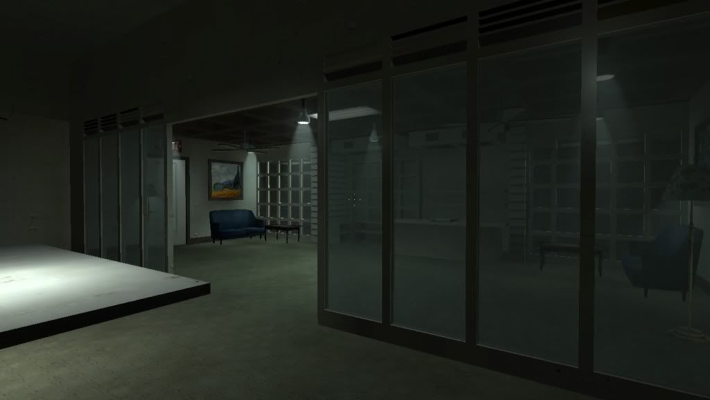
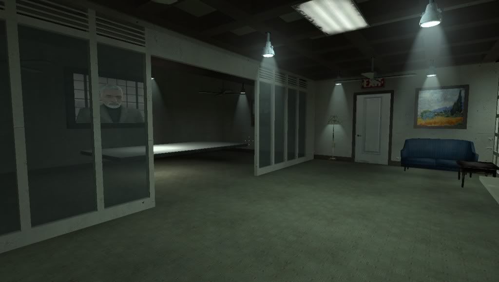
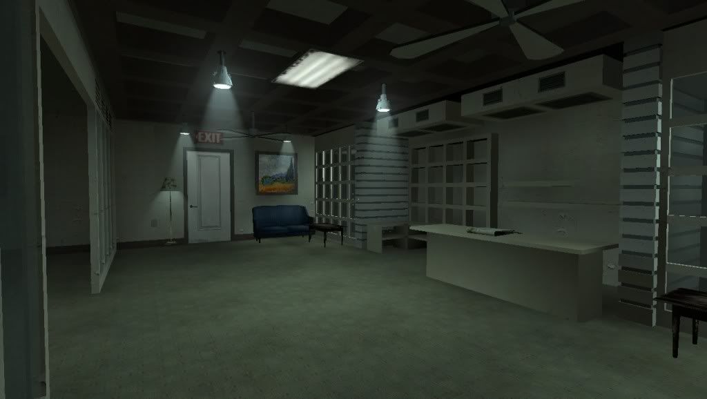
I think it's looking good. Save for some texture choices (such as the couch texture for the floor) but it's alright.
My cubicles entry:Some work to do before submitting.
My cubicles entry:Some work to do before submitting.
Posted 14 years ago2010-03-23 18:06:12 UTC
Post #279956
I think the screenshots are too small to see anything.
Also you shouldn't upload bmps. Ever.
Nobody waits for bmps to load. They're massive.
Edit: Ninja'd by Stu.
Also you shouldn't upload bmps. Ever.
Nobody waits for bmps to load. They're massive.
Edit: Ninja'd by Stu.
Posted 14 years ago2010-03-23 19:26:25 UTC
Post #279957
Looks nice disco! you always make decent use of the original textures.. (can't wait to see what special effects doodads you've in the map..)
)
Posted 14 years ago2010-03-23 19:29:56 UTC
Post #279958
BMPs aren't so bad...
... when you have 2.3 mb/s
KEKEKEKKEKEKEKEKEKEKEKEKEKEKEKE!
@Disco: I like your choice of texturing. It all matches the office theme really well. Keep up the good work!
... when you have 2.3 mb/s
KEKEKEKKEKEKEKEKEKEKEKEKEKEKEKE!
@Disco: I like your choice of texturing. It all matches the office theme really well. Keep up the good work!
Posted 14 years ago2010-03-23 20:36:14 UTC
Post #279959
So that's why they were loading so slowly, even for me.
Posted 14 years ago2010-03-23 20:44:17 UTC
Post #279960
@DiscoStu: Damn! That's some nice use of stock textures. I'm impressed.
@Atom: Is it bad that I guessed that? Maybe the scale is so perfect that I subconsciously picked up on it.
@robbas: Lern 2 Intarnet!!! :rly:
@Atom: Is it bad that I guessed that? Maybe the scale is so perfect that I subconsciously picked up on it.
@robbas: Lern 2 Intarnet!!! :rly:
Posted 14 years ago2010-03-23 21:17:09 UTC
Post #279961
Stu: Looks more detailed than my cubicle. I wish I had taken the effort to do that kind of work. So, is it an office, or a lobby?
Posted 14 years ago2010-03-23 23:18:57 UTC
Post #279962
Glad to know you guys like how it looks. Thanks! 
Actually I hate making textures, because I suck at it. So I have to make do with what's at hand.
Jeff: It is... my cubicles entry. Wait 'til the release and see for yourself

Actually I hate making textures, because I suck at it. So I have to make do with what's at hand.
Jeff: It is... my cubicles entry. Wait 'til the release and see for yourself

Posted 14 years ago2010-03-24 06:24:44 UTC
Post #279965
My pictures were bmps.
So, why did it load faster than his?
So, why did it load faster than his?
Posted 14 years ago2010-03-24 06:34:05 UTC
Post #279966
Because imageshack or wherever you uploaded them automatically converts them to jpeg if they're bmps.
Posted 14 years ago2010-03-24 11:47:56 UTC
Post #279970
They convert to PNGs so they keep their color palette.
I WAS working on a new KOTH map with 4 hills. The first hill is just a big hill. I haven't thought of the 3 others yet. Screens pending.
I WAS working on a new KOTH map with 4 hills. The first hill is just a big hill. I haven't thought of the 3 others yet. Screens pending.
Posted 14 years ago2010-03-24 13:55:30 UTC
Post #279971
ehm... do you guys have slow connections?  doesn't load slow for me.. anyway will upload to imageshack instead so they convert..
gah look for urself: http://img391.imageshack.us/gal.php?g=office201003230000.png
btw @stu i changed the texture u were talking about
 doesn't load slow for me.. anyway will upload to imageshack instead so they convert..
gah look for urself: http://img391.imageshack.us/gal.php?g=office201003230000.png
btw @stu i changed the texture u were talking about
Posted 14 years ago2010-03-24 14:12:22 UTC
Post #279972
robbas: it's not the point whether we are slow or not. you really have to "assume" that everyone is slow. Would you design a game that couldn't be played on any older systems? Plus, who, besides graphic designers even use .bmps anymore? Doesn't your screen capture program use .jpg? The only reason I use a .bmp is if I want the image to STAY crisp and clean. You can edit a .bmp and it will never change. Edit a .jpg and it will add a layer of "dust" every time you edit it.
yes, friends, it is true! please don't argue with me over this, ok?
I know you guys...
discostu: you kinda took my idea a little. I was trying to figure something like you have but couldn't get the friggin thing outta my head. The floor, although against my design methods, looks pretty good. I always like to design something like I was actually going to build it and I don't put carpet in diagonally but who's to say it wasn't made like that.
I am working on a source cubicle entry cause I simply don't have HL1 installed or set-up to map anymore. If I remember correctly it's a pain to set up so I will just stay where I am at. I am used to source now. Had another nice map to post but I have one diagonal solid that won't be nice.
Posted 14 years ago2010-03-24 14:16:41 UTC
Post #279973
The only reason I use a .bmp is if I want the image to STAY crisp and clean. You can edit a .bmp and it will never change.Same goes for PNG. BMPs are uncompress, while PNGs use lossless compression.
Posted 14 years ago2010-03-24 15:03:54 UTC
Post #279975
@kdnuvian: "Doesn't your screen capture program use .jpg?" nope 

Posted 14 years ago2010-03-24 15:09:29 UTC
Post #279976
Posted 14 years ago2010-03-24 16:04:34 UTC
Post #279978
Don't upload screenshots as PNG either. PNG is good for images where there is lots of the same colour, such as images of plain text. It doesn't work well when you have lots of different colours like in a game screenshot or a photo. Compress to jpeg with 90% quality and you will hardly notice the difference, except the filesize will be 10 times smaller. Use IrfanView to convert them if you don't have a proper image program.
Posted 14 years ago2010-03-24 16:20:18 UTC
Post #279979
You are certain? I've been using png a lot lately for game shots and the quality says a big fuck you to 90% jpg and I really don't see any loss of colour @_@ Teach me please 

Posted 14 years ago2010-03-24 19:00:17 UTC
Post #279980
For purposes of posting on a public forum 90% quality is perfectly fine.
Posted 14 years ago2010-03-25 21:55:41 UTC
Post #279997
military storage facility
a little map i'm working on (alpha stage) hope you guys like it :biggrin
EDIT:
damn, the image does not appear..
a little map i'm working on (alpha stage)
 hope you guys like it :biggrin
EDIT:
damn, the image does not appear..
Posted 14 years ago2010-03-25 22:29:18 UTC
Post #279999
They don't show up because you linked to the page with the image, rather than the image itself.
Here:It's good for a new mapper. You've used sloped surfaces, and interesting architecture, at least in that hallway. That's a good sign.
Here:It's good for a new mapper. You've used sloped surfaces, and interesting architecture, at least in that hallway. That's a good sign.
Posted 14 years ago2010-03-25 22:33:10 UTC
Post #280000
I see point lights.
Posted 14 years ago2010-03-26 14:22:53 UTC
Post #280016
i will upload my map soon, in unfinished stuff of course,
ah and the elevator room will have a good architeture, this is just alpha.
oh! and thanks for liking it!
ah and the elevator room will have a good architeture, this is just alpha.
oh! and thanks for liking it!

Posted 14 years ago2010-04-09 04:15:08 UTC
Post #280366
I've uploaded some pictures of my Left 4 Dead 2 map. I uploaded them to my blog so just check them out here because I can't be bothered linking to each of them:
http://hlifehotdog.blogspot.com/
http://hlifehotdog.blogspot.com/
Posted 14 years ago2010-04-26 10:50:59 UTC
Post #280791
My failing attempt to design a original handicap stencil:kdunivan: looks really nice (sorry so late to respond1)
Skedar: Looks like a good start is that for cubicles?
Skedar: Looks like a good start is that for cubicles?
Posted 14 years ago2010-04-26 12:32:02 UTC
Post #280795
Failing? It doesn't look that bad.
Posted 14 years ago2010-04-27 09:08:06 UTC
Post #280813
Wouldn't it be easier and more compile time friendly to use decals / overlays for that CT?
Posted 14 years ago2010-04-27 15:00:31 UTC
Post #280819
Figuring things out.  Does anyone else map for L4D2?
 Does anyone else map for L4D2?
Posted 14 years ago2010-04-28 16:46:45 UTC
Post #280839
haha bowling alley NICE! =P
I plan on getting L4D2 soon and mapping fo' it..
I plan on getting L4D2 soon and mapping fo' it..
Posted 14 years ago2010-04-29 01:26:45 UTC
Post #280858
ZOMBIES AINT GETTIN MAH BEER!Grim is helping me understand source mapping, couldn't have gotten this far without him. 

Posted 14 years ago2010-04-29 03:43:44 UTC
Post #280863
Posted 14 years ago2010-04-29 03:58:35 UTC
Post #280865
Posted 14 years ago2010-04-30 00:02:33 UTC
Post #280892
Those curved stairs look weird. I hate coming across those in real life. Rotate the steps too!
Posted 14 years ago2010-04-30 04:06:49 UTC
Post #280901
The steps have the same curve as the wall but you cant tell from the screenshot. its kind of a weird looking thing on paper i guess
You must be logged in to post a response.


