Post your screenshots! WIP thread Created 16 years ago2007-12-16 00:58:58 UTC by doodle doodle

Created 16 years ago2007-12-16 00:58:58 UTC by doodle doodle

Posted 8 years ago2016-06-02 06:55:26 UTC Post #330311
@kruk:

It's not the textures resolution that matters, but how much you scale them.

If you use 512x512px textures and leave them at 1.00 scaling, the compile times would be approximately the same as using 128x128px textures at 1.00 scaling. But if you scale them at 0.50 instead, your compile times would be two times slower.
The real purpose of using high resolution textures is that you can cover bigger areas using smaller scales and avoid to show the texture's seams, but at the same time achieving more detail.
In my case, I use 0.50 scaling on all textures, and sometimes 0.25 to push some details in the map (don't mess too much with 0.25 scaling, definitely not recommended).

It doesn't matter how powerful your computer is, because the engine is old and can be unperformant easly if misused.
The good thing is that you don't need more than 100 fps to play any Goldsrc based game, as more fps would just create a mess with the entities (especially NPCs) making them turn really slow depending on how many frames you're getting (the more the slower). Also bunnyhopping would be harder for the same reason, being unable to maintain speed.

And yes, you could use more than 8 of those textures, it's just about HOW you'll use them. ;)

@KB90:

Yes. Pure vanilla Goldsource. :)

@Urby:

I didn't know that. :o I thought it was 512px max for both sides.
Thanks for the info Urbeh. :hammer:

@Trempler:

Thanks bro. ;)
Alberto309 Alberto309weapon_spaghetti
Posted 8 years ago2016-06-02 08:05:38 UTC Post #330312
All of that detail needs more noise, it looks too surgical, plus the default half life/cs player models are less detailed than the world.
In other words, its too bland most of the time when I see maps like this. A lot of the atmosphere is missing.
Id rather play old style nicely blended maps with good shadow/light work than just hyper size texture. But thats my opinion and I would like to hear some one elses as well :)
Stojke StojkeUnreal
Posted 8 years ago2016-06-02 10:52:03 UTC Post #330314
There are mods for it compensate the detail level. You can download "HD" player models and weapons.
It also depends on how good you are at mapping; if you can optimize your map for good, then you can add more detail so it will not look bland at all.
Alberto309 Alberto309weapon_spaghetti
Posted 8 years ago2016-06-02 10:59:38 UTC Post #330315
Am I the only one here who "try" to match the texture sizes with the faces sizes ? In other words, if there is a 2048 units cube, I would use 512x512 textures scaled at 1.0 (or 0.5) and if there is a cube at 64 units, use a 64x64 texture scaled at 1.0 (or 0.5).
It doesn't matter how powerful your computer is, because the engine is old and can be unperformant easly if misused.
+1
The good thing is that you don't need more than 100 fps to play any Goldsrc based game, as more fps would just create a mess with the entities (especially NPCs) making them turn really slow depending on how many frames you're getting (the more the slower).
I see a lot this problem with Barney (when you move him because he's blocking you), and I think this is a mistake made on Valve's end because if I remember correctly, the formula is "Speed = Yaw speed depending on the monster and the activity * time between 2 frames * 10". I think this can be fixed by removing the "time between 2 frames" variable but I'm not willing to try.
Also bunnyhopping would be harder for the same reason, being unable to maintain speed.
This would be very noticeable if you play on WON or you remove the bunnyhop cap limit on Steam. Otherwise, I don't think it's really an issue.
Posted 8 years ago2016-06-03 21:44:16 UTC Post #330332
Am I the only one here who "try" to match the texture sizes with the faces sizes ? In other words, if there is a 2048 units cube, I would use 512x512 textures scaled at 1.0 (or 0.5) and if there is a cube at 64 units, use a 64x64 texture scaled at 1.0 (or 0.5).
While not for textures specifically, I do this all the time within UDK for the lightmap resolution.
It has a very convenient "Texel density" display mode (with colour coding to easily see mismatching densities) that I use excessively to satisfy my OCD.
Looks so wrong to have high resolution shadows on a surface directly next to one with blobby, low resolution shadows...
Crollo CrolloTrollo
Posted 8 years ago2016-06-04 05:39:56 UTC Post #330333
Looks so wrong to have high resolution shadows on a surface directly next to ome with blobby, low resolution shadows...
That's not true in some cases. If, let's say, a box is on a surface with hi-res lightmaps, next to a surface with low-res lightmaps, that would be perfectly OK. But only if there was an object far away from the low-res surface. Only then, a blurry shadow would make sense.

It commonly happens in real life. Bodies far away from their surfaces cast blurry shadows. Also, it depends on the intensity of the light itself.
Admer456 Admer456If it ain't broken, don't fox it!
Posted 8 years ago2016-06-04 17:37:05 UTC Post #330342
Well, no. The penumbra of the shadow is not the concern, it's the consistency of the resolution on surfaces.
Of course I'm aware that shadows can be blurry, even hl1 from 1998 had a basic radiosity engine... I'm just saying that you wouldn't have a 256x256 unit wall with a 512x512 map, then immediately next to it an identical sized wall with a 64x64 map stretched across it, whether it's a lightmap or a texture.
Crollo CrolloTrollo
Posted 8 years ago2016-06-04 21:48:41 UTC Post #330343
Decided to redo havana with a friend.Here are some screenshot tho keep in mind that the timelapse between them is huge:
User posted image
User posted image
User posted image
User posted image
User posted image
User posted image
User posted image
User posted image
Ignore the skybox :D
Also some of this screenshots are really old
Posted 8 years ago2016-06-04 23:10:28 UTC Post #330344
Nice quallity !
Posted 8 years ago2016-06-04 23:55:47 UTC Post #330345
I also did an Update to my DM Map, as so many people asked me to retexture it.
http://imgur.com/a/cemEh yeah also added some more details ^_^
Posted 8 years ago2016-06-05 10:34:11 UTC Post #330349
Your mapping reminds me a lot of Rimrook, Trempler, and believe me when I say that's a compliment!
Archie ArchieGoodbye Moonmen
Posted 8 years ago2016-06-05 16:52:14 UTC Post #330353
Both looking fantastic!
Lajron you're really nailing the style.
And Trempler... is that a curved ramp? D:
Posted 8 years ago2016-06-06 01:25:25 UTC Post #330354
Thank you Archie, this means a lot to me :D

And ofc this is DiscoStu :D

Btw releasing the map now as final :P have fun added 3 secrets find them and earn cookies !
Posted 8 years ago2016-06-06 03:32:51 UTC Post #330355
Are those tracking cookies?
Posted 8 years ago2016-06-06 15:33:44 UTC Post #330361
Looks even sexier now, Trempler. Love the energy ball too. :)
Posted 8 years ago2016-06-08 20:11:11 UTC Post #330373
I remember that havana map from last year, thought it was dead. Glad you kept at it, Lajron. I'm loving the color comps so far.
Posted 8 years ago2016-06-10 11:19:24 UTC Post #330378
And here the BETA(is able to download) of fy_alleystorage!
How I said before, the map of iraq must w8.
https://youtu.be/215xIKKpR2o
Mr. Cowboy Zombie Mr. Cowboy ZombieSemper fidelis
Posted 8 years ago2016-06-11 20:13:55 UTC Post #330385
User posted image
Starting up a surf map. The onion dome is hollow and all on grid and there's no hang ups on it while surfing it.
Posted 8 years ago2016-06-11 20:26:39 UTC Post #330386
Impossibru!
Posted 8 years ago2016-06-11 21:35:25 UTC Post #330387
Impossibru!
User posted image
Mr. Cowboy Zombie Mr. Cowboy ZombieSemper fidelis
Posted 8 years ago2016-06-12 06:19:59 UTC Post #330390
Nah, everything is possible. I carved an arch once. It worked perfectly! I even have an unfinished theoretical model of carving spheres.
Admer456 Admer456If it ain't broken, don't fox it!
Posted 8 years ago2016-06-12 07:57:32 UTC Post #330391
I carved an arch once.
Facepalm
Posted 8 years ago2016-06-12 10:55:25 UTC Post #330393
Dear God... Just because you CAN carve, doesn't mean you should. Ever.

Is entirely possible to make a phlegm sandwich for example...
monster_urby monster_urbyGoldsourcerer
Posted 8 years ago2016-06-12 12:07:21 UTC Post #330394
I don't recall the last time I even thought carving would be more useful than doing it manually.
Jessie JessieTrans Rights <3
Posted 8 years ago2016-06-12 13:28:28 UTC Post #330395
User posted image
Going to be a giant surfable sand castle. surf_sandcastle
Posted 8 years ago2016-06-12 19:56:17 UTC Post #330397
Surf_lag_lord :biggrin:
Stojke StojkeUnreal
Posted 8 years ago2016-06-12 21:25:25 UTC Post #330399
Just two onion domes, rest more simple geometry. Well there is the tower of babel in the center. Face palm.

I'll try it in my server when done. Can always recycle and simplify.
Posted 8 years ago2016-06-15 13:20:48 UTC Post #330441
User posted image
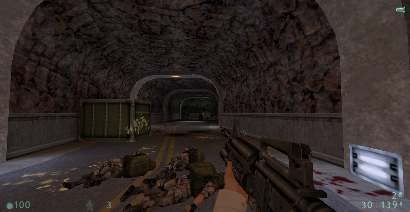
I made a rocky, tunnely thingy!
Dr. Orange Dr. OrangeSource good.
Posted 8 years ago2016-06-15 13:31:24 UTC Post #330443
It's very nice. My only complaint would be the rocks through, They look far too smooth and it emphasises the repeating texture.

Love the concept though.
monster_urby monster_urbyGoldsourcerer
Posted 8 years ago2016-06-15 13:32:57 UTC Post #330444
Add in some func_detail/func_wall chunks or something, that should break it up without making the underlying brushwork too messy.

Looks quite nice so far, though.
Notewell NotewellGIASFELFEBREHBER
Posted 8 years ago2016-06-15 19:19:27 UTC Post #330455
If I were crazy, I would vertex the hell out of this ^^
Posted 8 years ago2016-06-16 10:47:11 UTC Post #330468
For this kind of tunnels it's not hard at all to make "rocky" rock.
I made a video about it a while ago.
https://1drv.ms/i/s!AjDiyoLVPZZphLAs0l2qUi8dZXN47w

Eventhough, oddly, I personally quite like the smooth rock in this particulzr exemple. But still, the texture is too repetitive as Urby said.
Posted 8 years ago2016-06-16 10:51:25 UTC Post #330469
I think you failed your link Loulimi xD
Posted 8 years ago2016-06-16 11:00:02 UTC Post #330470
Lol well it's possible... :P
Corrected link: https://m.youtube.com/watch?v=0ksGc2keBCY
I have an excuse though, I'm using a Windows phone... ^^
Posted 8 years ago2016-06-16 14:21:39 UTC Post #330472
I also know that technique of making terrain.

But the thing that annoy me with a terrain like that is the collision, but hey, it's Gold Source ^^
Posted 8 years ago2016-06-16 23:18:32 UTC Post #330481
I believe that's what CLIP brushes are partially meant for.
Admer456 Admer456If it ain't broken, don't fox it!
Posted 8 years ago2016-06-17 00:07:44 UTC Post #330482
I believe that's what CLIP brushes are partially meant for.
CLIP won't help you on ground and edges collisions.
Posted 8 years ago2016-06-17 04:49:09 UTC Post #330483
You can use clip to stop the player getting snagged on the complex geometry.
monster_urby monster_urbyGoldsourcerer
Posted 8 years ago2016-06-17 11:03:51 UTC Post #330486
I guess that's subjective but I would hate such use of the CLIP texture. I find it so frustrating that an invisible wall prevents me from getting too close to a complex geometry or otherwise keep me away from the rock's cavities. It creates a break-up between what I can see and where I can move. It makes me feel that what I see is just a useless theater set and that I can only move in an artificial and predefined path. It gives me the feeling that the rock is covered with some sort of invisible, hard and unbreakable jelly preventing me from touching the world. The fact I hate jelly only makes things worse.

But then, everyone does not share my feeling. What I'd see anyway would be to find a way not to have to use the clip texture. As far as I can tell, the technique I used in my video does not require clip texture, collisions do not seem to cause (much) problems.
Posted 8 years ago2016-06-17 11:49:50 UTC Post #330487
What about BEVEL then? Isn't it a kind of anti-CLIP?
Jessie JessieTrans Rights <3
Posted 8 years ago2016-06-17 12:14:22 UTC Post #330488
Yep, bevel forces clipnodes not to be created for faces & edges. It's a useful alternative to NULL under complex terrain, although can result in oversimplified clip hulls which allow the player to sink through the ground.

I used BEVEL on this cliff face because the player never has to traverse it, and it was creating hundreds of unnecessary clipnodes (there is a hard limit in GS)
User posted image
But I used NULL on this ventilation pipe because I wanted all clipnodes to be calculated to prevent the player sinking through that subtle incline.
User posted image
Archie ArchieGoodbye Moonmen
Posted 8 years ago2016-06-17 17:10:20 UTC Post #330490
Wardon! Wardon! WARDON!
Posted 8 years ago2016-06-17 17:57:11 UTC Post #330491
Wardon! Wardon! WARDON!
You forgot this :

Llun! Llun ! LLUN!

Oh by the way :
User posted image
Posted 8 years ago2016-06-17 20:48:51 UTC Post #330492
Oh my goodness. Well spotted. We will delete the mod immediately.
monster_urby monster_urbyGoldsourcerer
Posted 8 years ago2016-06-17 21:00:07 UTC Post #330493
"We have canceled the mod because a stupid french moron spotted a tiny fail we made in our map" xD
Posted 8 years ago2016-06-17 21:21:30 UTC Post #330494
Please direct all your questions to Shepard62700FR

;)
monster_urby monster_urbyGoldsourcerer
Posted 8 years ago2016-06-17 23:01:41 UTC Post #330497
It's modders that half-ass their maps like that, that give the rest of us a bad fame.
Posted 8 years ago2016-06-18 01:20:27 UTC Post #330498
Oh my goodness. Well spotted. We will delete the mod immediately.
Finally! I've been telling you to do that for years! :biggrin: Also, holy shit, that is one sexy ventilation pipe.
Suparsonik SuparsonikI'm going off the edge to meet my maker.
Posted 8 years ago2016-06-18 02:37:20 UTC Post #330499
Is The Core HL3?
Jessie JessieTrans Rights <3
Posted 8 years ago2016-06-18 09:58:48 UTC Post #330507
Quake bigger than GoldSource? Only Quake 3 and 4's engines are.

Half-Life 3 will use Source 3, because it will come out probably in 2033, by then, Source 2 will be old.

But yeah, Volatile 3D is nice.
Admer456 Admer456If it ain't broken, don't fox it!
You must be logged in to post a response.