Post your screenshots! WIP thread
Created 17 years ago2007-12-16 00:58:58 UTC by
 doodle
Created 17 years ago2007-12-16 00:58:58 UTC by
![]() doodle
doodle
Posted 8 years ago2016-06-18 14:29:31 UTC
Post #330510
You guys really need to stop thinking about HL3, Ricochet 2 is way more important ^^
Posted 8 years ago2016-06-18 15:05:26 UTC
Post #330511
Nothing is more important than waiting for Crashday 2. At least when it comes to games.
Posted 8 years ago2016-06-19 11:22:27 UTC
Post #330516
This one's my favorite 

Posted 8 years ago2016-06-19 18:12:28 UTC
Post #330519
I only just noticed the van in that screenshot. Guess I was too horrified by the CURVED RAMP.
Posted 8 years ago2016-06-21 06:47:41 UTC
Post #330520
I feel that the brick texture is out of the place opposite to the original design. The wall infront of the ramp is too thin for bricks, should have been a more solid concrete texture in my oppinion.
Posted 8 years ago2016-06-21 08:12:58 UTC
Post #330522
How did u make the stairs in angle???
Posted 8 years ago2016-06-21 08:21:44 UTC
Post #330523
Triangles muh boi, triangles 

Posted 8 years ago2016-06-21 17:50:13 UTC
Post #330528
Is there any tutorials for that angled ramp?
Posted 8 years ago2016-06-21 17:55:19 UTC
Post #330529
That's so easy, a 14 year-old can do it! I'm going to try that just now.
Posted 8 years ago2016-06-21 19:32:45 UTC
Post #330531
Is there any tutorials for that angled ramp?Create an arch, clip each piece of the arch into two triangles, raise each pair of vertices higher than the previous ones, done.
Posted 8 years ago2016-06-21 22:55:13 UTC
Post #330536
Yeah... basically. But there's the risk of it rendering like crap.
Posted 8 years ago2016-06-22 07:25:56 UTC
Post #330540
A more real challenge would be a curved ramp (like the one on the picture) with support beams, and a fence on top of it. And, it must be OK for Counter-Strike's func_vehicle to traverse it with at most, minor problems.
Posted 8 years ago2016-07-02 17:43:29 UTC
Post #330643
Lovely green stuff!Plus some lovely, not-as-green stuff.
Posted 8 years ago2016-07-02 18:07:32 UTC
Post #330644
Classy and stylish, I like it ^^
Posted 8 years ago2016-07-02 18:56:41 UTC
Post #330645
This is GoldSRC, in space. Sadly, whenever I launch the damn map, every single sprite is pitch black, except for the space ship, which is near a light entity.
Anyways, this is how it should look like:
Anyways, this is how it should look like:
Posted 8 years ago2016-07-02 20:28:44 UTC
Post #330646
This is GoldSRC, in space. Sadly, whenever I launch the damn map, every single sprite is pitch black, except for the space ship, which is near a light entity.Have you made sure the fx ammount is set to 255? I fall for this error a lot since it's 0 by default and I don't think to change it.
Posted 8 years ago2016-07-03 08:57:49 UTC
Post #330654
Yeah, I already did it. I used to have this problem with transparent brushes (with blue parts).
Anyways, now I'm adding an opening camera sequence.
Anyways, now I'm adding an opening camera sequence.
Posted 8 years ago2016-07-03 12:48:54 UTC
Post #330656
Posted 8 years ago2016-07-04 14:43:20 UTC
Post #330680
Holy shit Dr.Orange, that looks lovely.
@Admer... you do know that Goldsource has a skybox for space right? It's 2D sure, but that map with the sprites look a little cluserfucky...
Not to mention the speed at which you'd need to be moving to visibly see stars move in relation to one another. Although I'm not sure what the focus of the map will be so you can ignore that particular point.
Just make sure that they're set to additive as that will make them light up.
@Admer... you do know that Goldsource has a skybox for space right? It's 2D sure, but that map with the sprites look a little cluserfucky...
Not to mention the speed at which you'd need to be moving to visibly see stars move in relation to one another. Although I'm not sure what the focus of the map will be so you can ignore that particular point.

Just make sure that they're set to additive as that will make them light up.
Posted 8 years ago2016-07-04 16:36:57 UTC
Post #330681
@Urby
The map with stars as sprites is simply an opening sequence for my map "space_wars". After all, as soon as I added a camera and a camera path (along with a trigger_auto), Sven Co-op crashed.
I guess I could find/make a custom space skybox, OR use the nebula skyboxes, it's much more awesome.
The map with stars as sprites is simply an opening sequence for my map "space_wars". After all, as soon as I added a camera and a camera path (along with a trigger_auto), Sven Co-op crashed.
I guess I could find/make a custom space skybox, OR use the nebula skyboxes, it's much more awesome.
Posted 8 years ago2016-07-04 19:08:58 UTC
Post #330682
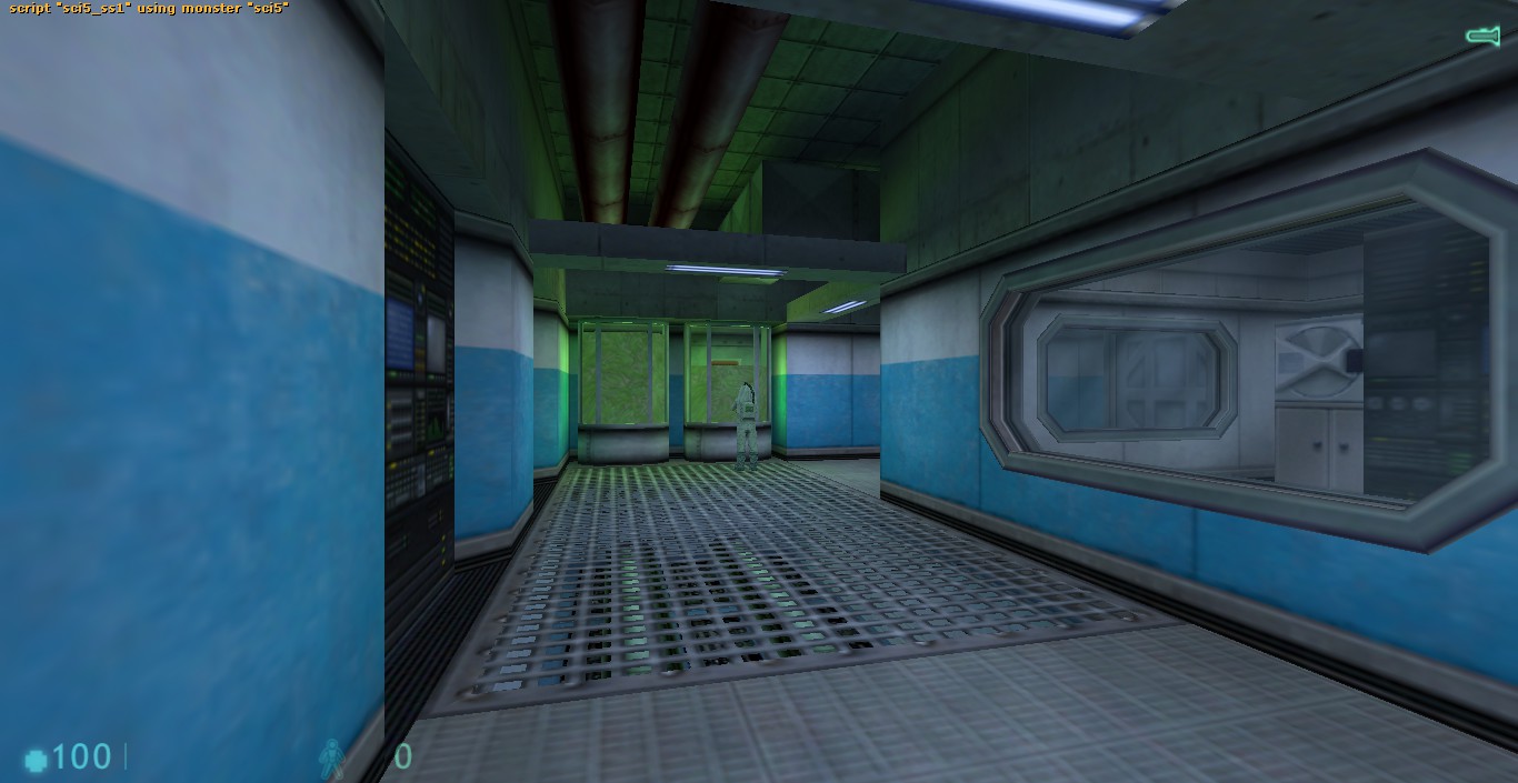
Maintenance floor interior of that skyscraper I posted on page 102.Still kinda new on mapping but there is anything I could improve in the screenshots above? Thanks for reading!
Posted 8 years ago2016-07-04 19:29:25 UTC
Post #330683
Still kinda new on mapping but there is anything I could improve in the screenshots above? Thanks for reading!It's a bit too dark. I can see what kind of environment you're creating, and you've really done a good job! However, it's still too dark. I suggest either making the lights you allready have more brighter, and perhaps add additional lighting where it gets too dark. Other than that, it looks good. keep it up!
Posted 8 years ago2016-07-05 10:03:33 UTC
Post #330688
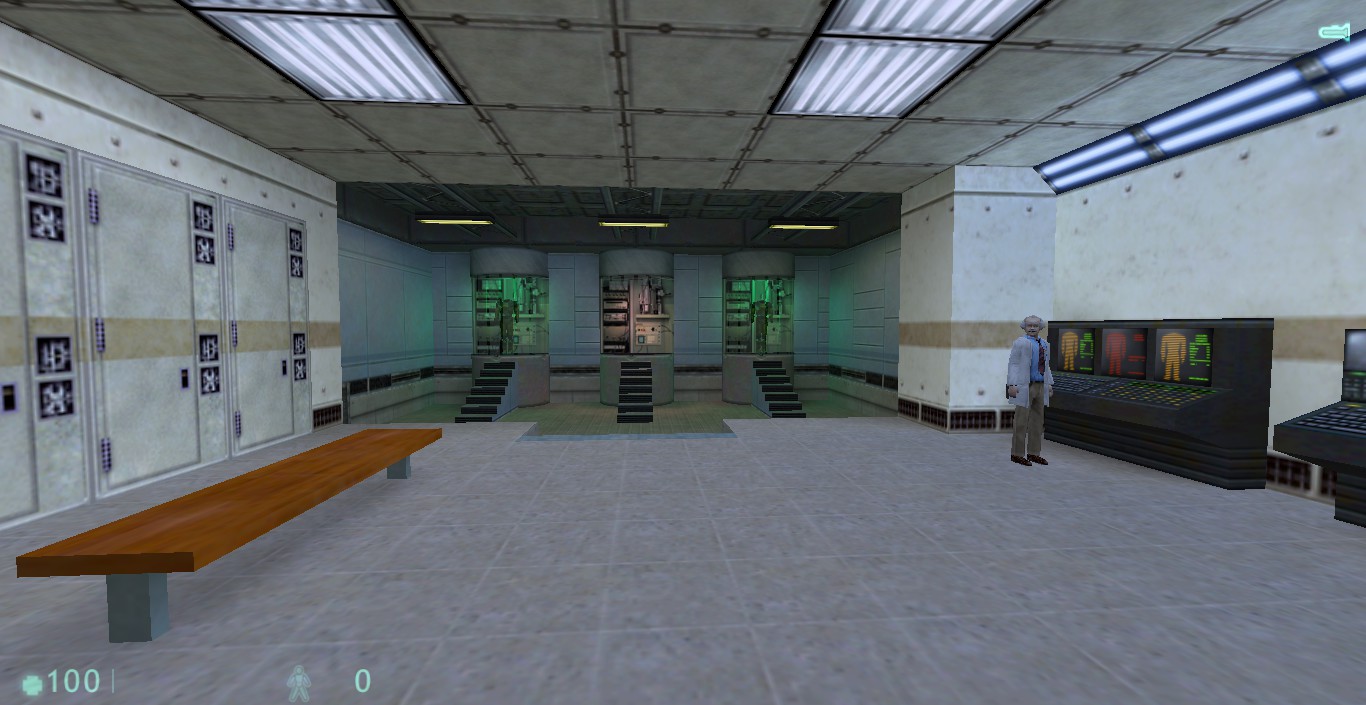
Alright, I followed your feedback to make the map more brighter, here's the pictures:How is it now? Is there anything else I can improve there?
Thanks for reading!
Thanks for reading!
Posted 8 years ago2016-07-05 10:57:56 UTC
Post #330690
Pretty much everything, aside from textures applied, it looks like a early wip. Floor, walls, ceiling; they're all flat. I'd say greybox everything and work on their overall shape, depth, levels and details. A couple of pipes won't save a flat ceiling 
Expand your textures a bit too, without going crazy. It might be a horror map that you're building, but that doesn't mean everything has to be boring grey. Pick a few (2,3,4..) textures that create a nice contrast, or some that make up for a good color comp/synergy. Lighting as well, get some more color in there without oversaturating the palette; usually the rule of 3 works fine: 1 overall ambient color, 2 detail colors.
P.S: Sorry if this sounded a bit harsh and puts you down, really not my intention

Posted 8 years ago2016-07-05 11:12:01 UTC
Post #330691
Hmm, yeah I'll do that since I think the map itself is too small and flat textured too.
I'll try to decorate it more and make it more interesting, thank you for the feedback!
I'll try to decorate it more and make it more interesting, thank you for the feedback!

Posted 8 years ago2016-07-05 18:01:36 UTC
Post #330693
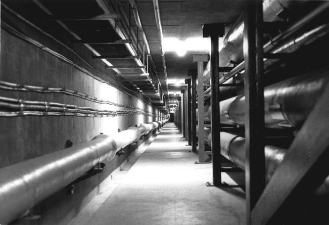
Do an image search for inspiration. You have what looks like a basic maintenance tunnel, am I right? Well, Google turns up these images. Don't go ahead and copy what you see, but use them for inspiration and you could have some real fun with it. 

Posted 8 years ago2016-07-06 00:52:13 UTC
Post #330700
To tell you the truth, those hallways are too bare. If they're supposed to be maintenance tunnels, throw some maintainable stuff down there. Right now it's as if there was nothing to do there. I second Urby's advice.
Posted 8 years ago2016-07-14 14:52:53 UTC
Post #330830
While this doesn't really show off any actual mapping I've done, I'm pretty sure it'll give you a hint of a feature I've implemented that'll make it a lot more fun to mess with players >:)It's also one of the first thing I've ever programmed so I'm proud.
Posted 8 years ago2016-07-14 17:52:05 UTC
Post #330831
How does it happen?
Posted 8 years ago2016-07-15 14:40:34 UTC
Post #330837
Also, how does it work in relation to difficulty settings?
Posted 8 years ago2016-07-15 19:30:14 UTC
Post #330839
How does it happen?
Also, how does it work in relation to difficulty settings?Like this:
Posted 8 years ago2016-07-15 19:34:57 UTC
Post #330840
Ah well, lookit that.
Nice job.
Nice job.

Posted 8 years ago2016-08-05 20:42:14 UTC
Post #331095
Posted 8 years ago2016-08-05 22:04:07 UTC
Post #331096
It is, however, a lot more work for the mapper.
Posted 8 years ago2016-08-06 06:52:27 UTC
Post #331097
It also has the potential of looking off in game in terms of lighting, especially in Steam HL and when using the flashlight.
Posted 8 years ago2016-08-06 19:34:59 UTC
Post #331099
It's going to look weird unless all the lighting is baked in. And then you go through all that work and the player and weapon models will be pitch black.
Posted 8 years ago2016-08-06 20:43:03 UTC
Post #331100
so you saying this really dons't work in case scenarios as the screenshots?
btw i plan to disable flashlight overall it looks poor.
The idea is to use big models for certain parts of the map with consistent light like arenas ect.
btw i plan to disable flashlight overall it looks poor.
The idea is to use big models for certain parts of the map with consistent light like arenas ect.
Posted 8 years ago2016-08-06 21:43:35 UTC
Post #331101
@Dr. Orange: Some lovely work. I will see to it to get some sort of replica done in my own engine modification for opposing force. I don't think anyone ever considered this what you did. So this is unique. 
@Urby: I wasn't aware you were building some sort of Alien Colonial Marines mod in secrecy.. Well what ever it is.. It looks intriguing to say the least.
I truly wish we could add an endless amount of models in hl just like in the Unreal Engine now that would be cool.

@Urby: I wasn't aware you were building some sort of Alien Colonial Marines mod in secrecy.. Well what ever it is.. It looks intriguing to say the least.

I truly wish we could add an endless amount of models in hl just like in the Unreal Engine now that would be cool.
Posted 8 years ago2016-08-07 11:17:22 UTC
Post #331104
I've been experimenting with making a Cycles material in Blender to generate fabric type textures, as even with CGTextures I could never get a nice looking fabric or carpet in GoldSrc. Hopefully this way I can mess with the fabric contrast and scale to get something that looks pretty nice.At the moment it's only set up to make single colour plain weave fabric, I'm going to try to set it up to generate multiple colour and twill fabrics.
Posted 8 years ago2016-08-07 21:08:24 UTC
Post #331117
@Urby: I wasn't aware you were building some sort of Alien Colonial Marines mod in secrecy.. Well what ever it is.. It looks intriguing to say the least.Heh... wait. Neither was I... wat?
Posted 8 years ago2016-08-09 11:00:52 UTC
Post #331129
Dont worry, Ill trash the piano.
https://youtu.be/3U83TEnlLmY
https://youtu.be/3U83TEnlLmY
Posted 8 years ago2016-08-09 16:25:37 UTC
Post #331133
That piano is fantastic! Just get the faces fixed and it'll look lovely. I always wanted to use a piano. And I love what you did with the statue ;P
@TJB: Doesn't that texture need to be TINY for it to look natural in game?
@TJB: Doesn't that texture need to be TINY for it to look natural in game?
Posted 8 years ago2016-08-09 16:57:54 UTC
Post #331136
The problem is I dont know fix the sides 

Posted 8 years ago2016-08-10 02:43:04 UTC
Post #331140
I'm not experienced enough to advise you on that but there's plenty of people here that are.
Posted 8 years ago2016-08-10 06:21:58 UTC
Post #331142
@vodka95
Don't trash that hard work because of a small, tiny error. You probably made the piano too smooth, or perhaps you resized using the selection tool, so some vertices went off-grid.
Or maybe you just applied Null textures by accident.
Don't trash that hard work because of a small, tiny error. You probably made the piano too smooth, or perhaps you resized using the selection tool, so some vertices went off-grid.
Or maybe you just applied Null textures by accident.
Posted 8 years ago2016-08-21 18:50:46 UTC
Post #331351
This one's turning into a bit of a headache...
Posted 8 years ago2016-08-21 20:07:21 UTC
Post #331354
the idea of mass using models in maps isn't dead for me XDAre you using HL1 GS 1.1.1.0 or HL1 Steam 1.1.2.0?, if you are using GS...how do you make the models block light and cast shadows?, are you using cyclers?. O_o
Posted 8 years ago2016-08-21 20:09:34 UTC
Post #331355
Lovely screens Archie.. This almost looks pre cascade?
Posted 8 years ago2016-08-21 20:31:29 UTC
Post #331357
I imagine he created the environment in a modeling suite and baked the lighting into the textures, abbadon.
Posted 8 years ago2016-08-22 09:25:23 UTC
Post #331363
mmmm, tricky!! 

You must be logged in to post a response.


