2024 Exercise #6: Combat
 EP2
EP2
2024 Exercise #6: Combat
by
CPripyatUit
Posted 11 months ago2024-02-25 00:56:56 UTC •
Completed •
Half-Life 2: Episode 2
- Name
- 2024 Exercise #6: Combat
- By
-
 CPripyatUit
 - Type
- Map
- Engine
- Source
- Game
- Half-Life 2: Episode 2
- Category
- Completed
- Included
- BSP, RMF/VMF
- Created
- 11 months ago2024-02-25 00:56:56 UTC
- Updated
- 11 months ago2024-02-25 01:21:17 UTC
- Views
- 792
- Downloads
- 181
- Comments
- 5
- Rating
- 5.00 (1)
- Reviews
- 0
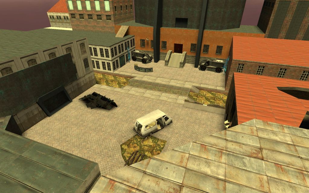
This is my... third? attempt at making a fun little combat arena. It's a fairly basic gauntlet with a few waves of enemies; I've tried to work out a pacing that doesn't overwhelm and doesn't bore.
My experience playing it is a little biased of course, since I know what's coming, so I'd be grateful for feedback on how well-balanced or not it is.
Enjoy!
(Edit: updated because the ending wouldn't trigger right)
My experience playing it is a little biased of course, since I know what's coming, so I'd be grateful for feedback on how well-balanced or not it is.
Enjoy!
(Edit: updated because the ending wouldn't trigger right)
5 Comments
You must log in to post a comment. You can login or register a new account.


They look very good!