Competition: Half-Life Re-imagined
Closed
View Results
- Open Date
- 8 years ago2016-12-01 00:00:00 UTC
- Close Date
- 7 years ago2017-03-31 23:59:59 UTC
- Type
- Full Map
- Allowed Engines
- Goldsource, Source
- Judging Type
- Judged (all engines combined)
- Judges
Choose a map from Half-Life 1 (or Opposing Force/Blue Shift) and remix it in an interesting way. Your entry must resemble the original map in an obvious way - whether it be in aesthetics, gameplay or design.
The key is to create a map that feels like the original version, without simply cloning it. We're looking for a new spin on the maps that we all know and love. The new map does not have to be for the same game or gameplay type as the one you choose to remake.
Examples:
The key is to create a map that feels like the original version, without simply cloning it. We're looking for a new spin on the maps that we all know and love. The new map does not have to be for the same game or gameplay type as the one you choose to remake.
Examples:
- Choose a singleplayer chapter and make a new level for it with the same ambience and style
- Use the layout of a multiplayer map and texture it in a unique way
- Turn a singleplayer map into a multiplayer map, or vice-versa
- Take the major gameplay elements from a map and make a new map that uses those same elements
- Use your imagination! Surprise us!
Results
Judged By:
 Strider
•
 Penguinboy
Even though we had the great competition drought of 2014-2015, we had a fantastic turnout for this competition! There were so many excellent entries and we had a lot of trouble narrowing down a top three. The nostalgia was palpable as we played through each entry with glee.
This was a very open-ended competition with a lot of room for creativity, and it shows with all the different entries. There was a huge amount of variety in all your submissions, and we're proud of all you folks for showing us why this series holds such a special place in our hearts. Congratulations to everyone involved!
This was a very open-ended competition with a lot of room for creativity, and it shows with all the different entries. There was a huge amount of variety in all your submissions, and we're proud of all you folks for showing us why this series holds such a special place in our hearts. Congratulations to everyone involved!
- Penguinboy, Strider, & Ant
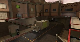
Victor-933 has taken one of the most memorable levels of the Surface Tension chapter and turned it into a beautiful multiplayer map. While still obviously resembling the area we've all played through before, it expands and adds some new, unique areas to balance the map for multiplayer gameplay. Texturing and lighting is detailed well across the map, and weapon placement is quite good (aside from, perhaps, a few too many AR grenades in the office areas). While the scale seems a little strange in the office areas, the other areas are well constructed, especially the main external area. Excellent job, and well deserving of first place! -Penguinboy
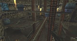
Xenworks is the most immediately-recognisable recreation that we received. As soon as I opened the map, it felt exactly like the Xen factory from the original game. This is a small, but very open map, making for some rather fast-paced gameplay. The atmosphere is as you would expect from a Xen location, though the echo can be a bit overbearing at times. Weapon placement is generally good, with the exception of the RPG at the bottom level - those upper levels don't tend to get much attention once the fighting starts. -Penguinboy
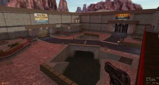
Archie continues to prove he's the <pretentious name drop> of GldSrc with an absolutely masterful bit of mapping, so how come this isn't in first place? To put it simply, it's too faithful. It seems like a horrible thing to pick someone up on, but while playing through this map there was a niggling thought that, as pretty as this is, it's essentially just Crossfire HD. I can't heap enough praise on this map, I really can't. I just wish it did something a little more unique - that it got a little more imaginative in its reimagining. Despite that, it plays just as well as the original, is gorgeous from top to bottom, and it has my glorious avatar up on a wall, so what's not to love! -Strider
Aperture Complex - Dr. Orange
While perhaps not the prettiest map I've seen, this was a clever remake of Office Complex using Portal's mechanics. Some of the original's obstacles are smartly redesigned for Portal and some were not. It's also surprisingly lengthy, given the time frame for the competition. It's a shame, then, that nothing clever and distinctly Portal-y was done with the freezer section, as you pretty much solve it the same way as in the original. Still, it was a novel take on the chapter well within the spirit of the competition. It's only really let down by some bland areas, where maybe, given more time, Dr Orange could have cooked up some more inventive Aperture-flavoured solutions. -Strider
In My Head - NineTnine
A strange one from NineTnine! Seemingly based off the Power Struggle chapter of Blue Shift, but made for Opposing Force, it begins with you gearing up for some squad action. You quickly lose consciousness however, and dip into not one, but two, dream sequences. It plays every bit like a weird fever dream, and I'm usually all for that, but it's not particularly reminiscent of Power Struggle at all, sadly. It's also very short, and very rushed, with lots of clipping errors and z-fighting brushes sliding through walls. I applaud NineTnine for his imagination, but this one mostly just left me scratching my head! -Strider
snark_pit remake - Info_Player_IDK
This level deserves a special award for remaking a level in the most evasive way possible. It's a Snark Pit remake, though you couldn't tell by looking at it - it's a large, tropical island with two opposing, metallic fortresses, more reminiscent of a certain TFC map than the HLDM classic. So where does Snark Pit factor in? Beneath the island, connected by long, underground passages, is the radioactive basin room where you can find the Gluon. That's it! It's a vibrant map (and I actually quite like the theme), but rather rough overall. It's a shame it sidesteps the whole purpose of the competition so casually. -Strider
dm_hydroelectric - Jessie
Jessie submitted this freaking enormous entry like it was no big deal. The recreation of the dam area from Surface Tension is breathtaking - I never get tired of the scene, no matter how many times I see it. In terms of gameplay, this map has a huge amount of open space which makes finding an opponent a chore at times. There's also a fairly large area below the water which almost always stays empty during the entire game, which could possibly be cut or altered to make the map a little smaller. The addition of the chopper, however, is inspired and adds a beautiful cherry to the top of this immaculate cake of a map. -Penguinboy
dm_training - Tetsu0
Another jaunt in the Black Mesa Hazard Course? Yes please! This is an incredible reimagining of an area that I'm sure we all know quite well, but expanded to include great use of vertical space for gameplay, and depth in the design and detail. Personally, I loved this map. But Penguinboy and Strider have strict rules about expressions of emotion, and made sure I was adequately punished for doing so. So, Tetsu0, you have my unending praise and the jar of tears that those two extracted from me after their vicious, brutal beatings. -Ant
You aren't going to mention the many hundreds (approximately) of times I blew you up with a satchel in the lift? -Strider
Hysteria - Urby
Ah, Urby. You talented, beautiful thing, you. You've somehow taken an HLDM map that I find utterly ordinary and turned into something mostly tolerable. Yes, this isn't my favourite HLDM map in the world, but the care and attention to detail in places elevates it to the status of 'painted turd that could almost certainly pass for haute couture'. I'm particularly fond of that beautiful green light emanating from the toxic goo, which had me pause to wonder how the hell you achieved it, and then had me explode in a shower of gibs after being grenaded by Strider. The prick. -Ant
Crossport - DocRock
DocRock chips in with a uniquely-styled remake of the iconic crossfire with this entry. DocRock's reimagining of the map is unique and truly represents the spirit of the competition we had in mind when judging the entries. DocRock's futuristic, sci-fi theme is very clearly presented, with some bold texture choices that blend nicely between lush, green grass and cold, concrete walls. The addition of teleports between areas result in a rather major change to the gameplay of the map (though perhaps a bit too much change for my liking). An excellent entry! -Penguinboy


