Post your screenshots! WIP thread
Created 17 years ago2007-12-16 00:58:58 UTC by
 doodle
Created 17 years ago2007-12-16 00:58:58 UTC by
![]() doodle
doodle
Posted 17 years ago2008-01-08 22:02:39 UTC
Post #242981
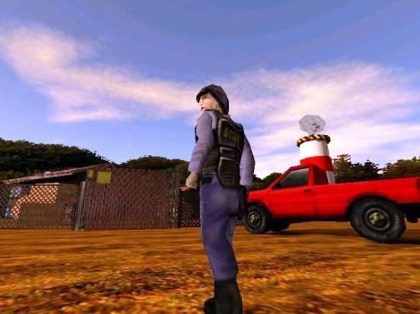
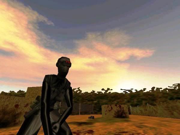
Hi ' I'm workin on this ..called HL:UFO
Posted 17 years ago2008-01-08 22:25:44 UTC
Post #242984
Awsome work Michey.
Is it a SP mod or only a map?.
Is it a SP mod or only a map?.
Posted 17 years ago2008-01-08 22:28:44 UTC
Post #242985
Seems like I've critiqued these same pictures before...
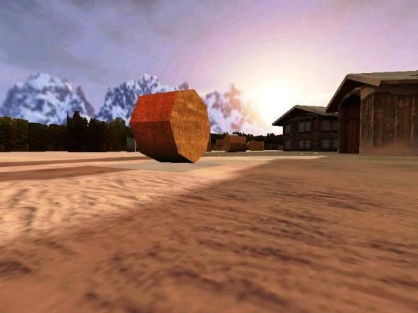
But anyway, looks fairly good except for the skybox that doesn't match the environment, the stretched tree textures, and the hay bails only sitting on two vertices, which looks really messed up. Also, I know I'm really nitpicking by saying this, but you don't usually see bails of hay sitting around farmhouses like that...they're usually out in fields.
But anyway, looks fairly good except for the skybox that doesn't match the environment, the stretched tree textures, and the hay bails only sitting on two vertices, which looks really messed up. Also, I know I'm really nitpicking by saying this, but you don't usually see bails of hay sitting around farmhouses like that...they're usually out in fields.
Posted 17 years ago2008-01-08 22:36:35 UTC
Post #242986
Oh yeah, I remember those shots from a while ago. Got any new(er) ones to show us?
Posted 17 years ago2008-01-09 10:41:23 UTC
Post #243017
It's a SP mod but still lot o' work to do.
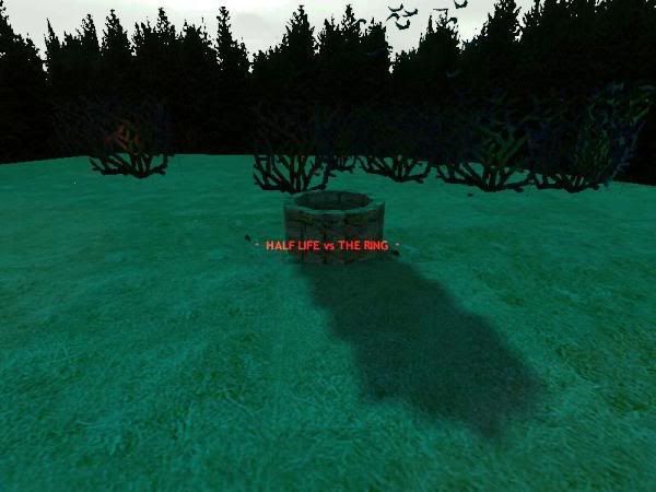
Instead my mod "HL vs RING" is virtually complete.. but.. I'm in that final stage/mood where one is tempted to put aside whole project !? cause thousands more doubts rise.
Anybody been there too ? Completing a mod makes you go insane !
Instead my mod "HL vs RING" is virtually complete.. but.. I'm in that final stage/mood where one is tempted to put aside whole project !?
 cause thousands more doubts rise.
Anybody been there too ? Completing a mod makes you go insane !
Posted 17 years ago2008-01-09 11:41:26 UTC
Post #243024
I think simply completing a mod gets you one-up on a few of us.
Posted 17 years ago2008-01-09 20:58:59 UTC
Post #243077
Posted 17 years ago2008-01-14 13:49:24 UTC
Post #243407
http://m0px.net/rimrook/WIPSCREENSHOT1.jpg
Yeah... I the hammer back out after a long delay. This map is a test of the new 6D compile set, as well as the new ZHLT that I so needed to upgrade.
Its nearly done. Be out soon sometime in a week or so. I do have a load of homework.
Yeah... I the hammer back out after a long delay. This map is a test of the new 6D compile set, as well as the new ZHLT that I so needed to upgrade.
Its nearly done. Be out soon sometime in a week or so. I do have a load of homework.
Posted 17 years ago2008-01-14 14:03:44 UTC
Post #243408
R_speeds?
Posted 17 years ago2008-01-14 19:13:43 UTC
Post #243439
R_crap. 
Haven't done a full test compile yet, but it shouldn't be so bad after that. It isn't a bad as it looks.

Haven't done a full test compile yet, but it shouldn't be so bad after that. It isn't a bad as it looks.
Posted 17 years ago2008-01-14 19:29:06 UTC
Post #243440
Looks nice, doodle. I like the lighting.
Posted 17 years ago2008-01-14 22:44:32 UTC
Post #243452
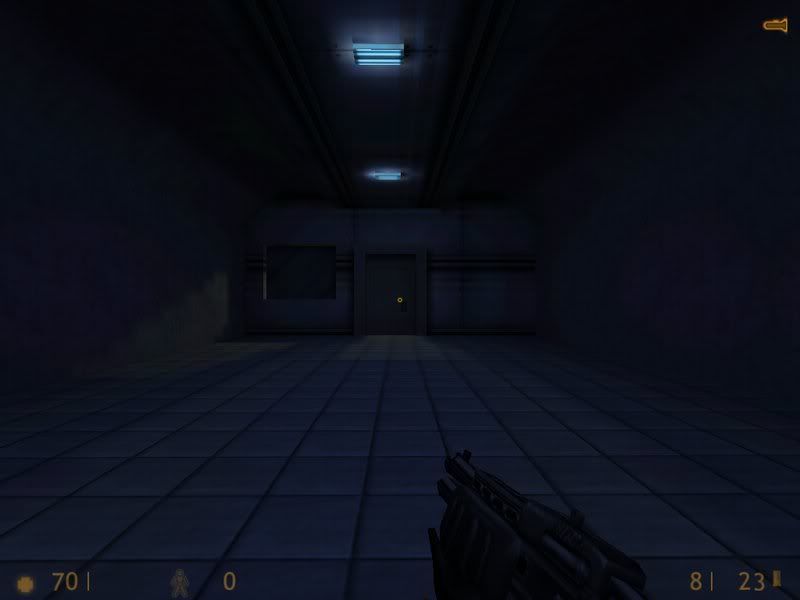
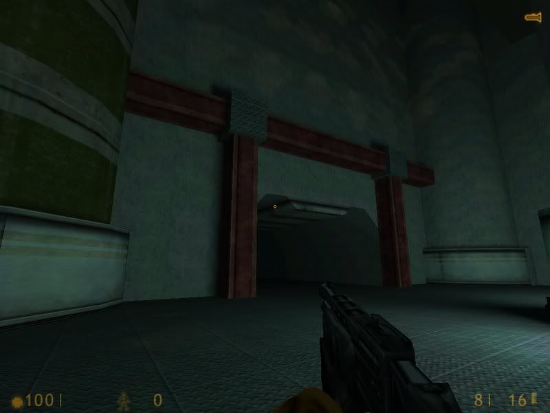
Some old stuff:The top one may be useful for some moody encounter though, if the architecture where improved some...
Posted 17 years ago2008-01-15 05:59:53 UTC
Post #243461
what on earth caused the lighting on the walls above the beams in the second shot, Skeetz?
Posted 17 years ago2008-01-15 08:30:09 UTC
Post #243469
Ah, yes... the map was supposed to be very vertically inclined... and that was the central room, where there were supposed to be a bunch of catwalks at different heights. Being as horrible as I am at mapping,I saw fit to make some uniform holes in the roof, and thus the funky lighting.
I may reinvent that room by lowering the roof and stuff a lot, then fixing my architecture.
I may reinvent that room by lowering the roof and stuff a lot, then fixing my architecture.
Posted 17 years ago2008-01-15 10:00:38 UTC
Post #243475
very vertically inclinedYa know, i had the same idea on my new map, most of which my maps are rather flat.
Posted 17 years ago2008-01-20 10:56:58 UTC
Post #243897
Posted 17 years ago2008-01-20 11:15:29 UTC
Post #243898
Whatever that is, it looks hot D:
Posted 17 years ago2008-01-20 13:17:25 UTC
Post #243900
Why it is clearly an Inter Galactic Rimrook Healing / Teleporter for a space themed floating rock with a Roman coliseum on top.
Strider what about your Portal map D:
Strider what about your Portal map D:
Posted 17 years ago2008-01-20 15:53:31 UTC
Post #243902
Posted 17 years ago2008-01-21 06:13:38 UTC
Post #243939
Whatever that is, it looks hot D:;D
Why it is clearly an Inter Galactic Rimrook Healing / Teleporter for a space themed floating rock with a Roman coliseum on top.DAMN, totally not what I was going for!
Strider what about your Portal map D:It's still alive... sorta. There's a few things about Portal mapping that are holding my ideas back, but i'll find a way around them.
SDK projects are more fun.
Posted 17 years ago2008-01-21 06:25:04 UTC
Post #243940
Damn, if theres one thing that draws me to source mapping its the lighting and effects 
Only problem is I can't map for source worth a shit.

Only problem is I can't map for source worth a shit.
Posted 17 years ago2008-01-21 10:41:51 UTC
Post #243963
Wow, Strider. Thats looks neat.
What entities did you used for those effects?
What entities did you used for those effects?
Posted 17 years ago2008-01-21 10:57:11 UTC
Post #243965
Mainly env_sprites, info_target's, and env_beams, but there's some func_rotating's and other special entities in there that serve a secret purpose. 

Posted 17 years ago2008-01-26 08:00:58 UTC
Post #244327
Posted 17 years ago2008-01-26 11:13:58 UTC
Post #244334
How do you make those things?
Posted 17 years ago2008-02-03 21:08:01 UTC
Post #244940
Posted 17 years ago2008-02-15 22:04:30 UTC
Post #245731
Posted 17 years ago2008-02-15 22:19:18 UTC
Post #245732
Ah Hydeph I saw that on Mapcore. Quite detailed for HL1.
Spike: PM me and I'll see if I can help but bot until Sunday for I'm out tommorow.
Spike: PM me and I'll see if I can help but bot until Sunday for I'm out tommorow.
Posted 16 years ago2008-02-27 17:55:04 UTC
Post #246733
Posted 16 years ago2008-02-27 18:04:45 UTC
Post #246734
Maybe it's just me, but some of those textures look way crisp and clear.
Posted 16 years ago2008-02-27 18:06:59 UTC
Post #246735
Yeah, I think I sort of agree, the mapping is awesome, but some of the ceiling textures look a little too well defined, and too perfect. Lighting is great too!
Posted 16 years ago2008-02-27 18:22:18 UTC
Post #246736
Posted 16 years ago2008-02-27 18:28:22 UTC
Post #246737
Yeah. The clean ones would stick out too much in Half-Life.
Posted 16 years ago2008-02-27 18:36:28 UTC
Post #246739
The clean ones look like custom textures made in Photoshop in 5 seconds without any detail added so yeah use dirty ones with noise.
Posted 16 years ago2008-02-27 18:49:56 UTC
Post #246741
K. Good points.
Posted 16 years ago2008-02-27 20:26:29 UTC
Post #246744
The dirty ones don't even really look dirty, just textured and normal. The others look like they were polished.
Also, I doubt you'd notice in-game, but it looks to me like you did some smudging and other effects on the low-res versions (assuming you started with a higher-resolution picture), as an afterthought, so they have blurry patches on them.
Also, I doubt you'd notice in-game, but it looks to me like you did some smudging and other effects on the low-res versions (assuming you started with a higher-resolution picture), as an afterthought, so they have blurry patches on them.
Posted 16 years ago2008-02-27 20:33:35 UTC
Post #246745
That's an old set from the Wadfather. I think it also comes in Quake and jpeg format, so its probably just compression.
Posted 16 years ago2008-02-27 20:33:45 UTC
Post #246746
Those aren't my texers. I got it from the Wadfather many years ago.
Posted 16 years ago2008-02-27 20:36:48 UTC
Post #246747
BATTLE!
Posted 16 years ago2008-02-27 20:46:27 UTC
Post #246748
O.
Posted 16 years ago2008-03-22 10:56:50 UTC
Post #247873
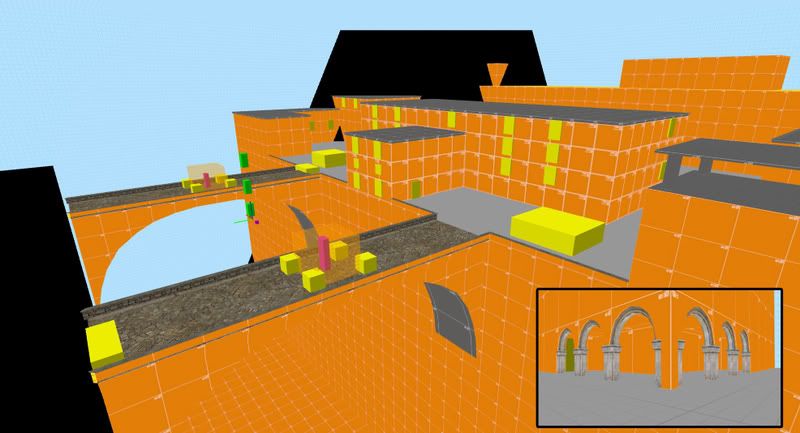
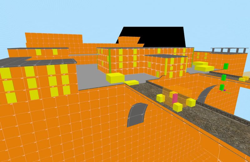
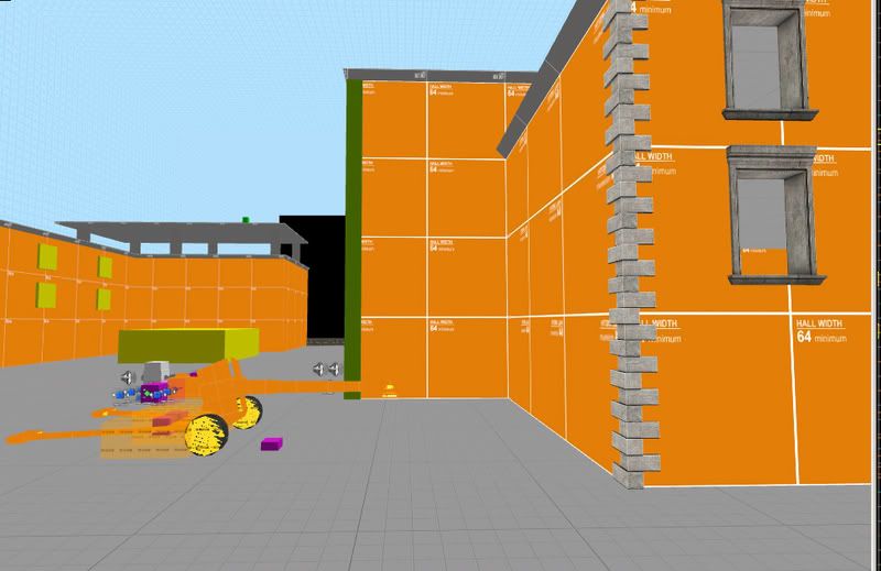
dod:S orange map, lots of windows for snipers, artillery cannon, other junk.
Posted 16 years ago2008-03-22 12:30:03 UTC
Post #247876
I'd like to see it textured!
Posted 16 years ago2008-03-31 12:07:53 UTC
Post #248275
Posted 16 years ago2008-03-31 12:46:54 UTC
Post #248283
Is that GoldSource? O.O
Posted 16 years ago2008-03-31 13:05:00 UTC
Post #248284
Hm... Yes...
http://twhl.co.za/vault.php?map=5046
http://twhl.co.za/vault.php?map=5046
Posted 16 years ago2008-03-31 15:27:13 UTC
Post #248293
Posted 16 years ago2008-04-01 13:05:31 UTC
Post #248331
WIP cp_pirate_island a TF2 CP Dustbowl-like
I started this map 3 weeks ago, but almost all the time I've been learning to model so map it is just started. The atmosphere of the map is that RED team comes with them pirate ship to the BLU(another pirate team) island. So REDs are trying to steal BLU treasure. RED attacks instead of BLU (dustbowl).
RED spawns at the right of the ship:Ship Warehouse:Full ship:Sketch of the first stage:And last thing I'm doing, the beach. As you can see the sketch is not accurate, is just to give an idea how it should look like.Class balance and team balance comments will be welcome. Of course of the map too.
Posted 16 years ago2008-04-01 13:13:41 UTC
Post #248332
Looks pretty damn good so far. 

Posted 16 years ago2008-04-01 18:09:32 UTC
Post #248341
Posted 16 years ago2008-04-01 18:37:43 UTC
Post #248342
Oh S**T Jaguar, that first one is awesome! I really wouldn't want to be the one compiling the final of that map!  Really nice feel to it, it just works so well - same with the second, reminds me of the combines walls in HL2.
Great work, definitely don't give this one up!
 Really nice feel to it, it just works so well - same with the second, reminds me of the combines walls in HL2.
Great work, definitely don't give this one up!
You must be logged in to post a response.

