Post your screenshots! WIP thread
Created 17 years ago2007-12-16 00:58:58 UTC by
 doodle
Created 17 years ago2007-12-16 00:58:58 UTC by
![]() doodle
doodle
Posted 16 years ago2008-10-07 16:42:33 UTC
Post #256785
Posted 16 years ago2008-10-07 16:49:26 UTC
Post #256786
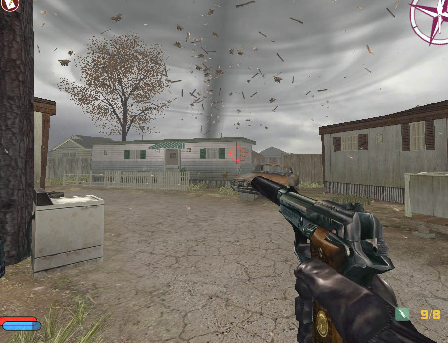
Aah. A tornado would certainly spice up the DM gameplay 

Posted 16 years ago2008-10-07 17:11:03 UTC
Post #256787
Do it! 

Posted 16 years ago2008-10-12 11:29:54 UTC
Post #256962
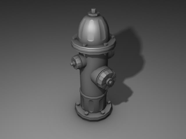
Yay! Fire hydrant!
Posted 16 years ago2008-10-12 11:40:12 UTC
Post #256963
Awesome detail. 

Posted 16 years ago2008-10-13 14:01:33 UTC
Post #257003
Program?
Looks like a ZBrush render.
Looks like a ZBrush render.
Posted 16 years ago2008-10-13 19:29:37 UTC
Post #257015
Sotimage XSI.
Just a single point-light in the scene with a slight blur in the shadowing and an ambient occlusion pass. It wasn't quite how I had pictured the result, but I liked how the backround floor transitioned from light to dark, which made the model itself pop out, so I kept it.
Roughly 3000 triangles in the end. Not suitable for a prop model of its size, but it still looks awesome. Thanks for the comments!


Posted 16 years ago2008-10-15 03:51:23 UTC
Post #257098
New plant light model instead of world brushes:Different angle: http://img510.imageshack.us/img510/5093/utopium20004lx6.jpg
Posted 16 years ago2008-10-15 04:45:31 UTC
Post #257099
s'nice
Posted 16 years ago2008-10-15 07:56:26 UTC
Post #257107
Yeah, thats pretty sweet.
Posted 16 years ago2008-10-15 12:52:24 UTC
Post #257121
Rimroook deserves a blowjob for making those textures. I can't get enough of them D:
Posted 16 years ago2008-10-18 13:23:32 UTC
Post #257309
Posted 16 years ago2008-10-18 13:26:33 UTC
Post #257310
Nice stuff Azura!!
Posted 16 years ago2008-10-20 22:03:42 UTC
Post #257416
I was sort of unsure to post this becuase its still pretty early. IE I just figured out how env_sprites work in hl2 so leave me alone about the lack of sprites  Once again photobucket raped the image
 Once again photobucket raped the image
Posted 16 years ago2008-10-20 22:45:58 UTC
Post #257417
Could use some nice foreground lighting, and a few more smaller lights near the back (up high) to give it some depth, but I like it. Brush and texture work is quite tidy.
Posted 16 years ago2008-10-21 23:36:15 UTC
Post #257473
Anybody know a good alternative to photobucket? These image restrictions suckRelit most of the map Its a bit brighter now but I want to still keep it pretty dark
Posted 16 years ago2008-10-22 00:01:16 UTC
Post #257474
www.imageshack.us
or a social networking site.
or a social networking site.
Posted 16 years ago2008-10-22 01:06:20 UTC
Post #257480
Those really remind me of sp_detritus, S3IZURE. ;o
Posted 16 years ago2008-10-22 01:26:52 UTC
Post #257481
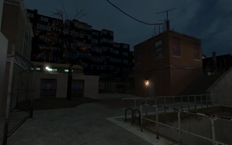
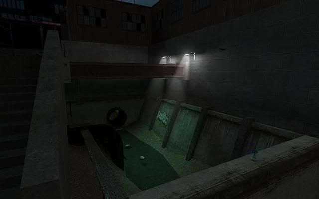
Right here's some shit that's way WIP...Just started it the other day. I'm trying to focus more on lighting techniques than architecture here, because when I look back at what Valve did I noticed their mapping technically was shit, but their lighting saved it.
Posted 16 years ago2008-10-22 01:28:39 UTC
Post #257482
Daubster: I'll have to check that map out 

Posted 16 years ago2008-10-22 15:37:13 UTC
Post #257502
why do you reduce the size of your images so much, S3IZURE?
It's impossible to see much in an image so tiny
It's impossible to see much in an image so tiny
Posted 16 years ago2008-10-22 15:44:37 UTC
Post #257503
Circular stairwell.
Streight up stairwells bore me now.
Streight up stairwells bore me now.

Posted 16 years ago2008-10-22 16:10:58 UTC
Post #257504
*stairwell
:3
looks hot.
:3
looks hot.
Posted 16 years ago2008-10-22 20:46:27 UTC
Post #257513
Hunter:I didn't notice that Imageshack had the automatic resise thing 
Heres a good one finally

Heres a good one finally

Posted 16 years ago2008-10-23 13:38:59 UTC
Post #257557
Hey guys, whats up, heres just a little side project I work on from time to time, some of you may have seen the earlier one that was being done in Maya using MentalRay found here: www.mikeverret.com
Anyways.. heres a couple link, check or dont.. your choice.
1. Wireframe
2. FlatShaded
3. Textured
4. Textured Lighting
5. Rendered
http://mikeverret.com/renders/GunWIP/Gun1.jpg
http://mikeverret.com/renders/GunWIP/Gun2.jpg
http://mikeverret.com/renders/GunWIP/Gun3.jpg
http://mikeverret.com/renders/GunWIP/Gun4.jpg
http://mikeverret.com/renders/GunWIP/Gun5.jpg
Posted 16 years ago2008-10-23 13:52:13 UTC
Post #257558
 muzzleflash that looks awesome . Can you make a tutorial or teach me how you did that ? I always tried to make something like that but didn't succeed
It's really really awesome.
Posted 16 years ago2008-10-23 14:41:39 UTC
Post #257559
Some pretty kickass modelling there, Unb. I'd make the shadows a wee bit less contrast-y though.
Lovin' the progress, Muzz. When should we expect a playable beta?
Lovin' the progress, Muzz. When should we expect a playable beta?

Posted 16 years ago2008-10-23 15:19:07 UTC
Post #257560
Posted 16 years ago2008-10-23 15:19:14 UTC
Post #257561
Muzzleflash for which game is that ?
Posted 16 years ago2008-10-23 15:25:45 UTC
Post #257562
HL:DM
Posted 16 years ago2008-10-23 16:52:49 UTC
Post #257570
Can you make a tutorial or teach me how you did that ? I always tried to make something like that but didn't succeed unhappy -Sure, maybe some time in the future. The stairs are made from scratch using simple blocks and carfull vertex manipulation to shape the actual stairs.
Posted 16 years ago2008-10-24 08:09:07 UTC
Post #257588
Worldcrafter: Well, that all depends on what you mean.. Yes I downloaded textures and then edited them/UVmapped them.. did I make them... no. 
Heres a great source for textures guys, I believe alot of game creators like valve have visited and used.. have a look:
www.cgtextures.com

Heres a great source for textures guys, I believe alot of game creators like valve have visited and used.. have a look:
www.cgtextures.com
Posted 16 years ago2008-10-24 18:47:30 UTC
Post #257600
No, this is not a different map, its the same map i posted two screenshots of a few posts up, the ones with the circular stairwell.
Posted 16 years ago2008-10-25 10:58:55 UTC
Post #257618
looks very nice, but hey, name a muzzleflash map that doesn't look nice.
Posted 16 years ago2008-10-25 11:13:55 UTC
Post #257620
I don't have a name yet. I suck at thinking of one...
Posted 16 years ago2008-10-25 12:23:55 UTC
Post #257621
muzzleflash_map is quite original 

Posted 16 years ago2008-10-25 12:51:23 UTC
Post #257622
judgement from a single screenshot 0.O
Posted 16 years ago2008-10-25 13:20:32 UTC
Post #257623
muzzleflash_map is quite originalyah, in 1 hour I will release cs_awesome_beta.
Posted 16 years ago2008-10-25 15:59:53 UTC
Post #257624
No.
Posted 16 years ago2008-10-25 16:04:27 UTC
Post #257634
Muzz those maps of yours look great, but if I'm to be absolutely honest I'd have to say that you need a little variation in lighting. Right now everything is sort of flat, and a little too bright. Maybe don't rely so much on overhead sources?
I probably shouldn't be so critical of WIP.
I probably shouldn't be so critical of WIP.

Posted 16 years ago2008-10-25 16:11:12 UTC
Post #257635
You have a point there, but remember this is still WIP, im just doing architecture first mostly. I just added those overhead lights quickly to put together a quick scene that is worth a screenshot.
The map is mostly lab stuff, labs have overhead lights in most cases i think. Got any tips for me abou"t lighting this particular map?
The map is mostly lab stuff, labs have overhead lights in most cases i think. Got any tips for me abou"t lighting this particular map?
Posted 16 years ago2008-10-25 16:30:54 UTC
Post #257636
Yeah, really you'll find overhead lights pretty much anywhere in real life because they do such a good job of lighting up large areas. Unfortunately for us mappers that's usually what we don't want. I've personally found that a sort of spotty, inconsistent lighting pattern is almost always preferable to all-around brightness. The more dark unlit areas the better, unless you're going for a warm and welcoming look. For this lab you might want to try some lights down near the floor, either mounted in the ground facing upwards, or on the walls pointing inwards. That lends itself to a more mysterious atmosphere that might be suitable for a lab like this. You could also try some downward facing lights along the mid-point of the wall where that metal trim is, which would help darken the ceiling up a bit (it's lit up too much IMO).
Posted 16 years ago2008-10-25 16:42:40 UTC
Post #257637
Thanks, i can do something with that. 

Posted 16 years ago2008-10-25 16:56:27 UTC
Post #257638
I would probably suggest to delete those overhead lights and adding just some mini-light points for athmosphere .Most of the light should come from the computers and pieces of technology in your lab . Sure , that will create the impression of "cold" because of the blue light emitted by those textures .
Heh , but what laboratory in real-life is a "warm" place ?
Heh , but what laboratory in real-life is a "warm" place ?

Posted 16 years ago2008-10-25 16:58:31 UTC
Post #257639
Well, i think ill replace the overhead lights with something smaller that give off less light, then add some lights close to the floor, and finally some spotlights here and there. I just don't to overbright it with too many lightsources.
Posted 16 years ago2008-10-25 17:02:22 UTC
Post #257640
I just don't to overbright it with too many lightsources.Besides , the compiler will give you a "too many light styles on a face" that way .
In my imagination , the perfect atmosphere in a small chamber are 3-4 light sources with almost the same color , but different intensities .
Posted 16 years ago2008-10-25 17:02:47 UTC
Post #257641
Yeah, a few lights throwing themselves on the floor would be nice. Maby a grating or something like that to break up the monotony would be nice too. Off course, your still working on it so goodluck!:)
Posted 16 years ago2008-10-27 13:43:30 UTC
Post #257688
Some shots of the a new lab:
Posted 16 years ago2008-10-27 13:46:20 UTC
Post #257766
That's way much better . Still , I can detect thw uniform light and too few shadows . Anyway , what I'm talking , this is cool .
Gj
Gj
Posted 16 years ago2008-10-27 14:19:33 UTC
Post #257769
muzz you rock! the ceiling in the first shot does suck tho. maybe add something more to it?
You must be logged in to post a response.

