Post your screenshots! WIP thread
Created 17 years ago2007-12-16 00:58:58 UTC by
 doodle
Created 17 years ago2007-12-16 00:58:58 UTC by
![]() doodle
doodle
Posted 16 years ago2008-11-06 14:48:21 UTC
Post #258221
Looks rather dangerous. No safety handles or grating? Also, use a different texture for the rail.
Posted 16 years ago2008-11-06 15:05:11 UTC
Post #258222
For whatever that may be; for the sake of keeping it simple it looks rather nice. 

Posted 16 years ago2008-11-06 15:41:03 UTC
Post #258223
It's a hibrid train : train&lift . It goes vertically as well as horizontally ( in the screenshot you can't see but I've just added a support for horizontal movement )
Posted 16 years ago2008-11-06 16:30:16 UTC
Post #258224
In that case, get rid of that humongous computer in it. Try a compact keypad-like button, as you'd never find machinery that big on a relatively small mobile platform.
Posted 16 years ago2008-11-06 17:09:39 UTC
Post #258225
I'll consider that. I'll keep it like this for the moment, though
Posted 16 years ago2008-11-08 01:38:11 UTC
Post #258257
Posted 16 years ago2008-11-08 20:44:50 UTC
Post #258278
New shots of the new lab:There is some serious entity work in that room. 

Posted 16 years ago2008-11-08 20:57:01 UTC
Post #258279
Gawd, mad detail there!
I can only hope other areas in the map will keep up - great stuff. :>
S3IZURE: Lookin neat as well.
I can only hope other areas in the map will keep up - great stuff. :>
S3IZURE: Lookin neat as well.
Posted 16 years ago2008-11-08 20:59:22 UTC
Post #258280
looking absolutely awesome, muzz.
You continue to be a massive inspiration to me.
You continue to be a massive inspiration to me.
Posted 16 years ago2008-11-09 00:05:48 UTC
Post #258283
Nice. Needs more blips and random science junk though.
Posted 16 years ago2008-11-09 11:27:43 UTC
Post #258294
Are you kidding me? Is there not enough junk yet? I think there is...
Posted 16 years ago2008-11-21 17:03:47 UTC
Post #258856
I'm going to have to learn to model at this rate. All brushwork.
It's from a Garry's Mod map I've made. gm_lollerskates2.
It's from a Garry's Mod map I've made. gm_lollerskates2.
Posted 16 years ago2008-11-21 17:06:48 UTC
Post #258857
I'm going to have to learn to model at this rate. All brushwork.What do you mean ?
What's your map about? How does it look, what features it has?
Posted 16 years ago2008-11-21 17:44:22 UTC
Post #258860
What do I mean?
I mean I spend a ridiculous amount of time making brushwork objects like the aircraft featured in lollerskates2, only to end up with something not-brilliant looking that could be done a lot better as a model.
And lollerskates2 is certainly not short of features.o Fully flyable, acurately scaled passenger aircraft.
o Several vehicular stunt areas.
o Buggy & Airboat armour. 90% bullet-proof. Will stop a combine sniper shot. Comes in 4 designs, all with sliding access doors.
o Fully operational teleport system, with map/diagram for ease of use & visually pleasing teleport effects.
That's maybe half. It spawned purely from ideas myself, Urbanebula and Livewire had while playing gmod together. I'd add the idea to the map. We'd play it, then think of something else. I'd add it and the process would repeat. It's a very efficient way of mapping, getting instant feedback.
Posted 16 years ago2008-11-21 17:55:45 UTC
Post #258861
Its true. I was there.
A lot of NPC's were killed.
A lot of NPC's were killed.
Posted 16 years ago2008-11-21 17:59:02 UTC
Post #258863
we blamed their deaths on "teleporter malfunctions"
Posted 16 years ago2008-11-21 19:06:58 UTC
Post #258868
And nukes.
Posted 16 years ago2008-12-14 16:16:25 UTC
Post #259962
And when it comes to mapping I also do :

Posted 16 years ago2008-12-14 18:11:47 UTC
Post #259966
Awesome.
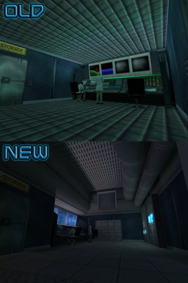
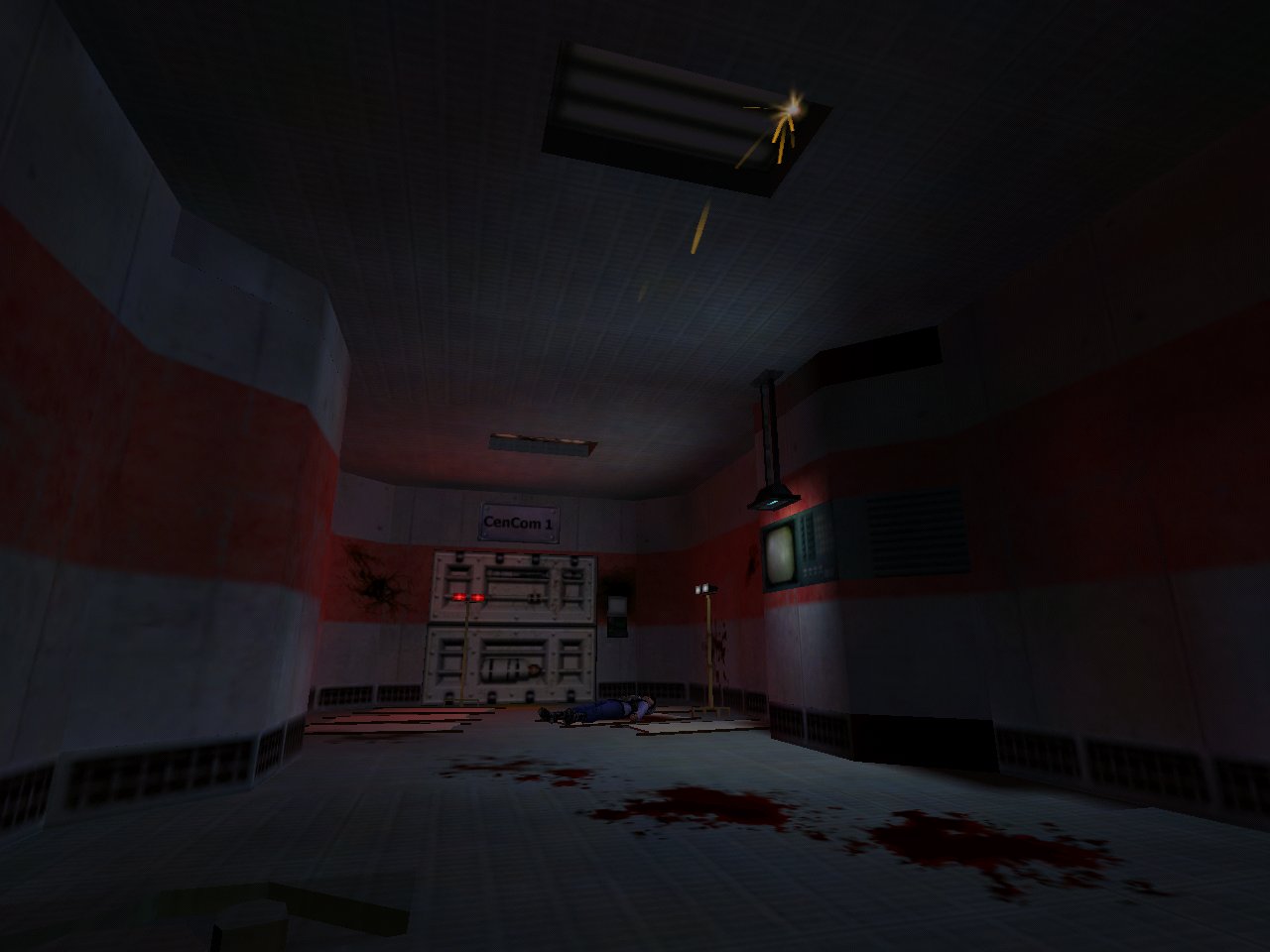
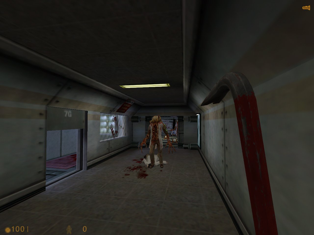
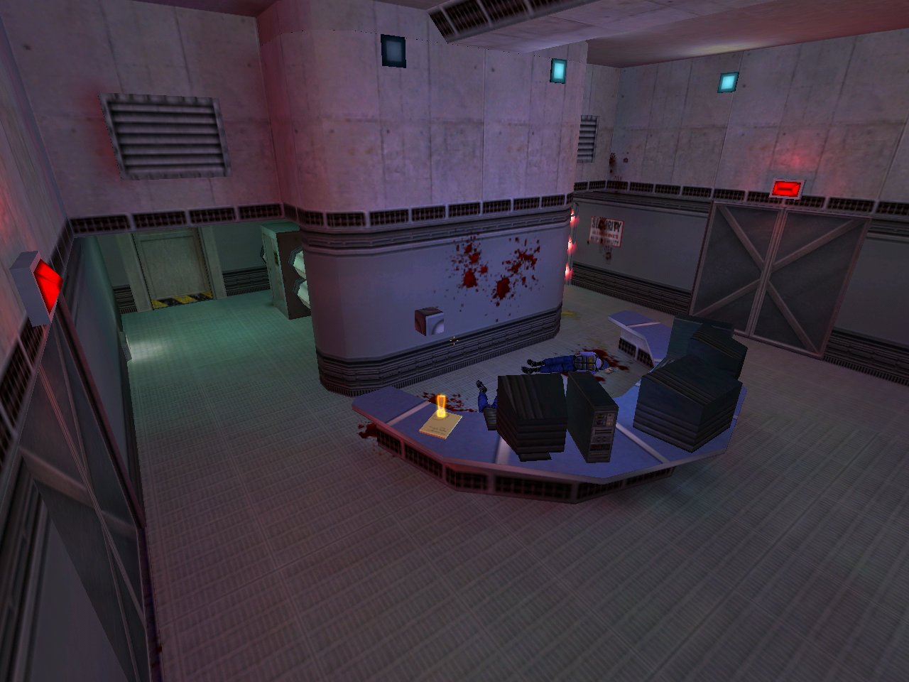
I know I dropped this on the Shoutbox a while back but I'm kinda proud of me. Also, more screens of the same projectAll very much WIP hence the huge button in the 3rd pic.
I know I dropped this on the Shoutbox a while back but I'm kinda proud of me.
 Also, more screens of the same projectAll very much WIP hence the huge button in the 3rd pic.
Posted 16 years ago2008-12-14 18:25:53 UTC
Post #259968
You know Urb, nothing can beat a good oll' Half-Life singleplayer map!
So you better finish that, boy!

So you better finish that, boy!


Posted 16 years ago2008-12-14 19:06:06 UTC
Post #259971
Awesome.Wow. I was shocked

 . Thanks.
Posted 16 years ago2008-12-15 04:57:06 UTC
Post #259990
...nothing can beat a good oll' Half-Life singleplayer map!How about a good ol' singleplayer mod?
Posted 16 years ago2008-12-15 06:12:04 UTC
Post #259991
Oh shit. Now I want to go back and start working on that map I posted screens of a long time back. Thank you so much Urb.
Posted 16 years ago2008-12-15 07:17:04 UTC
Post #259992
Lots of nice stuff in here.
Striker: lol@campaign editor. fun to do and sc2 campaign editor should be amazing.
Hunter: makes me want to try gmod = )
Striker: lol@campaign editor. fun to do and sc2 campaign editor should be amazing.
Hunter: makes me want to try gmod = )
Posted 16 years ago2008-12-15 11:27:50 UTC
Post #259996
How about a good ol' singleplayer mod?UberWin * 2 & "!"
Posted 16 years ago2008-12-15 11:49:47 UTC
Post #259998
Oh I forgot to comment on Muzz's map as I was distracted by Hunter's Gmod map :S
Anyway I wanted to say the vents look a little blocky texture wise. Curve some of 'dem bitches
Anyway I wanted to say the vents look a little blocky texture wise. Curve some of 'dem bitches

Posted 16 years ago2008-12-16 19:26:03 UTC
Post #260092
I forgot all about this thread and was posting pics with journal entries. 
Anyway here is my work. (Used some NS textures)
Screenshot1
Screenshot2
Screenshot3
Final:
Screenshot4
Tell me what you think everyone?

Anyway here is my work. (Used some NS textures)
Screenshot1
Screenshot2
Screenshot3
Final:
Screenshot4
Tell me what you think everyone?

Posted 16 years ago2008-12-16 20:07:19 UTC
Post #260095
it looks great. You've matched the textures and brushwork very nicely, except for in one spot. I recommend making the walls of the hole in front of it a different texture from the floor.
good work, but don't call anything final until after people have had a chance to give you suggestions.
good work, but don't call anything final until after people have had a chance to give you suggestions.
Posted 16 years ago2008-12-17 02:45:10 UTC
Post #260128
Very impressive lihting, brushwork & texturing. Looks great so far. :>
Posted 16 years ago2008-12-17 04:36:00 UTC
Post #260130
Posted 16 years ago2008-12-17 11:15:28 UTC
Post #260146
very impressively detailed! what a comeback, hrny... uh.. guinea pirate :3
Posted 16 years ago2008-12-17 12:32:07 UTC
Post #260152
Nice!
I'd live there.
...well...you know...after the terrorists had gone.
I'd live there.

...well...you know...after the terrorists had gone.
Posted 16 years ago2008-12-18 00:28:31 UTC
Post #260186
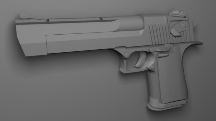
I don't remember if any of you remember this old thing:Well check this out:
http://www.youtube.com/watch?v=2BVMPuFNSqA
I'm pretty pleased with the animation; let me know what you all think.
Oh, and if you've been on the IRC, you've probably seen this:
http://www.youtube.com/watch?v=2BVMPuFNSqA
I'm pretty pleased with the animation; let me know what you all think.
Oh, and if you've been on the IRC, you've probably seen this:

Posted 16 years ago2008-12-18 01:30:43 UTC
Post #260187
I remember the DE from long ago. You still haven't skinned it? 
Very nice animation BTW.

Very nice animation BTW.
Posted 16 years ago2008-12-18 02:52:42 UTC
Post #260189
Definitely adequate animation, though you could give reloading a bit more finesse and power.
Posted 16 years ago2008-12-18 03:37:26 UTC
Post #260190
Rather nice. 

Posted 16 years ago2008-12-18 04:20:39 UTC
Post #260191
With recoil that significant I can't imagine how it could return to its original position that fast. It probably shouldn't have as much vertical travel, that kind of distracts me.
Posted 16 years ago2008-12-18 04:35:09 UTC
Post #260192
Posted 16 years ago2008-12-18 08:37:43 UTC
Post #260193
Those animations are looking pretty good. I for one love the shooting animations, they look powerful.
Those pics are also looking good Guinea Pirate. Looks cozy, I'd live there.
Those pics are also looking good Guinea Pirate. Looks cozy, I'd live there.
Posted 16 years ago2008-12-18 13:40:53 UTC
Post #260211
looks nice sajo did you not just post those somewhere?
Guinea pirate looks good and i like the detail. is that of a real place you know?
RotorSplint those look amazing and you're doing animations now?! o_O
Zeeba looks good from the thumb--doesn't expand for me--, but looks like it could use more smoothing in some areas.
Guinea pirate looks good and i like the detail. is that of a real place you know?
RotorSplint those look amazing and you're doing animations now?! o_O
Zeeba looks good from the thumb--doesn't expand for me--, but looks like it could use more smoothing in some areas.
Posted 16 years ago2008-12-18 17:25:52 UTC
Post #260220
Definitely adequate animation, though you could give reloading a bit more finesse and power.Yeah, I'll agree with you on that. I'm only somewhat pleased with the result, but I sort of wanted to turn the animation out quickly so I could get to skinning the weapon. I think there needs to be a little more of a jerk in the weapon overall when the clip is fully inserted and when the slide is kicked forward. It's sort of agrivating, though, when it takes you 3 days to get an animation like this to look half-realistic.

With recoil that significant I can't imagine how it could return to its original position that fast. It probably shouldn't have as much vertical travel, that kind of distracts me.It looked okay, but now that you've mentioned it, that bothers me too
 . I think having the view-kick added into the equation makes that problem more apparent, because in XSI, it looks picture-perfect. Admittedly, the fire animation still feels wrong because the gun swings back to a 'ready' enough position so quickly that if feels like you should be able to fire it faster than the game will allow. I'll probably lengthen the fire animation to give the gun more time to swing around and such.
I didn't want to base the animation on the Desert Eagle from Counter-Strike because I didn't want it to be a clone of that gun. I did, however, base the fire animation's timing on the 357's fire animations somewhat closely, so maybe I need to break farther away from that. I may rework both animations eventually, but for now my next task is to skin the gun.
Thanks for the comments! Expect to hear more from me about this. And yes, Captain Terror, I've been animating for some time now.

Posted 16 years ago2008-12-18 21:00:23 UTC
Post #260233
is that of a real place you know?Nope, just thought it up. Though I did draw some design inspiration from de_inferno.
Posted 16 years ago2008-12-21 01:42:38 UTC
Post #260375
An NS map for a server.
Posted 16 years ago2008-12-21 02:13:49 UTC
Post #260376
Looks awesome
Posted 16 years ago2008-12-21 04:08:09 UTC
Post #260379
Posted 16 years ago2008-12-21 07:23:48 UTC
Post #260381
Looks great Rimrook, but sometimes I'm afraid with those NS maps the immense texture detail distracts from the architecture. 

Posted 16 years ago2008-12-21 07:53:00 UTC
Post #260382
Nice stuff there, Rim.
And wow, very neat progress there, Hrny. What doesn't seem to come together though is the roof. Those wooden beams outside are way too dense (go for 3x less or so), also, you can't see them inside, which doesn't look too logical. And if it's a tile roof, it has to be somehow diagonal - never go for flat unless it's concrete.
And wow, very neat progress there, Hrny. What doesn't seem to come together though is the roof. Those wooden beams outside are way too dense (go for 3x less or so), also, you can't see them inside, which doesn't look too logical. And if it's a tile roof, it has to be somehow diagonal - never go for flat unless it's concrete.
Posted 16 years ago2008-12-21 11:30:09 UTC
Post #260389
Never bothered with NS. It never interested me. I tried it once or twice. Sorry rimmy but its just not what I'm waiting for. 
Excellent stuff Hrny. Great to see a CS:S map that isn't a based on cs_ass-salt or de_dust

Excellent stuff Hrny. Great to see a CS:S map that isn't a based on cs_ass-salt or de_dust
Posted 16 years ago2008-12-21 14:03:29 UTC
Post #260398
And wow, very neat progress there, Hrny. What doesn't seem to come together though is the roof. Those wooden beams outside are way too dense (go for 3x less or so), also, you can't see them inside, which doesn't look too logical. And if it's a tile roof, it has to be somehow diagonal - never go for flat unless it's concrete.I tried an angled roof with that building. Just didn't work. As for the beams, I took some rough measurements from some of the official CS maps. Also, the height of the ceiling is lower than the beams, so you wouldn't be able to see them inside anyway.
Posted 16 years ago2008-12-21 14:10:13 UTC
Post #260399
Yeah... NS mapping is balls. The textures are a headache and they suck up all of the lighting in the map. Probably should stick to my own texture sort for my own good.
You must be logged in to post a response.


