Show us a concrete example of that "leak". A leak only counts if the compilers complain about it and prevent you from compiling the map further. I've had "pseudo leaks" where it was actually an enclosed space between my hallways, but it was all NULL faces and nobody ever really noticed. Still doesn't count as a leak, because the compiler didn't yell "LEAK IN HULL 0" or anything.
The disadvantages of leaks are, as Zegfalt said, having your map fullbright, cuz' compilers generally stop at the BSP stage when you have a leak, and so VIS & RAD won't execute. But that's the least of your concerns.
VIS won't execute, meaning most, if not all of your map, will be rendered at once, and this also means all entities are sent at once. This breaks all engine limits (256 max visible entities for example) if your map is large enough.
Forum posts
Posted 2 years ago2022-12-17 12:54:04 UTC
in Ok, here goes: question, why is a LEAK bad? Post #347176
in Ok, here goes: question, why is a LEAK bad? Post #347176
So, the introduction video has been remade:Happy belated 2nd anniversary, my HL SDK Programming series.
And now we got a video about temporary entities:
And now we got a video about temporary entities:
Posted 2 years ago2022-10-25 14:29:44 UTC
in Was Goldsrc built off of WinQuake or QuakeWorld? Post #347004
in Was Goldsrc built off of WinQuake or QuakeWorld? Post #347004
Most of Half-Life was developed in software mode AFAIK, so I'm pretty sure they changed quite a couple of things here'n'there. I mean, just look at the water in software mode.
In Quake, gameplay logic is in QuakeC, but the client code is inside the engine. The client DLL in HL SDK is practically just engine code moved into a separate DLL. I don't think Valve renamed all the .c files into .cpp? No way to check that really, so I dunno.
In Quake, gameplay logic is in QuakeC, but the client code is inside the engine. The client DLL in HL SDK is practically just engine code moved into a separate DLL. I don't think Valve renamed all the .c files into .cpp? No way to check that really, so I dunno.
Posted 2 years ago2022-10-25 13:39:10 UTC
in Was Goldsrc built off of WinQuake or QuakeWorld? Post #347002
in Was Goldsrc built off of WinQuake or QuakeWorld? Post #347002
GoldSRC also separates the hardware renderer and software renderer. hw.dll and sw.dll are actually entire builds of the engine but with different renderers.
Posted 2 years ago2022-10-25 13:13:13 UTC
in C++ PROGRAMMERS: What would be the best option for a cross platform, modern hammer replacement? Post #347000
in C++ PROGRAMMERS: What would be the best option for a cross platform, modern hammer replacement? Post #347000
"please add realtime rendering"Hammer, J.A.C.K., even Worldcraft, all have real-time rendering. You can control the camera in real time with your mouse and WASD, and it renders at 60fps. That is real-time rendering, yes.
I imagine you're asking for real-time lights or maybe a lightmap preview. That's probably unlikely. This thread isn't about ideal editor features, but rather, what tools might be good for a programmer to develop one map editor.
Posted 2 years ago2022-10-25 13:02:13 UTC
in Was Goldsrc built off of WinQuake or QuakeWorld? Post #346999
in Was Goldsrc built off of WinQuake or QuakeWorld? Post #346999
I'm pretty sure xash is made off of the 2003 leak engine?Xash started off as a fork of one of those Quake engine forks, and it used 2003 leak code at some point for a couple of smaller things. I don't remember what, but either way, that got removed from Xash-FWGS and replaced with clean code.
GoldSRC has code from all kinds of places. IIRC it's mostly WinQuake/GLQuake with some QuakeWorld for networking and view bobbing and a teeny tiny bit of Quake 2 for some other things.
Seems like a good enough approximation.
Amazing.
The darkness could be due to gamma settings in-game etc., but also TWHL having pretty bright colours in general.
The darkness could be due to gamma settings in-game etc., but also TWHL having pretty bright colours in general.
I don't think that can be done. Here's the code responsible for ordering the engine to spawn the sprites:
As you can see, there is exactly nothing there that can possibly change the angles of these muzzleflashes. It is the engine's Efx API that controls this, which is out of a modder's reach.
switch( event->event )
{
case 5001:
    if ( iMuzzleFlash )
        gEngfuncs.pEfxAPI->R_MuzzleFlash( (float *)&entity->attachment[0], atoi( event->options) );
    break;
case 5011:
    if ( iMuzzleFlash )
        gEngfuncs.pEfxAPI->R_MuzzleFlash( (float *)&entity->attachment[1], atoi( event->options) );
    break;
case 5021:
    if ( iMuzzleFlash )
        gEngfuncs.pEfxAPI->R_MuzzleFlash( (float *)&entity->attachment[2], atoi( event->options) );
    break;
case 5031:
    if ( iMuzzleFlash )
        gEngfuncs.pEfxAPI->R_MuzzleFlash( (float *)&entity->attachment[3], atoi( event->options) );
    break;
case 5002:
    gEngfuncs.pEfxAPI->R_SparkEffect( (float *)&entity->attachment[0], atoi( event->options), -100, 100 );
    break;
// Client side sound
case 5004:
    gEngfuncs.pfnPlaySoundByNameAtLocation( (char *)event->options, 1.0, (float *)&entity->attachment[0] );
    break;
default:
    break;
}R_MuzzleFlash part only accepts a position (here the attachment point on the gun), and a type, presumably the type of the muzzle flash, some sprite ID.void ( *R_MuzzleFlash ) ( float *pos1, int type );As you can see, there is exactly nothing there that can possibly change the angles of these muzzleflashes. It is the engine's Efx API that controls this, which is out of a modder's reach.
Oh, I see, two muzzleflash sprites overlapping. My bad. Well, at least that should be a lot easier to fix. Could write some sorta per-frame bookkeeping/tracking mechanism that checks if a muzzleflash already happened on the current frame, so it doesn't duplicate them.
Posted 2 years ago2022-10-05 13:10:30 UTC
in Bootlegging Counterstrike (or something Goldsource) Post #346942
in Bootlegging Counterstrike (or something Goldsource) Post #346942
You can't make a standalone game, since Valve doesn't licence GoldSRC to anybody these days, but you can make a mod with the Half-Life SDK. I'd say Half-Life Updated SDK is a good place to start:
https://github.com/Solokiller/halflife-updated
For HL SDK programming knowledge, definitely start here:
Half-Life Programming - Getting Started
For mapping and other tomfoolery, check out the Tools and Resources page. J.A.C.K., WadMaker, SpriteMaker, GIMP, Audacity are all you need to start modding GoldSRC in general.
The muzzleflash sprite does not undergo the same "depth hack" as weapons do, meaning it will get clipped against nearby surfaces. Weapons are rendered in a way that they're "squished" along their Z axis (assuming this axis points away from your view), which prevents them from clipping into walls.
Since the engine is in control of rendering sprites, fixing this will require some super specific workarounds, namely preventing the engine from rendering those, and rendering this stuff ourselves in mod code. I am honestly not sure how feasible that would be. At best, one would need to write some custom rendering code (whether it's using OpenGL or the engine's Triangle API) just to render these muzzleflash effects.
Since the engine is in control of rendering sprites, fixing this will require some super specific workarounds, namely preventing the engine from rendering those, and rendering this stuff ourselves in mod code. I am honestly not sure how feasible that would be. At best, one would need to write some custom rendering code (whether it's using OpenGL or the engine's Triangle API) just to render these muzzleflash effects.
Posted 2 years ago2022-10-03 10:34:30 UTC
in Re-VISing Half-Life maps (aka I need bsp2prt for Goldsrc!) Post #346928
in Re-VISing Half-Life maps (aka I need bsp2prt for Goldsrc!) Post #346928
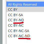
Well actually, the Vault has options for NoDerivatives (as well as NonCommercial and some others):Default option is All Rights Reserved™ which, yeah, is about the same as GameBanana's default. What I personally don't like is the lack of CC0, but oh well...
Anyway, I'd just like you to know that there's no "real" way of getting portals from a BSP, i.e. the original .prt file. The BSP doesn't store portals, just BSP leaves and which leaf can see which leaf. Thankfully it's mostly easy to calculate from the BSP's planes because that's what the BSP compilers do, and that's what I believe
BspGuy would be a good candidate to add this sorta functionality to, because you already got a 3D view of the BSP and all.
Anyway, I'd just like you to know that there's no "real" way of getting portals from a BSP, i.e. the original .prt file. The BSP doesn't store portals, just BSP leaves and which leaf can see which leaf. Thankfully it's mostly easy to calculate from the BSP's planes because that's what the BSP compilers do, and that's what I believe
bsp2prt does as well. Only thing I fear is that VHLT or some compiler down the family line is doing this step ever so slightly differently, which may cause all kinds of issues. Hope not.BspGuy would be a good candidate to add this sorta functionality to, because you already got a 3D view of the BSP and all.
I am not sure if the Entity Flags category needs further categorisation. I didn't even know it existed until you mentioned it.
The way I imagine it, someone would normally arrive to that page if they're looking for info about a specific entity flag, not to browse them, so, how much value would it really add?
The way I imagine it, someone would normally arrive to that page if they're looking for info about a specific entity flag, not to browse them, so, how much value would it really add?
Posted 2 years ago2022-10-03 07:49:18 UTC
in Warning: portal file is corrupt ( num_points = 1 ) Post #346925
in Warning: portal file is corrupt ( num_points = 1 ) Post #346925
It is perfectly fine. The thing about portal files is that VHLT (the map compilers that come with J.A.C.K. and are the newest ones in general) generates some extra data in the portal file for its VIS to work. The problem is, J.A.C.K. and all other map editors don't parse this. If you open up the .prt file in a text editor, you'll see two numbers, and then a bunch of one-digit numbers afterwards, which is basically the thing J.A.C.K. is complaining about.
There's 2 solutions, you can 1) use Seedee's FixPrt tool or 2) use one of the modified VHLTs, either the latest version of Seedee's SDHLT or my ADMT.
There's 2 solutions, you can 1) use Seedee's FixPrt tool or 2) use one of the modified VHLTs, either the latest version of Seedee's SDHLT or my ADMT.
New one! Attachments, controllers, hitboxes and animation events in a nutshell.
Hmm, I'll need to download BspGuy's code tomorrow and experiment. This was so far just me interpreting the code from its GitHub.
I wonder if it would be enough to perhaps query the BSP with a trace through the func_illusionary brush location to see if it hits something?Ah! You can actually borrow HLRAD's BSP raycast code... I think... it's meant for hull 0, but could be adapted for cliphull123 perhaps.
Might wanna check this too:
int vertIdx = mesh.edges[mesh.faces[i].edges[k]].verts[v];
if (!mesh.verts[vertIdx].visible) {
    continue;
}
uniqueFaceVerts.insert(vertIdx);Here's my thoughts:
BspRenderer.cpp
L770:
L772:
What
Basically works the exact same as the clipping tool in Hammer.
L790:
And that's... it I think? Get BSP planes that define the convex volume of a leaf, and create the mesh of that convex volume by chopping up the planes against a huge bounding box. Alternatively you can create a polygon object for each plane and cut those polygons up, instead of using a big cube as your starting clipping object.
NGL I did not think it was that simple, just getting the bounding volume of each solid BSP node per hull. Obtaining the list of solid BSP nodes isn't hard either.
Can I see your code? Maybe there's a tiny oversight somewhere.
BspRenderer.cpp
L770:
vector<NodeVolumeCuts> solidNodes = map->get_model_leaf_volume_cuts(modelIdx, i);get_model_leaf_volume_cuts. NodeVolumeCuts is the BSP planes that "define the leaf boundaries when applied to a bounding box". So these aren't just some random planes, these are effectively the planes that form the convex volume of a BSP node or well, leaf in this case.L772:
vector<CMesh> meshes;
for (int k = 0; k < solidNodes.size(); k++) {
    meshes.push_back(clipper.clip(solidNodes[k].cuts));
    clipnodeLeafCount++;
}CMesh is just a bunch of vertices, edges and faces, nothing special there.What
clipper.clip does is create a box CMesh that is the max size of a map (-131k to +131k units), which actually explains the thing you were seeing there, with -1317821 for the X coordinate. It then proceeds to chop up the box with cuts - the BSP planes that define that node's volume. It removes verts/edges/faces that are below the plane, and retains the ones above the plane, I believe. Or vice-versa. Doesn't really matter, you get the idea.Basically works the exact same as the clipping tool in Hammer.
L790:
for (int m = 0; m < meshes.size(); m++) {
    CMesh& mesh = meshes[m];

    for (int i = 0; i < mesh.faces.size(); i++) {

        if (!mesh.faces[i].visible) {
            continue;
}And that's... it I think? Get BSP planes that define the convex volume of a leaf, and create the mesh of that convex volume by chopping up the planes against a huge bounding box. Alternatively you can create a polygon object for each plane and cut those polygons up, instead of using a big cube as your starting clipping object.
NGL I did not think it was that simple, just getting the bounding volume of each solid BSP node per hull. Obtaining the list of solid BSP nodes isn't hard either.
Can I see your code? Maybe there's a tiny oversight somewhere.
It indeed expands the hulls because the player hull is like, 36x36x72 units I think. Similarly, cliphull2 would be larger, and cliphull3 would be the smallest.
I am also curious about generating a triangle mesh from clipnodes.
I think the answer can be found in BspGuy's source code, since that one renders clipnodes. Or at least seems to.
https://github.com/wootguy/bspguy/blob/master/src/editor/BspRenderer.cpp#L755
You could look into the original Quake compiler sources to see maybe how they're generated, but TL;DR you definitely gotta do some form of plane intersection to get polygons in the end.
Always compile both DLLs when editing weapons.
The classic WON-era view bobbing is part of the HL Updated SDK.
The HUD shifting may be a consequence of this:
The classic WON-era view bobbing is part of the HL Updated SDK.
The HUD shifting may be a consequence of this:
Hello there, I'm the author of that tutorial.
Did you compile both DLL files? Did you accidentally change
Did you compile both DLL files? Did you accidentally change
hud_draw to 0?Refer to sv_maxspeed and cl_forwardspeed, start from CL_CreateMove.
In this thread I propose a couple of things and outline my plans for writing content on TWHL.
In short, I am looking to improve navigation for the Wiki articles, establish some sort of guidelines for writing and see what needs to be done regarding introductory guides. Generally, the goal is to make stuff more accessible to beginners. Hopefully we'll get some conversation started.
You all know me, but here's a quick introduction:
I've been writing tutorials for 6 years now, having started writing on GameBanana (please don't look at them lol, especially the first ones), and I found TWHL to be a pretty nice place for that, so I switched to writing here around 2019 or so, and I've been here since 2016 for sure. I am primarily interested in writing mapping and programming tutorials, beginner and advanced ones alike, I just love writing.
Now, here's the thing. This place is pretty nice from the writer's POV (aside from the occasional parser edge case with
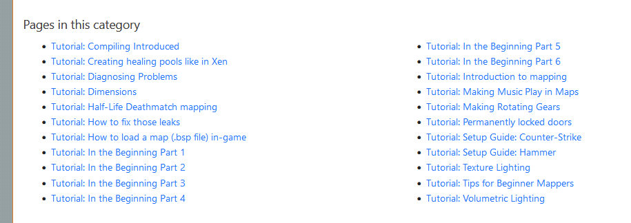
Let's look at the index page for GoldSRC tutorials:On first glance, this is probably perfectly okay. You got a couple of introductory articles highlighted on the top, and then some subcategories to filter out stuff you don't need. Currently we have 22 mapping tutorials in the beginner category. This is very nice. Let's put ourselves into the perspective of an absolute beginner mapper, who maybe hadn't seen Dimbeak's mapping videos and is coming here. There's a chance they'd navigate here:Just for a second, imagine you know next to nothing about Hammer, or BSP, or carving, or anything like that.
"Introduction to mapping" outlines a bunch of fundamental definitions, but you don't know that yet.
"In the beginning" shows how to create a bunch of different stuff, and because it has multiple parts, you may potentially be turned off by it, thinking it's mega long and complex, like some 30-minute video tutorials. Of course, it depends on the type of person. In reality, it's a series of short, level-headed guides.
(Let's also temporarily ignore the fact that a lot of tutorials involve setting up ancient tools, I'll talk about this in the next section)
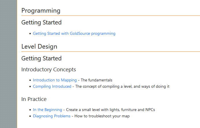
I'm not a marketing guy, so I can't catch attention all that well, but this is my idea:I published this change today, on the 1st of September 2022, and I am hoping to coordinate future changes like this here. Feedback is well appreciated.
I think this is an improvement because 1) there are now a few concept explanations as well as a troubleshooting guide upfront, and 2) each guide has a brief description next to it. I tried to keep them mostly short. They have an extra chance of helping the reader find the right place to start.
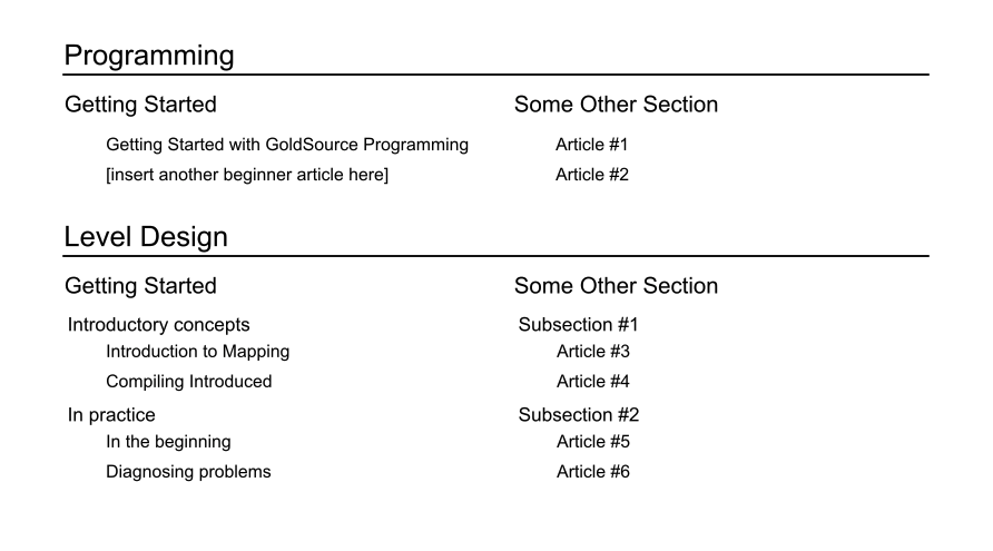
I was also thinking of this design, basically a grid with recommended articles with brief descriptions:On the left side, you have guides for newcomers, and on the right side, I am honestly not entirely sure. I think we can include some in-depth technical explanation guides there, or some interesting advanced tutorials. Tell me what you think!
For the sake of consistency, it would be pretty nice to have a couple of guides for contributors/writers. I love high-quality, consistent writing and would love to see that on TWHL. The Programming book is an example of high-quality writing, I like it (I mean, I wrote a chunk of it so I'm biased).
However, I've noticed one lil thing: the parts I wrote are more subjective (1st-person singular is not seldom), the parts by Penguinboy are more objective but both styles still have a pinch of personality, especially Shepard's contributions. Maybe I'm overthinking, but it would be nice to outline the basic style for the books.
Also, here are some brand new articles I wanna write, other than tutorials I typically tend to write:
So, what I'm saying is, maybe it'd be helpful to separate how-to guides and explanations of things. Explanations don't fit Definitions nor Tutorials the way I see it. Here are some articles that I think can potentially fit the Explanation prefix:
Finally, what do you think about linking keywords to their respective Definitions page? E.g. a beginner tutorial might mention ORIGIN, and I think it'd be useful to link to it, in case a newcomer doesn't know, they could simply click on it to see.
It'd look something like this:
"Make sure to give the door an origin brush."
Also, just to make sure, I plan to do most, if not all of these changes. This thread is more for me to see what the community thinks about it, but if we manage to get extra volunteers, that'd be epic.
In short, I am looking to improve navigation for the Wiki articles, establish some sort of guidelines for writing and see what needs to be done regarding introductory guides. Generally, the goal is to make stuff more accessible to beginners. Hopefully we'll get some conversation started.
You all know me, but here's a quick introduction:
I've been writing tutorials for 6 years now, having started writing on GameBanana (please don't look at them lol, especially the first ones), and I found TWHL to be a pretty nice place for that, so I switched to writing here around 2019 or so, and I've been here since 2016 for sure. I am primarily interested in writing mapping and programming tutorials, beginner and advanced ones alike, I just love writing.
Now, here's the thing. This place is pretty nice from the writer's POV (aside from the occasional parser edge case with
inline code and so on), and it's pretty nice for long-time members. But I think we can improve the landing a little bit, for beginners that is.
Improved navigation for beginners
What I'm about to say involves a fair bit of assumptions, so take it with a grain of salt.Let's look at the index page for GoldSRC tutorials:On first glance, this is probably perfectly okay. You got a couple of introductory articles highlighted on the top, and then some subcategories to filter out stuff you don't need. Currently we have 22 mapping tutorials in the beginner category. This is very nice. Let's put ourselves into the perspective of an absolute beginner mapper, who maybe hadn't seen Dimbeak's mapping videos and is coming here. There's a chance they'd navigate here:Just for a second, imagine you know next to nothing about Hammer, or BSP, or carving, or anything like that.
The problem
Now which one of these is relevant to you?"Introduction to mapping" outlines a bunch of fundamental definitions, but you don't know that yet.
"In the beginning" shows how to create a bunch of different stuff, and because it has multiple parts, you may potentially be turned off by it, thinking it's mega long and complex, like some 30-minute video tutorials. Of course, it depends on the type of person. In reality, it's a series of short, level-headed guides.
(Let's also temporarily ignore the fact that a lot of tutorials involve setting up ancient tools, I'll talk about this in the next section)
The solution
We need something that will almost instantly catch the reader's attention and let them know "yeah, this is exactly what you gotta read".I'm not a marketing guy, so I can't catch attention all that well, but this is my idea:I published this change today, on the 1st of September 2022, and I am hoping to coordinate future changes like this here. Feedback is well appreciated.
I think this is an improvement because 1) there are now a few concept explanations as well as a troubleshooting guide upfront, and 2) each guide has a brief description next to it. I tried to keep them mostly short. They have an extra chance of helping the reader find the right place to start.
I was also thinking of this design, basically a grid with recommended articles with brief descriptions:On the left side, you have guides for newcomers, and on the right side, I am honestly not entirely sure. I think we can include some in-depth technical explanation guides there, or some interesting advanced tutorials. Tell me what you think!
Guidelines for writing
Oh boy. Ooooooh boy. I'm guilty of this one sort of.For the sake of consistency, it would be pretty nice to have a couple of guides for contributors/writers. I love high-quality, consistent writing and would love to see that on TWHL. The Programming book is an example of high-quality writing, I like it (I mean, I wrote a chunk of it so I'm biased).
However, I've noticed one lil thing: the parts I wrote are more subjective (1st-person singular is not seldom), the parts by Penguinboy are more objective but both styles still have a pinch of personality, especially Shepard's contributions. Maybe I'm overthinking, but it would be nice to outline the basic style for the books.
Modernisation and quality improvement
Here I'll outline some articles I'll write a modern equivalent of, or improve in some other way.- Tutorial: In the Beginning series - I plan to write a new In the Beginning with J.A.C.K. in mind, and maybe a sister series for TrenchBroom
- Tutorial: Compiling Introduced - this is a fine, fine article. I think it might benefit from a bit better formatting though
- Tutorial: Diagnosing Problems - as usual, fine article, but can benefit from some modernisation. Personally I'd also reword it so it's a bit more objective
- Tutorial: Dimensions - could use some illustrations
Also, here are some brand new articles I wanna write, other than tutorials I typically tend to write:
- TrenchBroom configuration guide for GoldSRC
- Guides for Linux?
- Detailed in-depth explanation of BSP and the entire compilation process
Tutorial:. However, my interpretation of "tutorial" is that it's a how-to. A chunk of them are what-is, if you get what I mean. Penguinboy suggested "Guide" on Discord, and I came up with "Explanation" a year ago when I wrote about the reason why brushes can't be concave.So, what I'm saying is, maybe it'd be helpful to separate how-to guides and explanations of things. Explanations don't fit Definitions nor Tutorials the way I see it. Here are some articles that I think can potentially fit the Explanation prefix:
- Tutorial: Dimensions - this one is not an explanation per se, so it might be better to come up with an alternative name
- Tutorial: Introduction to mapping - this presents some theory, no how-to in it really
- Tutorial: All about info_nodes - same as above, definitely a good candidate for explanation articles
- Tutorial: Render Properties - yep, though this one could be part of Definitions
Finally, what do you think about linking keywords to their respective Definitions page? E.g. a beginner tutorial might mention ORIGIN, and I think it'd be useful to link to it, in case a newcomer doesn't know, they could simply click on it to see.
It'd look something like this:
"Make sure to give the door an origin brush."
Also, just to make sure, I plan to do most, if not all of these changes. This thread is more for me to see what the community thinks about it, but if we manage to get extra volunteers, that'd be epic.
Posted 2 years ago2022-08-31 20:13:13 UTC
in C++ PROGRAMMERS: What would be the best option for a cross platform, modern hammer replacement? Post #346836
in C++ PROGRAMMERS: What would be the best option for a cross platform, modern hammer replacement? Post #346836
Inactive tho' and not cross-platform.
Posted 2 years ago2022-08-31 12:30:49 UTC
in C++ PROGRAMMERS: What would be the best option for a cross platform, modern hammer replacement? Post #346833
in C++ PROGRAMMERS: What would be the best option for a cross platform, modern hammer replacement? Post #346833
I've checked it out, not bad. This is basically the same idea as J.A.C.K. but open-source?
I am not sure about that big update. There's some features in the beta, like sub-unit precision (which is reportedly pretty janky), and the developer still hasn't fixed UV locking. IMO the features it brings are mostly not that useful and don't justify the price tag.
Re: Eto.Forms
Oof, guess Qt is next.
I'm pretty sure they haven't updated that in ages. The Steam version has automatic mod setup which I think is unique to that version. It also had a big update a little while ago, if memory serves me correct.Automatic mod setup is a plus, but I've done it so many times I speedrun it now. Besides, you won't be making myriads of mod configs, no?
I am not sure about that big update. There's some features in the beta, like sub-unit precision (which is reportedly pretty janky), and the developer still hasn't fixed UV locking. IMO the features it brings are mostly not that useful and don't justify the price tag.
Re: Eto.Forms
Oof, guess Qt is next.
Posted 2 years ago2022-08-30 21:13:30 UTC
in C++ PROGRAMMERS: What would be the best option for a cross platform, modern hammer replacement? Post #346830
in C++ PROGRAMMERS: What would be the best option for a cross platform, modern hammer replacement? Post #346830
I looked up copperspice, and did not find anything relating to actual code examples,This is because all Qt code examples should work with CopperSpice just fine. Qt has an extensive documentation, so, yeah. Though, vanilla Qt should also work just fine, as Shepard suggests.
The reason I asked about C# is, some things you might wanna do are a lot easier there than in C++, like native plugins if you ever wanna add that.
Do you have any sorta design document for the editor, or is this a type of pre-planning phase?
Here's mine for example:
https://docs.google.com/document/d/134Chx1BxZPiWVkfK1hIfz5STCDqLrYRA3KRCA18-vQ4/edit?usp=sharing
Posted 2 years ago2022-08-30 18:34:36 UTC
in C++ PROGRAMMERS: What would be the best option for a cross platform, modern hammer replacement? Post #346828
in C++ PROGRAMMERS: What would be the best option for a cross platform, modern hammer replacement? Post #346828
Hey, I've been thinking about something similar too.
It is possible to create new Qt UI without touching Creator/Designer. I think that's how TrenchBroom goes about it, actually!
However it's closed-source. I remember seeing another repository with a C++ CSG map editor, but that was long inactive and it just said to use TrenchBroom, and I forgot the name...
What do you think about CopperSpice? It is a flavour of Qt but gets rid of some of its baggage.
Also, what about C# instead of C++? There's Eto.Forms which is pretty nice, WinForms but cross-platform basically.
but it is not open source or free (and nobody uses the out of date free Jack, I hope.)There is absolutely nothing wrong with the free version, I and many others use it lol.
Dear ImGui | I don't think this can be made to look like a normal application. (?)The real problem is the lack of a good, decent file browser plugin for it, and if you care about laptops, the fact it has to redraw everything so it'll use more battery.
It is possible to create new Qt UI without touching Creator/Designer. I think that's how TrenchBroom goes about it, actually!
There may be an other optionWell, there does exist a certain Hammer-style editor: http://www.evolved-software.com/mapscape/mapscape
However it's closed-source. I remember seeing another repository with a C++ CSG map editor, but that was long inactive and it just said to use TrenchBroom, and I forgot the name...
What do you think about CopperSpice? It is a flavour of Qt but gets rid of some of its baggage.
Also, what about C# instead of C++? There's Eto.Forms which is pretty nice, WinForms but cross-platform basically.
I've found this to be pretty useful:
https://gdbooks.gitbooks.io/3dcollisions/content/Chapter4/aabb-triangle.html
It has lots of other intersection algorithms too, like AABB vs. sphere, or AABB vs. plane which is useful for frustum culling.
https://gdbooks.gitbooks.io/3dcollisions/content/Chapter4/aabb-triangle.html
It has lots of other intersection algorithms too, like AABB vs. sphere, or AABB vs. plane which is useful for frustum culling.
Posted 2 years ago2022-08-18 13:25:36 UTC
in How do i make a map where i have to kill an npc to complete the mission in cs cz ds? Post #346798
in How do i make a map where i have to kill an npc to complete the mission in cs cz ds? Post #346798
I don't know how how to exactly trigger a mission completion in CZ:DS, but I can tell you how to approach it.
NPCs should have a "Trigger condition" property. There are several conditions you can choose from: when the player is seen, when the NPC is at 50% health, when the NPC is dead etc. You can use it to trigger some event when the NPC dies.
NPCs should have a "Trigger condition" property. There are several conditions you can choose from: when the player is seen, when the NPC is at 50% health, when the NPC is dead etc. You can use it to trigger some event when the NPC dies.
I think decals are always fixed in scale, you can't really change that.
Is it equivalent for these two ways on the capability for implementing any graphical features?Yes. Both approaches allow you to do any feature, whether it's PBR, shadowmapping, post-processing etc.
The difference is in the level of control you have and what amount of work you have to do.
With hooking, you are overriding parts of the engine. You get partial control or full control, depending on what you override. In some ways, it might be easier, in others it might be harder.
In a single mod, you need to write the entire renderer from scratch. The game state is already there in the form of client entities, i.e. their transformation data & which model they use. You get full control by design, but it also takes the most amount of work.
I was wondering that the new renderer is opaque for the original gameplayIn the case of hooking, it should generally work as a simple "addon" to most mods and vanilla games, so it shouldn't affect original gameplay whatsoever.
In the case of a single mod, it can only be ported to other mods if they are source-available or they don't use any custom code (so you can simply insert your own DLLs there). It's more useful to people who are making mods, so they can have rendering features out of the box and not worry about DLL injection and other stuff that may potentially trigger VAC.
There's a 3rd option, and that is using Xash, which will give you complete engine-side freedom to implement things. It is a Quake fork that mimics GoldSRC, but there are some grey area legal issues.
Oh, I didn't see your post @Lucida, welcome!
I have a similar ambition, I wanna experiment with writing a renderer that uses NVRHI, so I can have Vulkan and DirectX 11/12. GoldSRC is closed-source so you generally have 2 options: hook into the engine (something like MetaRenderer) or write the renderer inside a mod (something like Trinity).
@Meerjel01
That'd be a topic for a new thread. I think there is a way, but I never looked into it.
That would be
trigger_camera. And yes, it does actually do that.There's no view changer, I noclip and lower
sv_maxspeed and default_fov so I can record cinematic in-game shots. It might've been me accidentally moving the mouse ever so slightly.Controlling animated models:
Posted 2 years ago2022-08-13 14:51:12 UTC
in Make level change triggers work in multiplayer? Post #346779
in Make level change triggers work in multiplayer? Post #346779
That'd be a bit more complicated. You'd need to keep weapon data on the serverside before the level change, and send it to players when they spawn in the next map. This would involve user messages (read: server-to-client messages) and some bookkeeping.
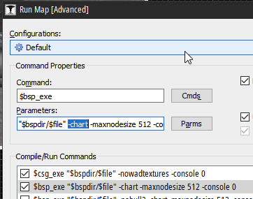
Compile with the
You can do so by entering the Expert compile dialog and adding
Also make sure your map has no leaks. Then we can start talking.
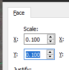
AllocBlock will get full depending on the number of surfaces in your map, and their texture scales (in the texture application tool). If you have a low texture scale like this:DON'T DO THAT on large surfaces. For small things like signs, it is acceptable, but please don't use it on floors, walls and stuff like that. Use a regular, normal texture scale of 1.0 on those. In some places, you might wanna use 2.0 or 4.0 (like canyons/cliffs). Smaller texture scale means AllocBlock will get filled faster.
If that still doesn't help, you can try increasing the texture scale on ceilings and some walls, and start removing some details. More polygons/faces means more AllocBlock will get filled too.
-chart parameter and you'll see exactly how much AllocBlock you're using.You can do so by entering the Expert compile dialog and adding
-chart after the last " there (make sure you selected $bsp_exe first!):(notice that there's a space too)Also make sure your map has no leaks. Then we can start talking.
AllocBlock will get full depending on the number of surfaces in your map, and their texture scales (in the texture application tool). If you have a low texture scale like this:DON'T DO THAT on large surfaces. For small things like signs, it is acceptable, but please don't use it on floors, walls and stuff like that. Use a regular, normal texture scale of 1.0 on those. In some places, you might wanna use 2.0 or 4.0 (like canyons/cliffs). Smaller texture scale means AllocBlock will get filled faster.
If that still doesn't help, you can try increasing the texture scale on ceilings and some walls, and start removing some details. More polygons/faces means more AllocBlock will get filled too.
Posted 2 years ago2022-08-11 12:03:08 UTC
in Make level change triggers work in multiplayer? Post #346771
in Make level change triggers work in multiplayer? Post #346771
In triggers.cpp, roughly around line 1460, you'll see this:
This doesn't work in multiplayer, so for that, we pass
You can't do a smooth singleplayer-style transition in multiplayer, if that's what you're looking for.
void CChangeLevel :: ChangeLevelNow( CBaseEntity *pActivator )
{
    edict_t    *pentLandmark;
    LEVELLIST    levels[16];

    ASSERT(!FStrEq(m_szMapName, ""));

    // Don't work in deathmatch
    if ( g_pGameRules->IsDeathmatch() )
        return;

    // Some people are firing these multiple times in a frame, disable
    if ( gpGlobals->time == pev->dmgtime )
        return;

pev->dmgtime = gpGlobals->time;// Don't work in deathmatch
if ( g_pGameRules->IsDeathmatch() )
return;// Yes, work in deathmatch
if ( g_pGameRules->IsDeathmatch() )
{
CHANGE_LEVEL( m_szMapName, nullptr );
return;
}changelevel2 console command.This doesn't work in multiplayer, so for that, we pass
nullptr to the landmark parameter, which is the same as using the changelevel console command. This means your player(s) will spawn at info_player_deathmatch points in the next map and won't actually carry over smoothly. You can't do a smooth singleplayer-style transition in multiplayer, if that's what you're looking for.
Posted 2 years ago2022-07-17 21:06:52 UTC
in Error: Exceeded MAX_MAP_VERTS on map with many prefabs Post #346738
in Error: Exceeded MAX_MAP_VERTS on map with many prefabs Post #346738
By the way, while investigating this issue I did a test and found out that func_wall entities do not cast shadows on the world, while func_detail did. Is this behavior expected? I thought they were mostly the same.Brush entities (except func_detail) get ignored by HLRAD, unless you set ZHLT Lightflags to something like "Opaque + concave fix".
The 2D views still struggle when too many elements are rendered, though.Maybe J.A.C.K. could render it a tad faster.
Posted 2 years ago2022-07-17 08:15:21 UTC
in Error: Exceeded MAX_MAP_VERTS on map with many prefabs Post #346726
in Error: Exceeded MAX_MAP_VERTS on map with many prefabs Post #346726
One simple cube brush has 6 vertices. A room made out of 6 brushes will end up having 6 vertices, as the BSP compilers will strip out the unseen faces (assuming there are no leaks), also assuming that it is 240x240x240 units or smaller.
The limit for brushes (individual brushes) is 32768. Their faces will get culled away and only the faces that are visible in-game will remain, so you don't see the backfaces if you noclip. This counts all sorts of brushes, non-entity and entity brushes alike.
The limit for brush models (solid entities etc.) is 512. If you have too many, for example, unique func_walls, you're gonna run out of brush models. A brush model is really just a group of brushes associated with an entity.
The vertex limit is also 32768, and if you have 50k faces, it's not hard to reach, esp. if a lot of these faces intersect, creating cuts on the underlying surfaces, thus creating new pairs of vertices too. Vertex count is calculated only after BSP filling and BSP splitting. (or maybe during it)
I specifically mentioned 240 units in the beginning, because every 240x240 texture pixels, there will be a new face too. If you have a very large surface, you'll get quads every 240x240 units, if the texture scale is 1.0. That also contributes to the number of vertices. If texture scale is 0.5, those cuts will happen every 120x120 units and so on.
Posted 2 years ago2022-06-08 19:22:16 UTC
in Ambiguous leafnode content ( EMPTY and SOLID ) Error Post #346609
in Ambiguous leafnode content ( EMPTY and SOLID ) Error Post #346609
I mean yeah, LeafThread is part of VIS, so that's VIS. LeafThread specifically tries to "connect" the boundaries of each VIS room to another, basically determining visibility.
Posted 2 years ago2022-06-08 18:15:07 UTC
in Ambiguous leafnode content ( EMPTY and SOLID ) Error Post #346607
in Ambiguous leafnode content ( EMPTY and SOLID ) Error Post #346607
I am seeing some pretty rocky shapes around here:You might wanna convert those to func_detail. I am guessing VIS is the phase that takes the most time? In which case, yeah, you should definitely use func_detail.
Whenever you have a non-entity brush, you should be aware that it essentially subdivides the space around it. So if you have an 8-sided cylinder in a room, it'll subdivide that room's space into 8 separate "rooms", which makes sense to the compilers, even though the player (and the mapper) perceives it as a single room. This causes the compilation to take a looot longer than really necessary.
I'll provide some illustrations soon.
Edit:
Here's one map with func_detail and func_wall:And here it is without them:Another example:The map compiles pretty fast on my i5-8400, maybe all within 5 minutes.
Anything that shouldn't contribute to visibility calculations (i.e. details) should be func_detail or func_wall, depending on certain things. But generally it's func_detail.
Posted 2 years ago2022-06-08 17:32:29 UTC
in Ambiguous leafnode content ( EMPTY and SOLID ) Error Post #346605
in Ambiguous leafnode content ( EMPTY and SOLID ) Error Post #346605
"Ambiguous leafnode content" is merely a warning. It's basically the compiler saying "Hmm, I can't figure out if whatever's in front of this surface is solid or air, this mapper really made some funky geometry". It'll help greatly if you post some screenshots of the map.
Posted 2 years ago2022-06-04 11:14:42 UTC
in Tutorial available? Pick up, hold, carry, and drop/throw item in GoldSrc Post #346594
in Tutorial available? Pick up, hold, carry, and drop/throw item in GoldSrc Post #346594
You should write a tutorial about it here on the TWHL Wiki!
Posted 2 years ago2022-05-31 21:12:34 UTC
in Map have low fps, which not have any leaks Post #346584
in Map have low fps, which not have any leaks Post #346584
Hmm, what's your graphics card?
Posted 2 years ago2022-05-31 15:55:37 UTC
in Map have low fps, which not have any leaks Post #346581
in Map have low fps, which not have any leaks Post #346581
Based on the compile log, your map doesn't have too many polygons, but your low framerate might potentially be because of dynamic lights. Have you placed any lights in the map that have an Appearance? (e.g. flickering, candle, fade etc.)
Posted 2 years ago2022-05-29 12:33:43 UTC
in Need help comiling my map. Sorry for make a plea to beg, Post #346561
in Need help comiling my map. Sorry for make a plea to beg, Post #346561
Are disappearing things entities like func_wall? Chances are, you're hitting the 256 visible entity limit, though... this shouldn't really be true any more cuz' I've seen one of Trempler's maps having over 2000 visible ents lol
But anyway, make sure to turn on
Also please post more high-res screenshots, with the affected brushes centered in the 2D views.
Edit: I've just read, yeah, the disappearing ents are item_generic. You're most likely running into that limit, or their origin is potentially inside a brush. Double-check the latter.
But anyway, make sure to turn on
developer 2 and check the console for anything like "Max entities in visible packet list". If you're hitting that, it means it's time to start reducing the entities in your map.Also please post more high-res screenshots, with the affected brushes centered in the 2D views.
Edit: I've just read, yeah, the disappearing ents are item_generic. You're most likely running into that limit, or their origin is potentially inside a brush. Double-check the latter.
Posted 2 years ago2022-05-24 18:56:20 UTC
in Need help comiling my map. Sorry for make a plea to beg, Post #346547
in Need help comiling my map. Sorry for make a plea to beg, Post #346547
You have a leak, you gotta fix that first. Read a little bit about leaks in these couple of guides:
https://twhl.info/wiki/page/Tutorial%3A_How_to_fix_those_leaks
https://twhl.info/wiki/page/Tutorial%3A_Pointfiles
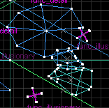
In short, follow the line from the reddest point to the bluest one, until you encounter either one of these 2:
1) the line is going through a gap into empty space outside the map (seal the gap)
2) the line is going through a brush itself:
- the brush is either invalid (fix it)
- or it's part of a brush entity (turn it into world, or put brushes behind it)

