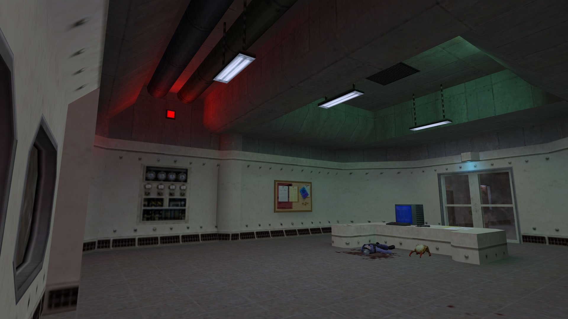
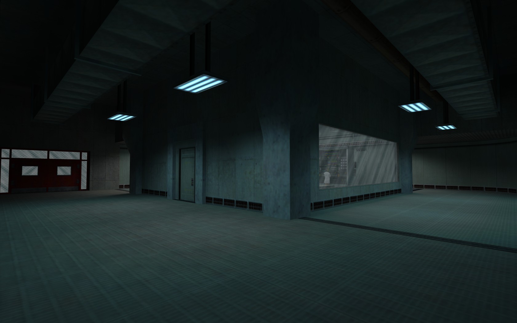
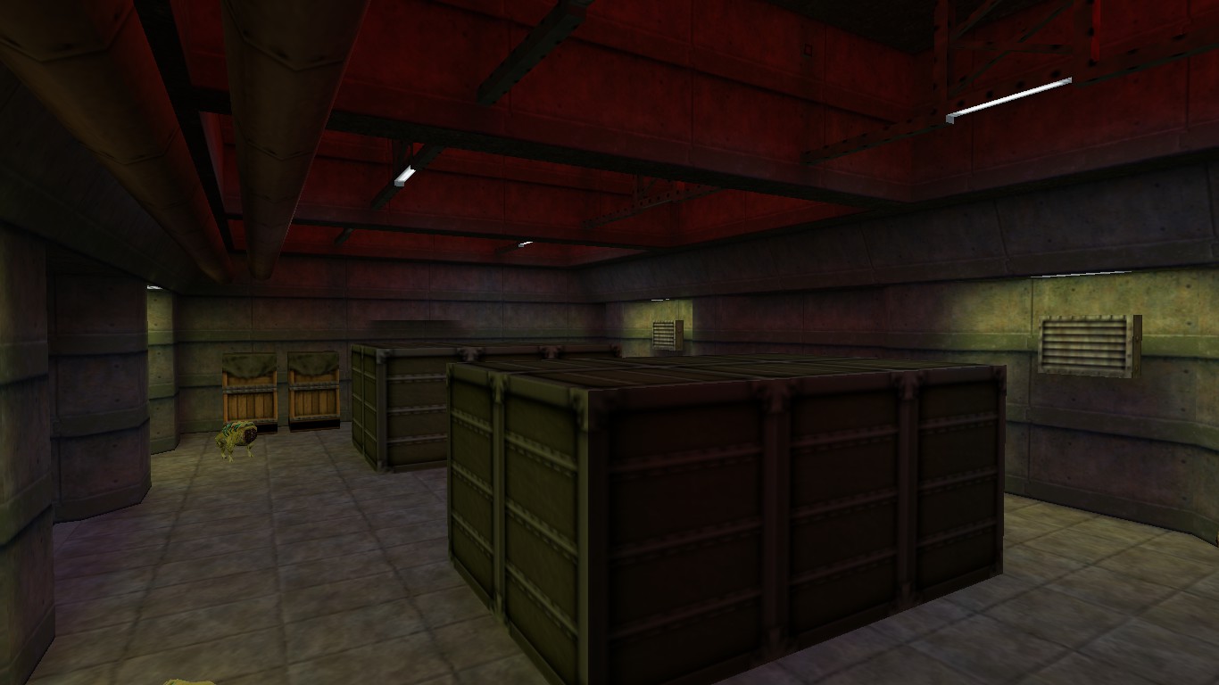
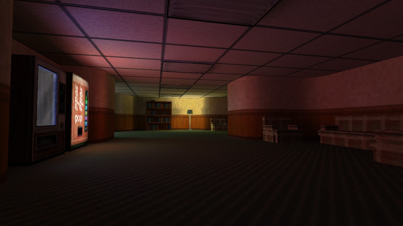
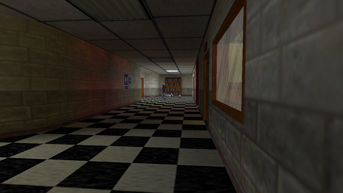
My approach is to try and make it fit in with Black Mesa, but I'm not going to skimp on detailing and making things look good. Basic architecture is acceptable for this challenge, and I may end up with a lot of that, but that's really not what I intend to build these days.
I'm not entering this challenge to go for the prizes, it's a great chance to get back into mapping and work simultaneously with the community on a project together. I'm in this to build and release a map that I'm proud of and that hopefully people will enjoy playing.
Competition 35: Vanilla Half-Life
Created 6 years ago2018-08-13 10:28:15 UTC by
 Penguinboy
Created 6 years ago2018-08-13 10:28:15 UTC by
![]() Penguinboy
Penguinboy
Posted 6 years ago2018-08-19 04:07:24 UTC
Post #340601
Posted 6 years ago2018-08-19 04:51:29 UTC
Post #340602
@Carrot: The restriction is on design - it should look like part of the Black Mesa complex (or Xen). The architecture/lighting/etc judging will be based on the quality of them in your entry, unrelated to how similar they are to HL1. The overall design is what matters, we're not looking for you to replicate the mapping techniques of HL1.
Posted 6 years ago2018-08-21 13:09:50 UTC
Post #340620
@Unq: Hear, hear!
I'm just doing this to try and get the creative juices flowing. I'm trying to get out of my habit of creating really corridors that lead to more corridors. Something I openly criticise mods like Azure Sheep for, when all I do is the same thing with more detail... (FYI, The Core is going to suck, and this is why )
)
I'm going to use this challenge to try and break old habits. Interesting combat sections and more variation in game play.
I'm just doing this to try and get the creative juices flowing. I'm trying to get out of my habit of creating really corridors that lead to more corridors. Something I openly criticise mods like Azure Sheep for, when all I do is the same thing with more detail... (FYI, The Core is going to suck, and this is why
 )
)I'm going to use this challenge to try and break old habits. Interesting combat sections and more variation in game play.
Posted 6 years ago2018-08-21 22:43:41 UTC
Post #340624
@Urby have you tried doing a really shit / rough plan on either paper or blocked our in Hammer before mapping proper? I'm very guilty of exactly what you've said, corridors upon corridors and not really thinking about how it goes together and the purpose for this. Could help potentially!
Posted 6 years ago2018-08-22 13:38:43 UTC
Post #340631
Yeah, I've planned out my corridors on paper before... 

Posted 6 years ago2018-08-22 18:54:12 UTC
Post #340637
I really find this image from Robert Yang useful to reference. It's not perfect but it gives a solid idea of the direction I want to be going in with map layouts.
Posted 6 years ago2018-08-24 17:15:58 UTC
Post #340648
I'll add that with the "advanced" method, you can note that they used walls for interior of areas on multiple sides. I've seen this used professionally like by Hondo for his map endlrainsh "endless rain scientist hunt" for his old scientist hunt mod. This method is typical in actual architecture and can create awesome environments.
At the end of the day, it all depends on the mod/ type of gameplay. Beginner was somewhat used for maps like fy_iceworld and it has consumed thousands of hours of gameplay. Intermediate is great for maps with harder clash points to overcome.
Layout theory ultimately depends on how the map will be played and enjoyed.
cs_assualt although does not have long corridors might suggest similar gameplay to intermediate layout in this example. The clash points are friggin impossible...
Posted 6 years ago2018-08-24 19:42:14 UTC
Post #340649
Anyone could attempt to map the ‘expert’ design and see what could be learned from it.
Edit: anyone but me. Don’t even ask. I have like 6 projects and 2 birthday presents to do.
Edit: anyone but me. Don’t even ask. I have like 6 projects and 2 birthday presents to do.
Posted 6 years ago2018-08-25 20:38:25 UTC
Post #340676
Posted 6 years ago2018-08-27 10:05:46 UTC
Post #340688
Very nice UrbanNebula, not only does the architecture looks great but the lighting is spot on.
As for my map, I haven't drawn a layout yet but I will challenge myself in one of the most impossible problems that exists in video game history: making a fun water sequence in an FPS. Of course, I'm not making a water level but I will try to make a water sequence less of a nuisance/obstacle but more of a challenge that has "platforming" to it.
The keyword to this water sequence is "Delta P".
Posted 6 years ago2018-08-27 12:58:47 UTC
Post #340691
Looking good, folks!
Posted 6 years ago2018-08-27 13:50:13 UTC
Post #340693
Do you map with texture filtering disabled, Urby?
I've just disabled it myself and found that it actually helps aligning things more accurately because of the sharp edges of each individual pixel.
I've just disabled it myself and found that it actually helps aligning things more accurately because of the sharp edges of each individual pixel.
Posted 6 years ago2018-08-27 21:37:55 UTC
Post #340699
looool @SourceSkyBoxer
Posted 6 years ago2018-08-27 21:54:43 UTC
Post #340700
How do I favorite a post
Posted 6 years ago2018-08-28 00:26:04 UTC
Post #340701
What on earth was any of that post meant to mean? I'm pretty sure Urby is using VHLT and also knows how to use texlights
Posted 6 years ago2018-08-28 01:38:06 UTC
Post #340702
I think I need to prepare excellent lighting explanations for beginners and advanced mappersYou absolutely should.
Posted 6 years ago2018-08-28 13:25:24 UTC
Post #340711
@savva: Thanks, I'm having a lot of fun with the lighting in this one
@Carrot: I do as a matter of fact. If I could, I would also force people to PLAY with filtering disabled!
@SSB: Thank you, I'm quite aware of VHLT and I use texture lighting (lights.rad) exclusively, except in specific areas where I want more control.
@Carrot: I do as a matter of fact. If I could, I would also force people to PLAY with filtering disabled!
@SSB: Thank you, I'm quite aware of VHLT and I use texture lighting (lights.rad) exclusively, except in specific areas where I want more control.
Posted 6 years ago2018-08-28 16:15:51 UTC
Post #340713
@UrbaNebula You must've developed a decent work flow if you're able to pull of these in such a short amount of time. Wish I'd have that...
Because meanwhile I'm sitting here with this:
Because meanwhile I'm sitting here with this:
Posted 6 years ago2018-08-28 20:08:23 UTC
Post #340719
SourceSkyBoxer said:how do we draw like awesome rockIf you want to draw awesome rocks, you can read my tutorial which is now available on TWHL.

Posted 6 years ago2018-08-28 20:55:52 UTC
Post #340720
@torekk: That's looking good. The only thing I would say is that the lighting is a little monotone. One thing I've done in my areas is to put different coloured lights up in the ceilings. Even just a teeny tiny red light occasionally up near the vents would add a lot to those hallways. 

Posted 6 years ago2018-08-28 21:13:44 UTC
Post #340722
@SSB: I realize the language barrier might not help this point get across, but;
keep in mind that the competition is to create an original area, not a replacement of an existing area.
keep in mind that the competition is to create an original area, not a replacement of an existing area.
Posted 6 years ago2018-08-29 13:30:41 UTC
Post #340732
I'm really trying to keep the game play varied and interesting, rather than running from hallways to rooms and killing bads.
I'm also getting increasingly frustrated with glass and water rendering in darkened rooms... Limitation of then engine I know, but it's quite distracting in places. Gonna have to figure out a way to make it look natural.
I'm also getting increasingly frustrated with glass and water rendering in darkened rooms... Limitation of then engine I know, but it's quite distracting in places. Gonna have to figure out a way to make it look natural.
Posted 6 years ago2018-08-29 14:41:50 UTC
Post #340735
Urby said:I'm also getting increasingly frustrated with glass and water rendering in darkened rooms... Limitation of then engine I know, but it's quite distracting in places. Gonna have to figure out a way to make it look natural.VHLT has an "embed lightmap" feature that bakes the lightmap into the texture for transparent objects. It instead looks a bit wonky when the player shines the flashlight on it, but it's a calculated tradeoff you have to do.
Posted 6 years ago2018-08-29 17:38:03 UTC
Post #340736
@Urby, I think textures beginning with ! emit light. So, just make your water texture not start with ! and create a brush over the water area and make it a func_water entity. You could use a func_conveyor and make a nice scrolling water texture to add some movement to it or do something else like an animated texture.
Posted 6 years ago2018-08-29 22:47:01 UTC
Post #340739
zhlt_embedlightmap, it works on some entities depending on the render mode. It's a neat thing. Even works on water, but make sure to put a bigger zhlt_embedlightmapresolution (I think) otherwise it'll take some more time and AllocBlock.
And weren't the ~ textures the ones that emit light?
And weren't the ~ textures the ones that emit light?
Posted 6 years ago2018-08-30 01:19:16 UTC
Post #340740
Yes the light textures had ~ in the name. But that's just for convenience, texture lighting is totally controlled by lights.rad, or info_texlights, or light_surface, whichever you prefer.
Posted 6 years ago2018-08-30 13:44:44 UTC
Post #340742
I have always used lights.rad for the sake of consistency. I use info_textlights to get the values right and then when I'm happy I add the value to lights.rad 
That's only when making custom light textures of course.

That's only when making custom light textures of course.
Posted 6 years ago2018-08-30 17:25:59 UTC
Post #340743
I guess I could post some Work in Progress screenshots of some of my less Work in Progress areas here.
Posted 6 years ago2018-08-30 18:07:46 UTC
Post #340744
Yeah I only recently switched to info_texlights. It's nice cause the settings are embedded in the rmf rather than being a separate rad file to keep track of and distribute. LIght_surface is even better though, I'm going to that as soon as I start actually mapping for this.
Posted 6 years ago2018-08-30 19:11:08 UTC
Post #340746
@Dr.Orange: Very nice! Definite Office Complex vibes from those screenshots.
Posted 6 years ago2018-08-30 21:05:49 UTC
Post #340747
This looks like it'll be a tough competition... some solid entries coming together. Might have to have a shot at it.
Posted 6 years ago2018-08-31 00:08:12 UTC
Post #340749
Posted 6 years ago2018-08-31 00:55:47 UTC
Post #340750
I'm really loving what I'm seeing of the WIPs so far, they're all great! There's a good variety of the different HL chapters so far too, which is exactly what I was hoping for 

Posted 6 years ago2018-08-31 13:05:25 UTC
Post #340752
I'm loving the amount of people who are working on this. Creates a real buzz seeing other people's WIPs and I can't wait to run through them. 
@DocRock: That is awesome!

@DocRock: That is awesome!
Posted 6 years ago2018-08-31 16:39:01 UTC
Post #340753
Just posting to tell my idea for the competition.
I plan on making a runway with a couple of hangars, planes, and a control tower.
That's about as far as I've gotten in terms of ideas.
I plan on making a runway with a couple of hangars, planes, and a control tower.
That's about as far as I've gotten in terms of ideas.
Posted 6 years ago2018-08-31 22:11:24 UTC
Post #340757
I'm having a hard time thinking of something good.
I have a funny idea. But i'm not sure how appreciated it will be.
If i can't think of anything before next month, i just might go with that. haha
I have a funny idea. But i'm not sure how appreciated it will be.
If i can't think of anything before next month, i just might go with that. haha
Posted 6 years ago2018-08-31 22:34:30 UTC
Post #340758
I think I got a prefab addiction...Mostly taken from the original half life 1 maps that I decompiled with WinBSPC, yes I know that creates some funky brushwork at times, where it did I either used the vertex manipulation tool to get them back on grid or just re-created it from scratch using the decompiled brushwork as a guide, e.g. I did this for the fan.
Besides the crates, those were actually the things I created first and then thought "hey wait, why re-invent the wheel?" and went on a hunt, might release this as a prefab pack as well afterwards for everyone to use.
Also still missing a lot of things, but I always loose track of which decompiled maps I already checked for useful things, and there's so many...
Posted 6 years ago2018-08-31 23:21:45 UTC
Post #340759
I always wondered why Valve didn't release more of their prefabs, like the vehicles. There's no way they actually had every level designer make a new SUV or Tank from scratch every time they wanted to use one.
Posted 6 years ago2018-09-01 00:30:52 UTC
Post #340760
Thanks SourceSkyBoxer and UrbaNebula 

Posted 6 years ago2018-09-01 12:47:40 UTC
Post #340762
@SourceSkyBoxer They aren't really prefabs as in .ol files, just a prefabs.rmf with all the brushes. Mostly func_detailed, but I kept some as func_breakable.
That's as far as prefabs go for JACK Hammer, since the prefab factory doesn't work there.
That's as far as prefabs go for JACK Hammer, since the prefab factory doesn't work there.
Posted 6 years ago2018-09-07 03:06:17 UTC
Post #340805
I'm really liking how this turned out so far, seeing as I had no idea how it should look like a few days ago.
Posted 6 years ago2018-09-08 14:53:11 UTC
Post #340818
Looking gooood. 

Posted 6 years ago2018-09-08 17:23:11 UTC
Post #340819
I get Uplink vibes from that screenshot.
Posted 6 years ago2018-09-17 11:50:46 UTC
Post #340902
Hey guys, I don't know if you discussed this but I just thought up a cool idea!
When the competition is finished and judged and whatnot, we should put all the maps submitted in the contest into one large Half Life mod! Of course, each level would need a solid transition of level change which would need the vmf to be modified after the competition, but I think it would be awesome that everybody's level could be played together in a mod.
Though its still quite early to judge and even plan for this concept since we don't even have the levels yet and some of the entries could have no gameplay to them, we should still attempt this later on and make it a birthday gift to Half Life's 20th anniversary!
Already thinking about it makes me 100x hyped up more than HL3...
Posted 6 years ago2018-09-17 17:08:47 UTC
Post #340904
The idea of doing a competition "roundup" once done is really good IMO - having one single thing to download rather than having to download a bunch of maps is much easier for punters to digest. I think rather than trying to have any sort of coherent transition between levels, a fade in / out or just straight level transition would probably be best to minimise any huge workload that may entail.
Posted 6 years ago2018-09-18 19:21:18 UTC
Post #340910
you could just hide a "next level" button somewhere in the level. but every map would need to be re-compiled in order to do that hah
Posted 6 years ago2018-09-18 19:46:04 UTC
Post #340911
That is true, this is definitely a big project but it will be so worth it. It's definitely an option for a fade in / out if the geometry of every level doesn't match up but we'll have to see once every map is completed.
Posted 6 years ago2018-09-24 03:03:35 UTC
Post #340946
Found some time tonight to do some more work on this in the early hours of the morning. Not as much as I was wanting to do because I fell asleep at my desk. I started at around midnight, then woke up at 02:50 and worked through until 03:50.
...I need to stop listening to chill out mixes when mapping in the evening.
...I need to stop listening to chill out mixes when mapping in the evening.
Posted 6 years ago2018-09-25 00:15:40 UTC
Post #340947
Finally started something for the compo. I had to get used to Sledge again after DarkRadiant. It's still pretty WIP.
Posted 6 years ago2018-09-27 16:52:28 UTC
Post #340958
I've never seen textures so pristine before
You must be logged in to post a response.


