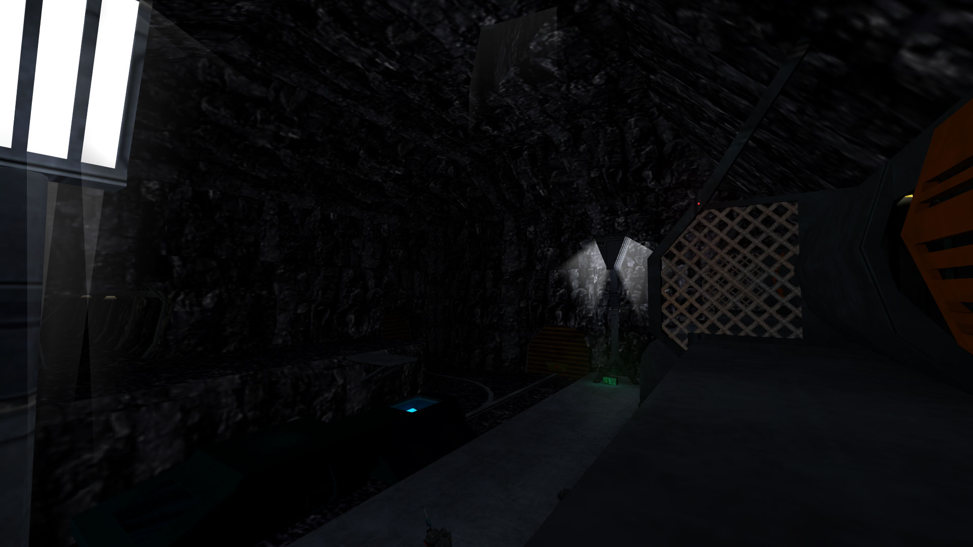
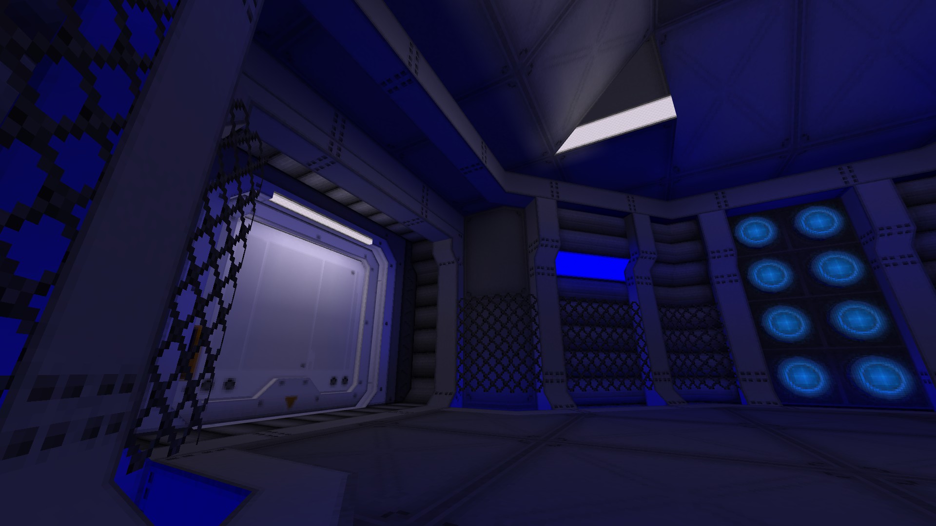
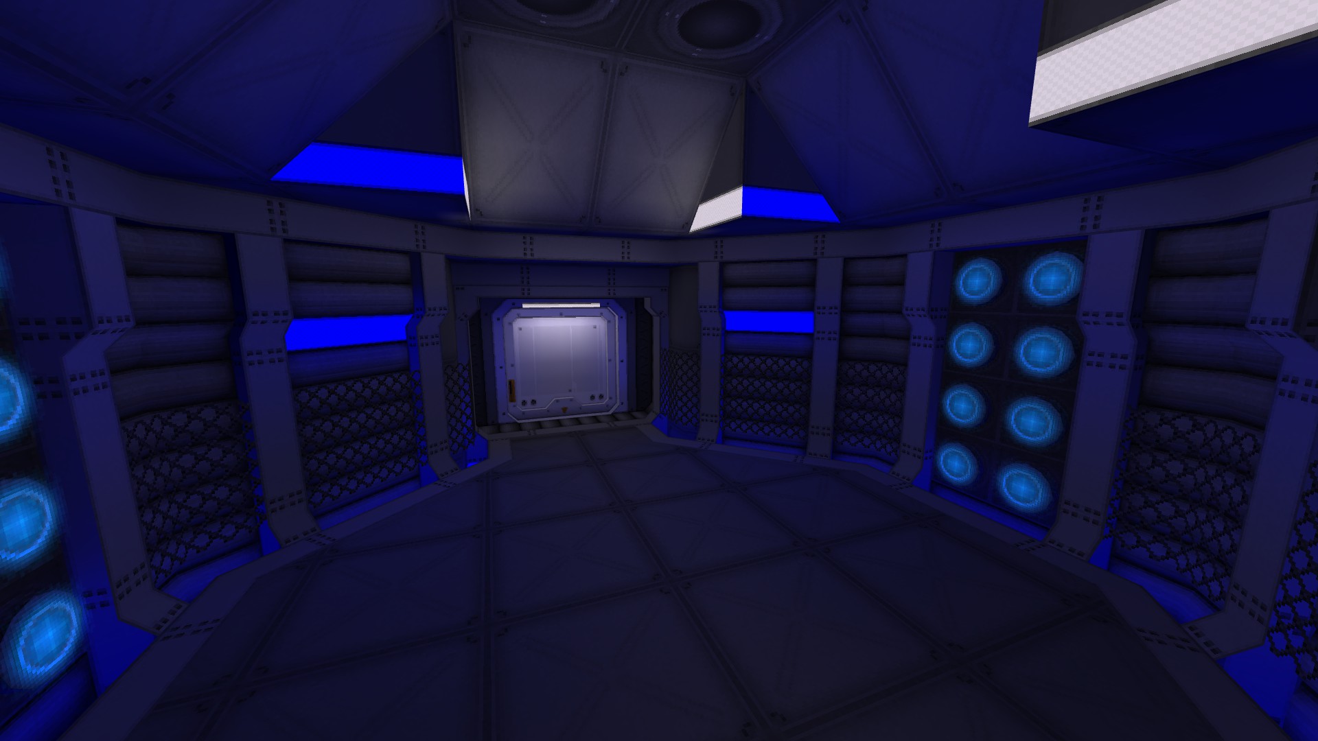
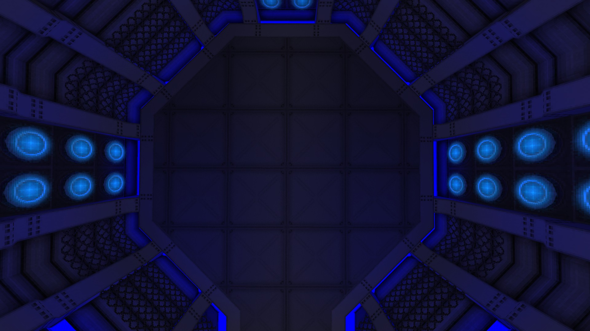
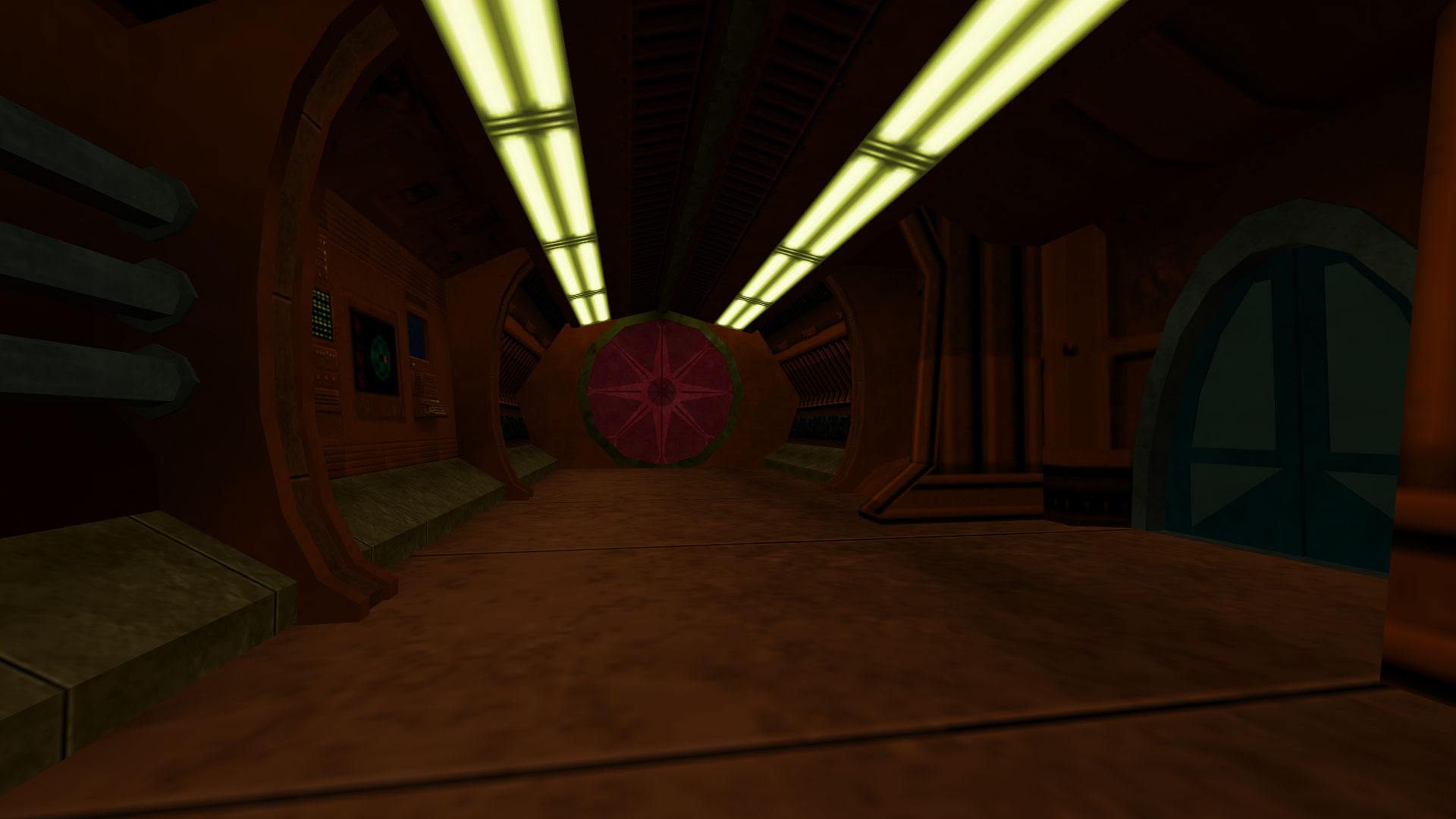
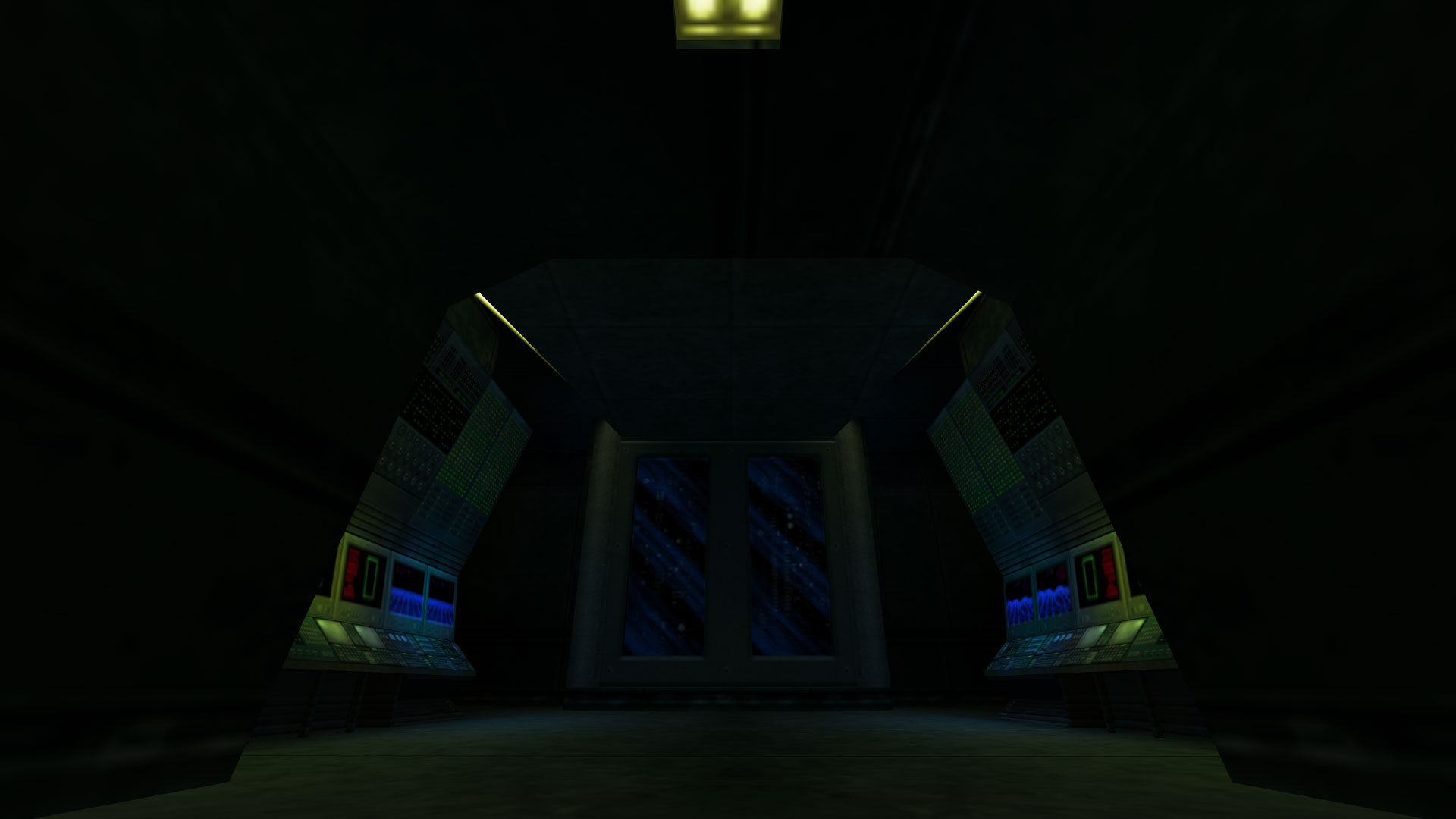
love that lava <3
you totally made me do a video of my lava map since the old one is gone.
https://youtu.be/fPQjBwjVlmk
Post your screenshots! WIP thread
Created 17 years ago2007-12-16 00:58:58 UTC by
 doodle
Created 17 years ago2007-12-16 00:58:58 UTC by
![]() doodle
doodle
Posted 6 years ago2018-04-06 18:14:05 UTC
Post #339227
Posted 6 years ago2018-04-14 06:20:50 UTC
Post #339310
Posted 6 years ago2018-04-15 20:01:45 UTC
Post #339329
is that from solo ops
Posted 6 years ago2018-04-22 05:56:39 UTC
Post #339408
Rolled out 38 textures last night. Here you can see 10 of them, and 2 vanilla ones.
I wish I did my elementary school map this way. :/
I wish I did my elementary school map this way. :/
Posted 6 years ago2018-04-22 10:49:07 UTC
Post #339409
 fitted textures.
Posted 6 years ago2018-04-22 18:28:54 UTC
Post #339411
Looking good! What's the solution to stuff like this, have never figured it out?Also pissing about with trying to stick to a big grid size to stop myself from over-detailing shit, and experimenting with from-scratch textures (ie. no overlays or use of stuff from textures.com )
Posted 6 years ago2018-04-22 20:22:28 UTC
Post #339412
It's because that pitch-black face isn't getting any light. Try using the "Light origin target" parameter. Place an info_null with an offset of 4-16 units away from the door's center. The direction of the offset should be opposite to the pitch-black face's position. Then give a name to the info_null and enter that name into the door's "Light origin target" field. The door will be moved to the info_null's position during light calculations and then, after the calculations are complete, moved back to its initial position.
Posted 6 years ago2018-04-23 16:55:09 UTC
Post #339418
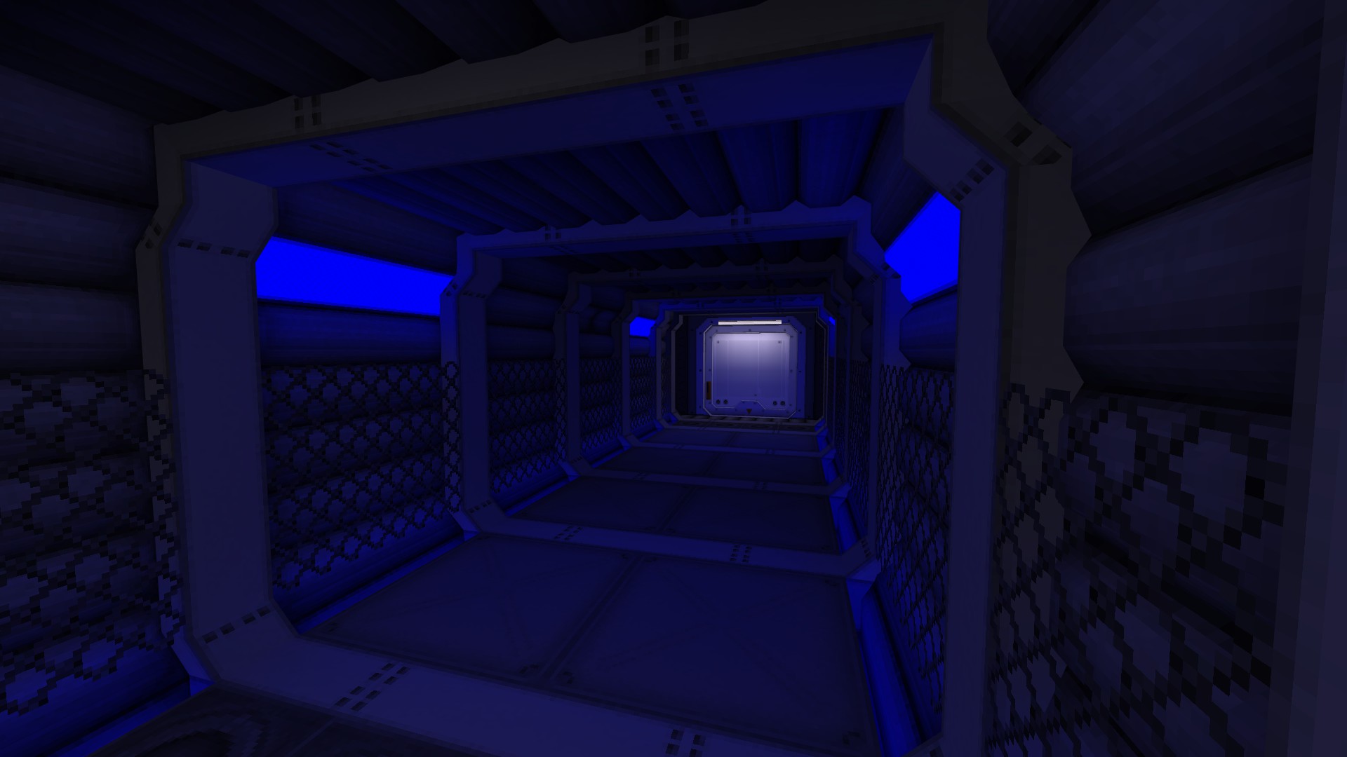
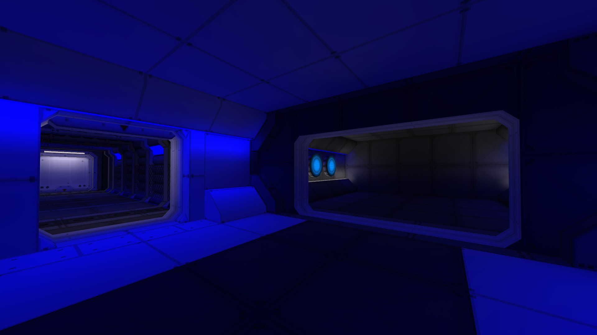
Inspired by Victor, doing some oldskooly things. Sticking to a large grid size so I don't overdetail like I always do, trying to use really saturated lights to give it a Doom 64 / Quake 64 vibe. Also made a bunch of light textures w/ corresponding color temperatures - automatically makes things look peng.
Posted 6 years ago2018-04-23 19:06:24 UTC
Post #339422
Definitely got a retro vibe. I like it.
Posted 6 years ago2018-04-24 01:00:54 UTC
Post #339423
Very nice, you've definitely nailed the desired aesthetic; it looks like something straight out of Knee Deep in ZDoom or SpaceDM5.
Posted 6 years ago2018-04-24 05:46:42 UTC
Post #339424
Posted 6 years ago2018-05-02 02:51:13 UTC
Post #339475
scoutzknivez remake in progress video
Been working on a scoutzknivez remake in my spare time. scoutzknivez_minaret coming soon. I used an interesting technique to map the onion dome. I used a six part shape per side and it is hollow so you can surf around inside it.
If you enter the region above the onion dome it opens the door on the minaret for a few seconds to access a m3 and uzi.
Posted 6 years ago2018-05-02 09:54:11 UTC
Post #339476
Nice onion dome. 

Posted 6 years ago2018-05-04 07:52:38 UTC
Post #339490
Reminds me of rocket dive
Posted 6 years ago2018-05-04 21:18:28 UTC
Post #339494
Posted 6 years ago2018-05-08 21:55:43 UTC
Post #339528
Making whole new prefabs for a thing I'm working on. This hover car took longer than I thought it would, but it'll at least be a great addition to the feel I'm going for, among other related things.
Posted 6 years ago2018-05-09 12:14:53 UTC
Post #339535
It's screaming for new textures. Though the idea of a 1940's Jeep being kitted out with hover pads is amusing in it's own way. 

Posted 6 years ago2018-05-09 19:15:13 UTC
Post #339536
It looks terrible, but it compiled successfully, unlike my last attempt (I still believe it was because I went too far with the tetrahedra). Finally. ^^
Now, the next step would be to improve the map, do experiments, and then write a good chunk of documentation, since I've found only a few resources about Q2 mapping.
@Sheepy
It looks cool.
Now, the next step would be to improve the map, do experiments, and then write a good chunk of documentation, since I've found only a few resources about Q2 mapping.
@Sheepy
It looks cool.

Posted 6 years ago2018-05-10 08:03:09 UTC
Post #339537
How to do that? MY map is always pitch black except for glowing textures.
Posted 6 years ago2018-05-10 12:06:17 UTC
Post #339544
Shift+E, select "light" from the dropdown menu, and click somewhere in the map, and press Enter if needed. A light will be created.
Then compile the map.
Sunlight etc. is done via map keyvalues, which you can either do by manually adding keyvalues like _sunlight, or by having an FGD which eliminates the need to add them manually.
This is if you're using a Hammer-style editor, in my case J.A.C.K.
As for other editors, you can apply the same principle. Add a light entity and change your map's keyvalues if necessary.
Posted 6 years ago2018-05-10 13:28:23 UTC
Post #339546
Is it the same on Trench-Broom?
Posted 6 years ago2018-05-10 15:36:22 UTC
Post #339549
Why don't you read everything I write?
As for other editors, you can apply the same principle. Add a light entity and change your map's keyvalues if necessary.
I don't know how you add entities in Trenchbroom, but I guess you already know. Besides, it has a user manual as far as I'm aware.
As for other editors, you can apply the same principle. Add a light entity and change your map's keyvalues if necessary.
I don't know how you add entities in Trenchbroom, but I guess you already know. Besides, it has a user manual as far as I'm aware.
Posted 6 years ago2018-05-17 23:05:10 UTC
Post #339646
Posted 6 years ago2018-05-18 15:07:16 UTC
Post #339653
Looks wonderfully industrial 

Posted 6 years ago2018-05-20 09:38:43 UTC
Post #339667
Making a cs map
cs_city1:
cs_city1:
Posted 6 years ago2018-05-20 18:03:29 UTC
Post #339673
My entity setup for a pistol fy map in progress. Yes, I know, I know, so many fy/aim maps, but they get a lot of playtime early in the night on my clan's custom map server and I need to make some that aren't ugly and aren't remakes of remakes.
So that is why, this particular fy map, has this entity room.It's not quite finished, there may be a few more light_surface entities in there but basically here's what you're looking at:
The metal block in the bottom left corner is a func_train that perpetually bounces between those two path_corner entities. Passing one of those two path_corner entities triggers something periodically that I will get back to in a moment. The giant block of yellow is a whole bunch of VHLT light_surface entities for various textures on the map, except for one which is an info_sunlight, which ties into the func_train setup that I'll explain now. You can see there are two light_environment entities. One is the regular lighting from the sky, the other is a bright light with a custom style that gives it a lightning flash look. It has a name and is set to be initially dark. The two multimanagers next to it are triggered by the func_train periodically and are used to turn the "lightning" light_environment on and then off again as well as trigger an ambient_generic that plays a thunder sound. This unfortunately created a problem where regardless of on or off the lighting light_environment caused all models including viewmodels to be lit up extremely bright at all times. The info_sunlight counters this using the same values as the primary light_environment. This unfortunately means that models don't get lit up more by the lightning, but it's a better trade off than all model shining brightly 100% of the time in a dark-ish map.
"Okay, but that was just the bottom left corner, what about the big array of..."
Ah, but I'm saving the big one for last! Next we have in the top left corner an info_map_parameters to restrict buying from both teams, an env_rain to add rain to the map, and a small unassigned buyzone to make sure buyzones aren't auto generated at spawn points. Just below that is a small array of player_weaponstrip entities that will be triggered by trigger_multiple brushes set up in a hallway. Why so many of them? People can throw weapons through one trigger brush, so making them pass through 4 at semi-close but unequal distances from each other will make it really difficult for players to smuggle weapons through.
So now, on to that big array of entities. You already know players are getting stripped of all their weapons. They will be forced to run through these triggers leaving spawn. They will then be presented with some func_buttons that will equip them with a knife, a pistol, and ammo. This array is a 12 round setup. It cycles through all 6 bistols, each getting two rounds at a time. Every odd number round will open doors to a lower part of the map and every even number round will open doors to an upper level of the map, so it's two maps in one, as well! The little concrete cube in the top right corner is a func_door that is used to trigger each round. It starts off triggering a 0th round (which you see slightly apart from the rest of the array near the func_door). This is to allow for a unique first round welcome message using two game_text entities and also because of a trigger_hurt that needs to be on every other round (so when it cycles from round 12 back to round 1, the trigger_hurts need to be switched off, however, for the FIRST round 1 they are already off, so triggering them would turn them on which is unwanted). The trigger hurt is to stop players from dropping from the upper map to the lower map safely into some shallow water(whose exact setup will be revealed when I release the map). The trigger hurt needs to be on when on the upper map to kill falling players but off when the lower map is in use so that players running through the water don't get insta-killed.
The 0th round then triggers the round 1 sequence trigger_changetarget that changes the target of the func_door to the round 2 multimanager, so on the next round the round 2 sequence begins. This cycle is then designed to loop through rounds 1 through 12 multimanagers forever. Each round multimanager also triggers a game_text entity that displays the type of pistol available for that round. Every odd number round opens the lower map and triggers a multimanger that then triggers another 2 multimanagers to then trigger the trigger_changetargets that change the targets of the buttons to the proper game_player equip to equip them with the corresponding pistol and ammo. The reason there are so many of them is to ensure each button has it's own equip entity to avoid any hangups (I had issues early on in testing de_pophouse where trying to consolidate certain entities lead to it not triggering for certain players because two or more players might trigger them at the same time). The odd number rounds also turn the trigger_hurt entities off (except, again, for the 0th round entity for the very first round). Every even number round turns the trigger_hurt entities back on and it opens the doors to the upper map instead of the lower map. It doesn't need to trigger all the changetargets for the buttons because it uses the same weapons as the previous round.
Edit: I forgot to mention the trigger_auto in the top right near the func_door that opens the lower map for the warmup before the first round. I also forgot to mention the trigger_auto that kickstarts the lightning controlling func_train when the map loads.
This setup isn't as complicated as it appears, there are just a lot of entities in use (in part because I wanted to ensure smooth operation by giving every button that can be used at once it's own dedicated equip entity). With the button system you could probably easily get away with consolidating equip entities but I'm not anywhere near hitting the entity limit so it will be fine. This is, however, the most organized I've had all my background entities set up on a map and I was really proud of how neat and orderly it all looks.
Posted 6 years ago2018-05-21 04:31:46 UTC
Post #339676
Impressive. But I think you should try replacing the second light_environment (the lightning) with a light_spot with "Is Sky" flag checked. This may be able to remove the need of having an info_sunlight.
Posted 6 years ago2018-05-21 04:58:53 UTC
Post #339677
You can get rid of that constant light_environment model lighting by setting info_sunlight to 0 0 0 0 then models will be lit the usual way however without the directional shading
Posted 6 years ago2018-05-23 03:26:51 UTC
Post #339689
Posted 6 years ago2018-05-23 11:49:44 UTC
Post #339692
On my screen it's so dark I barely see a thing 

Posted 6 years ago2018-05-23 13:27:44 UTC
Post #339693
That blue light on the third pic doesn't look that great. It's a common problem when you're trying to fit a rectangular texture on an oddly shaped surface like that.
Posted 6 years ago2018-05-27 22:36:21 UTC
Post #339694
@ Windawz & Bruce
I'll have to try those things next time the map is in a compileable state (I've currently removed all the temporary "seals" to continue work on the rest of the map). Once I finish the main spawn areas I'll be able to mess around with the lightning lighting some more. Thanks for the tips.
Edit: Bruce, that did the trick.
Posted 6 years ago2018-05-28 17:29:17 UTC
Post #339713
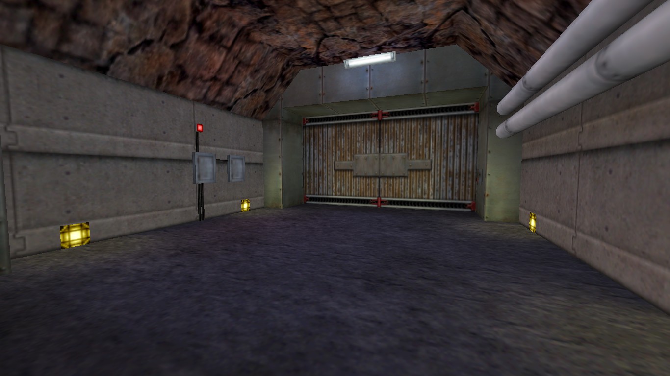
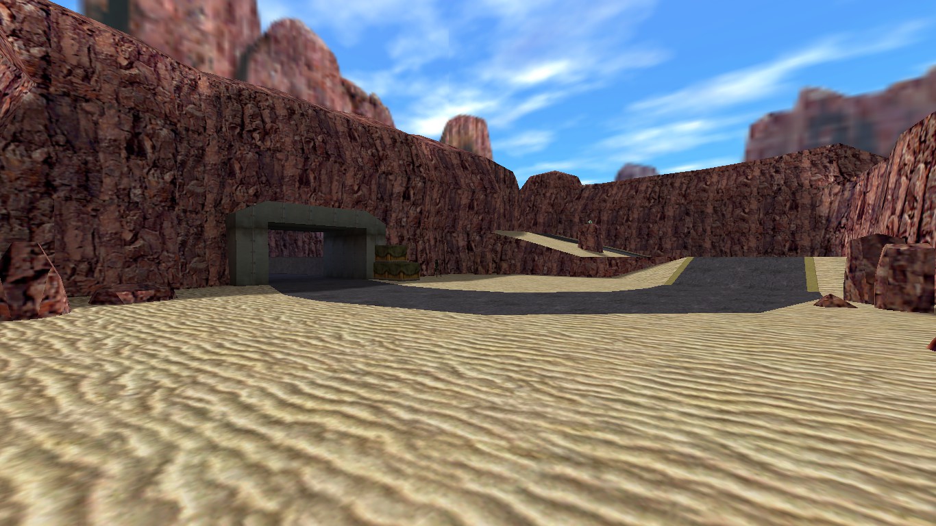
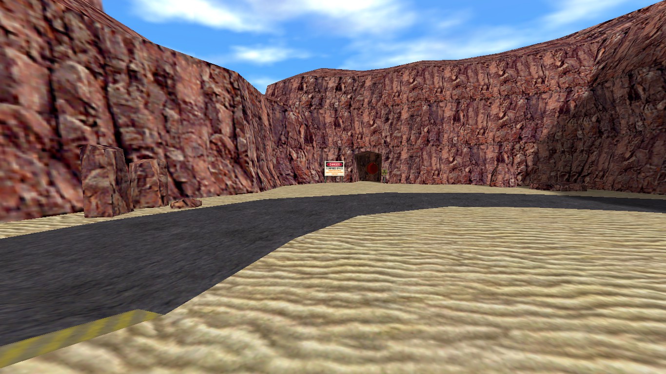
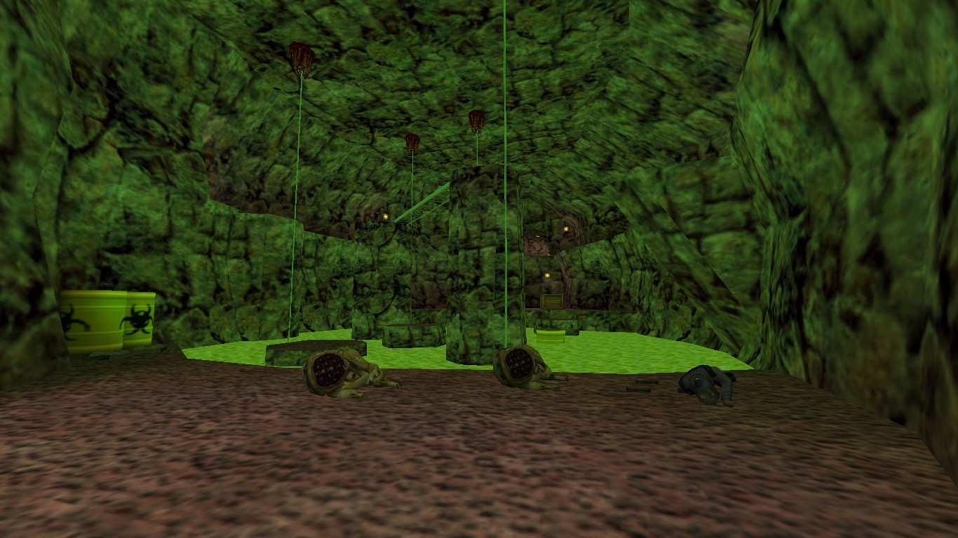
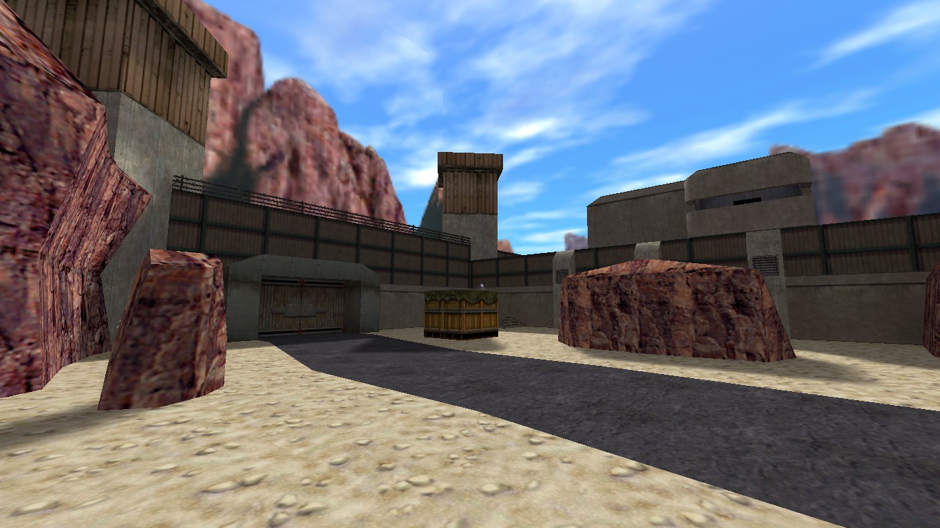
Half-Life map.
Posted 6 years ago2018-05-28 19:51:44 UTC
Post #339718
Looks alot like the original. In a good way.
Posted 6 years ago2018-05-28 22:05:20 UTC
Post #339721
It does look quite nice, but the surface areas could do with some more details imo.
Posted 6 years ago2018-05-29 12:18:00 UTC
Post #339726
@Dr.Orange: As I said with your Access Point map, it looks really authentic and blends well with the surface areas seen in Half-Life. Very nice. One thing I will say is that in the second and third shot, it does kind of just look like a big room with a rocky wall texture. I think it's a little too square, the corners are very obvious.
Posted 6 years ago2018-05-29 19:29:17 UTC
Post #339730
(old screenshot, didn't bother taking a new one xd)My teacher was AMAZED. I'm not yet amazed though. The textures were just taken and put into a WAD with no colour modifications, so they look kinda dull.
Also, in one of the screenshots you can see me using a prop model for the first time in my life in GoldSrc. :3
I've made it myself in 3DS Max and I have to say, modeling for GoldSrc isn't as bad as I thought.
Also, in one of the screenshots you can see me using a prop model for the first time in my life in GoldSrc. :3
I've made it myself in 3DS Max and I have to say, modeling for GoldSrc isn't as bad as I thought.
Posted 6 years ago2018-06-03 14:30:13 UTC
Post #339793
Posted 6 years ago2018-06-24 22:54:47 UTC
Post #340009
Summer break started for me on the 6th of July, so that means no new reference photos and no new textures.
So I picked up an older project of mine. Who remembers my modular prefabs for an SC map called Zvezde? Well, it's back on track with an actual story with more lore than 95% of other Sven Co-op maps, new ideas, planned Easter eggs, an entire planned spaceship to explore, and this:
zvezde_lazarroom.bsp on YouTube
Posted 6 years ago2018-07-09 02:21:42 UTC
Post #340098
Hey all,
Really excited to share that my project, The Cinema Rosa, is now on Kickstarter.
Check it out here: https://www.kickstarter.com/projects/1273762308/the-cinema-rosa-new-puzzle-game-by-atreyu-games#
Really excited to share that my project, The Cinema Rosa, is now on Kickstarter.
Check it out here: https://www.kickstarter.com/projects/1273762308/the-cinema-rosa-new-puzzle-game-by-atreyu-games#
Posted 6 years ago2018-07-15 14:42:14 UTC
Post #340146
Haven't posted here in ages, so here are my latest WIPs.
Posted 6 years ago2018-07-26 15:09:53 UTC
Post #340264
I imagined this all would've taken me longer, but thanks to the prefabs from Victor-933 I could dive right into the "entity magic":I'm not sure how long it took me in total, but I've been sitting on this since yesterday and this would be my first real GoldSrc experience. Though I have some experience with Source SDK, GTKRadiant and Doom Builder/Eureka, which helped.
My plan would be to atleast make a map that features a train ride that ocassionally gets blocked by different events that the player has to solve, e.g. water blocking a passage or something like that.
And somehow I fail to use noclip in GoldSrc as you can see in the video, it happens all the time to me.
Posted 6 years ago2018-07-27 00:02:22 UTC
Post #340271
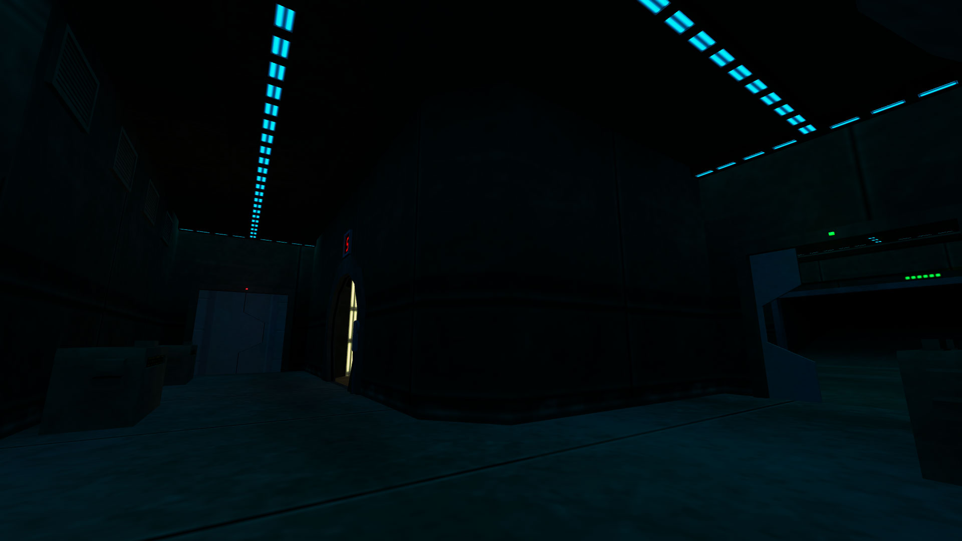
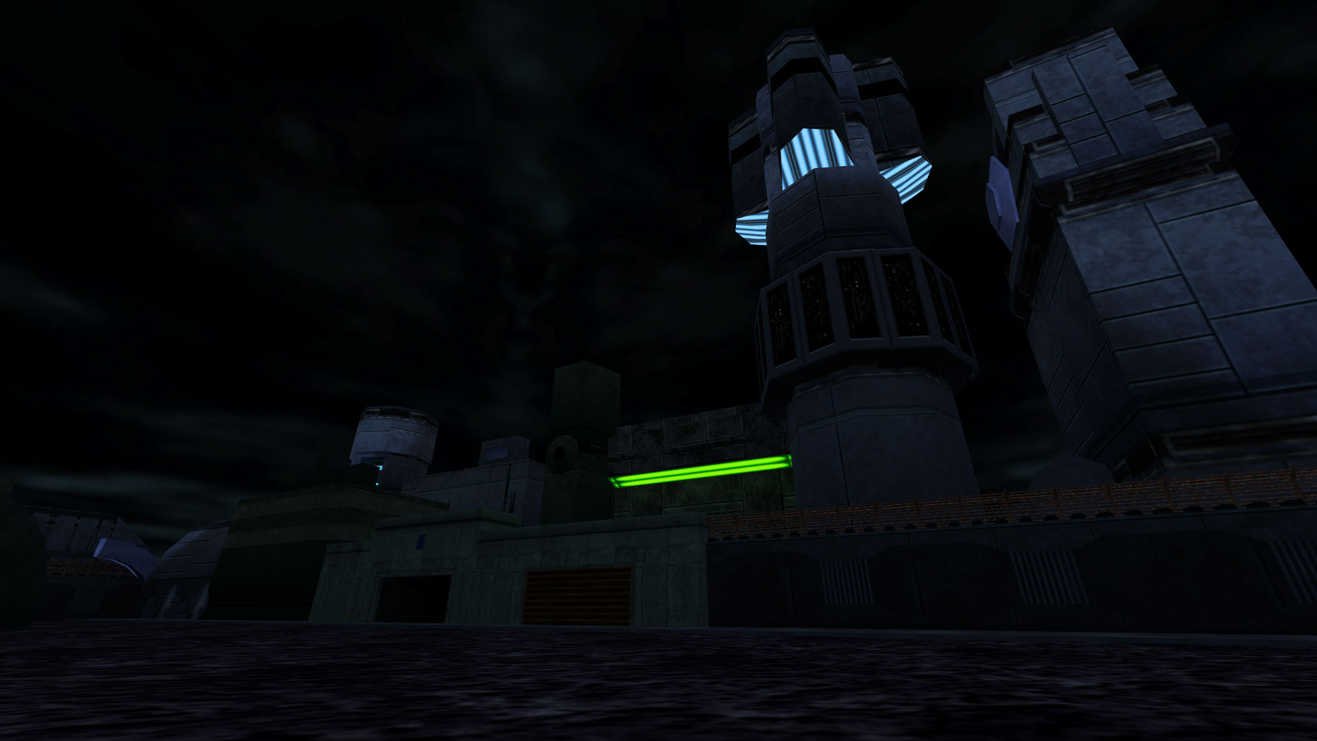
It's close to the end of July, I'm panicking because not much summer is left, but regardless, I've managed to put some more effort into my WiP Sven Co-op map.
Additional note: this entire thing compiled in 20 seconds on the new PC (with almost no func_details). I don't think I'll use the laptop for mapping and compiling any more.
Additional note: this entire thing compiled in 20 seconds on the new PC (with almost no func_details). I don't think I'll use the laptop for mapping and compiling any more.
Posted 6 years ago2018-07-28 20:40:57 UTC
Post #340308
I've been working on the map a bit more:A glass dome. Now with reflections. B)Tractor beam lift. B)Now I'll work more on expanding the map, instead of finishing what I've covered so far. I've still got to do the elevators, the center, and the many rooms the ship will have, the aliens' capturing sequence, and a demo may be ready. ^^
Posted 6 years ago2018-07-29 00:55:56 UTC
Post #340311
Oh, this is actually a standalone project. I rather avoid community stuff, except 2 or 3-person collabs. But yeah, nice windows you have there. 

Posted 6 years ago2018-07-29 12:10:29 UTC
Post #340319
I've experienced that after every major update so far. Windows 10 resets its settings after updating, just as I heard. :/
But you can always set up a Windows 7 virtual machine or something.
But you can always set up a Windows 7 virtual machine or something.
Posted 6 years ago2018-07-29 21:10:05 UTC
Post #340326
Oooor, check your settings.txt wherever you extracted your compiling tools. It probably auto-sets them that way.
Edit:This thing is huge.Here's a ground view. This small part will have a couple of telephones.
I've also been playing around with chrome textures.This one is just a test, however.
Edit:This thing is huge.Here's a ground view. This small part will have a couple of telephones.
I've also been playing around with chrome textures.This one is just a test, however.
Posted 6 years ago2018-07-29 21:14:23 UTC
Post #340327
@SourceSkyBoxer
So your rad line looks like "rad -fast -extra"?
I'm not sure if you know what -fast and -extra do, but:
So by telling hlrad to use -fast and -extra, it's kind of contradicting itself?
So your rad line looks like "rad -fast -extra"?
I'm not sure if you know what -fast and -extra do, but:
-fast -full: determines HLvis compilation method (e.g. use '-fast' for testing; poor optimization but fast compile and '-full' for good optimization and slower compiling).https://sites.google.com/site/svenmanor/tutorials/advancedlight
-extra : turns special HLrad.exe compiling, what makes all light look much better. Generally used for final compilling
So by telling hlrad to use -fast and -extra, it's kind of contradicting itself?
Posted 6 years ago2018-07-30 20:09:30 UTC
Post #340335
Here's some more progress on that huge area:
Posted 6 years ago2018-07-31 13:01:41 UTC
Post #340344
It's a Super Mega Hi-Tech Space Ship Naked Metal BareBones Techy Techy Tech Space Ship Interior.
Nah, this is the Centre. The players spawn in the apartments, and then come to the Lobby, and then go down a 8500-unit elevator ride, and walk there.
Nah, this is the Centre. The players spawn in the apartments, and then come to the Lobby, and then go down a 8500-unit elevator ride, and walk there.

You must be logged in to post a response.

